





























提示词
一键获取所有令人惊艳动效网站的提示词:

复刻提示词

提示词:

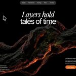
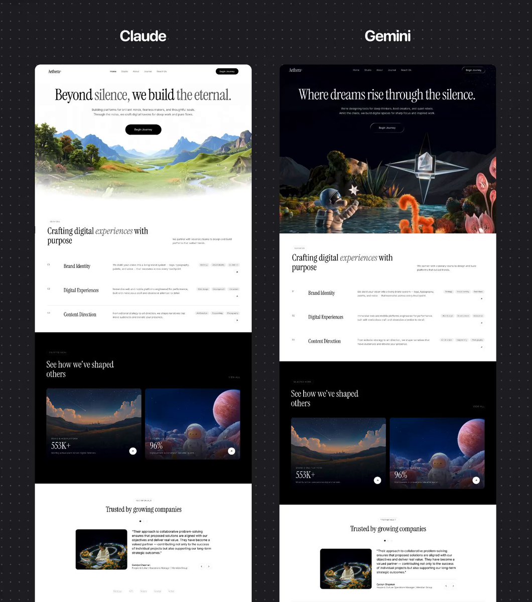
为一家名为「Aethera」的创意工作室构建一个 React + Vite + TypeScript + Tailwind CSS 落地页。网站仅使用浅色模式(不做暗色模式)。使用两种 Google Fonts:Instrument Serif(展示 / 标题)和 Inter(正文)。所有图标使用 lucide-react。网站有一个电影感视频 Hero,下方还有 7 个版块。所有版块都通过一个 IntersectionObserver 钩子实现滚动触发的揭示动画。

全局设置
字体(src/styles/fonts.css)
从 Google Fonts 引入:

Instrument Serif(斜体变体:0 和 1)
Inter(字重:300、400、500、600)
Tailwind 配置(tailwind.config.js)
扩展主题:

fontFamily.display: "Instrument Serif", serif
fontFamily.body: Inter, sans-serif
colors.background: #FFFFFF
colors.foreground: #000000
colors.muted: #6F6F6F
CSS 动画(src/styles/theme.css)
定义以下关键帧动画:

fade-rise:opacity 0 -> 1,translateY(20px -> 0),0.8 秒 ease-out
fade-in:opacity 0 -> 1
slide-up:opacity 0 -> 1,translateY(40px -> 0)
count-up:opacity 0 -> 1,scale(0.8 -> 1)
工具类:

.animate-fade-rise:0.8 秒 ease-out forwards
.animate-fade-rise-delay:相同但延迟 0.2 秒,初始 opacity:0
.animate-fade-rise-delay-2:相同但延迟 0.4 秒,初始 opacity:0
滚动揭示系统:

.reveal:初始 opacity:0,translateY(32px),过渡 opacity 和 transform 0.7 秒 ease-out
.reveal.visible:opacity:1,translateY(0)
.reveal-stagger-1 到 .reveal-stagger-6:过渡延迟从 0.1 秒到 0.6 秒,每级递增 0.1 秒
全局 CSS(src/index.css)
引入 fonts.css 和 theme.css,然后是 Tailwind 指令。重置 margin/padding/box-sizing。启用抗锯齿字体平滑。

滚动揭示 Hook(src/hooks/useReveal.ts)
一个自定义 React Hook,它:

接受一个泛型类型约束 <T extends HTMLElement = HTMLElement>
创建一个用于挂载到版块容器的 ref
使用 IntersectionObserver,threshold: 0.15
查询 ref 元素内所有的 .reveal 子元素
当元素进入视口时添加 visible 类
组件卸载时清理 observer
返回该 ref

版块 1:导航栏(src/components/Navbar.tsx)
顶部导航栏,包含:

左侧:品牌名「Aethera」,带注册商标上标,使用 font-display text-3xl
中间:移动端隐藏(hidden md:flex)。导航项:Home(当前项)、Studio、About、Journal、Reach Us。当前项为 text-foreground,其余为 text-muted。所有文字均为 text-sm,悬停变为 foreground。
右侧:「Begin Journey」CTA 按钮——rounded-full bg-foreground text-white px-6 py-2.5 text-sm,配 hover:scale-[1.03] 过渡。

版块 2:视频 Hero(src/components/VideoBackground.tsx + src/components/HeroSection.tsx)
VideoBackground:

绝对定位容器,从 top: 300px 开始,铺满右 / 下 / 左。
播放这个视频:
视频为 muted、playsInline、autoPlay,不通过 HTML 属性设置循环。
使用 requestAnimationFrame 实现自定义淡入淡出逻辑:FADE_DURATION = 0.5 秒
播放的前 0.5 秒内,opacity 从 0 渐变到 1
结束前的最后 0.5 秒内,opacity 从 1 渐变到 0
两者之间,opacity 保持为 1

在 ended 事件时:将 opacity 设为 0,等待 100ms,重置 currentTime 为 0,再次播放(带淡入淡出的手动循环)
object-cover 视频铺满容器
上方渐变叠加层:bg-gradient-to-b from-background via-transparent to-background
HeroSection:
居中文字内容,relative z-10,顶部内边距:calc(8rem - 75px),底部内边距:pb-40
标题:font-display text-5xl sm:text-7xl md:text-8xl,行高:0.95,字间距:-2.46px,最大宽度 7xl文字:Beyond silence, we build the eternal.
斜体单词使用 <em className="text-muted">
动画类:animate-fade-rise

副标题:text-base sm:text-lg text-muted,最大宽度 2xl,animate-fade-rise-delay文字:「Building platforms for brilliant minds, fearless makers, and thoughtful souls. Through the noise, we craft digital havens for deep work and pure flows.」

CTA:「Begin Journey」按钮——rounded-full bg-foreground text-white px-14 py-5 text-base,animate-fade-rise-delay-2,悬停缩放 1.03

App.tsx 将 VideoBackground、Navbar 和 HeroSection 包裹在一个 relative min-h-screen 的 div 中。

版块 3:SERVICES(src/components/ServicesSection.tsx)
id="studio",白色背景,py-32 px-6,最大宽度 7xl
顶部:「Services」药丸徽标(圆角边框,全大写字间距宽松,text-xs text-muted)
下方:两栏标题行(md:flex-row)。左侧:大标题 font-display text-4xl sm:text-5xl md:text-6xl,行高 1.05:「Crafting digital experiences with purpose」(斜体单词用 text-muted)。右侧:简短段落 text-muted max-w-md。
服务行:4 个项目,divide-y divide-foreground/10 网格。每行是一个 12 列网格(md:grid-cols-12):第 1 列:服务编号(「01」-「04」),text-sm text-muted
第 3 列:标题,font-display text-3xl md:text-4xl
第 5 列:描述,text-base text-muted
第 3 列:右侧带标签药丸(bg-foreground/5 rounded-full px-3 py-1 text-xs text-muted)和一个圆形箭头按钮(h-10 w-10 rounded-full border border-foreground/10),group 悬停时反转为 bg-foreground text-white

图标:lucide-react 的 ArrowUpRight,尺寸 16
服务数据:「Brand Identity」——「We distill your vision into a living brand system -- logo, typography, palette, and voice -- that resonates across every touchpoint.」标签:Strategy、Visual Identity、Guidelines
「Digital Experiences」——「Immersive web and mobile platforms engineered for performance, built with meticulous craft and obsessive attention to detail.」标签:Web Design、Development、Interaction
「Content Direction」——「From editorial strategy to art direction, we shape narratives that move audiences and elevate your presence.」标签:Art Direction、Copywriting、Photography
「Growth Systems」——「Data-informed marketing architectures that compound over time -- SEO, analytics, and conversion frameworks built to scale.」标签:SEO、Analytics、Automation

版块 4:案例研究 / 精选作品(src/components/CaseStudiesSection.tsx)

深色版块:bg-foreground,py-32 px-6,最大宽度 7xl
标题行:左侧是「Selected Work」药丸徽标(border-white/20,text-white/50),白色标题 font-display text-4xl sm:text-5xl md:text-6xl:「See how we've shaped others」。右侧:「View All」链接,text-white/50 uppercase tracking-widest text-sm。
两个项目卡片,grid md:grid-cols-2 gap-6。每张卡片:rounded-2xl overflow-hidden,group 悬停
aspect-[4/3] 容器,内含一个 <video> 元素:muted、loop、playsInline、autoPlay、object-cover,transition-transform 700ms,group 悬停时 scale-105
渐变叠加层:bg-gradient-to-t from-black/80 via-black/20 to-transparent
底部内容区(absolute,p-8):分类标签(text-xs uppercase tracking-widest text-white/60),数据 font-display text-5xl md:text-6xl text-white(行高:1),数据标签 text-sm text-white/60 max-w-xs,以及一个白色圆形按钮 h-12 w-12 rounded-full bg-white text-foreground 配 ArrowUpRight 图标

项目 1:「Meridian Health」,「Brand & Web Platform」,数据「553K+」,标签「Monthly active users across digital channels」,视频:
项目 2:「Coastal Living」,「E-Commerce Redesign」,数据「96%」,标签「Improvement in conversion rate after launch」,视频:

版块 5:TESTIMONIALS(src/components/TestimonialsSection.tsx)
白色背景,py-32 px-6,最大宽度 7xl,居中
「Testimonials」药丸徽标居中
标题:font-display text-4xl sm:text-5xl 居中,最大宽度 lg:「Trusted by growing companies」
圆点导航:3 个圆点,h-2.5 w-2.5 rounded-full border。当前项:border-foreground bg-foreground。非当前项:border-foreground/20 bg-transparent hover:border-foreground/40。
评价卡片:最大宽度 4xl,grid md:grid-cols-5 gap-8左侧(col-span-2):rounded-2xl overflow-hidden,内含一个播放中的 <video> 元素: —— muted、loop、playsInline、autoPlay,h-72 md:h-full w-full object-cover。所有评价幻灯片都播放同一个视频。
右侧(col-span-3):引用文字 text-lg md:text-xl leading-relaxed text-foreground,然后是底部栏 border-t border-foreground/10 pt-6,包含姓名(text-sm font-medium)、职位加公司(text-sm text-muted),以及使用 ChevronLeft / ChevronRight 图标(尺寸 16)的上一 / 下一按钮,位于 h-10 w-10 rounded-full border border-foreground/10 圆圈中,悬停时反转颜色。

状态管理:useState(0) 用于当前索引,上一 / 下一按钮循环切换。
评价数据(3 条):Carolyn Chapman,People & Culture Operations Manager,Meridian Group —— 关于协作解决问题的引言
Marcus Reid,Chief Product Officer,Coastal Living Co. —— 关于数字化转型的引言
Lena Okafor,Brand Director,Solaris Ventures —— 关于作为团队延伸运作的引言

下方 Logo 条:border-t border-foreground/10 pt-12 mt-20,5 个文字 Logo,font-display text-xl text-foreground/20:Meridian、GFS、Solaris、Coastal、Vertex
原文提示词(English)
Access ALL prompts for stunning animated websites in one click:

RECREATION PROMPT

PROMPT:

Build a React + Vite + TypeScript + Tailwind CSS landing page for a creative studio called "Aethera". The site is light-mode only (no dark mode). It uses two Google Fonts: Instrument Serif (display/headings) and Inter (body text). Use lucide-react for all icons. The site has a cinematic video hero and 7 additional sections below it. All sections use scroll-triggered reveal animations via an IntersectionObserver hook.

GLOBAL SETUP
Fonts (src/styles/fonts.css)
Import from Google Fonts:

Instrument Serif (italic variants: 0 and 1)
Inter (weights: 300, 400, 500, 600)
Tailwind Config (tailwind.config.js)
Extend theme with:

fontFamily.display: "Instrument Serif", serif
fontFamily.body: Inter, sans-serif
colors.background: #FFFFFF
colors.foreground: #000000
colors.muted: #6F6F6F
CSS Animations (src/styles/theme.css)
Define these keyframe animations:

fade-rise: opacity 0 -> 1, translateY(20px -> 0), 0.8s ease-out
fade-in: opacity 0 -> 1
slide-up: opacity 0 -> 1, translateY(40px -> 0)
count-up: opacity 0 -> 1, scale(0.8 -> 1)
Utility classes:

.animate-fade-rise: 0.8s ease-out forwards
.animate-fade-rise-delay: same but 0.2s delay, starts opacity:0
.animate-fade-rise-delay-2: same but 0.4s delay, starts opacity:0
Scroll-reveal system:

.reveal: starts opacity:0, translateY(32px), transitions opacity and transform 0.7s ease-out
.reveal.visible: opacity:1, translateY(0)
.reveal-stagger-1 through .reveal-stagger-6: transition-delays from 0.1s to 0.6s in 0.1s increments
Global CSS (src/index.css)
Import fonts.css and theme.css, then Tailwind directives. Reset margin/padding/box-sizing. Enable antialiased font smoothing.

Scroll Reveal Hook (src/hooks/useReveal.ts)
A custom React hook that:

Takes a generic type constraint <T extends HTMLElement = HTMLElement>
Creates a ref to attach to a section container
Uses IntersectionObserver with threshold: 0.15
Queries all .reveal children inside the ref element
Adds visible class when entry is intersecting
Cleans up observer on unmount
Returns the ref
SECTION 1: NAVBAR (src/components/Navbar.tsx)
Top navigation bar with:

Left: Brand name "Aethera" with a registered trademark superscript, using font-display text-3xl
Center: Hidden on mobile (hidden md:flex). Nav items: Home (active), Studio, About, Journal, Reach Us. Active item is text-foreground, others text-muted. All text-sm with hover to foreground.
Right: "Begin Journey" CTA button -- rounded-full bg-foreground text-white px-6 py-2.5 text-sm with hover:scale-[1.03] transition.
SECTION 2: VIDEO HERO (src/components/VideoBackground.tsx + src/components/HeroSection.tsx)
VideoBackground:

Absolutely positioned container starting at top: 300px, filling right/bottom/left.
Plays this video:
Video is muted, playsInline, autoPlay, NOT looped via HTML attribute.
Custom fade logic using requestAnimationFrame:FADE_DURATION = 0.5 seconds
During the first 0.5s of playback, opacity ramps from 0 to 1
During the last 0.5s before ending, opacity ramps from 1 to 0
Between those, opacity is 1

On ended event: set opacity to 0, wait 100ms, reset currentTime to 0, play again (manual loop with fade)
object-cover video filling container
Gradient overlay on top: bg-gradient-to-b from-background via-transparent to-background
HeroSection:
Centered text content, relative z-10, top padding: calc(8rem - 75px), bottom padding: pb-40
Heading: font-display text-5xl sm:text-7xl md:text-8xl, lineHeight: 0.95, letterSpacing: -2.46px, max-width 7xlText: Beyond silence, we build the eternal.
The italic words use <em className="text-muted">
Animation class: animate-fade-rise

Subheading: text-base sm:text-lg text-muted, max-width 2xl, animate-fade-rise-delayText: "Building platforms for brilliant minds, fearless makers, and thoughtful souls. Through the noise, we craft digital havens for deep work and pure flows."

CTA: "Begin Journey" button -- rounded-full bg-foreground text-white px-14 py-5 text-base, animate-fade-rise-delay-2, hover scale 1.03

App.tsx wraps VideoBackground, Navbar, and HeroSection inside a relative min-h-screen div.
SECTION 3: SERVICES (src/components/ServicesSection.tsx)
id="studio", white background, py-32 px-6, max-width 7xl
Top: "Services" pill badge (rounded-full border, uppercase tracking-widest, text-xs text-muted)
Below: Two-column header row (md:flex-row). Left: large heading font-display text-4xl sm:text-5xl md:text-6xl with lineHeight 1.05: "Crafting digital experiences with purpose" (italic word in text-muted). Right: short paragraph text-muted max-w-md.
Service rows: 4 items in a divide-y divide-foreground/10 grid. Each row is a 12-column grid (md:grid-cols-12) with:Col 1: service number ("01"-"04") in text-sm text-muted
Col 3: title in font-display text-3xl md:text-4xl
Col 5: description in text-base text-muted
Col 3: right side with tag pills (bg-foreground/5 rounded-full px-3 py-1 text-xs text-muted) and a circular arrow button (h-10 w-10 rounded-full border border-foreground/10) that inverts to bg-foreground text-white on group hover

Icons: ArrowUpRight from lucide-react, size 16
Services data:"Brand Identity" -- "We distill your vision into a living brand system -- logo, typography, palette, and voice -- that resonates across every touchpoint." Tags: Strategy, Visual Identity, Guidelines
"Digital Experiences" -- "Immersive web and mobile platforms engineered for performance, built with meticulous craft and obsessive attention to detail." Tags: Web Design, Development, Interaction
"Content Direction" -- "From editorial strategy to art direction, we shape narratives that move audiences and elevate your presence." Tags: Art Direction, Copywriting, Photography
"Growth Systems" -- "Data-informed marketing architectures that compound over time -- SEO, analytics, and conversion frameworks built to scale." Tags: SEO, Analytics, Automation

SECTION 4: CASE STUDIES / SELECTED WORK (src/components/CaseStudiesSection.tsx)

Dark section: bg-foreground, py-32 px-6, max-width 7xl
Header row: Left side has "Selected Work" pill badge (border-white/20, text-white/50), heading in white font-display text-4xl sm:text-5xl md:text-6xl: "See how we've shaped others". Right side: "View All" link in text-white/50 uppercase tracking-widest text-sm.
Two project cards in a grid md:grid-cols-2 gap-6. Each card:rounded-2xl overflow-hidden, group hover
aspect-[4/3] container with a <video> element: muted, loop, playsInline, autoPlay, object-cover, transition-transform 700ms, scale-105 on group-hover
Gradient overlay: bg-gradient-to-t from-black/80 via-black/20 to-transparent
Bottom content area (absolute, p-8): category label (text-xs uppercase tracking-widest text-white/60), stat in font-display text-5xl md:text-6xl text-white (lineHeight: 1), stat label in text-sm text-white/60 max-w-xs, and a white circular button h-12 w-12 rounded-full bg-white text-foreground with ArrowUpRight icon

Project 1: "Meridian Health", "Brand & Web Platform", stat "553K+", label "Monthly active users across digital channels", video:
Project 2: "Coastal Living", "E-Commerce Redesign", stat "96%", label "Improvement in conversion rate after launch", video:
SECTION 5: TESTIMONIALS (src/components/TestimonialsSection.tsx)
White background, py-32 px-6, max-width 7xl, centered
"Testimonials" pill badge centered
Heading: font-display text-4xl sm:text-5xl centered, max-w-lg: "Trusted by growing companies"
Dot navigation: 3 dots, h-2.5 w-2.5 rounded-full border. Active: border-foreground bg-foreground. Inactive: border-foreground/20 bg-transparent hover:border-foreground/40.
Testimonial card: max-w-4xl, grid md:grid-cols-5 gap-8Left (col-span-2): rounded-2xl overflow-hidden containing a <video> element playing:  -- muted, loop, playsInline, autoPlay, h-72 md:h-full w-full object-cover. This same video plays for all testimonial slides.
Right (col-span-3): blockquote in text-lg md:text-xl leading-relaxed text-foreground, then a bottom bar with border-t border-foreground/10 pt-6 containing name (text-sm font-medium), role + company (text-sm text-muted), and prev/next buttons using ChevronLeft/ChevronRight icons (size 16) in h-10 w-10 rounded-full border border-foreground/10 circles that invert on hover.

State management: useState(0) for active index, prev/next wrap around.
Testimonial data (3 entries):Carolyn Chapman, People & Culture Operations Manager, Meridian Group -- quote about collaborative problem-solving
Marcus Reid, Chief Product Officer, Coastal Living Co. -- quote about digital presence transformation
Lena Okafor, Brand Director, Solaris Ventures -- quote about operating as team extension

Logo strip below: border-t border-foreground/10 pt-12 mt-20, 5 text logos in font-display text-xl text-foreground/20: Meridian, GFS, Solaris, Coastal, Vertex
建议模型
Claude Code · Nano Banana Pro · Kling / GPT-5.6 Sol
视频地址
https://media.goodcase.ai/media/video/claude-nano-banana-kling-37787d8ec68d.mp4