












提示词
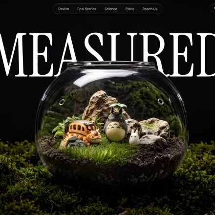
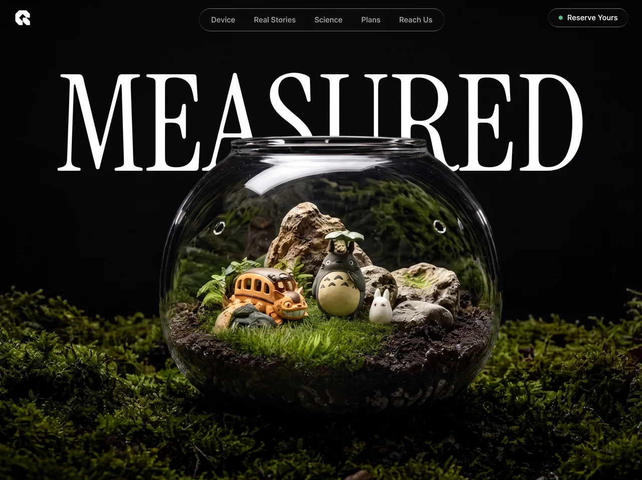
为名为 "Measured" 的产品构建单页 hero section——一个健康/康养可穿戴设备 landing page。页面为 fullscreen(100vh),采用深色/氛围感美学,包含分层图像、跟随光标的 spotlight reveal effect 和 frosted-glass navigation。使用 React + Vite + Tailwind CSS + TypeScript。

---

## 字体

1. **Google Fonts — Inter**(字重 300-700):用作所有元素的全局默认字体(`* { font-family: 'Inter', sans-serif; }`)
2. **Google Fonts — Instrument Serif**(常规体 + 斜体):用于 hero heading "Measured"。通过 index.html 中的 `<link>` 加载:`https://fonts.googleapis.com/css2?family=Instrument+Serif:ital@0;1&display=swap`
3. **Helvetica Neue Roman**(托管在 `/public/fonts/` 中的 woff2/woff):通过 hero section wrapper 上的 `.font-helvetica-neue` class 应用。使用 `@font-face` 声明。

---

## 资源 URL(精确)

- **背景图(BG_IMAGE_1):** `https://images.higgs.ai/?default=1&output=webp&url=https%3A%2F%2Fd8j0ntlcm91z4.cloudfront.net%2Fuser_38xzZboKViGWJOttwIXH07lWA1P%2Fhf_20260713_140344_79e1296a-86d7-43fd-9b5f-63ffe560f291.png&w=1280&q=85`
- **前景视频(FRONT_VIDEO):** `https://d8j0ntlcm91z4.cloudfront.net/user_38xzZboKViGWJOttwIXH07lWA1P/hf_20260713_162101_0d7498c5-29bb-47bf-a99f-2773c0a880a9.mp4`
- **叠加图像(OVERLAY_IMAGE):** `https://soft-zoom-63098134.figma.site/_assets/v11/3f10f1876e118f72a396e05a6c2d099569478272.png`

---

## 页面结构与图层(z-index 顺序)

### Navigation(z-50,fixed)
- **Logo(左上角):** 自定义 SVG 几何 logo(白色,28x28),形似互相咬合的棱角形状。精确 SVG path:`M 256 64 L 256 128 L 192.5 128 L 160 95 L 128 64 L 96 95 L 63.5 128 L 64 128 L 128 192 L 128 256 L 64.5 256 L 32 223 L 0 192 L 0 64 L 64 0 L 192 0 Z M 256 192 L 256 256 L 192.5 256 L 160 223 L 128 192 L 128 128 L 192 128 Z`(viewBox 0 0 256 256,fill white)
- **桌面端中央药丸 nav(移动端隐藏):** 水平固定居中,包含按钮:"设备"、"真实故事"、"科学"、"方案"、"联系我们"。使用 `.liquid-glass` 样式(frosted glass)。按钮为 `text-white/70`、`text-sm`、`font-medium`、rounded-full,hover 时变为白色。
- **桌面端 CTA(右上角,移动端隐藏):** `.liquid-glass` 药丸按钮,带一个绿色小圆点(w-2 h-2 rounded-full bg-green-400)和文本 "立即预订",白色 text-sm font-medium。
- **移动端 hamburger(右上角,md+ 时隐藏):** `.liquid-glass` rounded-full 药丸,包含两条白线(w-5 h-[1.5px] 和 w-3.5 h-[1.5px])。

### 移动端全屏菜单(z-55)
- 背景:`#0a0a0a` 纯色
- 关闭按钮:右上角,`.liquid-glass` rounded-full,X 由两条旋转的白线组成(+45deg、-45deg)
- Nav items 垂直堆叠、居中,`text-3xl sm:text-4xl`、white/90、中等字重
- 底部放置带绿色圆点的 "立即预订" CTA,采用 `.liquid-glass` 药丸样式
- 交错进入动画:每个项目从下方 24px 处向上滑入,opacity 从 0->1,延迟从 100ms 开始,每项递增 60ms。使用 `cubic-bezier(0.77, 0, 0.18, 1)` easing。关闭按钮从 -90deg 旋转进入,scale 0.8。

### Hero Section(100vh,overflow hidden)

**Layer 1 — 网格背景(z-0,opacity 0.1):**
- 使用包含 48px 重复单元格图案的 SVG。图案绘制一条 L 形 path(`M 48 0 L 0 0 0 48`),stroke `#64748b`,strokeWidth 0.6,无 fill。
- 网格根据光标位置进行轻微的 parallax 偏移(偏移量按光标相对于 section 中心的位置 * 16 计算,并以 0.06 factor 缓动)。

**Layer 2 — 背景图(z-10):**
- 将 `BG_IMAGE_1` 显示为 `background-image`,使用 `bg-center bg-cover bg-no-repeat`,绝对定位 inset-0。

**Layer 3 — Hero Text(z-20):**
- 以超大写文本显示单词 "Measured"
- 字体:`'Instrument Serif', serif`
- 尺寸:默认 `text-[4.5rem]`、`xs:text-[5.5rem]`、`sm:text-[10rem]`、`md:text-[13rem]`、`lg:text-[16rem]`
- `leading-[0.9]`、白色、居中,定位为 `top-20 sm:top-28 md:top-32`

**Layer 4 — 叠加图像(z-25):**
- 将 `OVERLAY_IMAGE` 用作 `<img>` tag,绝对定位 inset-0,`w-full h-full object-cover`,pointer-events-none。这是一张位于背景上方的半透明 PNG,用于增强深度/氛围感。

**Layer 5 — Spotlight Reveal(z-30):**
- 一个跟随光标的 radial reveal mask,仅在光标悬停处显示下方的视频。
- **半径:** 260px
- **Mask gradient stops:** 中心为完全白色(0-40%),之后逐渐羽化:60% 处 alpha 为 0.75,75% 处为 0.4,88% 处为 0.12,100% 处为 0(完全透明)。
- **实现方式:** 一个隐藏的 `<canvas>` 在经过平滑处理的光标位置绘制 radial gradient。将 canvas 导出为 dataURL,并作为 CSS mask(`-webkit-mask-image` / `mask-image`)应用到包含视频的 div 上。
- **光标平滑:** 使用 lerp factor 0.1 的 `requestAnimationFrame` loop(`smooth += (target - smooth) * 0.1`)。
- **视频位置:** 使用 `clipPath: 'inset(40% 0 0 0)'` 将视频(`FRONT_VIDEO`)裁剪到 viewport 底部 60%。视频自动播放、循环、静音,并使用 playsInline。

---

## 液态玻璃 CSS 效果(`.liquid-glass`)

```css
.liquid-glass {
  background: rgba(255, 255, 255, 0.01);
  background-blend-mode: luminosity;
  backdrop-filter: blur(4px);
  -webkit-backdrop-filter: blur(4px);
  border: none;
  box-shadow: inset 0 1px 1px rgba(255, 255, 255, 0.1);
  position: relative;
  overflow: hidden;
}
.liquid-glass::before {
  content: '';
  position: absolute;
  inset: 0;
  border-radius: inherit;
  padding: 1.4px;
  background: linear-gradient(180deg,
    rgba(255,255,255,0.45) 0%, rgba(255,255,255,0.15) 20%,
    rgba(255,255,255,0) 40%, rgba(255,255,255,0) 60%,
    rgba(255,255,255,0.15) 80%, rgba(255,255,255,0.45) 100%);
  -webkit-mask: linear-gradient(#fff 0 0) content-box, linear-gradient(#fff 0 0);
  -webkit-mask-composite: xor;
  mask-composite: exclude;
  pointer-events: none;
}
```

这会创建一个近乎不可见的 frosted glass 背景,并使用 mask-composite 技巧添加细微的渐变边框(仅边框渐变)。

---

## 关键行为

1. 移动端菜单打开时锁定 **Body overflow**
2. **不可滚动**——仅显示单个 viewport hero
3. 根容器的**背景为白色**(`bg-white`),但 hero section 以深色图像填满整个 viewport
4. **Reveal effect 仅在屏幕底部 60% 显示视频**(顶部 40% 通过 clipPath 屏蔽),因此悬停在顶部区域不会显示额外内容——只能看到基础图层

---

## 视觉效果总结

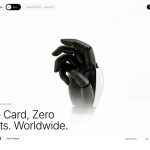
用户会看到一张深色、富有氛围感的产品图(手腕上的可穿戴设备),上方叠加巨大的衬线体 "Measured" 文本。半透明叠加层增添朦胧感/深度。随着用户移动光标,一个柔和的 spotlight 圆形区域会显露下方循环播放的视频(展示动态产品)——但仅限于屏幕下部。网格背景会随 parallax 轻微移动。Navigation 采用优雅的 frosted-glass 药丸美学。
原文提示词(English)
Build a single-page hero section for a product called "Measured" — a health/wellness wearable device landing page. The page is fullscreen (100vh), dark/moody aesthetic with layered imagery, a cursor-following spotlight reveal effect, and a frosted-glass navigation. Use React + Vite + Tailwind CSS + TypeScript.

---

## Fonts

1. **Google Fonts — Inter** (weights 300-700): Used as the global default font on all elements (`* { font-family: 'Inter', sans-serif; }`)
2. **Google Fonts — Instrument Serif** (regular + italic): Used for the hero heading "Measured". Load via `<link>` in index.html: `https://fonts.googleapis.com/css2?family=Instrument+Serif:ital@0;1&display=swap`
3. **Helvetica Neue Roman** (self-hosted woff2/woff in `/public/fonts/`): Applied via a `.font-helvetica-neue` class on the hero section wrapper. Declare with `@font-face`.

---

## Asset URLs (exact)

- **Background Image (BG_IMAGE_1):** `https://images.higgs.ai/?default=1&output=webp&url=https%3A%2F%2Fd8j0ntlcm91z4.cloudfront.net%2Fuser_38xzZboKViGWJOttwIXH07lWA1P%2Fhf_20260713_140344_79e1296a-86d7-43fd-9b5f-63ffe560f291.png&w=1280&q=85`
- **Front Video (FRONT_VIDEO):** `https://d8j0ntlcm91z4.cloudfront.net/user_38xzZboKViGWJOttwIXH07lWA1P/hf_20260713_162101_0d7498c5-29bb-47bf-a99f-2773c0a880a9.mp4`
- **Overlay Image (OVERLAY_IMAGE):** `https://soft-zoom-63098134.figma.site/_assets/v11/3f10f1876e118f72a396e05a6c2d099569478272.png`

---

## Page Structure & Layers (z-index order)

### Navigation (z-50, fixed)
- **Logo (top-left):** Custom SVG geometric logo (white, 28x28), resembling angular interlocking shapes. The exact SVG path: `M 256 64 L 256 128 L 192.5 128 L 160 95 L 128 64 L 96 95 L 63.5 128 L 64 128 L 128 192 L 128 256 L 64.5 256 L 32 223 L 0 192 L 0 64 L 64 0 L 192 0 Z M 256 192 L 256 256 L 192.5 256 L 160 223 L 128 192 L 128 128 L 192 128 Z` (viewBox 0 0 256 256, fill white)
- **Desktop center pill nav (hidden on mobile):** Fixed horizontally centered, contains buttons: "Device", "Real Stories", "Science", "Plans", "Reach Us". Uses `.liquid-glass` styling (frosted glass). Buttons are `text-white/70`, `text-sm`, `font-medium`, rounded-full, hover to white.
- **Desktop CTA (top-right, hidden on mobile):** `.liquid-glass` pill button with a small green dot (w-2 h-2 rounded-full bg-green-400) and text "Reserve Yours", white text-sm font-medium.
- **Mobile hamburger (top-right, hidden md+):** `.liquid-glass` rounded-full pill, contains two white lines (w-5 h-[1.5px] and w-3.5 h-[1.5px]).

### Mobile Fullscreen Menu (z-55)
- Background: `#0a0a0a` solid
- Close button: top-right, `.liquid-glass` rounded-full with X made of two rotated white lines (+45deg, -45deg)
- Nav items stacked vertically, centered, `text-3xl sm:text-4xl`, white/90, font-medium
- "Reserve Yours" CTA at bottom with green dot, `.liquid-glass` pill
- Staggered entry animations: each item slides up from 24px with opacity 0->1, delays incremented by 60ms starting at 100ms. Uses `cubic-bezier(0.77, 0, 0.18, 1)` easing. Close button rotates in from -90deg with scale 0.8.

### Hero Section (100vh, overflow hidden)

**Layer 1 — Grid Background (z-0, opacity 0.1):**
- SVG with a repeating pattern of 48px cells. Pattern draws an L-shaped path (`M 48 0 L 0 0 0 48`), stroke `#64748b`, strokeWidth 0.6, no fill.
- The grid subtly parallax-shifts based on cursor position (offset calculated as cursor position relative to section center * 16, eased at 0.06 factor).

**Layer 2 — Background Image (z-10):**
- `BG_IMAGE_1` displayed as `background-image`, `bg-center bg-cover bg-no-repeat`, absolutely positioned inset-0.

**Layer 3 — Hero Text (z-20):**
- The word "Measured" in huge uppercase text
- Font: `'Instrument Serif', serif`
- Sizes: `text-[4.5rem]` default, `xs:text-[5.5rem]`, `sm:text-[10rem]`, `md:text-[13rem]`, `lg:text-[16rem]`
- `leading-[0.9]`, white, centered, positioned `top-20 sm:top-28 md:top-32`

**Layer 4 — Overlay Image (z-25):**
- `OVERLAY_IMAGE` as an `<img>` tag, absolutely positioned inset-0, `w-full h-full object-cover`, pointer-events-none. This is a semi-transparent PNG that sits on top of the background to add depth/atmosphere.

**Layer 5 — Spotlight Reveal (z-30):**
- A cursor-following radial reveal mask that shows a video underneath only where the cursor hovers.
- **Radius:** 260px
- **Mask gradient stops:** center full white (0-40%), then feathers out: 60% at 0.75 alpha, 75% at 0.4, 88% at 0.12, 100% at 0 (fully transparent).
- **Implementation:** A hidden `<canvas>` draws the radial gradient at the smoothed cursor position. The canvas is exported as a dataURL and applied as a CSS mask (`-webkit-mask-image` / `mask-image`) on a div that contains the video.
- **Cursor smoothing:** Uses `requestAnimationFrame` loop with lerp factor 0.1 (`smooth += (target - smooth) * 0.1`).
- **Video placement:** The video (`FRONT_VIDEO`) is clipped to the bottom 60% of the viewport using `clipPath: 'inset(40% 0 0 0)'`. It autoplays, loops, is muted, and uses playsInline.

---

## Liquid Glass CSS Effect (`.liquid-glass`)

```css
.liquid-glass {
  background: rgba(255, 255, 255, 0.01);
  background-blend-mode: luminosity;
  backdrop-filter: blur(4px);
  -webkit-backdrop-filter: blur(4px);
  border: none;
  box-shadow: inset 0 1px 1px rgba(255, 255, 255, 0.1);
  position: relative;
  overflow: hidden;
}
.liquid-glass::before {
  content: '';
  position: absolute;
  inset: 0;
  border-radius: inherit;
  padding: 1.4px;
  background: linear-gradient(180deg,
    rgba(255,255,255,0.45) 0%, rgba(255,255,255,0.15) 20%,
    rgba(255,255,255,0) 40%, rgba(255,255,255,0) 60%,
    rgba(255,255,255,0.15) 80%, rgba(255,255,255,0.45) 100%);
  -webkit-mask: linear-gradient(#fff 0 0) content-box, linear-gradient(#fff 0 0);
  -webkit-mask-composite: xor;
  mask-composite: exclude;
  pointer-events: none;
}
```

This creates a near-invisible frosted glass background with a subtle gradient border using the mask-composite trick (border-only gradient).

---

## Key Behaviors

1. **Body overflow locks** when mobile menu is open
2. **No scrolling** — single viewport hero only
3. **Background is white** on the root container (`bg-white`), but the hero section fills the entire viewport with dark imagery
4. **The reveal effect only shows video in the bottom 60%** of the screen (the top 40% is masked out via clipPath), so hovering over the top portion shows nothing extra — just the base layers

---

## Summary of the Visual Effect

The user sees a dark, atmospheric product shot (wearable device on a wrist) with "Measured" in giant serif text overlaid. A semi-transparent overlay adds haze/depth. As the user moves their cursor, a soft spotlight circle reveals an underlying looping video (showing the product in motion) — but only in the lower portion of the screen. The grid background subtly shifts with parallax. Navigation uses an elegant frosted-glass pill aesthetic.
视频地址