

















提示词
使用 React、Vite 和 Framer Motion(`motion` package)创建一个全屏 hero section landing page。使用纯 CSS(不使用 Tailwind)。字体使用 Google Fonts 的 Inter(字重 300、400、500、600)。设计采用极简黑白风格,并配有占满 viewport 的背景视频。

**技术栈:** React 19、Vite、`motion`(framer-motion)、`lucide-react`(用于 Plus icon)。

**布局:**
- 占满 viewport 高度(`min-height: 100vh`),白色背景,采用 flex column 和 `justify-content: space-between`
- Navbar 固定在顶部(z-index 50,nav 本身设置 pointer-events none,子元素设置 auto)
- 全屏视频使用绝对定位,位于所有内容之后(z-index 0)
- Footer 内容固定在底部(z-index 30),背景为向上渐隐的白色渐变

**Navbar(固定在顶部):**
- 左侧包含:
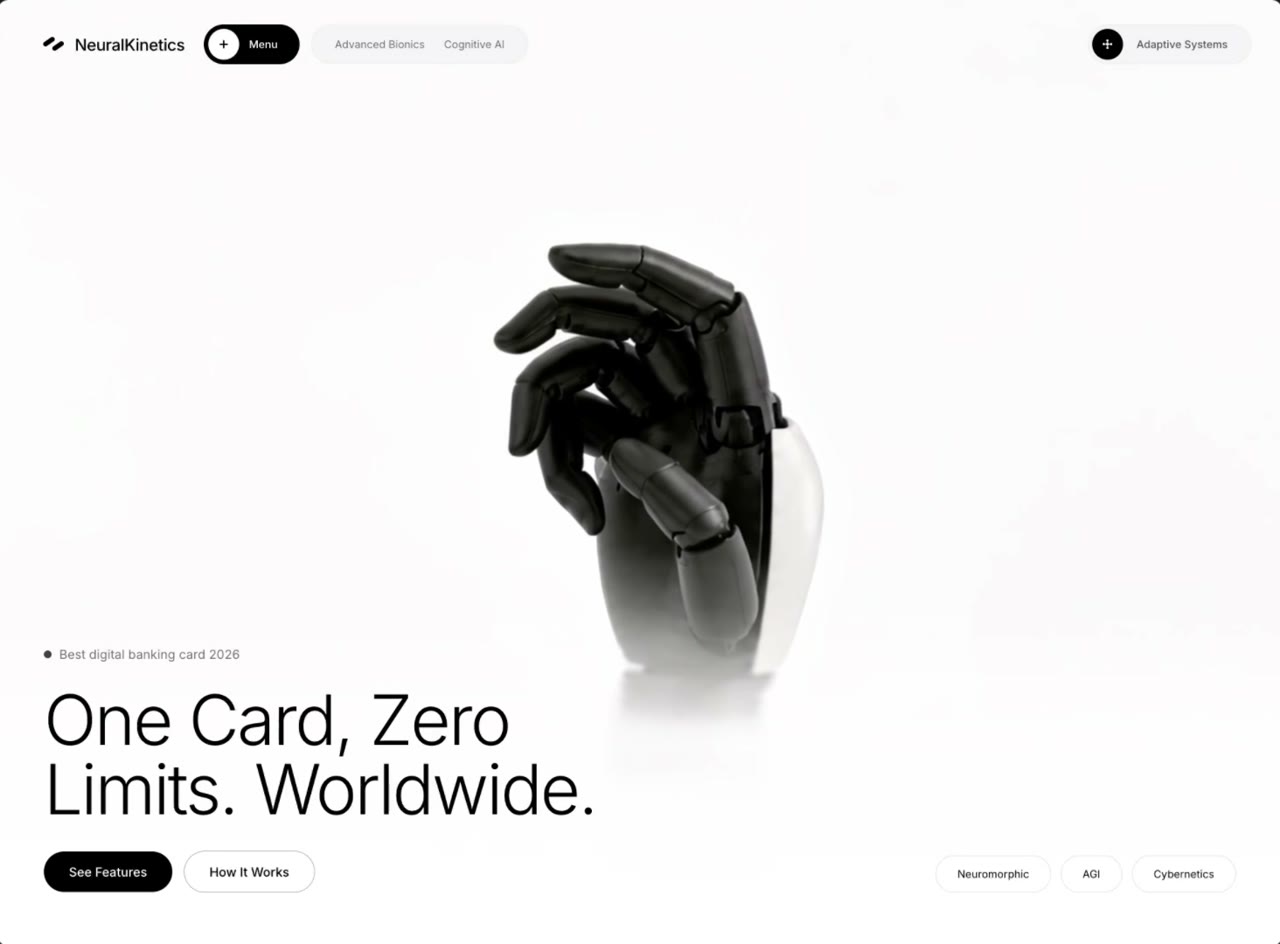
  1. Logo:自定义 SVG icon(两个旋转 -35deg 的圆角矩形,黑色填充)+ 品牌文字 "NeuralKinetics"(移动端隐藏,桌面端 768px+ 显示)
  2. 菜单按钮:黑色 pill,内含一个带 Plus icon 的白色圆形(lucide、size 12、strokeWidth 3)+ "Menu" 文字(11px、白色)
  3. 标签 pill:浅灰色(#F4F4F6)rounded-full 容器,包含两个文字标签 "Advanced Bionics" 和 "Cognitive AI"(移动端隐藏,桌面端显示)
- 右侧包含:
  - 一个浅灰色 pill,内含黑色圆形按钮(包含 4-dot grid SVG icon)+ 标签 "Adaptive Systems"(移动端隐藏)

**背景视频:**
- URL:`https://d8j0ntlcm91z4.cloudfront.net/user_38xzZboKViGWJOttwIXH07lWA1P/hf_20260508_215831_c6a8989c-d716-4d8d-8745-e972a2eec711.mp4`
- autoPlay、muted、playsInline、object-fit: cover
- 移动端:视频 wrapper 的宽度和高度均为 80%(居中)
- 桌面端(768px+):视频 wrapper 的宽度和高度均为 100%

**Footer 内容(底部,位于渐变之上):**
- 背景:`linear-gradient(to top, #ffffff 0%, rgba(255,255,255,0.8) 50%, transparent 100%)`
- 移动端:垂直堆叠。桌面端:row layout,各项底部对齐。
- 左侧区块:
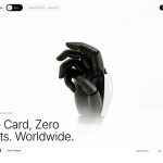
  1. 副标题行:黑色小圆点(8px circle)+ "2026 年最佳数字银行卡"(13px、黑色 55% opacity)
  2. 标题:"一张卡,全球 / 零限制。",分为两行。Font-weight 300,移动端为 clamp(2rem, 8vw, 4.5rem),桌面端为 clamp(2.5rem, 5.5vw, 4.5rem),letter-spacing -0.03em,line-height 1
  3. 两个按钮:"查看功能"(黑色 pill、白色文字、13px)和 "运作方式"(透明背景,深色边框 rgba(0,0,0,0.35),13px)
- 右侧区块:三个标签 pill:"Neuromorphic"、"AGI"、"Cybernetics"(白色 bg、浅色边框 rgba(0,0,0,0.12)、11px、rounded-full)

**动画(使用来自 'motion/react' 的 `motion`):**
- Navbar:从 y:-16、opacity 0 向下滑动至可见。Duration 0.8s,ease [0.16, 1, 0.3, 1]
- 视频:从 opacity 0 + scale 1.05 淡入至 opacity 1 + scale 1。Duration 1.8s
- Footer wrapper:从 y:20 向上滑动,delay 0.5s,duration 1s
- 副标题:从 y:16 向上滑动,delay 0.6s,duration 0.8s
- 标题:从 y:20 向上滑动,delay 0.8s,duration 0.8s
- 按钮:从 y:16 向上滑动,delay 1.0s,duration 0.8s
- 全部使用 ease: [0.16, 1, 0.3, 1]

**响应式(mobile-first,breakpoint 为 768px):**
- 移动端:navbar padding 16px,较小的按钮(28px circles),隐藏品牌文字、标签和右侧标签,footer 垂直堆叠,视频尺寸为 80%
- 桌面端(768px+):navbar padding 24px 32px,较大的按钮(32px circles),显示所有文字/标签,footer 使用 row layout,视频填满 100%
原文提示词(English)
Create a full-screen hero section landing page using React, Vite, and Framer Motion (`motion` package). Use plain CSS (no Tailwind). The font is Inter (weights 300, 400, 500, 600) from Google Fonts. The design is minimal black-and-white with a full-viewport background video.

**Stack:** React 19, Vite, `motion` (framer-motion), `lucide-react` (for the Plus icon).

**Layout:**
- Full viewport height (`min-height: 100vh`), white background, flex column with `justify-content: space-between`
- Fixed navbar at top (z-index 50, pointer-events none on the nav itself, auto on children)
- Absolutely positioned full-screen video behind everything (z-index 0)
- Footer content pinned to bottom (z-index 30) with a white gradient fade-up background

**Navbar (fixed, top):**
- Left side contains:
  1. Logo: custom SVG icon (two rotated rounded rectangles at -35deg, black fill) + brand text "NeuralKinetics" (hidden on mobile, shown on desktop 768px+)
  2. Menu button: black pill with white circle containing a Plus icon (lucide, size 12, strokeWidth 3) + "Menu" text (11px, white)
  3. Tags pill: light gray (#F4F4F6) rounded-full container with two text labels "Advanced Bionics" and "Cognitive AI" (hidden on mobile, shown on desktop)
- Right side contains:
  - A light gray pill with a black circle button (containing a 4-dot grid SVG icon) + label "Adaptive Systems" (hidden on mobile)

**Background Video:**
- URL: `https://d8j0ntlcm91z4.cloudfront.net/user_38xzZboKViGWJOttwIXH07lWA1P/hf_20260508_215831_c6a8989c-d716-4d8d-8745-e972a2eec711.mp4`
- autoPlay, muted, playsInline, object-fit: cover
- On mobile: video wrapper is 80% width and 80% height (centered)
- On desktop (768px+): video wrapper is 100% width and 100% height

**Footer content (bottom, over gradient):**
- Background: `linear-gradient(to top, #ffffff 0%, rgba(255,255,255,0.8) 50%, transparent 100%)`
- On mobile: stacks vertically. On desktop: row layout, items aligned to bottom.
- Left block:
  1. Subtitle line: small black dot (8px circle) + "Best digital banking card 2026" (13px, 55% opacity black)
  2. Heading: "One Card, Zero / Limits. Worldwide." on two lines. Font-weight 300, clamp(2rem, 8vw, 4.5rem) on mobile, clamp(2.5rem, 5.5vw, 4.5rem) on desktop, letter-spacing -0.03em, line-height 1
  3. Two buttons: "See Features" (black pill, white text, 13px) and "How It Works" (transparent with dark border rgba(0,0,0,0.35), 13px)
- Right block: Three tag pills "Neuromorphic", "AGI", "Cybernetics" (white bg, light border rgba(0,0,0,0.12), 11px, rounded-full)

**Animations (using `motion` from 'motion/react'):**
- Navbar: slides down from y:-16, opacity 0 to visible. Duration 0.8s, ease [0.16, 1, 0.3, 1]
- Video: fades in from opacity 0 + scale 1.05 to opacity 1 + scale 1. Duration 1.8s
- Footer wrapper: slides up from y:20, delay 0.5s, duration 1s
- Subtitle: slides up from y:16, delay 0.6s, duration 0.8s
- Heading: slides up from y:20, delay 0.8s, duration 0.8s
- Buttons: slides up from y:16, delay 1.0s, duration 0.8s
- All use ease: [0.16, 1, 0.3, 1]

**Responsive (mobile-first, breakpoint at 768px):**
- Mobile: navbar padding 16px, smaller buttons (28px circles), brand text hidden, tags hidden, right label hidden, footer stacks vertically, video at 80% size
- Desktop (768px+): navbar padding 24px 32px, larger buttons (32px circles), all text/tags visible, footer is row layout, video fills 100%
视频地址