



























提示词
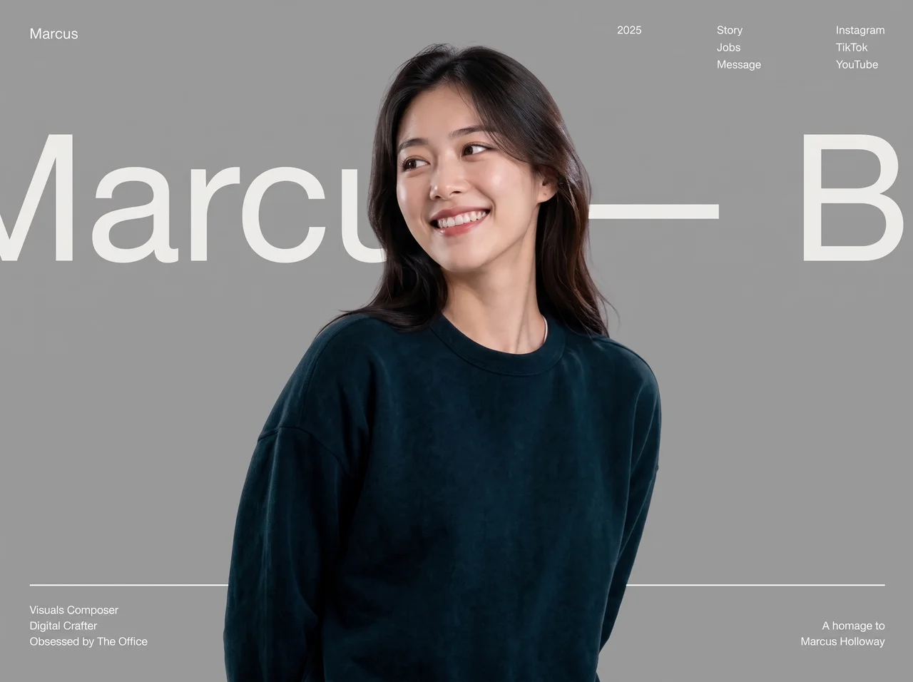
**像素级忠实地**复刻此页面。单个占满整个视口的首屏。React + Tailwind CSS。不要卡片,不要紫色,不要 Inter/Roboto。采用黑色/奶油色的编辑设计风格作品集外观。

---

## 技术栈与页面框架

- Vite + React + TypeScript + Tailwind CSS
- 文档标题:`Marcus — Bennet`(长破折号)
- Body 字体栈:`'Helvetica Neue ME', Helvetica, Arial, sans-serif`
- 加载此确切 webfont(print→all 模式):

```
https://db.onlinewebfonts.com/c/95cecf452d3208890088a5b4c19c7ecf?family=Helvetica+Neue+ME
```

- Tailwind 主题扩展:
  - 颜色 `cream`:`#efeee9`
  - 字体族 `hn`(以及 `sans`/`serif`):`"Helvetica Neue ME", Helvetica, Arial, sans-serif`
- Lucide React 仅用于移动端关闭图标(`X`、size `26`、strokeWidth `1.5`)
- 根 section:`relative h-[100dvh] w-full overflow-hidden`——单一构图,首屏不可滚动

---

## 确切素材 URL(不要替换)

**背景图片(全出血,位于所有内容之后):**
```
https://images.higgs.ai/?default=1&output=webp&url=https%3A%2F%2Fd8j0ntlcm91z4.cloudfront.net%2Fuser_38xzZboKViGWJOttwIXH07lWA1P%2Fhf_20260729_022513_486985a2-ac8c-4278-91a8-071dcd9fcaff.png&w=1280&q=85
```

**前景人像(抠图叠层,位于跑马灯之上,pointer-events none):**
```
https://stone-expand-60400629.figma.site/_assets/v11/8da570354e86aa0d44ac3e4aa335a72c8e750d68.png
```

两张图片均使用:`absolute inset-0 h-full w-full object-cover`。

---

## 图层顺序(z-index)

| 图层 | z | 内容 |
|--------|---|---------|
| 背景图片 | default | 全出血背景 |
| 跑马灯姓名 | `z-10` | 滚动的“Marcus — Bennet” |
| 水平奶油色分隔线 | `z-10` | 位于页脚上方 |
| 桌面端页脚 | `sm:z-10` | 底部文案 |
| 前景人像 | `z-20` | 覆盖跑马灯的抠图 |
| 页眉 + 移动端页脚 | `z-30` | 页面框架 |
| 移动端抽屉 | `z-40` | 遮罩层 + 面板 |
| Hamburger / 关闭按钮 | `z-50` | 始终位于最上层 |

---

## 文案与链接(字符串必须完全一致)

- 品牌 / logo 链接(左上角):`Marcus`
- 年份(仅桌面端):`2025`
- 导航栏(桌面端 + 移动端“Site Index”):`Story`、`Jobs`、`Message`
- 社交栏(桌面端 + 移动端“Find Me”):`Instagram`、`TikTok`、`YouTube`
- 跑马灯(复制两次以实现无缝循环):`Marcus — Bennet` + 不换行空格,每个 span 使用 `pr-[6vw]`。姓名之间使用 HTML entity `—`。
- 页脚左侧(三行):
  - `Visuals Composer`
  - `Digital Crafter`
  - `Obsessed by The Office`
- 页脚右侧(右对齐):
  - `A homage to`
  - `Marcus Holloway`
- 移动端抽屉标签:`Site Index`、`Find Me`(大写,`tracking-[0.2em]`、`text-cream/50`)
- 所有链接:暂时使用 `href="#"`
- 前景图片 `alt`:`Portrait`;背景图片 `alt`:空

所有 UI 文本颜色:`text-cream`(`#efeee9`)。

---

## 布局——桌面端(`sm:` 及以上)

**页眉**(`absolute inset-x-0 top-0 z-30 flex items-start justify-between px-6 pt-6 sm:px-10 sm:pt-8`):
- 左侧:品牌 `Marcus`——`font-hn text-lg tracking-wide`
- 右侧组合(`hidden sm:flex items-start gap-16 lg:gap-24`):
  - 年份 `text-sm`
  - 导航:垂直堆叠 `flex-col gap-0.5 text-sm`,hover 时在 `300ms` 内变为 `opacity-60`
  - 社交:相同的堆叠方式/hover 效果

**跑马灯**(`absolute inset-x-0 top-[16vh] sm:top-[14vh] z-10 overflow-hidden`):
- 内部轨道:`marquee flex w-max whitespace-nowrap font-hn text-[16vh] sm:text-[26vh] leading-none text-cream`
- 连续水平滚动:`translateX(0)` → `translateX(-50%)`,**30s linear infinite**(轨道由两个相同的半段组成)

**奶油色分隔线**(`absolute inset-x-6 sm:inset-x-10 bottom-[5.5rem] sm:bottom-28 z-10 h-0.5 bg-cream`):
- 从左侧开始,通过 `scaleX(0)` → `scaleX(1)` 生长,`transform-origin: left`

**页脚**(`absolute inset-x-0 bottom-0 flex items-end justify-between px-6 pb-5 sm:px-10 sm:pb-8 text-xs sm:text-sm leading-relaxed font-hn`)

**仅移动端**(`sm:hidden`):hamburger(3 条奶油色横条,容器为 `h-10 w-10`,横条区域为 `h-4 w-6`)。桌面端导航/社交栏在移动端隐藏。

---

## 移动端抽屉(`sm:hidden`)

- 背景遮罩:`fixed inset-0 z-40`、`bg-black/40 backdrop-blur-sm`,透明度在 `500ms` 内于 0↔100 之间变化;点击关闭;关闭时使用 `pointer-events-none`
- 面板:从右侧滑入,`w-[80%] max-w-sm`、`bg-[#141414]`、`px-8 py-10`,`translate-x-full` ↔ `translate-x-0`,`600ms`,ease 为 `cubic-bezier(0.76, 0, 0.24, 1)`
- 打开时锁定 `document.body.style.overflow = 'hidden'`
- 关闭按钮:Lucide `X`,absolute `right-6 top-6`;打开时:rotate 0 / opacity 1(延迟 300ms);关闭时:rotate 90 / opacity 0
- “Site Index”标签:淡入/向上滑入(延迟 250ms);导航链接为 `text-4xl`,以 `300 + i*80` ms 交错出现,初始为 `translate-y-6 opacity-0`
- “Find Me”标签:延迟 500ms;社交链接为 `text-sm` 并可换行,以 `550 + i*60` ms 交错出现,初始为 `translate-y-4 opacity-0`
- Hamburger 变形为 X:顶部/底部横条旋转 ±45° 至中心(`500ms`,ease 为 `cubic-bezier(0.76, 0, 0.24, 1)`);中间横条在 `300ms` 内淡出

---

## 入场动画(精确参数)

使用 `animation-fill-mode: both`。遵循 `prefers-reduced-motion: reduce`,将这些动画缩短至约 0.01ms / 0 延迟。

| Class | Keyframes | Duration / easing | 应用于 |
|--------|-----------|-------------------|---------|
| `anim-fade-in` | opacity 0→1 | **1.2s** `ease-out` | 背景图片(无延迟) |
| `anim-rise-in` | opacity 0→1,`translateY(4vh) scale(1.03)` → `0 / scale(1)` | **1.4s** `cubic-bezier(0.22, 1, 0.36, 1)` | 前景人像,**延迟 300ms** |
| `anim-fade-up` | opacity 0→1,`translateY(28px)` → 0 | **0.9s** `cubic-bezier(0.22, 1, 0.36, 1)` | UI 框架(延迟见下文) |
| `anim-line` | `scaleX(0)` → `1`,origin left | **1.1s** `cubic-bezier(0.76, 0, 0.24, 1)` | 奶油色分隔线,**延迟 1200ms** |
| `.marquee` | `translateX(0)` → `-50%` | **30s** `linear` infinite | 姓名轨道 |

**`anim-fade-up` 延迟:**
- 跑马灯 wrapper:`500ms`
- 品牌“Marcus”:`800ms`
- 年份 + hamburger:`900ms`
- 导航链接:`1000 + i*80` ms(Story/Jobs/Message)
- 社交链接:`1150 + i*80` ms
- 页脚左侧:`1400ms`
- 页脚右侧:`1550ms`

---

## 视觉 / 交互规则

- 第一视口 = 单一构图:品牌、跑马灯姓名、一组人像叠层(背景 + 抠图)、无 CTA 的页面框架(导航/社交栏)、页脚简介——不得包含其他内容
- 人像位于巨型滚动姓名**上方**,使字母透过抠图周围显示 / 位于抠图之后
- 在深色/照片背景上使用奶油色 `#efeee9`;不要卡片、不要药丸形元素、不要辉光、不要紫色
- 桌面端导航/社交链接 hover:`opacity-60`、`duration-300`
- 首屏不可滚动(`overflow-hidden` + `100dvh`)

---

## 实现检查清单

1. 从上方 OnlineWebFonts URL 接入 Helvetica Neue ME;映射 Tailwind `font-hn` / `cream`
2. 使用两个图片 URL 构建全视口 section,并设置正确的 z 图层
3. 在 `16vh` / `14vh`(sm)位置创建无限循环的双 span 跑马灯,字号为 `16vh` / `26vh`
4. 桌面端页眉三栏 + 移动端 hamburger → 带交错显现效果的抽屉
5. 奶油色分隔线 + 两个页脚区块,使用确切文案
6. 实现全部四种入场动画 + 跑马灯,并采用列出的延迟和 easing
7. 对 `prefers-reduced-motion` 进行短路处理

严格按照说明复刻——使用相同的 URL、文案、间距、z-order、时间参数和字体。
原文提示词(English)
Recreate this page **pixel-faithfully**. Single full-viewport hero. React + Tailwind CSS. No cards, no purple, no Inter/Roboto. Black/cream editorial portfolio look.

---

## Stack & page chrome

- Vite + React + TypeScript + Tailwind CSS
- Document title: `Marcus — Bennet` (em dash)
- Body font stack: `'Helvetica Neue ME', Helvetica, Arial, sans-serif`
- Load this exact webfont (print→all pattern):

```
https://db.onlinewebfonts.com/c/95cecf452d3208890088a5b4c19c7ecf?family=Helvetica+Neue+ME
```

- Tailwind theme extensions:
  - Color `cream`: `#efeee9`
  - Font family `hn` (and `sans`/`serif`): `"Helvetica Neue ME", Helvetica, Arial, sans-serif`
- Lucide React for the mobile close icon only (`X`, size `26`, strokeWidth `1.5`)
- Root section: `relative h-[100dvh] w-full overflow-hidden` — one composition, no scroll on the hero

---

## Exact asset URLs (do not substitute)

**Background image (full-bleed, behind everything):**
```
https://images.higgs.ai/?default=1&output=webp&url=https%3A%2F%2Fd8j0ntlcm91z4.cloudfront.net%2Fuser_38xzZboKViGWJOttwIXH07lWA1P%2Fhf_20260729_022513_486985a2-ac8c-4278-91a8-071dcd9fcaff.png&w=1280&q=85
```

**Front portrait (cutout overlay, above marquee, pointer-events none):**
```
https://stone-expand-60400629.figma.site/_assets/v11/8da570354e86aa0d44ac3e4aa335a72c8e750d68.png
```

Both images: `absolute inset-0 h-full w-full object-cover`.

---

## Layer order (z-index)

| Layer | z | Content |
|--------|---|---------|
| BG image | default | full-bleed background |
| Marquee name | `z-10` | scrolling “Marcus — Bennet” |
| Horizontal cream rule | `z-10` | above footer |
| Desktop footer | `sm:z-10` | bottom copy |
| Front portrait | `z-20` | cutout over marquee |
| Header + mobile footer | `z-30` | chrome |
| Mobile drawer | `z-40` | overlay + panel |
| Hamburger / close | `z-50` | always on top |

---

## Copy & links (exact strings)

- Brand / logo link (top-left): `Marcus`
- Year (desktop only): `2025`
- Nav column (desktop + mobile “Site Index”): `Story`, `Jobs`, `Message`
- Social column (desktop + mobile “Find Me”): `Instagram`, `TikTok`, `YouTube`
- Marquee (duplicated twice for seamless loop): `Marcus — Bennet` + non-breaking space, with `pr-[6vw]` on each span. Use HTML entity `—` between names.
- Footer left (three lines):
  - `Visuals Composer`
  - `Digital Crafter`
  - `Obsessed by The Office`
- Footer right (right-aligned):
  - `A homage to`
  - `Marcus Holloway`
- Mobile drawer labels: `Site Index`, `Find Me` (uppercase, `tracking-[0.2em]`, `text-cream/50`)
- All links: `href="#"` for now
- Front image `alt`: `Portrait`; BG image `alt`: empty

All UI text color: `text-cream` (`#efeee9`).

---

## Layout — desktop (`sm:` and up)

**Header** (`absolute inset-x-0 top-0 z-30 flex items-start justify-between px-6 pt-6 sm:px-10 sm:pt-8`):
- Left: brand `Marcus` — `font-hn text-lg tracking-wide`
- Right cluster (`hidden sm:flex items-start gap-16 lg:gap-24`):
  - Year `text-sm`
  - Nav: vertical stack `flex-col gap-0.5 text-sm`, hover `opacity-60` over `300ms`
  - Social: same stack/hover

**Marquee** (`absolute inset-x-0 top-[16vh] sm:top-[14vh] z-10 overflow-hidden`):
- Inner track: `marquee flex w-max whitespace-nowrap font-hn text-[16vh] sm:text-[26vh] leading-none text-cream`
- Continuous horizontal scroll: `translateX(0)` → `translateX(-50%)`, **30s linear infinite** (track is two identical halves)

**Cream rule** (`absolute inset-x-6 sm:inset-x-10 bottom-[5.5rem] sm:bottom-28 z-10 h-0.5 bg-cream`):
- Grows from left via `scaleX(0)` → `scaleX(1)`, `transform-origin: left`

**Footer** (`absolute inset-x-0 bottom-0 flex items-end justify-between px-6 pb-5 sm:px-10 sm:pb-8 text-xs sm:text-sm leading-relaxed font-hn`)

**Mobile-only** (`sm:hidden`): hamburger (3 cream bars in `h-10 w-10`, bars in `h-4 w-6`). Desktop nav/social hidden on mobile.

---

## Mobile drawer (`sm:hidden`)

- Backdrop: `fixed inset-0 z-40`, `bg-black/40 backdrop-blur-sm`, opacity 0↔100 over `500ms`; click closes; when closed: `pointer-events-none`
- Panel: right slide-in, `w-[80%] max-w-sm`, `bg-[#141414]`, `px-8 py-10`, `translate-x-full` ↔ `translate-x-0`, `600ms` ease `cubic-bezier(0.76, 0, 0.24, 1)`
- Lock `document.body.style.overflow = 'hidden'` while open
- Close button: Lucide `X`, absolute `right-6 top-6`; open: rotate 0 / opacity 1 (delay 300ms); closed: rotate 90 / opacity 0
- “Site Index” label: fades/slides up (delay 250ms); nav links `text-4xl`, staggered `300 + i*80` ms, from `translate-y-6 opacity-0`
- “Find Me” label: delay 500ms; socials `text-sm` wrap, staggered `550 + i*60` ms, from `translate-y-4 opacity-0`
- Hamburger morphs to X: top/bottom bars rotate ±45° to center (`500ms`, ease `cubic-bezier(0.76, 0, 0.24, 1)`); middle fades out `300ms`

---

## Entrance animations (exact)

Use `animation-fill-mode: both`. Honor `prefers-reduced-motion: reduce` by collapsing these to ~0.01ms / 0 delay.

| Class | Keyframes | Duration / easing | Used on |
|--------|-----------|-------------------|---------|
| `anim-fade-in` | opacity 0→1 | **1.2s** `ease-out` | BG image (no delay) |
| `anim-rise-in` | opacity 0→1, `translateY(4vh) scale(1.03)` → `0 / scale(1)` | **1.4s** `cubic-bezier(0.22, 1, 0.36, 1)` | Front portrait, **delay 300ms** |
| `anim-fade-up` | opacity 0→1, `translateY(28px)` → 0 | **0.9s** `cubic-bezier(0.22, 1, 0.36, 1)` | UI chrome (see delays) |
| `anim-line` | `scaleX(0)` → `1`, origin left | **1.1s** `cubic-bezier(0.76, 0, 0.24, 1)` | Cream rule, **delay 1200ms** |
| `.marquee` | `translateX(0)` → `-50%` | **30s** `linear` infinite | Name track |

**`anim-fade-up` delays:**
- Marquee wrapper: `500ms`
- Brand “Marcus”: `800ms`
- Year + hamburger: `900ms`
- Nav links: `1000 + i*80` ms (Story/Jobs/Message)
- Social links: `1150 + i*80` ms
- Footer left: `1400ms`
- Footer right: `1550ms`

---

## Visual / interaction rules

- First viewport = one composition: brand, marquee name, one portrait stack (BG + cutout), one CTA-less chrome (nav/social), footer blurb — nothing else
- Portrait sits **on top of** the giant scrolling name so letters read through / behind the cutout
- Cream `#efeee9` on dark/photo; no cards, no pills, no glow, no purple
- Hover on desktop nav/social: `opacity-60`, `duration-300`
- No page scroll on the hero (`overflow-hidden` + `100dvh`)

---

## Implementation checklist

1. Wire Helvetica Neue ME from the OnlineWebFonts URL above; map Tailwind `font-hn` / `cream`
2. Full-viewport section with the two image URLs at the correct z-layers
3. Infinite dual-span marquee at `16vh` / `14vh` (sm), sizes `16vh` / `26vh`
4. Desktop header triple column + mobile hamburger → drawer with staggered reveals
5. Cream rule + dual footer blocks with exact copy
6. All four entrance animations + marquee with the delays and easings listed
7. `prefers-reduced-motion` short-circuit

Recreate this **exactly** as specified — same URLs, copy, spacing, z-order, timings, and font.
视频地址