





















提示词
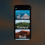
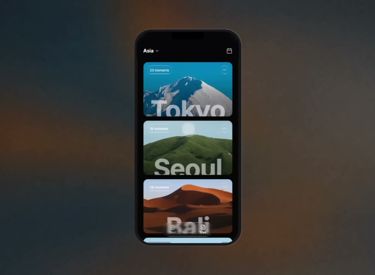
创建一个移动旅行应用 UI mockup,显示在逼真的 iPhone-style phone frame 内,并居中置于白色网页上。技术栈:React + TypeScript、Tailwind CSS、Lucide React icons、Vite。字体:Google Fonts “Inter”(字重 300-900)。

---

**页面容器:**

全视口(`h-screen w-screen`),纯白背景,使用 flexbox 居中,隐藏溢出内容。

---

**手机边框:**

- 尺寸:375px x 780px
- 背景:`#0a0a0c`
- Border-radius:52px
- 溢出:hidden
- Box-shadow(分层边框效果):
  ```
  inset 0 0 0 2px rgba(255, 255, 255, 0.08),
  0 0 0 1px rgba(0, 0, 0, 0.6),
  0 0 0 10px #1a1a1e,
  0 0 0 11px rgba(255, 255, 255, 0.06),
  0 0 60px rgba(0, 0, 0, 0.5)
  ```

**Dynamic Island 刘海:** Absolute,top-0,水平居中,宽 120px,高 28px,纯黑色,`rounded-b-2xl`,z-50。

---

**顶部标题栏(absolute,top):**

- Z-index:30
- `backdrop-filter: blur(12px)`,搭配 `background-color: rgba(10, 10, 12, 0.75)`
- 内边距:`px-6 pt-14 pb-4`
- 左侧:带“亚洲”文字(text-lg、font-semibold、白色)和 ChevronDown icon(size 18、text-white/70)的按钮
- 右侧:Calendar icon 按钮(size 22、text-white/70)

---

**可滚动内容:**

- `overflow-y-auto`,隐藏滚动条
- 内边距:`px-6 pt-28 pb-24`
- 垂直间距:`space-y-4`(间距 16px)

---

**目的地卡片(共 4 张):**

每张卡片:
- 全宽,高 200px,rounded-2xl,隐藏溢出内容,position relative
- 满幅背景图(`absolute inset-0, object-cover`)
- 渐变遮罩:`bg-gradient-to-t from-black/20 to-transparent`
- **左上角:** liquid-glass 胶囊(`rounded-full px-3 py-1`),带“{N} 个瞬间”文字(text-white/90、text-xs、font-normal)
- **右上角:** liquid-glass 圆形(w-8 h-8、rounded-full),带 MoreHorizontal icon(size 16、text-white/80)
- **底部:** 目的地名称使用 96px 粗体,水平居中,裁切在高 80px 且设置 `overflow: hidden` 的容器中。颜色:`rgba(255, 255, 255, 0.55)`,tracking-tight,leading-none,顶部外边距 2px

**卡片数据及准确图片 URL:**

1. **东京** - 23 个瞬间
   `https://images.higgs.ai/?default=1&output=webp&url=https%3A%2F%2Fd8j0ntlcm91z4.cloudfront.net%2Fuser_38xzZboKViGWJOttwIXH07lWA1P%2Fhf_20260704_101902_e8f0f37b-18b7-4c14-bb5c-99f0724d2646.png&w=1280&q=85`

2. **首尔** - 18 个瞬间
   `https://images.higgs.ai/?default=1&output=webp&url=https%3A%2F%2Fd8j0ntlcm91z4.cloudfront.net%2Fuser_38xzZboKViGWJOttwIXH07lWA1P%2Fhf_20260704_101935_4b17f250-8ddb-4ff2-b63d-dfd3497d4428.png&w=1280&q=85`

3. **巴厘岛** - 29 个瞬间
   `https://images.higgs.ai/?default=1&output=webp&url=https%3A%2F%2Fd8j0ntlcm91z4.cloudfront.net%2Fuser_38xzZboKViGWJOttwIXH07lWA1P%2Fhf_20260704_101958_7116d6bf-fd6f-496f-b3cf-007688cd5123.png&w=1280&q=85`

4. **罗马** - 15 个瞬间
   `https://images.higgs.ai/?default=1&output=webp&url=https%3A%2F%2Fd8j0ntlcm91z4.cloudfront.net%2Fuser_38xzZboKViGWJOttwIXH07lWA1P%2Fhf_20260704_143008_72ee7299-04a8-474c-ae73-220d45b24a20.png&w=1280&q=85`

---

**悬浮底部导航栏:**

- Absolute,bottom-6,水平居中,z-30
- liquid-glass 胶囊(`rounded-full, flex, gap-6, px-6 py-2`)
- 3 个导航项(flex-col、items-center、gap-0.5):
  - “动态” + Home icon(size 20)-- 未激活(`text-white/50`)
  - “账户” + User icon(size 20)-- 未激活(`text-white/50`)
  - “旅程” + FileText icon(size 20)-- 已激活(`text-white`)
- 标签样式:`text-[10px] font-medium`

---

**LIQUID-GLASS CSS:**

```css
.liquid-glass {
  background: rgba(255, 255, 255, 0.01);
  background-blend-mode: luminosity;
  backdrop-filter: blur(4px);
  -webkit-backdrop-filter: blur(4px);
  border: none;
  box-shadow: inset 0 1px 1px rgba(255, 255, 255, 0.1);
  position: relative;
  overflow: hidden;
}

.liquid-glass::before {
  content: '';
  position: absolute;
  inset: 0;
  border-radius: inherit;
  padding: 1.4px;
  background: linear-gradient(180deg,
    rgba(255,255,255,0.45) 0%, rgba(255,255,255,0.15) 20%,
    rgba(255,255,255,0) 40%, rgba(255,255,255,0) 60%,
    rgba(255,255,255,0.15) 80%, rgba(255,255,255,0.45) 100%);
  -webkit-mask: linear-gradient(#fff 0 0) content-box, linear-gradient(#fff 0 0);
  -webkit-mask-composite: xor;
  mask-composite: exclude;
  pointer-events: none;
}
```

---

**错落入场动画:**

每张卡片初始状态为 `opacity: 0` 和 `transform: translateY(24px)`。组件挂载时,由 `setTimeout` 触发状态变化,过渡到 `opacity: 1` 和 `translateY(0)`。过渡:`transition-all duration-700 ease-out`。错开延迟:第一张卡片为 150ms,此后每张增加 120ms(150、270、390、510ms)。使用 React `useState` + `useEffect` 实现。

---

**隐藏滚动条:**

```css
.scrollbar-hide::-webkit-scrollbar { display: none; }
.scrollbar-hide { -ms-overflow-style: none; scrollbar-width: none; }
```

---

**全局:**

```css
* { font-family: 'Inter', sans-serif; }
```

在 HTML head 中加载:
```html
<link rel="preconnect" href="https://fonts.googleapis.com" />
<link rel="preconnect" href="https://fonts.gstatic.com" crossorigin />
<link href="https://fonts.googleapis.com/css2?family=Inter:wght@300;400;500;600;700;800;900&display=swap" rel="stylesheet" />
```
原文提示词(English)
Create a mobile travel app UI mockup displayed inside a realistic iPhone-style phone frame, centered on a white webpage. Tech stack: React + TypeScript, Tailwind CSS, Lucide React icons, Vite. Font: Google Fonts "Inter" (weights 300-900).

---

**PAGE WRAPPER:**

Full viewport (`h-screen w-screen`), solid white background, flexbox centered, overflow hidden.

---

**PHONE FRAME:**

- Dimensions: 375px x 780px
- Background: `#0a0a0c`
- Border-radius: 52px
- Overflow: hidden
- Box-shadow (layered bezel effect):
  ```
  inset 0 0 0 2px rgba(255, 255, 255, 0.08),
  0 0 0 1px rgba(0, 0, 0, 0.6),
  0 0 0 10px #1a1a1e,
  0 0 0 11px rgba(255, 255, 255, 0.06),
  0 0 60px rgba(0, 0, 0, 0.5)
  ```

**Dynamic Island notch:** Absolute, top-0, centered horizontally, 120px wide, 28px tall, solid black, `rounded-b-2xl`, z-50.

---

**HEADER (absolute, top):**

- Z-index: 30
- `backdrop-filter: blur(12px)` with `background-color: rgba(10, 10, 12, 0.75)`
- Padding: `px-6 pt-14 pb-4`
- Left side: Button with "Asia" text (text-lg, font-semibold, white) + ChevronDown icon (size 18, text-white/70)
- Right side: Calendar icon button (size 22, text-white/70)

---

**SCROLLABLE CONTENT:**

- `overflow-y-auto` with hidden scrollbar
- Padding: `px-6 pt-28 pb-24`
- Vertical spacing: `space-y-4` (16px gap)

---

**DESTINATION CARDS (4 total):**

Each card:
- Full width, height 200px, rounded-2xl, overflow hidden, position relative
- Full-bleed background image (`absolute inset-0, object-cover`)
- Gradient overlay: `bg-gradient-to-t from-black/20 to-transparent`
- **Top-left:** liquid-glass pill (`rounded-full px-3 py-1`) with "{N} moments" text (text-white/90, text-xs, font-normal)
- **Top-right:** liquid-glass circle (w-8 h-8, rounded-full) with MoreHorizontal icon (size 16, text-white/80)
- **Bottom:** Destination name in 96px bold font, centered horizontally, clipped in an 80px tall container with `overflow: hidden`. Color: `rgba(255, 255, 255, 0.55)`, tracking-tight, leading-none, margin-top 2px

**Card data with exact image URLs:**

1. **Tokyo** - 23 moments
   `https://images.higgs.ai/?default=1&output=webp&url=https%3A%2F%2Fd8j0ntlcm91z4.cloudfront.net%2Fuser_38xzZboKViGWJOttwIXH07lWA1P%2Fhf_20260704_101902_e8f0f37b-18b7-4c14-bb5c-99f0724d2646.png&w=1280&q=85`

2. **Seoul** - 18 moments
   `https://images.higgs.ai/?default=1&output=webp&url=https%3A%2F%2Fd8j0ntlcm91z4.cloudfront.net%2Fuser_38xzZboKViGWJOttwIXH07lWA1P%2Fhf_20260704_101935_4b17f250-8ddb-4ff2-b63d-dfd3497d4428.png&w=1280&q=85`

3. **Bali** - 29 moments
   `https://images.higgs.ai/?default=1&output=webp&url=https%3A%2F%2Fd8j0ntlcm91z4.cloudfront.net%2Fuser_38xzZboKViGWJOttwIXH07lWA1P%2Fhf_20260704_101958_7116d6bf-fd6f-496f-b3cf-007688cd5123.png&w=1280&q=85`

4. **Rome** - 15 moments
   `https://images.higgs.ai/?default=1&output=webp&url=https%3A%2F%2Fd8j0ntlcm91z4.cloudfront.net%2Fuser_38xzZboKViGWJOttwIXH07lWA1P%2Fhf_20260704_143008_72ee7299-04a8-474c-ae73-220d45b24a20.png&w=1280&q=85`

---

**FLOATING BOTTOM NAV BAR:**

- Absolute, bottom-6, centered horizontally, z-30
- liquid-glass pill (`rounded-full, flex, gap-6, px-6 py-2`)
- 3 nav items (flex-col, items-center, gap-0.5):
  - "Feed" + Home icon (size 20) -- inactive (`text-white/50`)
  - "Account" + User icon (size 20) -- inactive (`text-white/50`)
  - "Trips" + FileText icon (size 20) -- active (`text-white`)
- Label style: `text-[10px] font-medium`

---

**LIQUID-GLASS CSS:**

```css
.liquid-glass {
  background: rgba(255, 255, 255, 0.01);
  background-blend-mode: luminosity;
  backdrop-filter: blur(4px);
  -webkit-backdrop-filter: blur(4px);
  border: none;
  box-shadow: inset 0 1px 1px rgba(255, 255, 255, 0.1);
  position: relative;
  overflow: hidden;
}

.liquid-glass::before {
  content: '';
  position: absolute;
  inset: 0;
  border-radius: inherit;
  padding: 1.4px;
  background: linear-gradient(180deg,
    rgba(255,255,255,0.45) 0%, rgba(255,255,255,0.15) 20%,
    rgba(255,255,255,0) 40%, rgba(255,255,255,0) 60%,
    rgba(255,255,255,0.15) 80%, rgba(255,255,255,0.45) 100%);
  -webkit-mask: linear-gradient(#fff 0 0) content-box, linear-gradient(#fff 0 0);
  -webkit-mask-composite: xor;
  mask-composite: exclude;
  pointer-events: none;
}
```

---

**STAGGERED ENTRANCE ANIMATION:**

Each card starts at `opacity: 0` and `transform: translateY(24px)`. On component mount, a `setTimeout` triggers a state change that transitions to `opacity: 1` and `translateY(0)`. Transition: `transition-all duration-700 ease-out`. Stagger delay: first card 150ms, each subsequent +120ms (150, 270, 390, 510ms). Implemented with React `useState` + `useEffect`.

---

**SCROLLBAR HIDING:**

```css
.scrollbar-hide::-webkit-scrollbar { display: none; }
.scrollbar-hide { -ms-overflow-style: none; scrollbar-width: none; }
```

---

**GLOBAL:**

```css
* { font-family: 'Inter', sans-serif; }
```

Load in HTML head:
```html
<link rel="preconnect" href="https://fonts.googleapis.com" />
<link rel="preconnect" href="https://fonts.gstatic.com" crossorigin />
<link href="https://fonts.googleapis.com/css2?family=Inter:wght@300;400;500;600;700;800;900&display=swap" rel="stylesheet" />
```
视频地址