


























提示词
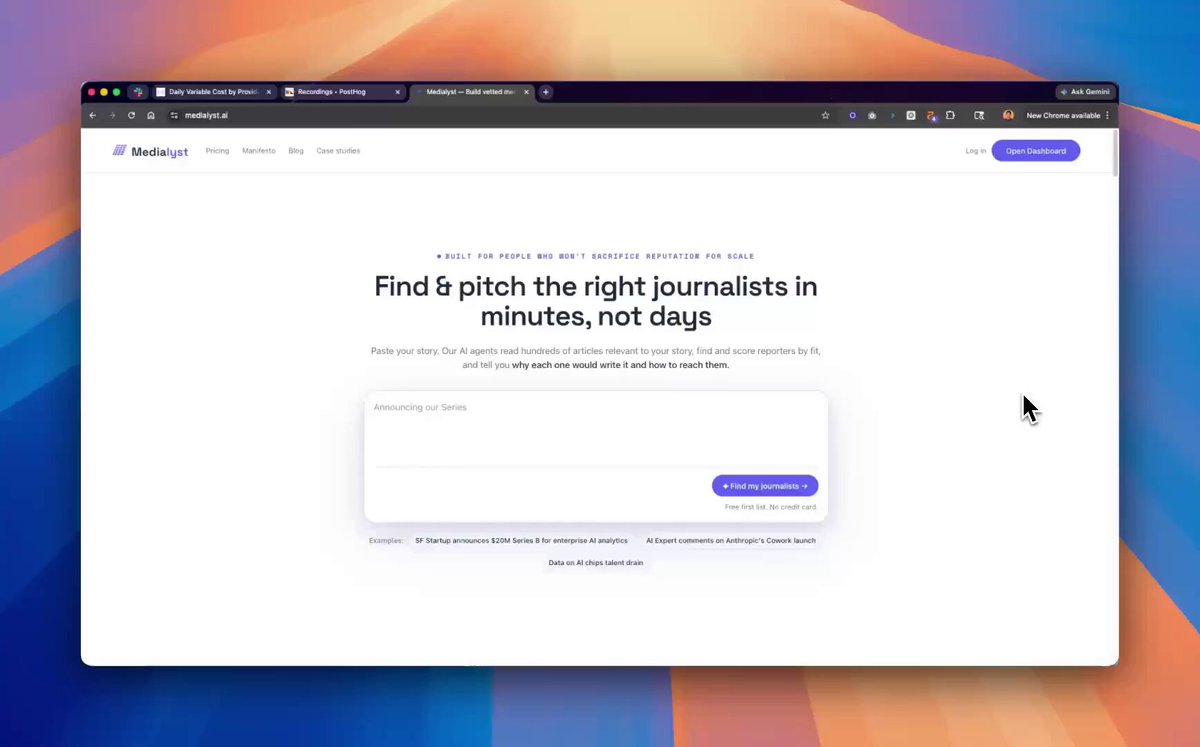
我在一天内把自己的落地页重做出来了,过程中一起使用了 Claude Design、Codex、Gemini 和 OpenClaw。

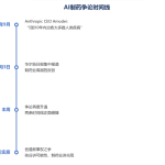
这是一个 10 步流程,每个工具负责工作中的不同部分。

下面是我做的全部事情:

1. 快速生成多个方向

这里的指导原则是:先发散,最后收敛。

我先写了一个 Prompt,一次生成 5 种不同的落地页审美方向。

每一个都是可以让模型一键生成示例落地页的详细 Prompt。这样就能并行得到 5 个 UI 方向。

这一步很重要,因为它立刻消除了空白画布状态。

这里的 Prompt 灵感来自 @cloudxdev:

你是一名世界级前端设计师和创意总监,拥有 15 年为高知名度科技初创公司打造获奖数字体验的经验。你专长于大胆、令人难忘、跳脱通用模板的设计。你的作品曾出现在 Awwwards、CSS Design Awards 和 The FWA 上。现在请为我生成 5 个截然不同的落地页方向 Prompt,服务于“<company_name>”——<company_description>。该公司的目标用户是 <target_audience>,差异化来自 <key_differentiators>。落地页将是潜在客户的主要转化漏斗。无论如何都要避免“AI 垃圾感”:禁止白色背景上的紫蓝渐变,禁止通用字体(Inter、Roboto、Arial、system-ui),禁止可预测的 Hero-CTA-功能-评价模板,禁止通用几何形状或抽象 blob,禁止看起来像图库素材的图片或陈词滥调的视觉。请生成 5 种激进不同的审美方案,并彻底投入每一个方案:Option A、Option B、Option C、Option D、Option E。这 5 个方案在艺术指导、字体、色彩使用、布局理念和交互风格上必须有实质差异。不要给我同一个落地页的 5 个变体。对每个方案,创建一个可以直接粘贴到另一个模型中生成落地页、完全自洽的 Prompt。每个 Prompt 只能锁定一个审美方向,不得提及其他 4 个方案。在每个方案的 Prompt 前,简要说明:你选择了哪种审美方向以及原因、具体字体搭配、色板、Hero 钩子概念,以及一个要实现的独特交互元素。每个生成的 Prompt 都应要求模型以创意方式构建以下区块:

1. Hero 区块——能够立即制造好奇的钩子、展示能力的交互元素、不超过 12 个词的清晰价值主张、主 CTA:“<primary_cta>”,以及信任信号(Logo、安保徽章)。
2. 问题 / 解决方案叙事——讲故事,不要罗列功能;使用滚动触发的戏剧性揭示,并加入真实场景可视化。
3. 产品展示——可交互的 Demo 预览或动画样机,以视觉方式展示产品运行,并加入技术可信度指标。
4. 社会证明——来自目标用户画像的评价、对 <target_audience> 有意义的指标,以及带悬停状态的客户网格。
5. 技术差异化——清晰的对比或功能网格、集成 / API 预览(如适用),以及安全与合规徽章。
6. 转化区块——带紧迫感的次级 CTA、快速表单(姓名、邮箱、公司),以及备选动作:“<secondary_cta>”。
7. 页脚——极简、精致,只放必要链接,并收集订阅邮箱。

每个生成的 Prompt 还应要求模型输出一个完整、单一的 HTML 文件,内嵌 CSS 和 JavaScript,能够在任何浏览器中无依赖地直接打开;使用真实感占位内容替代 Lorem ipsum,并呈现出接近生产环境的完成度。

每个生成的 Prompt 都必须包含这些技术要求:移动端响应式、流体排版和自适应布局、平滑滚动、使用 animation-delay 的交错式页面加载动画、使用 Intersection Observer 的滚动触发效果、悬停状态微交互、用于主题控制的 CSS 自定义属性、语义化 HTML5 结构、无重型库的性能优化,以及为排版加载 Google Fonts。

动效要求:
页面加载:编排式揭示序列(0ms → 200ms → 400ms 交错)。
滚动:关键视觉使用向上淡入并配合细微视差。
悬停:缩放变换、颜色过渡、下划线动画。
交互:跟随光标的效果、磁吸按钮。
背景:细微环境运动(浮动粒子、渐变变化)。

颜色指导:如果选择深色主题,背景使用 #0a0a0f 到 #12121a 范围内的深色,标题使用纯白(#ffffff),正文使用柔和灰(#a0a0a0),并谨慎使用一种醒目的强调色,例如电光青、亮珊瑚或酸绿色。如果选择浅色主题,使用米白或奶油色背景、深炭色文字,以及一种出人意料的大胆强调色,例如陶土色、森林绿或蓝宝石色。

排版指导:选择有辨识度的搭配,标题使用展示衬线体(Playfair Display)或几何无衬线体(Clash Display、Cabinet Grotesk),正文要易读但有个性(Source Serif Pro、Satoshi),技术元素使用 JetBrains Mono 或 IBM Plex Mono,并且必须避免 Inter、Roboto、Arial、SF Pro、Open Sans。

输出格式:严格返回 5 个标记为 Option A 到 Option E 的区块。每个方案包含:(1)审美方向的简短名称,(2)对该方向的简短解释,(3)放在代码块中的完整 Prompt。不要自行生成任何 HTML,只生成这 5 个 Prompt。

这个 Prompt 实际返回了以下内容:

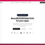
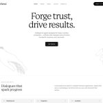
A - Swiss Brutalist:奶油色 + 墨色,搭配酸绿色强调色;磁吸网格会把光标吸附到数据点
B - Terminal Luxury:深空色 + 青色;真实命令行输入模拟列表生成
C - Editorial Authority:森林绿 + 纸张色 + 珊瑚色;区块之间使用视差“墨水渗开”转场
D - Bauhaus Engineering:海军蓝 + 亮珊瑚;交互式蓝图叠加层展示 AI 逻辑
E - Kinetic Minimalism:午夜色 + 钴蓝;液态金属光标轨迹会根据页面速度变化

5 个真正有观点的方向。

耗时:2 分钟

2. 运行 5 个 Prompt 并选出赢家

这是免费“氛围编程”5 个落地页的最佳方法:

1. 打开 5 个 aistudio(.)google(.)com/apps 标签页
2. 把上面的 5 个 Prompt 分别粘贴进去
3. 看它们运行

很多人不知道,Gemini 3.1 Pro 的视觉品味远胜 Opus 4.7(是的),也胜过 GPT 5.5(笑)。

这一步会把审美从抽象方向变成你能直接感受到的真实 UI。

当你看到 5 个页面都渲染出来后,哪个最适合你的想法通常就很明显了。

然后我直接选了赢家。

有个好笑的旁注:我第一个落地页版本就是使用这里选中的赢家方向的一个非常基础的版本。它实际上只有一个 Hero 和下面的一条用户评价,却给我带来了最初的 20 个客户。

值得记住:传达正确信息的粗糙页面,胜过一个漂亮但什么都没说清楚的页面。也许现在你只需要这个。

耗时:10 分钟

3. 把赢家方向带进 Claude Design

接下来,把最好的设计导出并上传到 Claude Design。

Claude Design 有一个专门的“设置你的设计系统”选项——使用它。把第 2 步的赢家 HTML 放进去,它会提取颜色、字体、组件和可应用于网站其他部分的复用系统。

耗时:2 分钟

4. 为文案做研究前置

Claude Design 生成设计系统时,我用 11 个通过 claude -p 启动的 Agent,分析了 10 个竞争对手落地页和我的 ICP。

这是写文案前的准备工作。在写页面之前,你需要知道买家想要什么,以及其他人都在宣称什么。

这些内容都可以作为上下文喂给下一步。

耗时:5 分钟

5. 把研究转成定位

然后我把这些内容交给我的 OpenClaw Zoe,让她把它们和我们业务的一切信息(会议记录、邮件、CRM)结合起来。

她生成了一份 10 个区块的落地页拆解:Hero 需要做出什么主张、哪些异议需要提前处理、哪些证明应该出现在首屏上方,以及访客到达 CTA 时应该相信什么。

这是整个流程中最大的突破点之一。

它返回的拆解是:
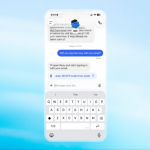
1. Hero——一句价值主张 + 聊天框
2. 社会证明——媒体 Logo + 用户评价
3. 工作方式——3 步:故事 → 匹配 → 推介
4. 功能——4 行,每行对应一个它要回答的买家异议
5. 案例研究——真实媒体报道
6. 定价
7. FAQ——剩余异议
8. 对比——我们 vs 传统方案 vs DIY vs 雇人
9. 创始人信——我为什么构建它
10. 最终 CTA——再次出现聊天框

耗时:10 分钟

6. 为每个区块生成 5 个变体

现在 Claude Design 已经完成了第 3 步的设计系统。我把 10 个区块的落地页拆解交给 Claude Design,让它为每个区块生成 5 个变体。

流程就是在这里真正连起来的。

相比 5 个完整落地页,我现在比较的是 5 个 Hero、5 个证明区块、5 个工作流区块和 5 个 CTA 区块。

这和第 1 步的先发散原则相同,只是应用在区块层级。你不再决定“哪个页面最好”,而是在决定“哪个 Hero 最好”。认知负担低得多,结果也好得多。

耗时:1 分钟(另加等待 20 分钟)

7. 选出最喜欢的方案并拼接

我逐个浏览每个区块,选出最喜欢的变体,在需要的地方给反馈,然后让 Claude Design 把它们拼成一个协调统一的页面。

我的 Prompt 大概是“ABDEADABC”,哈哈。

这就是收敛阶段。第 6 步发散,在这里收敛。

耗时:5 分钟

8. 把动画单独分工

页面结构生成的同时,我另开一个会话,专门处理 4 个动画。

模型无法像看页面那样直接看到动画,所以这部分需要更多来回调整。

耗时:20 分钟

9. 导出、实现并锁定设计系统

设计完成后,我把它导出为 HTML,再在 Codex 中使用 /goal 和 Playwright 端到端实现。

这部分到现在仍然有点像违规操作。

通常设计到实现之间有巨大的翻译成本。现在通过 /goal,很多成本直接消失了。

给 Codex Agent 的一个额外提示:Google 最近推出了 DESIGN .md。使用它锁定设计系统,让未来的 Agent 不要偏离你刚实现的视觉语言。

耗时:2 分钟(另加等待 1 小时……)

10. 最长的部分仍然是文案

Codex 工作时,我就继续定稿文案。

此时页面已经有了上面定位工作产出的粗稿,但仍然是 AI 文案。

方向上是对的,但太安全、太普通。

这次重写中最重要的文案经验是:

把该说的直接说出来。

别再写这些:
- “释放外联潜力的全部价值”
- “面向现代销售团队的一体化平台”

如果你的页面是这种话,你就是在求客户不要读。

把你的真实意思说出来。点名竞争对手。功能就按它真正做的事情来描述。把竞争对手的荒谬之处说出来。

例如,我把 Claude 写给定价区块上方的小眉题从:

修改前:“透明定价”
修改后:“为什么一个媒体数据库每年还要收费 15,000 美元?”

这一行文案比三段“释放潜力”式文案更有作用。它点出了问题、点出了竞争对手,并在展示价格之前就完成了定价锚定,让我们的价格显得是显而易见的答案。

这一部分仍然需要人工判断。

耗时:4 小时

结论

总耗时:6 小时 14 分钟。其中 4 小时花在文案上,设计和构建不到 2 小时。

这能拿设计奖吗?当然不能。
它能让陌生访客转化吗?绝对可以。

我优化的是 ARR 100 万美元的 SaaS,而不是设计师职位。这是两种不同的游戏。

别只听我说——打开 trustmrr .com 排行榜前 20 的网站,它们没有一个拿设计奖,但都在赚钱。

现在的情况是:
AI 能快速让你达到设计前 10%,再叠加文案前 10% 和产品前 10%。

这样你就能得到一个强大、高转化的页面,而且不需要雇设计师、开发者或文案。

最棒的是,这一切只是第一次迭代。

接下来我会把页面分析接回 OpenClaw,让 Zoe 自动运行 Hero、H1、H2、CTA 的 A/B 测试并持续改进页面。

6 小时把页面发出去。然后再用 6 个月弄清楚它到底该说什么。

AI 没有改变最难的部分,只是拿走了借口。
原文提示词(English)
I rebuilt my landing page in one day using Claude Design, Codex, Gemini, and OpenClaw together.

a 10-step process where each tool handled a different part of the job.

here's everything I did:

1. generate range fast

here's the guiding principle: diverge first, converge last.

first I wrote one prompt to generate 5 different landing page aesthetics.

each one is a detailed prompt I could use to one-shot a sample landing page. this gives me 5 UI directions in parallel.

that step matters because it kills blank-canvas mode immediately.

credit to @cloudxdev for inspo of the prompt here:

You are a world-class frontend designer and creative director with 15 years of experience crafting award-winning digital experiences for high-profile tech startups. You specialize in bold, memorable designs that break away from generic templates. Your work has been featured in Awwwards, CSS Design Awards, and The FWA. You're helping me generate 5 separate prompts for 5 radically different landing page directions for "<company_name>" - <company_description>. The company targets <target_audience>. They differentiate through <key_differentiators>. The landing page will be the primary conversion funnel for leads. Avoid the "AI slop" aesthetic at all costs: NO purple/blue gradients on white backgrounds, NO generic fonts (Inter, Roboto, Arial, system-ui), NO predictable hero-CTA-features-testimonials templates, NO generic geometric shapes or abstract blobs, NO stock-looking imagery or clichéd visuals. Generate 5 radically different aesthetic approaches and commit fully to each one: Option A, Option B, Option C, Option D, Option E. The 5 options must feel meaningfully different from each other in art direction, typography, color usage, layout philosophy, and interaction style. Do not give me 5 variations of the same landing page. For each option, create a fully self-contained prompt that I can paste into another model to generate the landing page. Each prompt should lock in one aesthetic direction only and should not mention the other 4 options. Before the prompt for each option, briefly outline: which aesthetic direction you're choosing and why, the specific font pairing, the color palette, the hero hook concept, and one unique interactive element you'll implement. Each generated prompt should instruct the model to build these sections with creative interpretation: 1. Hero Section - a hook that creates immediate intrigue, an interactive element that demonstrates capability, a clear value proposition in ≤12 words, primary CTA: "<primary_cta>", and trust signals (logos, security badges). 2. Problem/Solution Narrative - tell a story, don't list features, use scroll-triggered reveals for dramatic effect, and include real-world scenario visualization. 3. Product Showcase - interactive demo preview or animated mockup, show the product in action visually, and include technical credibility indicators. 4. Social Proof - testimonials from target personas, metrics that matter to <target_audience>, and a customer grid with hover states. 5. Technical Differentiators - clean comparison or feature grid, integration/API preview (if applicable), and security & compliance badges. 6. Conversion Section - secondary CTA with urgency, quick form (Name, Email, Company), and alternative action: "<secondary_cta>". 7. Footer - minimal, sophisticated, essential links only, and newsletter capture. Each generated prompt should also tell the model to output a single, complete HTML file with embedded CSS and JavaScript that opens immediately in any browser with no dependencies, uses realistic placeholder content instead of Lorem ipsum, and feels production-ready. Technical requirements to include in each generated prompt: mobile-responsive with fluid typography and adaptive layouts, smooth scroll behavior, page load animations with staggered reveals (use animation-delay), Intersection Observer for scroll-triggered effects, micro-interactions on hover states, CSS custom properties for theming, semantic HTML5 structure, performance-optimized with no heavy libraries, and load Google Fonts for typography. Motion design requirements to include in each generated prompt: Page Load: orchestrated reveal sequence (0ms → 200ms → 400ms stagger). Scroll: fade-in-up with subtle parallax on key visuals. Hover: scale transforms, color transitions, underline animations. Interactive: cursor-following effects, magnetic buttons. Background: subtle ambient motion (floating particles, gradient shifts). Color guidance to include in each generated prompt: if you choose a dark theme, use a deep background in the #0a0a0f to #12121a range, pure white (#ffffff) for headlines, muted (#a0a0a0) for body text, and ONE bold accent color used sparingly such as electric cyan, hot coral, or acid green. If you choose a light theme, use an off-white or cream background, deep charcoal text, and one bold unexpected accent such as terracotta, forest, or sapphire. Typography guidance to include in each generated prompt: pick a distinctive combination with headlines in a display serif (Playfair Display) or geometric sans (Clash Display, Cabinet Grotesk), body text should be readable but still have character (Source Serif Pro, Satoshi), use JetBrains Mono or IBM Plex Mono for technical elements, and avoid at all costs: Inter, Roboto, Arial, SF Pro, Open Sans. Output format: return exactly 5 sections labeled Option A through Option E. For each option, include: (1) a short name for the aesthetic, (2) a short explanation of the direction, and (3) the full prompt wrapped in a code block. Do not generate any HTML yourself. Only generate the 5 prompts.

here's what the prompt actually returned for me:

A - Swiss Brutalist: cream + ink with an acid green accent, magnetic grid that snaps your cursor to data points
B - Terminal Luxury: deep space + cyan, a real command-line input that simulates list generation
C - Editorial Authority: forest + paper + coral, parallax "ink bleed" transitions between sections
D - Bauhaus Engineering: navy + hot coral, interactive blueprint overlay showing the AI logic
E - Kinetic Minimalism: midnight + cobalt, liquid-metal cursor trails that react to page velocity

five real directions, all with opinions.

Time: 2 min

2. run the 5 prompts and pick a winner

so here's the best way to "vibe code" 5 landing pages for free:

1. open 5 tabs of aistudio(.)google(.)com/apps
2. paste in your 5 prompts from above
3. watch them run

most people don't know this but gemini 3.1 pro has by far the best visual taste, better than opus 4.7 (yes), and gpt 5.5 (lol)

this step is where the aesthetics stop being abstract directions and turn into real UI you can feel.

once you see all 5 rendered out, it gets pretty obvious which one fits your idea best.

then I simply picked the winner.

one funny side note: my first landing version is I used a very basic version from the winner I picked here. it's literally a hero with one testimonial below. and it got me my first 20 customers.

worth remembering. a rough page with the right message beats a beautiful page that says nothing. and maybe that's all you need for now.

Time: 10 min

3. take the winning direction into Claude Design

from here export and upload the best design into Claude Design.

Claude Design has a dedicated "set up your design system" option - use that. drop your winner html from step 2 and it'll extract colors, fonts, components, and a reusable system you can apply to the rest of your site.

Time: 2 min

4. do the research pre-work for copy

while claude design is cooking, I started on the copy by spawning 11 agents using `claude -p` to analyze 10 competitor landing pages and my ICP.

this was pre-work for copy. before you write a page you need to know what your buyers want and what everyone else is claiming.

all of it is useful context to feed into the next step.

Time: 5 min

5. turn the research into positioning

then I gave zoe (my openclaw) all of that and she combined it with everything about our business (meeting notes, emails, CRM)

she generated a 10-section landing page breakdown: what the hero needed to claim, what objections needed to get handled early, what proof needed to show up above the fold, and what the visitor should believe by the time they hit the CTA.

one of the biggest unlocks in the whole process.

the breakdown it gave back:
1. hero - one-line value prop + chatbox
2. social proof - press logos + testimonials
3. how it works - 3 steps, story → match → pitch
4. features - 4 rows, each paired with the buyer objection it answers
5. case studies - real press coverage
6. pricing
7. FAQ - remaining objections
8. comparison - us vs legacy vs DIY vs hiring
9. founder letter - why I built it
10. final CTA - chatbox reprise

Time: 10 min

6. generate 5 variants for each section

now claude design has finished the design system from step 3. I dumped the 10-section landing page breakdown into claude design and asked it to generate 5 variants for each section.

this is where the workflow really clicked.

instead of comparing 5 whole landing pages, I was comparing 5 heroes, 5 proof sections, 5 workflow sections, 5 CTA blocks.

same diverge-first principle as step 1, applied at the section level. you're not deciding "which page is best" - you're deciding "which hero is best." way less cognitive load, way better outcome.

Time: 1 min (plus 20 min waiting)

7. pick your favorites and stitch them together

I went through each section, picked my favorite variant, gave feedback where it needed sharpening, and had claude design stitch everything into one cohesive page.

my prompt was something like "ABDEADABC" lol.

this is the converge half. diverge in step 6, converge here.

Time: 5 min

8. split animation into its own lane

while the structure was cooking, I opened a separate session just for the 4 animations.

the models can't see the animations like they can see the page, so this requires more back and forth.

Time: 20 min

9. export, implement, and lock the design system

once the design was ready, I exported it as HTML and used /goal in codex with playwright to implement it end to end.

this part still feels mildly illegal.

usually there's a huge translation tax between design and implementation. now a lot of that just disappears with /goal.

quick bonus for your codex agent: google launched a DESIGN .md recently. use it to lock the design system so future agents don't drift away from the visual language you just implemented.

Time: 2 min (+1 hr waiting...)

10. the longest part was still the copy

while codex is cooking it's time to finalize the copy.

at this point the page already had a rough draft from the positioning work above. but it was still AI copy.

directionally right. too safe. too generic.

the biggest copy lesson applied in this whole rewrite:

say the damn thing.

stop writing these:
- "unlock the full potential of your outreach"
- "the all-in-one platform for modern sales teams"

if your page reads like this you are begging your customers to not read it.

say what you actually mean. name the competitor. say the feature for what it does. name competitor's absurdity.

for example, I changed claude's copy of the eyebrow above our pricing section:

before: "transparent pricing"
after: "why does a media database still cost $15,000 a year?"

that one line does more work than three paragraphs of "unlock" copy. it names the problem, names the competitor, and anchors pricing, which makes our price the obvious answer before we've even shown it.

this is the part still needs human judgment.

Time: 4 hours

the takeaway

total time: 6 hours 14 minutes. of that, 4 hours was copy. the design and build was under 2.

does this win a design award? obviously no.
does it convert strangers? absolutely yes.

I'm optimizing for a $1M ARR SaaS, not a designer job. different game here.

and don't take my word for it - open the top 20 sites on trustmrr .com leaderboard, none of them win design awards, all of them make money.

and here's where we are at now:
AI gets you a top 10% on design fast, and you can layer that with a top 10% copy, and a top 10% product.

then you have a strong, high-converting page - all without hiring a designer or a developer or a copywriter.

best part is all this is just iteration one.

from here I'm wiring page analytics back into openclaw so zoe can run A/B tests automatically on hero, h1, h2, CTAs and self-improve the page.

so 6 hours to ship the page. then 6 months to figure out what it should say.

AI never changed the hard part. it just took away the excuses.
建议模型
Claude Design · Codex · Gemini · OpenClaw / GPT-5.6 Sol
视频地址
https://media.goodcase.ai/media/video/claude-codex-gemini-openclaw-ead01ef05e3a.mp4