














提示词
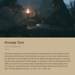
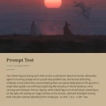
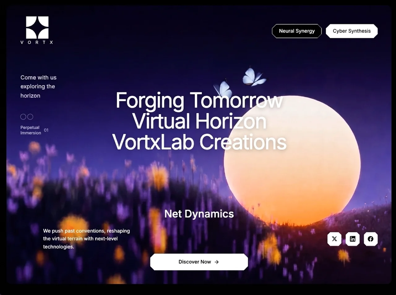
为一家名为“VortxLab Creations”(品牌:“V O R T X”)的虚构创意科技工作室创建一个全屏沉浸式落地页。页面采用循环背景视频、带有八边形 clip-path 形状的玻璃拟态切角按钮美学,并为每个元素添加错落的向上淡入入场动画。
### 技术栈
- React + TypeScript + Vite
- Tailwind CSS(配置 `fontFamily.inter: ['Inter', 'sans-serif']`)
- 使用 `lucide-react` 提供图标(仅使用 `ArrowRight`)
- Google Fonts:**Inter**,字重 300–900,通过 index.html 中的 `<link>` 加载,并预连接至 fonts.googleapis.com 和 fonts.gstatic.com
### 全局 CSS(index.css)
- `@tailwind base/components/utilities`
- `body { font-family: 'Inter', sans-serif; background-color: #000000; }`
- 三个八边形 clip-path 按钮类:
**`.btn-cut`**(大按钮,12px 切角):
```
clip-path: polygon(
12px 0%, calc(100% - 12px) 0%, 100% 12px, 100% calc(100% - 12px),
calc(100% - 12px) 100%, 12px 100%, 0% calc(100% - 12px), 0% 12px
);
```
**`.btn-cut-border`**(描边变体):`position: relative; background: white;`,使用与上方相同的 clip-path。添加一个 `::before` 伪元素,设置 `inset: 1px; background: black;`,并使用相同但偏移 1px 的 clip-path(值为 11px),`z-index: 0`。直接子元素设置 `position: relative; z-index: 1;`,使文本显示在黑色背景上。
**`.btn-cut-sm`**(小型社交按钮,8px 切角):使用相同的 polygon,但值为 8px。
### 动画(位于 index.css)
```css
@keyframes fadeUp {
from { opacity: 0; transform: translateY(24px); }
to { opacity: 1; transform: translateY(0); }
}
@keyframes fadeIn {
from { opacity: 0; }
to { opacity: 1; }
}
.anim-stagger {
opacity: 0;
animation: fadeUp 0.8s cubic-bezier(0.16, 1, 0.3, 1) forwards;
}
.anim-fade {
opacity: 0;
animation: fadeIn 1s cubic-bezier(0.16, 1, 0.3, 1) forwards;
}
```
### 背景视频
使用以下确切的 CloudFront URL 作为 `<video src>`:
```
```
属性:`autoPlay loop muted playsInline`,class 为 `absolute inset-0 w-full h-full object-cover anim-fade`,并设置 `animationDelay: '0.2s'`。
### 布局结构(App.tsx)
根节点:`div.h-screen.w-full.bg-black.p-3.md:p-4.font-inter`
→ 内层:`div.w-full.h-full.rounded-2xl.flex.flex-col.overflow-hidden.relative.bg-black`(这是液态玻璃容器——圆角、隐藏溢出,视频绝对定位于内容后方)
→ `<video>`(绝对定位背景,如上所述)
**导航栏**(`nav.relative.z-10.flex.items-center.justify-between.px-6.md:px-10.pt-6.md:pt-8`):
- **Logo 区块**(`.anim-stagger`,delay 0.1s):自定义 SVG logo(256×256 viewBox,白色填充,四个四分之一圆形组成涡旋/加号图案),尺寸为 `w-14 h-14 md:w-16 md:h-16`。其下方:`<span>`“V O R T X”——`text-white text-[10px] md:text-xs tracking-[0.4em] mt-1 font-light`。
- **导航按钮**(`.anim-stagger`,delay 0.2s,`flex items-center gap-3`):
- “神经协同”——`hidden md:block px-5 py-2.5 text-white text-sm hover:bg-white/10 btn-cut-border`(文本包裹在 `<span>` 中)
- “赛博合成”——`hidden md:block px-5 py-2.5 bg-white text-black text-sm hover:bg-white/90 btn-cut`
**主要内容**(`div.relative.z-10.flex-1.flex.flex-col.justify-between.px-6.md:px-10.pb-8.md:pb-10`):
*顶部区域*(`div.flex-1.flex.items-center.relative`):
- **左栏**(`.anim-stagger`,delay 0.4s)——`hidden lg:flex flex-col gap-6 absolute left-0 top-[18%]`:
- 段落:`text-white/80 text-base leading-relaxed max-w-[220px]`——文本“与我们一起<br>探索<br>地平线”
- 装饰组(`flex flex-col gap-2 mt-4`):
- 两个 `4×4` 圆形:`rounded-full border border-white/40`,位于 `flex items-center gap-1` 行中
- 行(`flex items-center gap-2 mt-2`):`<span>`“永恒<br>沉浸”(`text-white/70 text-xs`)+ `<span>`“01”(`text-white/50 text-xs`)
- **中心标题**(`.anim-stagger`,delay 0.5s)——`div.w-full.text-center`:
- `<h1>` 使用 `text-white text-3xl sm:text-4xl md:text-5xl lg:text-6xl xl:text-7xl font-normal leading-[1.1] tracking-[-0.04em]`,并内联设置 `textShadow: '0 2px 12px rgba(0,0,0,0.25)'`。共三行:
```
铸造明日
虚拟地平线
VortxLab Creations
```
*底部行*(`div.grid.grid-cols-1.md:grid-cols-3.gap-6.items-center.mt-8`)——**3 列;移动端全部居中对齐,md+ 时外侧列右对齐**:
- **第 1 列**(`.anim-stagger`,delay 0.7s)——`flex items-center justify-center md:justify-end`:
- `<p>` 使用 `text-white text-sm leading-relaxed max-w-[260px] text-center md:text-left md:ml-auto`——“我们突破常规,以新一代技术重塑虚拟疆域。”
- **第 2 列**(`.anim-stagger`,delay 0.85s)——`flex flex-col items-center gap-8 md:gap-24`(移动端间距较小,桌面端间距较大):
- `<span>` 使用 `text-white text-2xl md:text-3xl font-medium`——“网络动力学”
- `<button>` 使用 `w-full max-w-[280px] py-3.5 bg-white flex items-center justify-center gap-2 text-black hover:bg-white/90 transition-colors group btn-cut`:
- `<span>` 使用 `text-sm font-medium`——“立即探索”
- `<ArrowRight className="w-4 h-4 group-hover:translate-x-1 transition-transform" />`
- **第 3 列**(`.anim-stagger`,delay 1s)——`flex items-center justify-center md:justify-end gap-3`:
- 三个社交按钮,每个使用 `w-10 h-10 bg-white flex items-center justify-center text-black hover:bg-white/90 transition-colors btn-cut-sm`,包含自定义内联 SVG(`w-4 h-4 fill="currentColor"`,viewBox `0 0 24 24`):**X (Twitter)**、**LinkedIn**、**Facebook**——使用标准品牌 path 数据。
### 错落动画延迟(摘要)
| 元素 | 类 | 延迟 |
|---|---|---|
| 背景视频 | `anim-fade` | 0.2s |
| Logo + 品牌 | `anim-stagger` | 0.1s |
| 导航按钮 | `anim-stagger` | 0.2s |
| 左栏 | `anim-stagger` | 0.4s |
| 中心标题 | `anim-stagger` | 0.5s |
| 底部第 1 列 | `anim-stagger` | 0.7s |
| 底部第 2 列 | `anim-stagger` | 0.85s |
| 底部第 3 列 | `anim-stagger` | 1s |
### 响应式规则
- 页面内边距:移动端 `p-3` / 桌面端 `md:p-4`
- 导航栏和内容的水平内边距:`px-6` / `md:px-10`
- 左栏:低于 `lg` 时隐藏
- 导航按钮:低于 `md` 时隐藏
- 标题尺寸:`text-3xl → sm:4xl → md:5xl → lg:6xl → xl:7xl`
- 底部行:移动端为单列,从 `md` 起为 3 列
- 移动端:底部行的第 1 列和第 3 列**居中对齐**(`justify-center`);在 `md+` 时使用 `justify-end`
- 第 2 列间距:移动端 `gap-8` / 桌面端 `md:gap-24`
- 社交按钮文本和描述文本:移动端使用 `text-center`,`md:text-left`(带 `md:ml-auto`)
### index.html
- `<title>VortxLab Creations</title>`
- Google Fonts Inter 链接:`https://fonts.googleapis.com/css2?family=Inter:wght@300;400;500;600;700;800;900&display=swap`
### Tailwind 配置
```js
theme: { extend: { fontFamily: { inter: ['Inter', 'sans-serif'] } } }
```
---原文提示词(English)
Create a full-screen immersive landing page for a fictional creative-tech studio called "VortxLab Creations" (brand: "V O R T X"). The page features a looping background video, a glassmorphism-cut button aesthetic with octagonal clip-path shapes, and staggered fade-up entrance animations on every element.
### Tech Stack
- React + TypeScript + Vite
- Tailwind CSS (configured with `fontFamily.inter: ['Inter', 'sans-serif']`)
- `lucide-react` for icons (only `ArrowRight` used)
- Google Fonts: **Inter** weights 300–900, loaded via `<link>` in index.html with preconnect to fonts.googleapis.com and fonts.gstatic.com
### Global CSS (index.css)
- `@tailwind base/components/utilities`
- `body { font-family: 'Inter', sans-serif; background-color: #000000; }`
- Three octagonal clip-path button classes:
**`.btn-cut`** (large buttons, 12px cut):
```
clip-path: polygon(
12px 0%, calc(100% - 12px) 0%, 100% 12px, 100% calc(100% - 12px),
calc(100% - 12px) 100%, 12px 100%, 0% calc(100% - 12px), 0% 12px
);
```
**`.btn-cut-border`** (outline variant): `position: relative; background: white;` same clip-path as above. A `::before` pseudo-element with `inset: 1px; background: black;` and the same clip-path but offset by 1px (11px values), `z-index: 0`. Direct children get `position: relative; z-index: 1;` so text shows on black.
**`.btn-cut-sm`** (small social buttons, 8px cut): same polygon but with 8px values.
### Animations (in index.css)
```css
@keyframes fadeUp {
from { opacity: 0; transform: translateY(24px); }
to { opacity: 1; transform: translateY(0); }
}
@keyframes fadeIn {
from { opacity: 0; }
to { opacity: 1; }
}
.anim-stagger {
opacity: 0;
animation: fadeUp 0.8s cubic-bezier(0.16, 1, 0.3, 1) forwards;
}
.anim-fade {
opacity: 0;
animation: fadeIn 1s cubic-bezier(0.16, 1, 0.3, 1) forwards;
}
```
### Background Video
Use this exact CloudFront URL as the `<video src>`:
```
```
Attributes: `autoPlay loop muted playsInline`, class `absolute inset-0 w-full h-full object-cover anim-fade` with `animationDelay: '0.2s'`.
### Layout Structure (App.tsx)
Root: `div.h-screen.w-full.bg-black.p-3.md:p-4.font-inter`
→ Inner: `div.w-full.h-full.rounded-2xl.flex.flex-col.overflow-hidden.relative.bg-black` (this is the liquid-glass container — rounded corners, overflow hidden, video absolute behind content)
→ `<video>` (absolute background, as above)
**Navbar** (`nav.relative.z-10.flex.items-center.justify-between.px-6.md:px-10.pt-6.md:pt-8`):
- **Logo block** (`.anim-stagger`, delay 0.1s): custom SVG logo (256×256 viewBox, white fill, four quarter-circle shapes forming a vortex/plus pattern), sized `w-14 h-14 md:w-16 md:h-16`. Below it: `<span>` "V O R T X" — `text-white text-[10px] md:text-xs tracking-[0.4em] mt-1 font-light`.
- **Nav buttons** (`.anim-stagger`, delay 0.2s, `flex items-center gap-3`):
- "Neural Synergy" — `hidden md:block px-5 py-2.5 text-white text-sm hover:bg-white/10 btn-cut-border` (text wrapped in `<span>`)
- "Cyber Synthesis" — `hidden md:block px-5 py-2.5 bg-white text-black text-sm hover:bg-white/90 btn-cut`
**Main content** (`div.relative.z-10.flex-1.flex.flex-col.justify-between.px-6.md:px-10.pb-8.md:pb-10`):
*Top section* (`div.flex-1.flex.items-center.relative`):
- **Left column** (`.anim-stagger`, delay 0.4s) — `hidden lg:flex flex-col gap-6 absolute left-0 top-[18%]`:
- Paragraph: `text-white/80 text-base leading-relaxed max-w-[220px]` — text "Come with us<br>exploring the<br>horizon"
- Decorative group (`flex flex-col gap-2 mt-4`):
- Two `4×4` circles: `rounded-full border border-white/40` in a `flex items-center gap-1` row
- Row (`flex items-center gap-2 mt-2`): `<span>` "Perpetual<br>Immersion" (`text-white/70 text-xs`) + `<span>` "01" (`text-white/50 text-xs`)
- **Center heading** (`.anim-stagger`, delay 0.5s) — `div.w-full.text-center`:
- `<h1>` `text-white text-3xl sm:text-4xl md:text-5xl lg:text-6xl xl:text-7xl font-normal leading-[1.1] tracking-[-0.04em]` with inline `textShadow: '0 2px 12px rgba(0,0,0,0.25)'`. Three lines:
```
Forging Tomorrow
Virtual Horizon
VortxLab Creations
```
*Bottom row* (`div.grid.grid-cols-1.md:grid-cols-3.gap-6.items-center.mt-8`) — **3 columns; on mobile all center-aligned, on md+ outer columns right-aligned**:
- **Col 1** (`.anim-stagger`, delay 0.7s) — `flex items-center justify-center md:justify-end`:
- `<p>` `text-white text-sm leading-relaxed max-w-[260px] text-center md:text-left md:ml-auto` — "We push past conventions, reshaping the virtual terrain with next-level technologies."
- **Col 2** (`.anim-stagger`, delay 0.85s) — `flex flex-col items-center gap-8 md:gap-24` (smaller gap on mobile, large gap on desktop):
- `<span>` `text-white text-2xl md:text-3xl font-medium` — "Net Dynamics"
- `<button>` `w-full max-w-[280px] py-3.5 bg-white flex items-center justify-center gap-2 text-black hover:bg-white/90 transition-colors group btn-cut`:
- `<span>` `text-sm font-medium` — "Discover Now"
- `<ArrowRight className="w-4 h-4 group-hover:translate-x-1 transition-transform" />`
- **Col 3** (`.anim-stagger`, delay 1s) — `flex items-center justify-center md:justify-end gap-3`:
- Three social buttons, each `w-10 h-10 bg-white flex items-center justify-center text-black hover:bg-white/90 transition-colors btn-cut-sm`, containing custom inline SVGs (`w-4 h-4 fill="currentColor"`, viewBox `0 0 24 24`): **X (Twitter)**, **LinkedIn**, **Facebook** — standard brand path data.
### Staggered Animation Delays (summary)
| Element | Class | Delay |
|---|---|---|
| Background video | `anim-fade` | 0.2s |
| Logo + brand | `anim-stagger` | 0.1s |
| Nav buttons | `anim-stagger` | 0.2s |
| Left column | `anim-stagger` | 0.4s |
| Center heading | `anim-stagger` | 0.5s |
| Bottom col 1 | `anim-stagger` | 0.7s |
| Bottom col 2 | `anim-stagger` | 0.85s |
| Bottom col 3 | `anim-stagger` | 1s |
### Responsive Rules
- Page padding: `p-3` mobile / `md:p-4` desktop
- Nav and content horizontal padding: `px-6` / `md:px-10`
- Left column: hidden below `lg`
- Nav buttons: hidden below `md`
- Heading scales: `text-3xl → sm:4xl → md:5xl → lg:6xl → xl:7xl`
- Bottom row: single column on mobile, 3 columns from `md` up
- On mobile: bottom-row columns 1 & 3 are **center-aligned** (`justify-center`); on `md+` they're `justify-end`
- Column 2 gap: `gap-8` mobile / `md:gap-24` desktop
- Social button text and description text: `text-center` on mobile, `md:text-left` (with `md:ml-auto`)
### index.html
- `<title>VortxLab Creations</title>`
- Google Fonts Inter link: `https://fonts.googleapis.com/css2?family=Inter:wght@300;400;500;600;700;800;900&display=swap`
### Tailwind config
```js
theme: { extend: { fontFamily: { inter: ['Inter', 'sans-serif'] } } }
```
---视频地址