


提示词
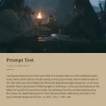
使用 React、Tailwind CSS 和 Lucide React 图标,为名为“Atelier”的设计机构创建一个全屏 hero 落地页区块。该区块必须完全适配移动端,并带有动画 hamburger 移动端菜单。具体规范如下:
**字体(Google Fonts):**
- “Instrument Serif”(常规 + italic),用于 heading 和移动端菜单链接
- “Inter”(字重 300、400、500、600),用作 sans-serif 正文字体
在 index.html 中加载:
```html
<link rel="preconnect" href="https://fonts.googleapis.com" />
<link rel="preconnect" href="https://fonts.gstatic.com" crossorigin />
<link href="https://fonts.googleapis.com/css2?family=Instrument+Serif:ital@0;1&family=Inter:wght@300;400;500;600&display=swap" rel="stylesheet" />
```
**Tailwind Config**——扩展 fontFamily:
```js
fontFamily: {
'instrument-serif': ['"Instrument Serif"', 'serif'],
sans: ['Inter', 'system-ui', 'sans-serif'],
}
```
**背景:**
一个全屏、循环、自动播放、静音的视频,使用 `object-cover` 覆盖整个视口。视频 URL:
```
```
**布局:**整个区块为 `w-full h-screen overflow-hidden`,视频使用 absolute 定位,位于一个 `relative z-10` 内容层之后,该内容层为 `flex flex-col h-full`。
**Navbar:**
- 水平 flex 栏,内边距为 `px-6 md:px-12 lg:px-16 py-5 md:py-6`
- 左侧:Logo 文本“Atelier”(白色、font-semibold、text-lg、tracking-tight、font-sans),后接桌面端 nav 链接(移动端隐藏,md+ 显示):“项目”“专业能力”“工作室”“洞察”——样式为 `text-white/80 hover:text-white text-sm font-light transition-colors duration-200`
- 右侧:“联系我们”文本链接(移动端隐藏)+“洽谈合作”按钮(白色背景、黑色文本、rounded-full、px-5 py-2,移动端隐藏)+ hamburger 按钮(仅在移动端显示,md:hidden)
- Hamburger:3 条线(高度 2px、白色、rounded-full),中间线较短(w-4,其他为 w-6)。打开时,顶部/底部线分别旋转 45/-45 度并发生位移,中间线淡出。使用 `cubic-bezier(0.76,0,0.24,1)` easing,时长为 500ms。
**移动端菜单 Overlay(fixed inset-0 z-50、md:hidden):**
- Backdrop:`bg-black/90 backdrop-blur-xl`,通过 700ms transition 淡入
- 内容使用相同的 700ms cubic-bezier easing 淡入
- Header:与 navbar 布局一致,包含 logo + 关闭按钮(由旋转线条形成的 X)
- Nav 链接:垂直堆叠、居中,`text-4xl sm:text-5xl font-instrument-serif`,白色文本,每项带 `border-b border-white/10`、`py-4`。打开时,它们以交错延迟(150ms + index*80ms)播放进入动画,从 `translate-y-8` 位移至 `translate-y-0`。Hover 时通过 `hover:pl-4` 将文本向右移动
- 项目:“项目”“专业能力”“工作室”“洞察”“联系我们”
- Footer:全宽“洽谈合作”按钮(白色背景、黑色文本、rounded-full、py-4),延迟 550ms 淡入
**Hero 内容(在 navbar 下方居中):**
- 容器:`flex-1 flex flex-col items-center justify-start pt-4 sm:pt-6 md:pt-8 lg:pt-10 px-6 text-center`
- Heading(h1):`font-instrument-serif text-white text-3xl sm:text-4xl md:text-5xl lg:text-6xl xl:text-7xl leading-[1.1] max-w-5xl`
- 文本内容(带换行):
```
UX <italic>与</italic> APP
DESIGN <italic>为</italic> BOLD
VENTURES
```
- italic 单词“与”和“为”使用 `italic font-instrument-serif` span
- Subtext(p):`mt-4 md:mt-5 text-white/70 text-sm md:text-base font-light max-w-md leading-relaxed`
- “我们塑造定义品牌的数字产品”+ 换行(hidden sm:block)+“并释放指数级增长。”
- 按钮行:`mt-5 md:mt-6 flex flex-col sm:flex-row items-center gap-4`
- 主要按钮:“查看案例”,带 ArrowRight 图标(lucide-react)、白色背景、黑色文本、rounded-full、px-7 py-3、text-sm font-medium。Hover 时箭头向右移动 0.5
- 次要按钮:“观看 Showreel”,带 Play 图标(lucide-react)、透明背景,使用 `border border-white/40`、白色文本、rounded-full、px-7 py-3。Hover 时:`bg-white/10 border-white/60`
**全局 CSS(index.css):**
```css
@tailwind base;
@tailwind components;
@tailwind utilities;
* {
margin: 0;
padding: 0;
box-sizing: border-box;
}
html, body, #root {
height: 100%;
width: 100%;
overflow-x: hidden;
}
```
**依赖项:**React、lucide-react(用于 ArrowRight 和 Play 图标)、Tailwind CSS。不使用其他 UI 库。原文提示词(English)
Create a fullscreen hero landing page section for a design agency called "Atelier" using React, Tailwind CSS, and Lucide React icons. The section must be fully mobile responsive with an animated hamburger mobile menu. Here are the exact specifications:
**Fonts (Google Fonts):**
- "Instrument Serif" (regular + italic) for headings and mobile menu links
- "Inter" (weights 300, 400, 500, 600) as the sans-serif body font
Load them in index.html:
```html
<link rel="preconnect" href="https://fonts.googleapis.com" />
<link rel="preconnect" href="https://fonts.gstatic.com" crossorigin />
<link href="https://fonts.googleapis.com/css2?family=Instrument+Serif:ital@0;1&family=Inter:wght@300;400;500;600&display=swap" rel="stylesheet" />
```
**Tailwind Config** - extend fontFamily:
```js
fontFamily: {
'instrument-serif': ['"Instrument Serif"', 'serif'],
sans: ['Inter', 'system-ui', 'sans-serif'],
}
```
**Background:**
A fullscreen looping autoplay muted video covering the entire viewport with `object-cover`. Video URL:
```
```
**Layout:** The entire section is `w-full h-screen overflow-hidden` with the video absolutely positioned behind a `relative z-10` content layer that is `flex flex-col h-full`.
**Navbar:**
- Horizontal flex bar with padding `px-6 md:px-12 lg:px-16 py-5 md:py-6`
- Left side: Logo text "Atelier" (white, font-semibold, text-lg, tracking-tight, font-sans) followed by desktop nav links (hidden on mobile, shown md+): "Projects", "Expertise", "Studio", "Insights" - styled as `text-white/80 hover:text-white text-sm font-light transition-colors duration-200`
- Right side: "Reach Out" text link (hidden mobile) + "Let's Talk" button (white bg, black text, rounded-full, px-5 py-2, hidden mobile) + hamburger button (shown only on mobile, md:hidden)
- Hamburger: 3 lines (2px height, white, rounded-full) with the middle line shorter (w-4 vs w-6). On open, top/bottom lines rotate 45/-45 degrees and translate, middle fades out. Uses `cubic-bezier(0.76,0,0.24,1)` easing with 500ms duration.
**Mobile Menu Overlay (fixed inset-0 z-50, md:hidden):**
- Backdrop: `bg-black/90 backdrop-blur-xl` fading in with 700ms transition
- Content fades in with same 700ms cubic-bezier easing
- Header: matches navbar layout with logo + close button (X formed by rotated lines)
- Nav links: Stacked vertically, centered, `text-4xl sm:text-5xl font-instrument-serif`, white text, each with `border-b border-white/10`, `py-4`. On open they animate in with staggered delays (150ms + index*80ms), translating from `translate-y-8` to `translate-y-0`. Hover shifts text right with `hover:pl-4`
- Items: "Projects", "Expertise", "Studio", "Insights", "Reach Out"
- Footer: Full-width "Let's Talk" button (white bg, black text, rounded-full, py-4) with 550ms delay fade-in
**Hero Content (centered below navbar):**
- Container: `flex-1 flex flex-col items-center justify-start pt-4 sm:pt-6 md:pt-8 lg:pt-10 px-6 text-center`
- Heading (h1): `font-instrument-serif text-white text-3xl sm:text-4xl md:text-5xl lg:text-6xl xl:text-7xl leading-[1.1] max-w-5xl`
- Text content (with line breaks):
```
UX <italic>and</italic> APP
DESIGN <italic>for</italic> BOLD
VENTURES
```
- The italic words "and" and "for" use `italic font-instrument-serif` spans
- Subtext (p): `mt-4 md:mt-5 text-white/70 text-sm md:text-base font-light max-w-md leading-relaxed`
- "We shape digital products that define brands" + line break (hidden sm:block) + "and unlock exponential growth."
- Buttons row: `mt-5 md:mt-6 flex flex-col sm:flex-row items-center gap-4`
- Primary: "See Cases" with ArrowRight icon (lucide-react), white bg, black text, rounded-full, px-7 py-3, text-sm font-medium. On hover the arrow translates 0.5 right.
- Secondary: "Watch Reel" with Play icon (lucide-react), transparent with `border border-white/40`, white text, rounded-full, px-7 py-3. On hover: `bg-white/10 border-white/60`
**Global CSS (index.css):**
```css
@tailwind base;
@tailwind components;
@tailwind utilities;
* {
margin: 0;
padding: 0;
box-sizing: border-box;
}
html, body, #root {
height: 100%;
width: 100%;
overflow-x: hidden;
}
```
**Dependencies:** React, lucide-react (for ArrowRight and Play icons), Tailwind CSS. No other UI libraries.