






















提示词
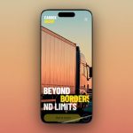
使用 React、Tailwind CSS、Framer Motion 和 Lucide React icons 构建一个全屏 Hero Section。使用 Inter 字体。页面需要完全适配移动端。以下是确切规格:

---

**背景:**
- 使用一段自动播放、循环、静音的视频作为背景,覆盖整个视口。
- 视频 URL:`https://d8j0ntlcm91z4.cloudfront.net/user_38xzZboKViGWJOttwIXH07lWA1P/hf_20260517_222138_3e3205be-3364-417b-a64a-bfe087acbec4.mp4`
- 视频使用 absolute 定位、inset-0,并通过 `object-cover` 填满视口。

---

**颜色:**
- 强调色:`#5E0ED7`(深紫色)。用于 Logo 圆点、统计数据中的“+”符号以及 CTA 链接文本。
- 所有正文文本均为黑色(#000)。

---

**字体:**
- 字体族:`'Inter', sans-serif`,应用于根容器。
- 所有文本均为大写,并使用较宽的字母间距(`tracking-widest` 或 `tracking-wide`)。
- 字重:全局使用 600(semibold)。

---

**布局(flex column,min-h-screen):**
页面采用 flex column,包含三个垂直区域:
1. **导航栏**(顶部,固定高度)
2. **统计行**(flex-1,垂直居中,右对齐)
3. **底部内容**(通过内边距固定在底部)

---

**导航栏:**
- 水平 flex,items centered,justified between。内边距:`px-5 sm:px-8 md:px-12 pt-5 md:pt-6`。
- **左侧:** 一个圆形 Logo——32px 圆形 div,带 2px 强调色边框,内部包含一个 10px 强调色实心圆。
- **中央(移动端隐藏,md+ 显示):** 四个导航链接:“故事”、“专长”、“工作室”、“反馈”。文本:14px、font-semibold、tracking-widest、大写、黑色。
- **右侧:** 一个 36px 黑色圆形按钮,带三条白色水平线(hamburger icon——三个 `span` 元素,每个均为 `w-4 h-0.5 bg-white`,使用 `gap-1`)。点击后打开移动端菜单。

---

**移动端菜单叠层:**
- 通过点击 hamburger 触发。fixed、全屏、z-50、白色背景。
- 顶部行:相同的 Logo(左侧)和一个带 X icon 的 36px 黑色圆形关闭按钮(右侧)。
- 下方:包含 4 个导航链接的垂直列表,使用 `text-3xl`、font-semibold、tracking-widest、大写,并设置 `gap-8` 和 `mt-16`。
- 底部(mt-auto):强调色的“与我们合作”CTA,带 ArrowUpRight icon,`text-xl`。

---

**统计行(中间区域):**
- 容器:`flex-1 flex items-center justify-end`,使用相同的水平内边距。`py-8 md:py-0`。
- 三个统计项水平排列,使用 `gap-5 sm:gap-8 md:gap-10`,每项右对齐:
  - **+300** / 打造的品牌
  - **+200** / 数字产品
  - **+100** / 获得资助的项目
- 数字样式:`fontSize: clamp(1.5rem, 5vw, 3.5rem)`,字重 600。“+”单独渲染,使用强调色,尺寸为 0.5em。数字为黑色。
- 标签:`text-[10px] sm:text-xs md:text-sm`、font-semibold、tracking-widest、大写、黑色、`whitespace-pre-line leading-tight`(每个标签的两个词之间都有换行)。

---

**底部区域:**
- 内边距:`px-5 sm:px-8 md:px-12 pb-8 md:pb-12`。flex column,使用 `gap-6 md:gap-12`。

**A 行(标语 + CTA):**
- Flex row、items-center、justify-between、gap-4。
- **左侧:** 小号大写标语段落:“塑造大胆 / 愿景成为力量 / 为你的族群”(使用 `<br />` 换行)。文本:`text-[10px] sm:text-xs md:text-sm`、font-semibold、tracking-widest,最大宽度为 `130px sm:160px md:max-w-xs`。
- **右侧:** CTA 链接“与我们合作”,带 ArrowUpRight icon。文本:`text-base sm:text-xl md:text-2xl`、强调色、字重 600、`whitespace-nowrap`。Icon:移动端 18px,sm+ 为 22px。

**B 行(描述 + 主标题):**
- Flex row、`items-end`、justify-between、`gap-3 sm:gap-4`。
- **左侧:** 一个固定宽度容器(`w-[120px] sm:w-[180px] md:w-[280px]`、shrink-0),其中包含段落:“创意工作室,致力于将你的愿景提升为震撼现实”。文本:`text-[9px] sm:text-xs md:text-sm`、font-semibold、tracking-widest、大写、`text-left md:text-right`。
- **右侧:** 主标题——三个单词垂直堆叠:“无畏”、“愿景”、“实现”。每个单词都位于各自的 `overflow-hidden` 包装器中。文本:`fontSize: clamp(2rem, 9vw, 9rem)`、`lineHeight: 0.88`、字重 600、大写、黑色、text-right。

---

**动画(Framer Motion):**

所有动画均在页面加载时触发(initial -> animate)。

1. **fadeDown variant**(导航元素):
   - From:`{ opacity: 0, y: -20 }`
   - To:`{ opacity: 1, y: 0 }`
   - 每个元素都有一个自定义交错索引。延迟:`index * 0.1s`。持续时间:0.5s。Ease:`[0.22, 1, 0.36, 1]`。
   - 应用于:Logo(custom=0)、每个导航链接(custom=1-4)、hamburger(custom=5)。

2. **fadeUp variant**(统计数据 + 底部内容):
   - From:`{ opacity: 0, y: 32 }`
   - To:`{ opacity: 1, y: 0 }`
   - 延迟:`index * 0.12s`。持续时间:0.6s。Ease:`[0.22, 1, 0.36, 1]`。
   - 应用于:每个统计卡片(custom=2,3,4)、标语段落(custom=5)、CTA 链接(custom=6)、描述区块(custom=7)。

3. **Heading slide-up**(主标题单词):
   - 每个单词在其 overflow-hidden 父元素内从 `y: "110%"` 向上滑动至 `y: 0`(clip reveal effect)。
   - 延迟:`0.4 + wordIndex * 0.14`(即 0.4s、0.54s、0.68s)。持续时间:0.7s。Ease:`[0.22, 1, 0.36, 1]`。

---

**响应式断点:**
- 移动端优先。三个层级:默认(移动端)、`sm:`(640px)、`md:`(768px)。
- 导航链接在移动端隐藏,在 md+ 显示。
- 间距、字号和宽度在每个断点逐级增大。
- 移动端菜单在小屏幕上提供完整导航。

---

**依赖项:**
- React 18
- Tailwind CSS 3
- framer-motion
- lucide-react(ArrowUpRight、X icons)
原文提示词(English)
Build a full-screen hero section using React, Tailwind CSS, Framer Motion, and Lucide React icons. Use the Inter font. The page is fully mobile-responsive. Here are the exact specifications:

---

**BACKGROUND:**
- A full-screen autoplaying, looping, muted video covering the entire viewport as a background.
- Video URL: `https://d8j0ntlcm91z4.cloudfront.net/user_38xzZboKViGWJOttwIXH07lWA1P/hf_20260517_222138_3e3205be-3364-417b-a64a-bfe087acbec4.mp4`
- The video is positioned absolute, inset-0, with `object-cover` to fill the viewport.

---

**COLOR:**
- Accent color: `#5E0ED7` (deep purple). Used for the logo dot, the "+" symbols in stats, and the CTA link text.
- All body text is black (#000).

---

**FONT:**
- Font family: `'Inter', sans-serif` applied to the root container.
- All text is uppercase with wide letter-spacing (`tracking-widest` or `tracking-wide`).
- Font weights: 600 (semibold) throughout.

---

**LAYOUT (flex column, min-h-screen):**
The page is a flex column with three vertical sections:
1. **Nav** (top, fixed height)
2. **Stats row** (flex-1, vertically centered, right-aligned)
3. **Bottom content** (pinned to bottom with padding)

---

**NAVIGATION BAR:**
- Horizontal flex, items centered, justified between. Padding: `px-5 sm:px-8 md:px-12 pt-5 md:pt-6`.
- **Left:** A circular logo — 32px round div with 2px border in accent color, containing a 10px solid circle in accent color.
- **Center (hidden on mobile, visible md+):** Four nav links: "Story", "Expertise", "Studios", "Feedback". Text: 14px, font-semibold, tracking-widest, uppercase, black.
- **Right:** A 36px round black button with three horizontal white lines (hamburger icon — three `span` elements, each `w-4 h-0.5 bg-white` with `gap-1`). This opens the mobile menu on click.

---

**MOBILE MENU OVERLAY:**
- Triggered by hamburger click. Fixed, full-screen, z-50, white background.
- Top row: same logo (left) and a 36px round black close button with an X icon (right).
- Below: vertical list of the 4 nav links at `text-3xl`, font-semibold, tracking-widest, uppercase, with `gap-8` and `mt-16`.
- Bottom (mt-auto): "Work With Us" CTA in accent color with ArrowUpRight icon, `text-xl`.

---

**STATS ROW (middle section):**
- Container: `flex-1 flex items-center justify-end`, with same horizontal padding. `py-8 md:py-0`.
- Three stat items in a horizontal row with `gap-5 sm:gap-8 md:gap-10`, each right-aligned:
  - **+300** / CRAFTED BRANDS
  - **+200** / DIGITAL PRODUCTS
  - **+100** / VENTURES FUNDED
- Number styling: `fontSize: clamp(1.5rem, 5vw, 3.5rem)`, weight 600. The "+" is rendered separately in accent color at 0.5em size. The number is black.
- Label: `text-[10px] sm:text-xs md:text-sm`, font-semibold, tracking-widest, uppercase, black, `whitespace-pre-line leading-tight` (each label has a line break between the two words).

---

**BOTTOM SECTION:**
- Padding: `px-5 sm:px-8 md:px-12 pb-8 md:pb-12`. Flex column with `gap-6 md:gap-12`.

**Row A (tagline + CTA):**
- Flex row, items-center, justify-between, gap-4.
- **Left:** Small uppercase tagline paragraph: "Shaping Bold / Visions Into Power / For Your Tribe" (with `<br />` line breaks). Text: `text-[10px] sm:text-xs md:text-sm`, font-semibold, tracking-widest, max-width `130px sm:160px md:max-w-xs`.
- **Right:** CTA link "Work With Us" with ArrowUpRight icon. Text: `text-base sm:text-xl md:text-2xl`, accent color, weight 600, `whitespace-nowrap`. Icon: 18px on mobile, 22px on sm+.

**Row B (description + main heading):**
- Flex row, `items-end`, justify-between, `gap-3 sm:gap-4`.
- **Left:** A fixed-width container (`w-[120px] sm:w-[180px] md:w-[280px]`, shrink-0) containing a paragraph: "Creative Studios Built Around Elevating Your Vision Into Striking Reality". Text: `text-[9px] sm:text-xs md:text-sm`, font-semibold, tracking-widest, uppercase, `text-left md:text-right`.
- **Right:** The main heading — three words stacked vertically: "Fearless", "Vision", "Delivered". Each word in its own `overflow-hidden` wrapper. Text: `fontSize: clamp(2rem, 9vw, 9rem)`, `lineHeight: 0.88`, weight 600, uppercase, black, text-right.

---

**ANIMATIONS (Framer Motion):**

All animations fire on page load (initial -> animate).

1. **fadeDown variant** (nav elements):
   - From: `{ opacity: 0, y: -20 }`
   - To: `{ opacity: 1, y: 0 }`
   - Each element has a custom stagger index. Delay: `index * 0.1s`. Duration: 0.5s. Ease: `[0.22, 1, 0.36, 1]`.
   - Applied to: logo (custom=0), each nav link (custom=1-4), hamburger (custom=5).

2. **fadeUp variant** (stats + bottom content):
   - From: `{ opacity: 0, y: 32 }`
   - To: `{ opacity: 1, y: 0 }`
   - Delay: `index * 0.12s`. Duration: 0.6s. Ease: `[0.22, 1, 0.36, 1]`.
   - Applied to: each stat card (custom=2,3,4), tagline paragraph (custom=5), CTA link (custom=6), description block (custom=7).

3. **Heading slide-up** (main heading words):
   - Each word slides up from `y: "110%"` to `y: 0` within its overflow-hidden parent (clip reveal effect).
   - Delay: `0.4 + wordIndex * 0.14` (so 0.4s, 0.54s, 0.68s). Duration: 0.7s. Ease: `[0.22, 1, 0.36, 1]`.

---

**RESPONSIVE BREAKPOINTS:**
- Mobile-first. Three tiers: default (mobile), `sm:` (640px), `md:` (768px).
- Nav links hidden on mobile, shown md+.
- Spacing, font sizes, and widths scale up at each breakpoint.
- Mobile menu provides full navigation on small screens.

---

**DEPENDENCIES:**
- React 18
- Tailwind CSS 3
- framer-motion
- lucide-react (ArrowUpRight, X icons)