








































提示词
一键获取所有令人惊艳动效网站的提示词:

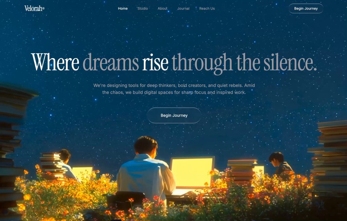
创建一个单页 Hero 区域,带全屏循环背景视频、玻璃拟态导航和电影感排版。使用 React + Vite + Tailwind CSS + TypeScript,配 shadcn/ui。

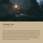
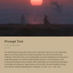
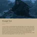
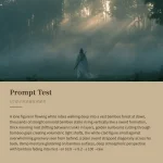
视频背景:

全屏 <video> 元素,带 autoPlay、loop、muted、playsInline
来源 URL:
定位为 absolute inset-0 w-full h-full object-cover z-0

字体:

从 Google Fonts 引入:Instrumental Serif(用于展示)和 Inter 的 400/500 字重(用于正文)
CSS 变量:--font-display: 'Instrumental Serif', serif 和 --font-body: 'Inter', sans-serif
正文使用 var(--font-body),标题使用内联 fontFamily: "'Instrument Serif', serif"

配色主题(暗色,CSS 变量使用 HSL 值):

--background: 201 100% 13%(深藏青色)
--foreground: 0 0% 100%(白色)
--muted-foreground: 240 4% 66%(柔和灰)
--primary: 0 0% 100%,--primary-foreground: 0 0% 4%
--secondary: 0 0% 10%,--muted: 0 0% 10%,--accent: 0 0% 10%
--border: 0 0% 18%,--input: 0 0% 18%

导航栏:

relative z-10,flex row,justify-between,px-8 py-6,max-w-7xl mx-auto
Logo:「Velorah®」(® 用 <sup className="text-xs"> 表示),text-3xl tracking-tight,Instrument Serif 字体,text-foreground
导航链接(移动端隐藏,md:flex 显示):Home(当前项,text-foreground)、Studio、About、Journal、Reach Us —— 均为 text-sm text-muted-foreground,hover:text-foreground 加 transition-colors
CTA 按钮:「Begin Journey」,液态玻璃 rounded-full px-6 py-2.5 text-sm text-foreground,hover:scale-[1.03]

Hero 区域:

relative z-10,flex column,居中,text-center,px-6 pt-32 pb-40 py-[90px]
H1:「Where dreams rise through the silence.」—— text-5xl sm:text-7xl md:text-8xl,leading-[0.95],tracking-[-2.46px],max-w-7xl,font-normal,Instrument Serif。「dreams」和「through the silence.」两处文字用 <em className="not-italic text-muted-foreground"> 包裹以形成色彩对比
副文本:text-muted-foreground text-base sm:text-lg max-w-2xl mt-8 leading-relaxed —— 「We're designing tools for deep thinkers, bold creators, and quiet rebels. Amid the chaos, we build digital spaces for sharp focus and inspired work.」
CTA 按钮:「Begin Journey」,液态玻璃 rounded-full px-14 py-5 text-base text-foreground mt-12,hover:scale-[1.03] cursor-pointer

液态玻璃效果(CSS 类 .liquid-glass):

.liquid-glass {
background: rgba(255, 255, 255, 0.01);
background-blend-mode: luminosity;
backdrop-filter: blur(4px);
-webkit-backdrop-filter: blur(4px);
border: none;
box-shadow: inset 0 1px 1px rgba(255, 255, 255, 0.1);
position: relative;
overflow: hidden;
}
.liquid-glass::before {
content: '';
position: absolute;
inset: 0;
border-radius: inherit;
padding: 1.4px;
background: linear-gradient(180deg,
rgba(255,255,255,0.45) 0%, rgba(255,255,255,0.15) 20%,
rgba(255,255,255,0) 40%, rgba(255,255,255,0) 60%,
rgba(255,255,255,0.15) 80%, rgba(255,255,255,0.45) 100%);
-webkit-mask: linear-gradient(#fff 0 0) content-box, linear-gradient(#fff 0 0);
-webkit-mask-composite: xor;
mask-composite: exclude;
pointer-events: none;
}

动画(CSS 关键帧加类名):

@keyframes fade-rise {
from { opacity: 0; transform: translateY(24px); }
to { opacity: 1; transform: translateY(0); }
}
.animate-fade-rise { animation: fade-rise 0.8s ease-out both; }
.animate-fade-rise-delay { animation: fade-rise 0.8s ease-out 0.2s both; }
.animate-fade-rise-delay-2 { animation: fade-rise 0.8s ease-out 0.4s both; }

H1 使用 animate-fade-rise
副文本使用 animate-fade-rise-delay
Hero CTA 按钮使用 animate-fade-rise-delay-2

布局:不要装饰性色块、放射状渐变或叠加层。极简、电影感、垂直居中的 Hero。所有视觉深度都由视频本身提供。
原文提示词(English)
Access ALL prompts for stunning animated websites in one click:

Create a single-page hero section with a fullscreen looping background video, glassmorphic navigation, and cinematic typography. Use React + Vite + Tailwind CSS + TypeScript with shadcn/ui.

Video Background:

Fullscreen <video> element with autoPlay, loop, muted, playsInline
Source URL:
Positioned absolute inset-0 w-full h-full object-cover z-0

Fonts:

Import from Google Fonts: Instrumental Serif (display) and Inter weights 400/500 (body)
CSS variables: --font-display: 'Instrumental Serif', serif and --font-body: 'Inter', sans-serif
Body uses var(--font-body), headings use inline fontFamily: "'Instrument Serif', serif"

Color Theme (dark, HSL values for CSS variables):

--background: 201 100% 13% (deep navy blue)
--foreground: 0 0% 100% (white)
--muted-foreground: 240 4% 66% (muted gray)
--primary: 0 0% 100%, --primary-foreground: 0 0% 4%
--secondary: 0 0% 10%, --muted: 0 0% 10%, --accent: 0 0% 10%
--border: 0 0% 18%, --input: 0 0% 18%

Navigation Bar:

relative z-10, flex row, justify-between, px-8 py-6, max-w-7xl mx-auto
Logo: "Velorah®" (® as <sup className="text-xs">), text-3xl tracking-tight, Instrument Serif font, text-foreground
Nav links (hidden on mobile, md:flex): Home (active, text-foreground), Studio, About, Journal, Reach Us — all text-sm text-muted-foreground with hover:text-foreground transition-colors
CTA button: "Begin Journey", liquid-glass rounded-full px-6 py-2.5 text-sm text-foreground, hover:scale-[1.03]

Hero Section:

relative z-10, flex column, centered, text-center, px-6 pt-32 pb-40 py-[90px]
H1: "Where dreams rise through the silence." — text-5xl sm:text-7xl md:text-8xl, leading-[0.95], tracking-[-2.46px], max-w-7xl, font-normal, Instrument Serif. The words "dreams" and "through the silence." wrapped in <em className="not-italic text-muted-foreground"> for color contrast
Subtext: text-muted-foreground text-base sm:text-lg max-w-2xl mt-8 leading-relaxed — "We're designing tools for deep thinkers, bold creators, and quiet rebels. Amid the chaos, we build digital spaces for sharp focus and inspired work."
CTA button: "Begin Journey", liquid-glass rounded-full px-14 py-5 text-base text-foreground mt-12, hover:scale-[1.03] cursor-pointer

Liquid Glass Effect (CSS class .liquid-glass):

.liquid-glass {
background: rgba(255, 255, 255, 0.01);
background-blend-mode: luminosity;
backdrop-filter: blur(4px);
-webkit-backdrop-filter: blur(4px);
border: none;
box-shadow: inset 0 1px 1px rgba(255, 255, 255, 0.1);
position: relative;
overflow: hidden;
}
.liquid-glass::before {
content: '';
position: absolute;
inset: 0;
border-radius: inherit;
padding: 1.4px;
background: linear-gradient(180deg,
rgba(255,255,255,0.45) 0%, rgba(255,255,255,0.15) 20%,
rgba(255,255,255,0) 40%, rgba(255,255,255,0) 60%,
rgba(255,255,255,0.15) 80%, rgba(255,255,255,0.45) 100%);
-webkit-mask: linear-gradient(#fff 0 0) content-box, linear-gradient(#fff 0 0);
-webkit-mask-composite: xor;
mask-composite: exclude;
pointer-events: none;
}

Animations (CSS keyframes + classes):

@keyframes fade-rise {
from { opacity: 0; transform: translateY(24px); }
to { opacity: 1; transform: translateY(0); }
}
.animate-fade-rise { animation: fade-rise 0.8s ease-out both; }
.animate-fade-rise-delay { animation: fade-rise 0.8s ease-out 0.2s both; }
.animate-fade-rise-delay-2 { animation: fade-rise 0.8s ease-out 0.4s both; }

H1 gets animate-fade-rise
Subtext gets animate-fade-rise-delay
Hero CTA button gets animate-fade-rise-delay-2

Layout: No decorative blobs, radial gradients, or overlays. Minimalist, cinematic, vertically centered hero. The video provides all visual depth.
建议模型
Lovable · Nano Banana · Veo 3
视频地址
https://media.goodcase.ai/media/video/nano-banana-veo-3-lovable-a22361354031.mp4