






提示词
提示词:
使用 Vite、Tailwind CSS 和 motion/react 构建现代 React 落地页,实现优雅动画。应用必须包含高度精致、美观的 Hero 区块和玻璃拟态导航栏。
1. 排版与全局 CSS(src/index.css)
从 Google Fonts 导入字体 "Inter" 和 "Outfit"。
将 --font-sans 设置为 Inter,将 --font-display 设置为 Outfit。
将 --color-brand-green 设置为 #9fff00,并将 --color-bg-base 严格设置为 #EDEEF5。
确保 body 使用 @apply bg-bg-base text-zinc-900 font-sans antialiased;,让 #EDEEF5 背景贯穿整个页面。
2. 组件结构(src/App.tsx)
导入 Navbar 和 Hero。
返回一个包含 <Navbar /> 和 <main><Hero /></main> 的 div。
将外层容器类设置为 min-h-screen bg-bg-base selection:bg-brand-green selection:text-black。
3. Navbar 组件(src/components/Navbar.tsx)
为其设置固定样式:fixed top-0 left-0 w-full z-50 py-6 md:py-10 bg-gradient-to-b from-[#f1f1f1]/80 to-transparent backdrop-blur-[2px]。
容器布局:12 列网格(grid-cols-12 max-w-7xl mx-auto)。
左侧(Cols 1-3):一个几何花朵/四叶草 SVG 图标(fill: #1a1a1a),旁边是使用展示字体的品牌名称 "mėntality"。
中间(Cols 4-9):仅桌面端显示、默认隐藏的导航链接:"服务"、"患者资源"、"关于我们"、"教育中心"。使用小号小写样式。
右侧(Cols 10-12):"寻求帮助" 锚点链接、一个写有 "开始使用 →" 的黑色圆角按钮,以及用于移动端的优雅动画 hamburger 切换图标。
加入 AnimatePresence 和 motion.div 抽屉,在移动端向下滑入并显示导航链接。
4. Hero 组件(src/components/Hero.tsx)
主样式:<section className="relative min-h-[110vh] sm:min-h-[140vh] w-full flex flex-col items-center justify-start overflow-hidden bg-bg-base">
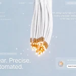
背景视频容器:
绝对定位外层容器:<div className="absolute top-[15vh] sm:top-[20vh] left-0 w-full h-[95vh] sm:h-[120vh] z-0 pointer-events-none">
视频本身应为 <video autoPlay loop muted playsInline className="w-full h-full object-cover opacity-100" />
精确 CloudFront URL:https://d8j0ntlcm91z4.cloudfront.net/user_38xzZboKViGWJOttwIXH07lWA1P/hf_20260603_132049_036591b8-6e92-4760-b94c-a7ea6eef315c.mp4
渐变蒙版:在外层容器中的视频下方添加 <div className="absolute top-0 left-0 w-full h-24 sm:h-32 bg-gradient-to-b from-bg-base to-transparent"></div>,使视频平滑融入 #EDEEF5 背景。
Hero 内容对齐:使用 <div className="max-w-7xl w-full mx-auto px-8 md:px-16 lg:px-20 relative z-10 grid grid-cols-12 gap-x-4 md:gap-x-8">。将文字放在 col-span-12 md:col-span-10 md:col-start-2 中。
Hero 标题(motion.h1):需要向上滑动淡入(initial={{ opacity: 0, y: 15 }} animate={{ opacity: 1, y: 0 }} transition={{ duration: 0.8 }})。
精确文字格式:
[#1a1a1a] Remix:Mentality 提供
[#8e8e8e] 信息
(换行)
[#8e8e8e] 和资源,帮助你管理
(换行)
[#8e8e8e] 你的 [Eye Icon Puipl UI Element] 心理健康。
对于 "你的" 与 "心理" 之间的 Eye Icon Element,创建一个行内胶囊形视觉元素:w-[16px] md:w-[42px] lg:w-[62px] border-[2px] border-[#1a1a1a] rounded-full inline-flex items-center justify-center,其中包含一个微小的黑色实心圆点(w-2 h-2)。
Search Pill 组件:
在标题文字下方添加延迟向上滑入动画(delay: 0.15)。
创建一个自定义胶囊 <div className="bg-white rounded-[6px] border border-black/[0.05] p-1 pl-4 flex items-center shadow-sm">。
加入一个 <input placeholder="Ask me anything...">,使用透明背景,使其呈现为一体化效果。
尾部操作按钮:<button className="bg-[#1a1a1a] text-white w-9 h-9 rounded-full relative">,其中包含 SVG chevron/arrow 图标。
建筑式边缘锚点:
右侧中部绝对定位:创建一个用于语言切换的玻璃拟态胶囊按钮(pl — en)。
左下角绝对定位:放置小巧整洁的文字 "2024"。
右下角绝对定位:放置小巧整洁的文字 "心理健康工具"。
确保视频下方没有人为添加的 margin/padding,使视频恰好占据 Hero viewport 的 100%,同时让 #EDEEF5 基础背景干净地承托整个页面。
原文提示词(English)
Prompt:
Build a modern React landing page using Vite, Tailwind CSS, and motion/react for elegant animations. The application must feature a highly polished, aesthetic hero section and a glassmorphic navigation bar.
1. Typography & Global CSS (src/index.css)
Import the fonts "Inter" and "Outfit" from Google Fonts.
Set --font-sans to Inter and --font-display to Outfit.
Set --color-brand-green to #9fff00 and --color-bg-base strictly to #EDEEF5.
Ensure the body uses @apply bg-bg-base text-zinc-900 font-sans antialiased; to carry the #EDEEF5 background throughout the entire page.
2. Component Structure (src/App.tsx)
Import Navbar and Hero.
Return a div containing the <Navbar /> and <main><Hero /></main>.
Set the wrapper container classes to min-h-screen bg-bg-base selection:bg-brand-green selection:text-black.
3. Navbar Component (src/components/Navbar.tsx)
Give it fixed styling: fixed top-0 left-0 w-full z-50 py-6 md:py-10 bg-gradient-to-b from-[#f1f1f1]/80 to-transparent backdrop-blur-[2px].
Container layout: A 12-column grid (grid-cols-12 max-w-7xl mx-auto).
Left (Cols 1-3): A geometric flower/clover SVG icon (fill: #1a1a1a) beside the brand name "mėntality" using the display font.
Center (Cols 4-9): Desktop-only hidden nav links: "service", "patient resources", "about us", "education center". Styled small and lowercase.
Right (Cols 10-12): "find help" anchor link, a black rounded button reading "get started →", and an elegant animated hamburger toggle icon for mobile.
Include an AnimatePresence and motion.div drawer that slides down for mobile with the navigation links.
4. Hero Component (src/components/Hero.tsx)
Main styling: <section className="relative min-h-[110vh] sm:min-h-[140vh] w-full flex flex-col items-center justify-start overflow-hidden bg-bg-base">
Background Video Container:
Absolute wrapper: <div className="absolute top-[15vh] sm:top-[20vh] left-0 w-full h-[95vh] sm:h-[120vh] z-0 pointer-events-none">
The video itself should be <video autoPlay loop muted playsInline className="w-full h-full object-cover opacity-100" />
Exact CloudFront URL: https://d8j0ntlcm91z4.cloudfront.net/user_38xzZboKViGWJOttwIXH07lWA1P/hf_20260603_132049_036591b8-6e92-4760-b94c-a7ea6eef315c.mp4
Gradient Mask: Below the video in the wrapper, add <div className="absolute top-0 left-0 w-full h-24 sm:h-32 bg-gradient-to-b from-bg-base to-transparent"></div> to smoothly blend the video into the #EDEEF5 background.
Hero Content Alignment: Use <div className="max-w-7xl w-full mx-auto px-8 md:px-16 lg:px-20 relative z-10 grid grid-cols-12 gap-x-4 md:gap-x-8">. Place the text in col-span-12 md:col-span-10 md:col-start-2.
Hero Header (motion.h1): Needs a slide-up fade (initial={{ opacity: 0, y: 15 }} animate={{ opacity: 1, y: 0 }} transition={{ duration: 0.8 }}).
Exact text formatting:
[#1a1a1a] Remix: Mentality offers
[#8e8e8e] information
(line break)
[#8e8e8e] and resources to help you manage
(line break)
[#8e8e8e] your [Eye Icon Puipl UI Element] mental wellbeing.
For the Eye Icon Element between "your" and "mental", create an inline pill-shaped visual: w-[16px] md:w-[42px] lg:w-[62px] border-[2px] border-[#1a1a1a] rounded-full inline-flex items-center justify-center containing a tiny solid black dot (w-2 h-2).
Search Pill Component:
Add a delayed slide-up animation (delay: 0.15) under the header text.
Make a custom capsule <div className="bg-white rounded-[6px] border border-black/[0.05] p-1 pl-4 flex items-center shadow-sm">.
Include an <input placeholder="Ask me anything..."> with transparent background so it looks integrated.
Trailing action button: <button className="bg-[#1a1a1a] text-white w-9 h-9 rounded-full relative"> containing an SVG chevron/arrow icon.
Architectural Edge Anchors:
Absolute middle right edge: Create a glassmorphic pill button for language switching (pl — en).
Absolute bottom left corner: Place "2024" in small neat text.
Absolute bottom right corner: Place "mental health tools" in small neat text.
Ensure there are no artificial margins/padding below the video to make sure the video takes exactly 100% of the Hero viewport, while allowing the #EDEEF5 background base to anchor the entire page cleanly.