









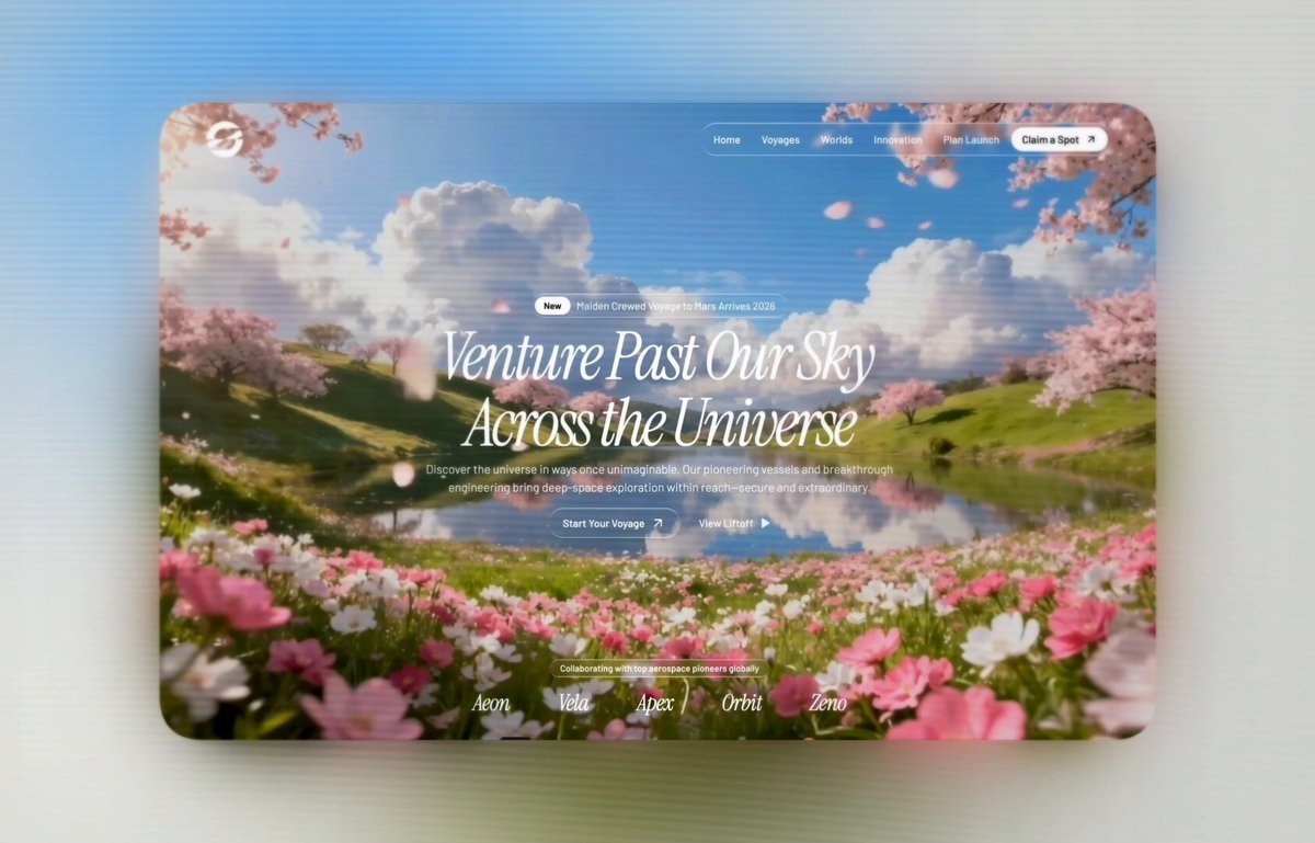
提示词
无限量的动画 AI Hero ——

这是我使用的确切提示词:

用 React、Vite、TypeScript、Tailwind CSS 和 motion/react(Framer Motion)库为一个太空旅行网站构建一个全屏电影感 Hero 区域。严格按照下面的每一处细节还原。

1. 字体

从 Google Fonts 引入 Instrument Serif(斜体)和 Barlow(300、400、500、600 字重):
@import url('');
在 tailwind.config.ts 中注册:
fontFamily: {
heading: ["'Instrument Serif'", "serif"],
body: ["'Barlow'", "sans-serif"],
}
设置 --radius: 9999px 以实现完全圆角元素。使用基于 HSL 的色彩系统,其中 --background: 213 45% 67%(柔和天空蓝),--foreground: 0 0% 100%(白色)。

2. 背景视频

使用一个全屏 <video> 元素,定位为 absolute inset-0,配 object-cover、z-0,并带以下属性:autoPlay loop muted playsInline preload="auto"。

视频 URL:

海报图片:/images/hero_bg.jpeg

叠加层:一个 div,absolute inset-0 bg-black/5 z-0,位于视频之上。

在 index.html 的 <head> 中添加预加载提示:

<link rel="preload" as="image" href="/images/hero_bg.jpeg" type="image/jpeg" />
<link rel="preload" as="video" href="" type="video/mp4" />

3. 液态玻璃 CSS

在 index.css 的 @layer components 下定义两个工具类:

.liquid-glass(轻量):

.liquid-glass {
background: rgba(255, 255, 255, 0.01);
background-blend-mode: luminosity;
backdrop-filter: blur(4px);
-webkit-backdrop-filter: blur(4px);
border: none;
box-shadow: inset 0 1px 1px rgba(255, 255, 255, 0.1);
position: relative;
overflow: hidden;
}
.liquid-glass::before {
content: '';
position: absolute;
inset: 0;
border-radius: inherit;
padding: 1.4px;
background: linear-gradient(180deg,
rgba(255,255,255,0.45) 0%, rgba(255,255,255,0.15) 20%,
rgba(255,255,255,0) 40%, rgba(255,255,255,0) 60%,
rgba(255,255,255,0.15) 80%, rgba(255,255,255,0.45) 100%);
-webkit-mask: linear-gradient(#fff 0 0) content-box, linear-gradient(#fff 0 0);
-webkit-mask-composite: xor;
mask-composite: exclude;
pointer-events: none;
}

.liquid-glass-strong(加强版,用于 CTA 按钮):

.liquid-glass-strong {
background: rgba(255, 255, 255, 0.01);
background-blend-mode: luminosity;
backdrop-filter: blur(50px);
-webkit-backdrop-filter: blur(50px);
border: none;
box-shadow: 4px 4px 4px rgba(0,0,0,0.05), inset 0 1px 1px rgba(255,255,255,0.15);
position: relative;
overflow: hidden;
}

与 .liquid-glass 相同的 ::before 伪元素,但透明度值改为 0.5 和 0.2,而不是 0.45 和 0.15。

4. 导航栏

固定定位:fixed top-4 left-0 right-0 z-50,配 px-8 lg:px-16。包含:

左侧:一个 Logo 图片(h-12 w-12)。

中间(仅桌面端):一个液态玻璃圆角药丸容器,内含导航链接:「Home」「Voyages」「Worlds」「Innovation」「Plan Launch」——每个都是 px-3 py-2 text-sm font-medium text-foreground/90 font-body。

药丸内最后一项:一个纯白色按钮 bg-white text-black rounded-full px-3.5 py-1.5 text-sm font-medium font-body,文字为「Claim a Spot」,配一个 ArrowUpRight 图标(lucide-react,h-4 w-4)。

5. Hero 内容(居中)

外层容器:flex-1 flex flex-col items-center justify-center text-center px-4 pt-24。

a) 徽标:
一个液态玻璃圆角 px-1 py-1 容器,内含:

一个纯白色药丸:bg-white text-black rounded-full px-3 py-1 text-xs font-semibold font-body,文字为「New」。

相邻文字:text-sm text-foreground/90 pr-3 font-body —— 「Maiden Crewed Voyage to Mars Arrives 2026」。

底部外边距 mb-2。

b) 标题:
使用一个自定义的 BlurText 组件(逐词从下方模糊显现动画)。属性:

text="Venture Past Our Sky Across the Universe"
className="text-6xl md:text-7xl lg:text-[5.5rem] font-heading italic text-foreground leading-[0.8] max-w-2xl justify-center tracking-[-4px]"
delay={100}
animateBy="words"
direction="bottom"

BlurText 组件按词拆分文字,使用 IntersectionObserver 触发,并用 motion.span 让每个词从 {filter: 'blur(10px)', opacity: 0, y: 50} 经过 {filter: 'blur(5px)', opacity: 0.5, y: -5} 动画到 {filter: 'blur(0px)', opacity: 1, y: 0},stepDuration: 0.35,每个词错开 100ms 延迟。

c) 副标题:
一个 motion.p,类名为 mt-1 text-sm md:text-base text-white max-w-2xl font-body font-light leading-tight。文字:「Discover the universe in ways once unimaginable. Our pioneering vessels and breakthrough engineering bring deep-space exploration within reach—secure and extraordinary.」
动画:initial={{ filter: 'blur(10px)', opacity: 0, y: 20 }} → animate={{ filter: 'blur(0px)', opacity: 1, y: 0 }},duration: 0.6,delay: 0.8。

d) CTA 按钮:
一个 motion.div,flex items-center gap-6 mt-4,使用相同的模糊显现动画,delay: 1.1。
主按钮:liquid-glass-strong rounded-full px-5 py-2.5 text-sm font-medium text-foreground font-body —— 「Start Your Voyage」加 ArrowUpRight 图标(h-5 w-5)。
次按钮:纯文字按钮 —— 「View Liftoff」加 Play 图标(h-4 w-4 fill-current)。

6. 合作伙伴条(底部)

定位在底部:flex flex-col items-center gap-4 pb-8。
一个液态玻璃圆角 px-3.5 py-1 text-xs font-medium text-white font-body 标签:「Collaborating with top aerospace pioneers globally」。
一排 5 个合作伙伴名称:「Aeon」「Vela」「Apex」「Orbit」「Zeno」——每个样式为 text-2xl md:text-3xl font-heading italic text-white tracking-tight,间距 gap-12 md:gap-16。

7. Z-Index 层级
视频加叠加层:z-0
所有内容(导航栏、Hero、合作伙伴):包裹在一个 relative z-10 容器中。
导航栏:z-50。
原文提示词(English)
Unlimited Aniamted AI Heros -

Here’s the exact prompt I used:

Build a full-screen cinematic hero section for a space travel website using React, Vite, TypeScript, Tailwind CSS, and the motion/react (Framer Motion) library. Recreate every detail exactly as described below.

1. Fonts

Import Instrument Serif (italic) and Barlow (weights 300, 400, 500, 600) from Google Fonts:
@import url('');
Register them in tailwind.config.ts:
fontFamily: {
heading: ["'Instrument Serif'", "serif"],
body: ["'Barlow'", "sans-serif"],
}
Set --radius: 9999px for fully rounded elements. Use an HSL-based color system where --background: 213 45% 67% (muted sky blue) and --foreground: 0 0% 100% (white).

2. Background Video

Use a full-screen <video> element positioned absolute inset-0 with object-cover, z-0, and these attributes: autoPlay loop muted playsInline preload="auto".

Video URL:

Poster image: /images/hero_bg.jpeg

Overlay: A div with absolute inset-0 bg-black/5 z-0 on top of the video.

In index.html, add preload hints in <head>:

<link rel="preload" as="image" href="/images/hero_bg.jpeg" type="image/jpeg" />
<link rel="preload" as="video" href="" type="video/mp4" />

3. Liquid Glass CSS

Define two utility classes in index.css under @layer components:

.liquid-glass (light):

.liquid-glass {
background: rgba(255, 255, 255, 0.01);
background-blend-mode: luminosity;
backdrop-filter: blur(4px);
-webkit-backdrop-filter: blur(4px);
border: none;
box-shadow: inset 0 1px 1px rgba(255, 255, 255, 0.1);
position: relative;
overflow: hidden;
}
.liquid-glass::before {
content: '';
position: absolute;
inset: 0;
border-radius: inherit;
padding: 1.4px;
background: linear-gradient(180deg,
rgba(255,255,255,0.45) 0%, rgba(255,255,255,0.15) 20%,
rgba(255,255,255,0) 40%, rgba(255,255,255,0) 60%,
rgba(255,255,255,0.15) 80%, rgba(255,255,255,0.45) 100%);
-webkit-mask: linear-gradient(#fff 0 0) content-box, linear-gradient(#fff 0 0);
-webkit-mask-composite: xor;
mask-composite: exclude;
pointer-events: none;
}

.liquid-glass-strong (heavy, for CTA buttons):

.liquid-glass-strong {
background: rgba(255, 255, 255, 0.01);
background-blend-mode: luminosity;
backdrop-filter: blur(50px);
-webkit-backdrop-filter: blur(50px);
border: none;
box-shadow: 4px 4px 4px rgba(0,0,0,0.05), inset 0 1px 1px rgba(255,255,255,0.15);
position: relative;
overflow: hidden;
}

Same ::before pseudo-element as .liquid-glass but with 0.5 and 0.2 alpha values instead of 0.45 and 0.15.

4. Navbar

Fixed position: fixed top-4 left-0 right-0 z-50, with px-8 lg:px-16. Contains:

Left: A logo image (h-12 w-12).

Center (desktop only): A liquid-glass rounded-full pill containing nav links: "Home", "Voyages", "Worlds", "Innovation", "Plan Launch" — each styled px-3 py-2 text-sm font-medium text-foreground/90 font-body.

Inside pill, last item: A solid white button bg-white text-black rounded-full px-3.5 py-1.5 text-sm font-medium font-body with text "Claim a Spot" and an ArrowUpRight icon (lucide-react, h-4 w-4).

5. Hero Content (centered)

Wrapper: flex-1 flex flex-col items-center justify-center text-center px-4 pt-24.

a) Badge:
A liquid-glass rounded-full px-1 py-1 container with:

A solid white pill: bg-white text-black rounded-full px-3 py-1 text-xs font-semibold font-body with text "New".

Adjacent text: text-sm text-foreground/90 pr-3 font-body — "Maiden Crewed Voyage to Mars Arrives 2026".

mb-2 bottom margin.

b) Heading:
Use a custom BlurText component (word-by-word blur-in animation from bottom). Props:

text="Venture Past Our Sky Across the Universe"
className="text-6xl md:text-7xl lg:text-[5.5rem] font-heading italic text-foreground leading-[0.8] max-w-2xl justify-center tracking-[-4px]"
delay={100}
animateBy="words"
direction="bottom"

The BlurText component splits text by words, uses IntersectionObserver to trigger, and animates each word with motion.span from {filter: 'blur(10px)', opacity: 0, y: 50} through {filter: 'blur(5px)', opacity: 0.5, y: -5} to {filter: 'blur(0px)', opacity: 1, y: 0} with stepDuration: 0.35 and staggered delay of 100ms per word.

c) Subheading:
A motion.p with classes mt-1 text-sm md:text-base text-white max-w-2xl font-body font-light leading-tight. Text: "Discover the universe in ways once unimaginable. Our pioneering vessels and breakthrough engineering bring deep-space exploration within reach—secure and extraordinary."
Animation: initial={{ filter: 'blur(10px)', opacity: 0, y: 20 }} → animate={{ filter: 'blur(0px)', opacity: 1, y: 0 }}, duration: 0.6, delay: 0.8.

d) CTA Buttons:
A motion.div with flex items-center gap-6 mt-4, same blur-in animation with delay: 1.1.
Primary: liquid-glass-strong rounded-full px-5 py-2.5 text-sm font-medium text-foreground font-body — "Start Your Voyage" + ArrowUpRight icon (h-5 w-5).
Secondary: Plain text button — "View Liftoff" + Play icon (h-4 w-4 fill-current).

6. Partners Bar (bottom)

Positioned at bottom: flex flex-col items-center gap-4 pb-8.
A liquid-glass rounded-full px-3.5 py-1 text-xs font-medium text-white font-body label: "Collaborating with top aerospace pioneers globally".
A row of 5 partner names: "Aeon", "Vela", "Apex", "Orbit", "Zeno" — each styled text-2xl md:text-3xl font-heading italic text-white tracking-tight, spaced gap-12 md:gap-16.

7. Z-Index Layering
Video + overlay: z-0
All content (navbar, hero, partners): wrapped in a relative z-10 container.
Navbar: z-50.
建议模型
React · Vite · TypeScript / GPT-5.6 Sol
视频地址