


























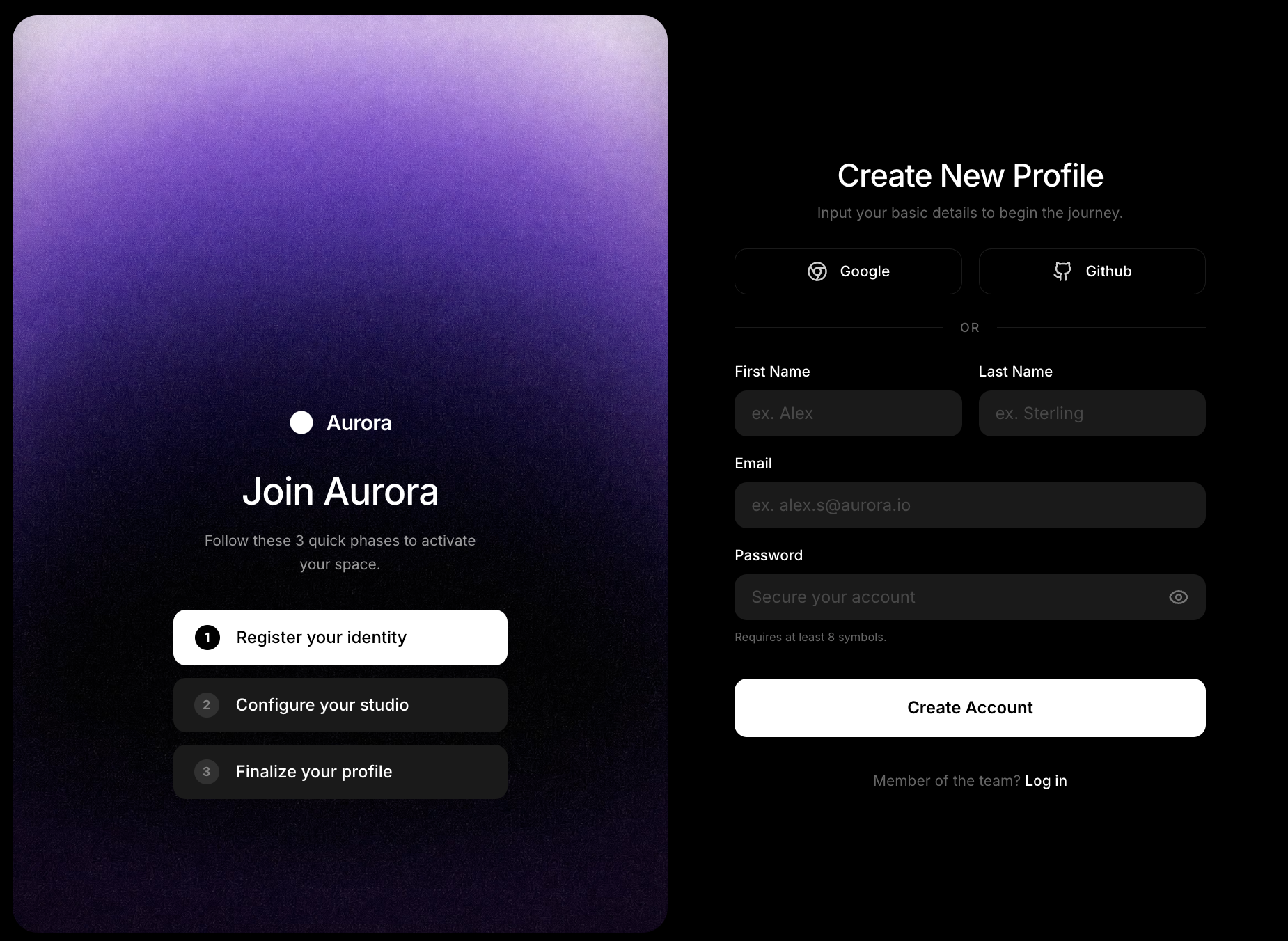
提示词
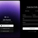
请构建一个名为“Aurora Sign Up”的现代双栏注册界面。使用 React、Tailwind CSS (v4)、`motion/react`(用于动画)和 `lucide-react`(用于图标)。整个应用应完全包含在 `App.tsx` 和 `index.css` 中。

### 1. 全局设置与 CSS(`index.css`)
- 从 Google Fonts 导入“Inter”字体(字重 300、400、500、600、700)。
- 使用 `--font-sans: "Inter", ui-sans-serif, system-ui, sans-serif;` 和自定义颜色 `--color-brand-gray: #1A1A1A` 扩展 Tailwind 主题。
- 为 `body` 应用基础样式:`@apply font-sans bg-black text-white antialiased;`。

### 2. 主布局(`App.tsx` 容器)
- `<main>` 元素应具有:`flex min-h-screen w-full bg-black selection:bg-white/30 p-2 transition-all duration-500`。
- 在 `lg` 断点下:`lg:h-screen lg:overflow-hidden lg:p-4`。
- 将此容器拆分为左栏(主视觉)和右栏(表单)。

### 3. 左栏(主视觉与背景视频)
- 大屏幕下的宽度应精确设为 `w-[52%]`。在手机/平板设备上隐藏,仅通过 `lg:flex` 显示。
- 样式:`relative flex-col items-center justify-end pb-32 px-12 rounded-3xl overflow-hidden shadow-2xl h-full`。
- **背景视频**:添加一个绝对定位的 `<video>` 标签(`inset-0`、`w-full`、`h-full`、`object-cover`)。它必须具有 `autoPlay`、`muted`、`loop` 和 `playsInline`。
- **关键要求**:`<source>` 必须精确为 `https://d8j0ntlcm91z4.cloudfront.net/user_38xzZboKViGWJOttwIXH07lWA1P/hf_20260506_081238_406ed0e3-5d83-436e-a512-0bbff7ec5b95.mp4`(`type="video/mp4"`)。
- **关键要求**:不要在视频上添加任何深色叠加层、渐变或色调遮罩。让视频纯净播放,不添加叠加效果。
- **主视觉内容容器**:将内容放在视频上方(`z-10 w-full max-w-xs space-y-8`)。
- **动画**:使用 `motion.div` 实现交错显示。容器应从 `opacity: 0` 过渡到 `1`,并设置 `staggerChildren: 0.15` 和 `delayChildren: 0.2`。其中每个子元素都应淡入并向上滑动(`y: 10` 到 `y: 0`,持续时间 `0.5`)。
- **品牌/标志**:一个 flex 行,包含 Lucide 的 `Circle` 图标(fill-white text-white)和文本“Aurora”(`text-xl font-semibold tracking-tight`)。
- **标题区块**:“加入 Aurora”(`text-4xl font-medium tracking-tight whitespace-nowrap`)。下方添加描述:“完成以下 3 个快速阶段,即可激活你的空间。”(`text-white/60 text-sm leading-relaxed px-4`)。
- **步骤**:渲染自定义 `<StepItem>` 组件三次。
  1:“注册你的身份”(激活状态)
  2:“配置你的工作室”
  3:“完善你的个人资料”

### 4. 右栏(注册表单)
- 一个具有 `flex-1 flex flex-col items-center justify-center py-12 lg:py-6 px-4 sm:px-12 lg:px-16 xl:px-24 overflow-y-auto lg:overflow-hidden` 的容器。
- **动画**:使用 `motion.div` 包裹内部内容,使其淡入(`opacity: 0` 到 `1`,持续时间 `0.8`,`ease: "easeOut"`)。内部宽度为 `w-full max-w-xl`,间距为 `space-y-8 lg:space-y-6 sm:space-y-10`。
- **页头**:“创建新资料”(`text-3xl font-medium tracking-tight`)。副标题:“输入你的基本信息,开启这段旅程。”(`text-white/40 text-sm`)。
- **社交按钮**:一个两栏网格(`grid grid-cols-2 gap-4`)。使用 `<SocialButton>` 组件渲染 Google(`Chrome` 图标)和 Github(`Github` 图标)。
- **分隔线**:一条水平线(`border-white/10`),中央显示文本“或”(`bg-black px-4 text-xs font-medium text-white/40 uppercase tracking-widest`)。
- **表单布局**:
  - 名和姓放在两栏网格中。
  - 电子邮箱(占满宽度)。
  - 密码(占满宽度),在输入框右侧绝对定位一个自定义 `lucide-react` `Eye` 切换图标,并添加小号辅助文本“至少需要 8 个符号。”
  - **提交按钮**:“创建账户”(`w-full h-14 bg-white text-black font-semibold rounded-xl hover:bg-white/90 active:scale-[0.98] mt-4`)。
  - **页脚链接**:“已经是团队成员?登录”。

### 5. 要创建的可复用组件
在文件底部创建以下确切的函数组件:
1. **`<StepItem>`**:接收 `number`、`text` 和可选的 `active` 布尔值。
   - 如果激活:应用 `bg-white text-black border border-white`。数字圆圈为 `bg-black text-white`。
   - 如果未激活:应用 `bg-brand-gray text-white border-none`。数字圆圈为 `bg-white/10 text-white/40`。
2. **`<SocialButton>`**:接收 `icon` 和 `label`。按钮具有 `bg-black border border-white/10 rounded-xl hover:bg-white/5`。
3. **`<InputGroup>`**:接收 `label`、`placeholder` 和 `type`。标签为 `text-sm font-medium text-white`。输入框为 `bg-brand-gray border-none rounded-xl h-11 px-4 text-white placeholder:text-white/20 focus:ring-2 focus:ring-white/20`。

确保最终代码在顶部使用 `export default function App()`。
原文提示词(English)
Please build a modern, two-column registration interface called "Aurora Sign Up". Use React, Tailwind CSS (v4), `motion/react` (for animations), and `lucide-react` (for icons). The app should be contained entirely in `App.tsx` and `index.css`.

### 1. Global Setup & CSS (`index.css`)
- Import the "Inter" font from Google Fonts (weights 300, 400, 500, 600, 700).
- Extend the Tailwind theme with `--font-sans: "Inter", ui-sans-serif, system-ui, sans-serif;` and a custom color: `--color-brand-gray: #1A1A1A`.
- Apply base styles to the `body`: `@apply font-sans bg-black text-white antialiased;`.

### 2. Main Layout (`App.tsx` container)
- The `<main>` element should have: `flex min-h-screen w-full bg-black selection:bg-white/30 p-2 transition-all duration-500`.
- On `lg` breakpoints: `lg:h-screen lg:overflow-hidden lg:p-4`.
- Split this container into a Left Column (Hero) and a Right Column (Form).

### 3. Left Column (Hero & Background Video)
- Width on large screens should be exactly `w-[52%]`. It should be hidden on mobile/tablet and only visible `lg:flex`.
- Styles: `relative flex-col items-center justify-end pb-32 px-12 rounded-3xl overflow-hidden shadow-2xl h-full`.
- **Background Video**: Add an absolutely positioned `<video>` tag (`inset-0`, `w-full`, `h-full`, `object-cover`). It must have `autoPlay`, `muted`, `loop`, and `playsInline`.
- **CRITICAL**: The `<source>` MUST be exactly `https://d8j0ntlcm91z4.cloudfront.net/user_38xzZboKViGWJOttwIXH07lWA1P/hf_20260506_081238_406ed0e3-5d83-436e-a512-0bbff7ec5b95.mp4` (`type="video/mp4"`).
- **CRITICAL**: Do NOT add any dark overlay, gradient, or tint mask over the video. Let it play purely without overlays.
- **Hero Content Container**: Place content over the video (`z-10 w-full max-w-xs space-y-8`).
- **Animations**: Use `motion.div` for a staggered reveal. The container should transition `opacity: 0` to `1` with `staggerChildren: 0.15` and `delayChildren: 0.2`. Every child element inside should fade in and slide up (`y: 10` to `y: 0`, duration `0.5`).
- **Brand/Logo**: A flex row with the `Circle` icon from Lucide (fill-white text-white) and the text "Aurora" (`text-xl font-semibold tracking-tight`).
- **Heading Block**: "Join Aurora" (`text-4xl font-medium tracking-tight whitespace-nowrap`). Below it, a description: "Follow these 3 quick phases to activate your space." (`text-white/60 text-sm leading-relaxed px-4`).
- **Steps**: Render a custom `<StepItem>` component three times.
  1: "Register your identity" (active state)
  2: "Configure your studio"
  3: "Finalize your profile"

### 4. Right Column (Sign Up Form)
- A container with `flex-1 flex flex-col items-center justify-center py-12 lg:py-6 px-4 sm:px-12 lg:px-16 xl:px-24 overflow-y-auto lg:overflow-hidden`.
- **Animation**: Wrap the interior content in a `motion.div` that fades in (`opacity: 0` to `1`, `duration: 0.8`, `ease: "easeOut"`). Inner width `w-full max-w-xl`, spacing `space-y-8 lg:space-y-6 sm:space-y-10`.
- **Header**: "Create New Profile" (`text-3xl font-medium tracking-tight`). Subtitle: "Input your basic details to begin the journey." (`text-white/40 text-sm`).
- **Social Buttons**: A 2-column grid (`grid grid-cols-2 gap-4`). Render Google (`Chrome` icon) and Github (`Github` icon) using a `<SocialButton>` component.
- **Divider**: A horizontal line (`border-white/10`) with the text "Or" in the center (`bg-black px-4 text-xs font-medium text-white/40 uppercase tracking-widest`).
- **Form Layout**:
  - First Name and Last Name in a 2-column grid.
  - Email (full width).
  - Password (full width) with a custom `lucide-react` `Eye` toggle icon in the absolute right of the input, and a tiny helper text "Requires at least 8 symbols."
  - **Submit Button**: "Create Account" (`w-full h-14 bg-white text-black font-semibold rounded-xl hover:bg-white/90 active:scale-[0.98] mt-4`).
  - **Footer Link**: "Member of the team? Log in".

### 5. Reusable Components to Create
Create these exact functional components at the bottom of the file:
1. **`<StepItem>`**: Takes `number`, `text`, and an optional `active` boolean.
   - If active: Apply `bg-white text-black border border-white`. The number circle is `bg-black text-white`.
   - If inactive: Apply `bg-brand-gray text-white border-none`. The number circle is `bg-white/10 text-white/40`.
2. **`<SocialButton>`**: Takes `icon` and `label`. Button has `bg-black border border-white/10 rounded-xl hover:bg-white/5`.
3. **`<InputGroup>`**: Takes `label`, `placeholder`, and `type`. The label is `text-sm font-medium text-white`. The input is `bg-brand-gray border-none rounded-xl h-11 px-4 text-white placeholder:text-white/20 focus:ring-2 focus:ring-white/20`.

Ensure the final code uses `export default function App()` at the top.