


















提示词
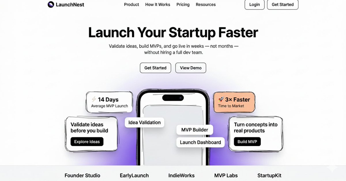
我确实在不到 2 分钟内用 google nano banana 为一个 web app 设计出了落地页。而且看起来很棒。

Prompt:

"使用 Next.js(App Router)和 Shadcn UI,基于提供的粗略手绘线框图构建一个现代、可用于生产的 SaaS 落地页。

线框图只表示布局和层级——将其转化为适合真实创业公司发布的精致、高级 SaaS 设计。

网站描述
为 LaunchNest 创建一个落地页。LaunchNest 是一个帮助创始人验证创业想法、快速构建 MVP 并更快发布产品的平台,无需雇用完整团队。

页面应有以下感觉:
以创始人为中心
快速而简洁
高级但简单
以转化为导向
想象 Stripe × Linear × 早期创业公司的活力。
页面结构(严格遵循线框图)
固定顶部导航栏
居中的 Hero 区域
大标题(最多 6 个词)
简短辅助副标题(1–2 行)
Hero 文案附近的两个 CTA 按钮

中央手机模型从底部部分露出

手机周围悬浮统计卡片和信息卡片

底部少量品牌/Logo 文字占位符

整洁的页脚对齐

不要改变布局——只提升视觉质量。

品牌与内容(严格使用这些文字)

品牌名:LaunchNest

导航栏
产品
工作原理
定价
资源
登录(次要、描边)
开始使用(主要、实心)

Hero 区域
标题:
更快启动你的创业项目
副标题:
验证想法、构建 MVP,并在几周而非几个月内上线——无需雇用完整的开发团队。

主要 CTA:开始使用
 次要 CTA:查看演示
悬浮统计卡片

⚡ 平均 14 天发布 MVP
🚀 上市速度提升 3 倍

左侧信息卡片

在构建前验证想法
按钮:探索想法

右侧信息卡片

将概念变成真实产品
按钮:构建 MVP

手机模型叠加标签
想法验证

MVP 构建器
发布面板
底部品牌占位符

Founder Studio
EarlyLaunch
IndieWorks
MVP Labs
StartupKit

颜色调色板

主黑色:#0F0F0F
白色:#FFFFFF
柔和灰色文字:#6B7280
柔和灰色背景:#F4F4F5
强调黄色卡片:#FACC15
强调橙色卡片:#FB923C
柔和紫色渐变:#E9D5FF → #F5E9FF
设计原则
大号粗体 Hero 排版
充裕的间距和内边距
清晰的视觉层级
带细微阴影的圆角卡片
围绕手机分层排列的悬浮 UI 元素
整洁的网格对齐
即使内容很少也要看起来很好
UI 与组件要求

使用 Shadcn UI 组件:
Button
Card
Badge

固定导航栏

主要 CTA:黑色背景、白色文字
次要 CTA:白色背景、黑色边框
手机模型居中,并在底部部分裁切
相对于 Hero 容器绝对定位悬浮卡片

完全响应式(移动端 → 桌面端)

技术要求:
Next.js App Router
Tailwind CSS
整洁、语义化 HTML
可复用组件
不要使用 lorem ipsum 占位文本
只输出代码,不要解释"

接下来会尝试用 Gemini 3 将其实现。
原文提示词(English)
I literally designed the landing page for a web app using google nano banana in under 2 minutes. And its looking awesome.

Prompt:

"Build a modern, production-ready SaaS landing page using Next.js (App Router) and Shadcn UI, based on the rough hand-drawn wireframe provided.

The wireframe represents layout and hierarchy only — transform it into a polished, premium SaaS design suitable for a real startup launch.

Website Description
Create a landing page for LaunchNest, a platform that helps founders validate startup ideas, build MVPs quickly, and launch faster without hiring a full team.

The page should feel:
Founder-focused
Fast and minimal
Premium but simple
Conversion-optimized
Think Stripe × Linear × early-stage startup energy.
Page Structure (Follow the Wireframe Exactly)
Sticky top navigation bar
Center-aligned hero section
Large headline (max 6 words)
Short supporting subheadline (1–2 lines)
Two CTA buttons near the hero text

A central mobile phone mockup partially visible from the bottom

Floating stat cards and info cards around the phone

Small brand/logo text placeholders at the bottom

Clean footer alignment

Do not change the layout — only improve visual quality.

Brand & Content (Use Exactly This Text)

Brand Name: LaunchNest

Navigation Bar
Product
How It Works
Pricing
Resources
Login (secondary, outlined)
Get Started (primary, filled)

Hero Section
Headline:
Launch Your Startup Faster
Subheadline:
Validate ideas, build MVPs, and go live in weeks — not months — without hiring a full dev team.

Primary CTA: Get Started
 Secondary CTA: View Demo
Floating Stat Cards

⚡ 14 Days Average MVP Launch
🚀 3× Faster Time to Market

Left Info Card

Validate ideas before you build
Button: Explore Ideas

Right Info Card

Turn concepts into real products
Button: Build MVP

Phone Mockup Overlay Labels
Idea Validation

MVP Builder
Launch Dashboard
Bottom Brand Placeholders

Founder Studio
EarlyLaunch
IndieWorks
MVP Labs
StartupKit

Color Palette

Primary Black: #0F0F0F
White: #FFFFFF
Muted Gray Text: #6B7280
Soft Gray Background: #F4F4F5
Accent Yellow Card: #FACC15
Accent Orange Card: #FB923C
Soft Purple Gradient: #E9D5FF → #F5E9FF
Design Principles
Large, bold hero typography
Generous spacing and padding
Strong visual hierarchy
Rounded cards with subtle shadows
Floating UI elements layered around the phone
Clean grid alignment
Looks great even with minimal content
UI & Component Requirements

Use Shadcn UI components:
Button
Card
Badge

Sticky navigation bar

Primary CTA: black background, white text
Secondary CTA: white background, black border
Phone mockup centered and partially cut off at bottom
Floating cards positioned absolutely relative to hero container

Fully responsive (mobile → desktop)

Technical Requirements:
Next.js App Router
Tailwind CSS
Clean, semantic HTML
Reusable components
No placeholder lorem ipsum
Output code only, no explanations"

Will try to bring this to life using Gemini 3 next.
建议模型
Google Nano Banana · Next.js · Shadcn UI / GPT-5.6 Sol