


































提示词
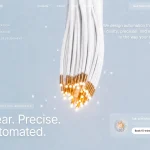
严格按照以下规范重建一个单文件、深色电影感的 AI 基础设施落地页。交付一个独立完整的 index.html(内联 CSS + JS,无需构建步骤)。像素级忠实还原经过测量的 Figma 风格设计稿。不要卡片、不要紫色、不要光晕球体,也不要把装饰性抽象渐变作为主视觉——首屏主视觉是一个全出血循环视频。
════════════════════════════════════════
页面元信息 / 品牌标识
════════════════════════════════════════
- 文档标题:"下一层智能"
- 品牌:抽象几何 S 形标记(闪电/电光几何造型),header 中不要使用文字标识。
- 产品氛围:高端 AI 基础设施 / “下一层智能”;纯黑虚空舞台;克制的银白色字体;白色药丸形 CTA。
- Viewport:固定全屏舞台;html/body height 100%;overflow hidden;background #050505。
- 使用抗锯齿 Manrope UI;text-rendering: geometricPrecision。
════════════════════════════════════════
字体(必需)
════════════════════════════════════════
1) 主要 UI 字体:Manrope(variable / range font-weight 200–800),normal style。
- 通过 @font-face woff2 或等效 Google Fonts 加载:
https://fonts.google.com/specimen/Manrope
覆盖 400、500、700 字重(首选 variable 200–800)。
- body font-family: 'Manrope', system-ui, -apple-system, 'Segoe UI', sans-serif
2) 合作伙伴 logo 文字标识字体:名为 "IpsumMark" 的自定义 display face,weight 700。
- 仅用于底部四个 “logoipsum” 文字标识。
- 如果 IpsumMark 二进制文件不可用,使用接近 logoipsum 标记的粗体几何无衬线字体近似呈现(仍需设置 font-family stack: 'IpsumMark','Manrope',sans-serif)——不要以 Inter/Roboto/Arial 作为主要字体。
════════════════════════════════════════
颜色 TOKEN(CSS VARIABLES)
════════════════════════════════════════
--ink: #fafafa /* 标题 / 主要文字 */
--muted: #a7a6a6 /* 辅助文案 */
--nav: #b6b5b5 /* header 链接 */
--strip: #8b8a8a /* 合作伙伴 logo */
--pill: #ffffff /* CTA 填充 */
--pill-ink: #050505 /* CTA 文字 */
舞台 / 页面黑色:#050505
════════════════════════════════════════
响应式单位系统(关键——必须精确匹配)
════════════════════════════════════════
参考画布:1487 × 1058。
:root {
--u: calc(100vh / 1058); /* 1 个设计像素锁定到高度 */
--uw: calc(100vw / 1487);
--h: clamp(var(--u), calc(var(--u) * .65 + var(--uw) * .35), calc(var(--u) * 1.16));
}
@supports (height: 100dvh) { :root { --u: calc(100dvh / 1058); } }
含义:
- 垂直节奏始终铺满屏幕(nav ~27u、标题顶部 ~230.5u、logo ~995u、基线 1058u)。
- 左侧栏距左侧约 75u;header CTA 距右侧约 75–76u;nav + logo 条居中。
- --h 在超宽屏上略微放大字体(最大 +16%),绝不缩小到低于按高度锁定的 --u。
Portrait / 窄屏(max-aspect-ratio: 11/10):
- 切换为 flow layout(flex column),单位 --m: min(100vw/430, 1.34px);--u: var(--m)
- Tablet 区间(≥600px AND max-aspect-ratio 11/10):
--m: min(100vw/860, 100vh/760, 1.25px)
════════════════════════════════════════
背景——CLOUDFRONT 视频(强制 URL)
════════════════════════════════════════
精确视频 URL(必须使用,不得替换):
覆盖舞台的 absolute .plate 内部标记:
<video class="plate-video" autoplay muted loop playsinline preload="auto" aria-hidden="true">
<source src="[URL ABOVE]" type="video/mp4">
</video>
Desktop 视频几何尺寸(匹配 photo-plate 尺寸):
- position absolute
- left: 50%; top: calc(1 * var(--u))
- width: calc(1492 * var(--u)); height: calc(1054 * var(--u))
- transform: translateX(calc(-50% - calc(0.5 * var(--u))))
- object-fit: cover; pointer-events: none
Portrait:inset 0;full width/height;transform none;object-fit cover;object-position 43% center
Tablet portrait:object-position 44% center
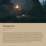
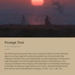
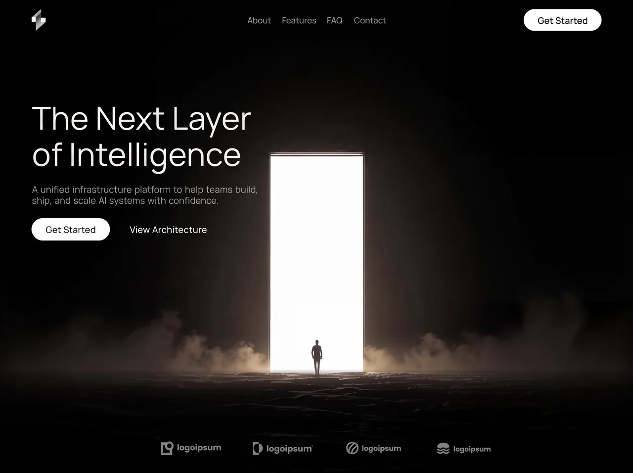
视频主体(确保艺术指导忠实度):深色电影感场景——人物剪影走向一道高耸、发出白色强光的竖直 portal/door of light,地面笼罩薄雾,底部有烟雾,四周纯黑。无缝循环。
.plate::after 上的 FADE OVERLAYS(保留两个渐变):
Desktop:
1) 底部淡出:
linear-gradient(to bottom,
rgba(5,5,5,0) 78.8%, rgba(5,5,5,.23) 79.6%, rgba(5,5,5,.45) 81.4%,
rgba(5,5,5,.75) 83.3%, rgba(5,5,5,.84) 85.2%, rgba(5,5,5,.888) 88%,
rgba(5,5,5,.905) 91%, rgba(5,5,5,.96) 95%, #050505 100%)
2) 两侧 letterbox:
linear-gradient(to right,
#050505 calc(50% - 746u),
transparent calc(50% - 676u),
transparent calc(50% + 676u),
#050505 calc(50% + 746u))
其中 u = var(--u)
Portrait overlays(替换 Desktop 设置):
- to-right: rgba(5,5,5,.86)→.66@42%→.20@78%→.10@100%
- to-bottom: .72@0%→.34@24%→.34@56%→.80@82%→.97@94%→#050505
Tablet portrait 的侧面/顶部数值略浅(.84/.60/.16/.06 和 .66/.28/.30/.78/.96)。
════════════════════════════════════════
结构(DOM ORDER)
════════════════════════════════════════
.stage
.plate > video.plate-video
header.topbar
a.brand (aria-label Home) > brand SVG
nav.links (aria-label Primary): 关于 | 功能 | 常见问题 | 联系我们
a.pill.pill-nav > span “立即开始”
button.burger#burger (two <i> bars) — 仅在 portrait 中视觉显示
nav.menu#menu (mobile overlay)
.menu-inner
p.menu-eyebrow “菜单”
ul.menu-list: 关于、功能、常见问题、联系我们
.menu-foot: pill “立即开始” + ghost “查看架构”
main.hero
h1.headline: <span>下一层</span> <span>智能</span>
p.sub: <span>一个统一的基础设施平台,帮助团队满怀信心地构建、</span>
<span>发布和扩展 AI 系统。</span>
.actions
a.pill.pill-cta > span “立即开始”
a.ghost “查看架构”
.logos
.lg.lg1 … .lg.lg4 (icon SVG + 文字 “logoipsum”;lg2 的文字后有一个微小的凸起圆点)
════════════════════════════════════════
DESKTOP ABSOLUTE LAYOUT(使用 --u / --h 单位)
════════════════════════════════════════
品牌标记:
- left 75u, top 27u, size 31.5u × 48.5u
Nav links (.links):
- left 50%, top 51u, transform translate(-50%, -50%)
- font 19.0u / weight 400 / color --nav
- 链接间距 ≈ 24.5u、23.5u(第 3 个)、26.0u(第 4 个)
- 项目:关于、功能、常见问题、联系我们——纯文字链接,无下划线
Header pill (.pill-nav):
- right 75.4u, top 27u, 175u × 49u
- 白色 pill,radius 999px,文字 #050505,font 20.6u weight 500
- 内部 span translateY(1u) 以实现视觉居中
- 标签:“立即开始”
标题 (.headline):
- left 75.5u, top 230.5u
- font-size 71.6h, line-height 80.5h, weight 400, letter-spacing 0.3h
- color --ink;white-space nowrap;每个 span display:block(两行):
Line1:“下一层”
Line2:“智能”
辅助文案 (.sub):
- left 75.5u
- top: 230.5u + 189.0h
- font 20.7h / lh 23.5h / weight 400 / word-spacing 1.8h / color --muted
- 两个 nowrap 行,使用 span:
“一个统一的基础设施平台,帮助团队满怀信心地构建、”
“发布和扩展 AI 系统。”
主要 CTA (.pill-cta):
- left 74.9u
- top: 230.5u + 264.5h
- size 175.6h × 50h, font 20.6h
- 标签:“立即开始”
Ghost link (.ghost):
- left: 74.9u + 220.6h
- top: 230.5u + 279.5h
- font 20.6h weight 500 letter-spacing 0.12h color #fff
- 标签:“查看架构”(无下划线)
合作伙伴条 (.logos):
- width 741u, left 50%, transform translateX(-50% + 20u)
- color --strip (#8b8a8a)
- 四个标记,absolute positions:
lg1: left -0.5u, top 994.7u; mark 30.5×31u; word left 37u top ~5.6u size 18.1u “logoipsum”
lg2: left 206.5u, top 995.7u; mark 24.5×30u; word left 31u top ~7.3u size 18.5u “logoipsum” + .dot (inline 0.09em circle, vertical-align 0.62em, margin-left 0.06em)
lg3: left 416.5u, top 996.7u; mark 28.5×28u; word left 35u top ~7.3u size 16.15u “logoipsum”
lg4: left 620.5u, top 998.7u; mark 28.5×25.5u; word left 37u top ~8.3u size 15.3u “logoipsum”
- 文字标识使用 font-family IpsumMark, weight 700
════════════════════════════════════════
品牌 SVG(精确几何形状)
════════════════════════════════════════
viewBox="0 0 31.5 48.5"
- LinearGradient id bg1 from (8,0)→(34.1,28.9) stops:
0 #9e9e9e, .28 #a6a6a6, .34 #a3a3a3, .40 #3a3a3a, .55 #414141,
.60 #7a7a7a, .68 #8e8e8e, .80 #a9a9a9, .95 #c4c4c4, 1 #cccccc
- Path: M21.5 0 L21.5 19.5 L31.5 19.5 L31.5 29 L10 48.5 L10 28.5 L0.5 28.5 L0.5 18.5 Z fill url(#bg1)
- Rect 0.5,18.5 9×10 fill #fdfdfd
- Rect 22,19.5 9.5×9.5 fill #fdfdfd
形状看起来像一个风格化的棱角 “S” / bolt,并带有两个明亮的矩形缺口。
════════════════════════════════════════
合作伙伴 ICON SVG(currentColor = --strip)
════════════════════════════════════════
1) viewBox 0 0 30 31 — 带圆形缺口的方框(mask circle at 19.5,10.5 r5.1)+ circle path
2) viewBox 0 0 25 30 — 竖条 + circle yin-yang mask split(经典 logoipsum 双形态)
3) viewBox 0 0 28 28 — circle stroke r12.35 sw 3.1 + 两条 curved stroke paths(漩涡)
4) viewBox 0 0 28 25.5 — filled wavy “mound” path + 下方两条 stroked wave lines(sw ~3.05)
(如果可用,请使用源页面中的精确 path data;否则精确匹配这些 logoipsum 剪影。)
════════════════════════════════════════
动画(仅限 prefers-reduced-motion: no-preference)
════════════════════════════════════════
Easing: cubic-bezier(.22, 1, .36, 1)
@keyframes rise:
from { opacity:0; transform: translateY(14u) }
@keyframes riseNav:(用于居中的 nav——保留 translate(-50%,-50%) 结束状态)
from { opacity:0; transform: translate(-50% + 0u, -50% + 14u) }
to { opacity:1; transform: translate(-50% + 0u, -50%) }
@keyframes fade:
from { opacity:0 }
加载时错峰:
- .brand, .links, .pill-nav → rise / riseNav, 0.8s, both
- .headline → rise 0.9s, delay 0.06s
- .sub → rise 0.9s, delay 0.14s
- .pill-cta, .ghost → rise 0.9s, delay 0.22s
- .lg → fade 1.1s, delay 0.34s, ease
Reduced motion:将 menu/burger transitions 缩短至约 0.001s;跳过入场动画。
════════════════════════════════════════
PORTRAIT / MOBILE 行为
════════════════════════════════════════
- 隐藏 .links 和 .pill-nav;显示磨砂玻璃 pill burger(rgba white .06 / border .14, backdrop blur)。
- 当 .stage.is-open 时,Burger bars 变形为 X(rotate ±45deg with translateY ±4.3m)。
- Overlay .menu:全屏深色 gradient blur,opacity/visibility transition 0.42s。
- 错峰显示菜单(eyebrow、每个 li、foot),opacity+translateY,delays .06/.10/.16/.22/.28/.34s。
- Menu links 较大(~31m, min 25px),带小型 chevron ::after。
- Headline 在 phone 上以 inline 方式换行;在 tablet band 上恢复为两个 line spans。
- Logos:phone 上采用 2×2 grid;tablet ≥600px 上采用单行 4 个。
- stage 使用 safe-area padding。
════════════════════════════════════════
JS(最少量)
════════════════════════════════════════
点击 burger 时在 .stage 上切换 .is-open;同步 aria-expanded / aria-hidden / aria-label。
按 Escape、点击 menu link,以及调整为横屏 aspect > 1.1 时关闭。
════════════════════════════════════════
构图规则(不得违反)
════════════════════════════════════════
- 首个 viewport = 一个完整构图:品牌标记 + nav + 一个标题 + 一段辅助文案 + CTA 组合 + 全出血视频 + 底部合作伙伴条。不要 stats、cards、badge chips 或次要营销模块。
- 品牌标记是首屏层级的左侧视觉信号,而不只是 nav 中的小装饰。
- 视频是 edge-to-edge background plane(不是 inset card/media)。
- 除了经过测量的边缘/底部 fades,不要在视频上添加 overlays/stickers。
- 主要 CTA 仅使用白色全圆角 pills;次要操作使用 ghost text。
- 单个 HTML 文件;支持 desktop + mobile。
构建结果应确保在 1487×1058 的 desktop screenshot 中逐像素匹配此布局,CloudFront MP4 在左侧文字栏后方循环播放,四个灰色 logoipsum 标记位于底部 fade 中。
```
---原文提示词(English)
Recreate a single-file dark cinematic AI-infrastructure landing page EXACTLY as specified. Deliver one self-contained index.html (inline CSS + JS, no build step). Pixel-faithful to a measured Figma-style comp. No cards, no purple, no glow orbs, no decorative abstract gradients as the main visual — the hero visual is a full-bleed looping video.
════════════════════════════════════════
PAGE META / IDENTITY
════════════════════════════════════════
- Document title: "The Next Layer of Intelligence"
- Brand: abstract geometric S-like mark (lightning/bolt geometry), NOT a wordmark in the header.
- Product vibe: premium AI infrastructure / “next layer of intelligence”; black void stage; restrained silver/white type; white pill CTAs.
- Viewport: fixed full-screen stage; html/body height 100%; overflow hidden; background #050505.
- Antialiased Manrope UI; text-rendering: geometricPrecision.
════════════════════════════════════════
FONTS (REQUIRED)
════════════════════════════════════════
1) Primary UI type: Manrope (variable / range font-weight 200–800), normal style.
- Load via @font-face woff2 OR Google Fonts equivalent:
https://fonts.google.com/specimen/Manrope
weights covering 400, 500, 700 (variable 200–800 preferred).
- body font-family: 'Manrope', system-ui, -apple-system, 'Segoe UI', sans-serif
2) Partner logo wordmark type: custom display face named "IpsumMark", weight 700.
- Used ONLY on the four bottom “logoipsum” wordmarks.
- If IpsumMark binary is unavailable, approximate with a bold geometric sans close to logoipsum marks (still set font-family stack: 'IpsumMark','Manrope',sans-serif) — do NOT use Inter/Roboto/Arial as primary.
════════════════════════════════════════
COLOR TOKENS (CSS VARIABLES)
════════════════════════════════════════
--ink: #fafafa /* headline / primary text */
--muted: #a7a6a6 /* subcopy */
--nav: #b6b5b5 /* header links */
--strip: #8b8a8a /* partner logos */
--pill: #ffffff /* CTA fill */
--pill-ink: #050505 /* CTA text */
Stage / page black: #050505
════════════════════════════════════════
RESPONSIVE UNIT SYSTEM (CRITICAL — MATCH EXACTLY)
════════════════════════════════════════
Reference canvas: 1487 × 1058.
:root {
--u: calc(100vh / 1058); /* 1 design px locked to HEIGHT */
--uw: calc(100vw / 1487);
--h: clamp(var(--u), calc(var(--u) * .65 + var(--uw) * .35), calc(var(--u) * 1.16));
}
@supports (height: 100dvh) { :root { --u: calc(100dvh / 1058); } }
Meaning:
- Vertical rhythm always fills the screen (nav ~27u, headline top ~230.5u, logos ~995u, baseline 1058u).
- Left column anchored ~75u from left; header CTA ~75–76u from right; nav + logo strip centered.
- --h grows type slightly on ultra-wide (max +16%), never shrinks below height-locked --u.
Portrait / narrow (max-aspect-ratio: 11/10):
- Switch to flow layout (flex column), unit --m: min(100vw/430, 1.34px); --u: var(--m)
- Tablet band (≥600px AND max-aspect-ratio 11/10):
--m: min(100vw/860, 100vh/760, 1.25px)
════════════════════════════════════════
BACKGROUND — CLOUDFRONT VIDEO (MANDATORY URL)
════════════════════════════════════════
Exact video URL (must use this, not a substitute):
Markup inside absolute .plate covering the stage:
<video class="plate-video" autoplay muted loop playsinline preload="auto" aria-hidden="true">
<source src="[URL ABOVE]" type="video/mp4">
</video>
Desktop video geometry (match photo-plate sizing):
- position absolute
- left: 50%; top: calc(1 * var(--u))
- width: calc(1492 * var(--u)); height: calc(1054 * var(--u))
- transform: translateX(calc(-50% - calc(0.5 * var(--u))))
- object-fit: cover; pointer-events: none
Portrait: inset 0; full width/height; transform none; object-fit cover; object-position 43% center
Tablet portrait: object-position 44% center
Video subject (for art direction fidelity): dark cinematic scene — silhouetted figure walking toward a tall glowing white vertical portal/door of light on misty ground, smoke/fog at base, pure black surroundings. Loop seamlessly.
FADE OVERLAYS on .plate::after (keep BOTH gradients):
Desktop:
1) Bottom fade:
linear-gradient(to bottom,
rgba(5,5,5,0) 78.8%, rgba(5,5,5,.23) 79.6%, rgba(5,5,5,.45) 81.4%,
rgba(5,5,5,.75) 83.3%, rgba(5,5,5,.84) 85.2%, rgba(5,5,5,.888) 88%,
rgba(5,5,5,.905) 91%, rgba(5,5,5,.96) 95%, #050505 100%)
2) Side letterbox:
linear-gradient(to right,
#050505 calc(50% - 746u),
transparent calc(50% - 676u),
transparent calc(50% + 676u),
#050505 calc(50% + 746u))
where u = var(--u)
Portrait overlays (replace desktop):
- to-right: rgba(5,5,5,.86)→.66@42%→.20@78%→.10@100%
- to-bottom: .72@0%→.34@24%→.34@56%→.80@82%→.97@94%→#050505
Tablet portrait slightly lighter side/top values (.84/.60/.16/.06 and .66/.28/.30/.78/.96).
════════════════════════════════════════
STRUCTURE (DOM ORDER)
════════════════════════════════════════
.stage
.plate > video.plate-video
header.topbar
a.brand (aria-label Home) > brand SVG
nav.links (aria-label Primary): About | Features | FAQ | Contact
a.pill.pill-nav > span “Get Started”
button.burger#burger (two <i> bars) — portrait only visually
nav.menu#menu (mobile overlay)
.menu-inner
p.menu-eyebrow “Menu”
ul.menu-list: About, Features, FAQ, Contact
.menu-foot: pill “Get Started” + ghost “View Architecture”
main.hero
h1.headline: <span>The Next Layer</span> <span>of Intelligence</span>
p.sub: <span>A unified infrastructure platform to help teams build,</span>
<span>ship, and scale AI systems with confidence.</span>
.actions
a.pill.pill-cta > span “Get Started”
a.ghost “View Architecture”
.logos
.lg.lg1 … .lg.lg4 (icon SVG + word “logoipsum”; lg2 has a tiny raised dot after the word)
════════════════════════════════════════
DESKTOP ABSOLUTE LAYOUT (in --u / --h units)
════════════════════════════════════════
Brand mark:
- left 75u, top 27u, size 31.5u × 48.5u
Nav links (.links):
- left 50%, top 51u, transform translate(-50%, -50%)
- font 19.0u / weight 400 / color --nav
- gaps between links ≈ 24.5u, 23.5u (3rd), 26.0u (4th)
- items: About, Features, FAQ, Contact — plain text links, no underlines
Header pill (.pill-nav):
- right 75.4u, top 27u, 175u × 49u
- white pill, radius 999px, text #050505, font 20.6u weight 500
- inner span translateY(1u) for optical centering
- label: “Get Started”
Headline (.headline):
- left 75.5u, top 230.5u
- font-size 71.6h, line-height 80.5h, weight 400, letter-spacing 0.3h
- color --ink; white-space nowrap; each span display:block (two lines):
Line1: “The Next Layer”
Line2: “of Intelligence”
Subcopy (.sub):
- left 75.5u
- top: 230.5u + 189.0h
- font 20.7h / lh 23.5h / weight 400 / word-spacing 1.8h / color --muted
- two nowrap lines as spans:
“A unified infrastructure platform to help teams build,”
“ship, and scale AI systems with confidence.”
Primary CTA (.pill-cta):
- left 74.9u
- top: 230.5u + 264.5h
- size 175.6h × 50h, font 20.6h
- label “Get Started”
Ghost link (.ghost):
- left: 74.9u + 220.6h
- top: 230.5u + 279.5h
- font 20.6h weight 500 letter-spacing 0.12h color #fff
- label “View Architecture” (no underline)
Partner strip (.logos):
- width 741u, left 50%, transform translateX(-50% + 20u)
- color --strip (#8b8a8a)
- Four marks, absolute positions:
lg1: left -0.5u, top 994.7u; mark 30.5×31u; word left 37u top ~5.6u size 18.1u “logoipsum”
lg2: left 206.5u, top 995.7u; mark 24.5×30u; word left 31u top ~7.3u size 18.5u “logoipsum” + .dot (inline 0.09em circle, vertical-align 0.62em, margin-left 0.06em)
lg3: left 416.5u, top 996.7u; mark 28.5×28u; word left 35u top ~7.3u size 16.15u “logoipsum”
lg4: left 620.5u, top 998.7u; mark 28.5×25.5u; word left 37u top ~8.3u size 15.3u “logoipsum”
- Wordmarks use font-family IpsumMark, weight 700
════════════════════════════════════════
BRAND SVG (exact geometry)
════════════════════════════════════════
viewBox="0 0 31.5 48.5"
- LinearGradient id bg1 from (8,0)→(34.1,28.9) stops:
0 #9e9e9e, .28 #a6a6a6, .34 #a3a3a3, .40 #3a3a3a, .55 #414141,
.60 #7a7a7a, .68 #8e8e8e, .80 #a9a9a9, .95 #c4c4c4, 1 #cccccc
- Path: M21.5 0 L21.5 19.5 L31.5 19.5 L31.5 29 L10 48.5 L10 28.5 L0.5 28.5 L0.5 18.5 Z fill url(#bg1)
- Rect 0.5,18.5 9×10 fill #fdfdfd
- Rect 22,19.5 9.5×9.5 fill #fdfdfd
Shape reads as a stylized angular “S” / bolt with two bright rectangular notches.
════════════════════════════════════════
PARTNER ICON SVGs (currentColor = --strip)
════════════════════════════════════════
1) viewBox 0 0 30 31 — square frame with circular bite (mask circle at 19.5,10.5 r5.1) + circle path
2) viewBox 0 0 25 30 — vertical bar + circle yin-yang mask split (classic logoipsum dual form)
3) viewBox 0 0 28 28 — circle stroke r12.35 sw 3.1 + two curved stroke paths (swirls)
4) viewBox 0 0 28 25.5 — filled wavy “mound” path + two stroked wave lines beneath (sw ~3.05)
(Use the exact path data from the source page if available; otherwise match these logoipsum silhouettes precisely.)
════════════════════════════════════════
ANIMATIONS (prefers-reduced-motion: no-preference ONLY)
════════════════════════════════════════
Easing: cubic-bezier(.22, 1, .36, 1)
@keyframes rise:
from { opacity:0; transform: translateY(14u) }
@keyframes riseNav: (for centered nav — preserve translate(-50%,-50%) end state)
from { opacity:0; transform: translate(-50% + 0u, -50% + 14u) }
to { opacity:1; transform: translate(-50% + 0u, -50%) }
@keyframes fade:
from { opacity:0 }
Stagger on load:
- .brand, .links, .pill-nav → rise / riseNav, 0.8s, both
- .headline → rise 0.9s, delay 0.06s
- .sub → rise 0.9s, delay 0.14s
- .pill-cta, .ghost → rise 0.9s, delay 0.22s
- .lg → fade 1.1s, delay 0.34s, ease
Reduced motion: collapse menu/burger transitions to ~0.001s; skip entrance animations.
════════════════════════════════════════
PORTRAIT / MOBILE BEHAVIOR
════════════════════════════════════════
- Hide .links and .pill-nav; show frosted-glass pill burger (rgba white .06 / border .14, backdrop blur).
- Burger bars morph to X when .stage.is-open (rotate ±45deg with translateY ±4.3m).
- Overlay .menu: full-screen dark gradient blur, opacity/visibility transition 0.42s.
- Staggered menu reveal (eyebrow, each li, foot) opacity+translateY with delays .06/.10/.16/.22/.28/.34s.
- Menu links large (~31m, min 25px) with small chevron ::after.
- Headline wraps inline on phone; returns to two-line spans on tablet band.
- Logos: 2×2 grid on phone; single row of 4 on tablet ≥600px.
- Safe-area padding on stage.
════════════════════════════════════════
JS (minimal)
════════════════════════════════════════
Toggle .is-open on .stage via burger click; sync aria-expanded / aria-hidden / aria-label.
Close on Escape, on menu link click, and when resized to landscape aspect > 1.1.
════════════════════════════════════════
COMPOSITION RULES (DO NOT VIOLATE)
════════════════════════════════════════
- First viewport = ONE composition: brand mark + nav + one headline + one sub + CTA pair + full-bleed video + bottom partner strip. No stats, cards, badge chips, or secondary marketing blocks.
- Brand mark is a hero-level left signal, not tiny nav decoration only.
- Video is edge-to-edge background plane (not inset card/media).
- No overlays/stickers on the video except the measured edge/bottom fades.
- White fully-rounded pills for primary CTAs only; ghost text for secondary.
- Single HTML file; works desktop + mobile.
Build it so a 1487×1058 desktop screenshot matches this layout to the pixel, with the CloudFront MP4 looping behind the left typography column and the four gray logoipsum marks sitting in the bottom fade.
```
---视频地址