







































提示词
本设计由 Nixtio Agency 提交。

一键获取所有精彩动画网站的 Prompt:

---

## Prompt:重建 Dental Health 落地页

使用 **React + Vite + TypeScript + Tailwind CSS** 创建一个单页牙科诊所落地页。不要使用外部 UI 库或图标库。所有内容都放在一个 `App.tsx` 文件中。页面包含 3 个全屏区块、一个 splash screen 和一个固定导航栏。

---

### 设置

**字体:**在 `index.html` 的 `<head>` 中通过以下精确链接加载 "Open Sauce One":
```html
<link href="" rel="stylesheet">
<link href="" rel="stylesheet">
```

**标题:**"Dental Health - Quality Healthcare"

**全局 CSS(index.css):**
```css
@tailwind base;
@tailwind components;
@tailwind utilities;

@layer base {
html, body, #root {
height: 100%;
margin: 0;
padding: 0;
}
body {
font-family: 'Open Sauce One', -apple-system, BlinkMacSystemFont, sans-serif;
-webkit-font-smoothing: antialiased;
-moz-osx-font-smoothing: grayscale;
}
}
```

**Tailwind 配置:**使用默认配置,不做扩展。Content:`['./index.html', './src/**/*.{js,ts,jsx,tsx}']`。

---

### 图片 URL(使用这些精确 URL)

```ts
const HERO_IMAGE = '';

const SECTION2_IMAGE = '';

const SECTION3_IMG1 = '';

const SECTION3_IMG2 = '';

const SECTION3_BG = '';
```

---

### 数据常量

```ts
const featureBars = ['Advanced Dentistry', 'High Quality Equipment', 'Friendly Staff'];

const services = [
{ name: 'Dental
Veneers', num: '01', active: true },
{ name: 'Dental
Crowns', num: '02', active: false },
{ name: 'Teeth
Whitening', num: '03', active: false },
{ name: 'Dental
Implants', num: null, active: false },
];
```

---

### 核心技术概念:“Masked Cards”

第 1 和第 2 区块使用同一张大型背景图,每张卡片都展示这张图的不同“窗口”,从而形成统一的马赛克效果。实现方式如下:

**`useMaskPositions` hook:**
- 接收 section 容器的 ref 和卡片元素数组的 ref。
- 在 section 容器上使用 `ResizeObserver`。
- 对每张卡片计算 `{ x, y, sw, sh }`,其中 x/y 是卡片左上角相对于 section 的偏移,sw/sh 是 section 的宽度/高度。

**`useImageWidth` hook:**
- 使用 `new Image()` 对象加载图片。
- 计算:`renderWidth = img.naturalWidth * (sectionHeight / img.naturalHeight)`。
- 返回图片按 section 高度缩放后应有的宽度。

**`MaskedCard` 组件:**
- Props:`bgImage`、来自 `useMaskPositions` 的 `position`、来自 `useImageWidth` 的 `imageWidth`、`focalX`(0–1 浮点数)、`className`、`children`、`cardRef`、`style`。
- 计算:`overflow = imageWidth > position.sw ? imageWidth - position.sw : 0`,然后计算 `focalOffset = overflow * focalX`。
- 应用以下内联样式:
```
backgroundImage: url(bgImage)
backgroundSize: auto []px
backgroundPosition: -[position.x + focalOffset]px -[position.y]px
backgroundRepeat: no-repeat
```
- `focalX` 值:第 1 区块移动端 = 0.7,桌面端 = 0.8。第 2 区块移动端 = 0.65,桌面端 = 0.8。

**`useIsMobile` hook:**
- 监听 `window.matchMedia('(max-width: 767px)')` 的 change 事件。
- 返回 boolean。

---

### 动画:`useStaggeredReveal` hook

- 接收 `count`(元素数量)和 `threshold`(IntersectionObserver 阈值,默认 0.15)。
- 返回 `{ containerRef, getAnimStyle }`。
- 将 `containerRef` 绑定到 section;当它越过阈值时,`visible` 变为 true(只触发一次)。
- `getAnimStyle(index)` 返回:
```css
opacity: visible ? 1 : 0
transform: visible ? 'translateY(0)' : 'translateY(24px)'
transition: opacity 0.6s cubic-bezier(0.16,1,0.3,1) [index*120]ms,
transform 0.6s cubic-bezier(0.16,1,0.3,1) [index*120]ms
```

---

### Splash Screen

- 固定覆盖视口的叠加层,`z-[100]`,白色背景。
- 数字计数器显示在**左下角**(`items-end justify-start`)。
- 计数器样式:`text-7xl md:text-9xl font-bold tabular-nums p-6 md:p-10 leading-none`,黑色文字。
- 在精确 2000ms 内从 0 计数到 100(每步 20ms,共 100 步)。
- 到达 100 后等待 200ms,然后设置 `exiting=true`,触发带 `transition-opacity duration-700` 的 `opacity-0`。
- 从到达 100 开始总计 900ms 后,调用 `onComplete()`,从 DOM 中移除 splash。

---

### 导航栏

**容器:**`fixed top-0 left-0 right-0 z-50`、`flex items-center justify-between`、`px-4 md:px-6 py-2 md:py-3`、`bg-white/80 backdrop-blur-md`。

**Logo(左侧):**
- 两行堆叠显示:“Dental”和“Health”
- Wrapper:`flex flex-col`
- 文字:`text-xl md:text-2xl font-extrabold uppercase tracking-tight leading-none`
- 第二行使用 `-mt-1.5 md:-mt-2` 以保持紧凑间距
- Logo 文字下方是“quality healthcare”,样式为 `text-[8px] md:text-[9px] font-medium leading-none mt-1.5 md:mt-2`

**桌面导航(移动端隐藏,使用 `hidden md:block`):**
- “Menu”按钮:`px-6 py-3 bg-white rounded-full border border-black text-sm font-semibold`,悬停:`hover:bg-black hover:text-white transition-colors duration-200`
- “Dental Emergency”文字:`text-sm font-semibold text-black`

**移动端汉堡按钮(只在移动端显示,使用 `md:hidden`):**
- 容器:`w-10 h-10 flex items-center justify-center`、`relative`
- 3 个 span,每个使用:`absolute h-0.5 w-6 bg-black rounded-full`
- 转场:`transition-all duration-300 ease-[cubic-bezier(0.76,0,0.24,1)]`
- 关闭状态:顶部 span 为 `-translate-y-2`,中间为 `opacity-100 scale-x-100`,底部为 `translate-y-2`
- 打开状态:顶部为 `rotate-45 translate-y-0`,中间为 `opacity-0 scale-x-0`,底部为 `-rotate-45 translate-y-0`

**移动端菜单叠加层(`md:hidden`):**
- 外层:`fixed inset-0 z-40`,根据打开状态切换 pointer-events
- 背景遮罩:`absolute inset-0 bg-black/20 backdrop-blur-sm`,淡化 opacity。点击后关闭菜单。
- 面板:`absolute top-0 right-0 h-full w-[85%] max-w-sm bg-white shadow-2xl`,打开时使用 `translate-x-0`,关闭时使用 `translate-x-full`,`duration-500 ease-[cubic-bezier(0.76,0,0.24,1)]`
- 内容:`flex flex-col justify-center h-full px-8 gap-1`
- 导航链接:['Home', 'Services', 'About', 'Gallery', 'Contact']
- 每个链接:`text-4xl font-bold text-black hover:text-neutral-500`
- 错开进入:打开时从 `opacity-0 translate-x-8` 变为 `opacity-100 translate-x-0`,打开时使用 `transitionDelay: ${100 + i * 60}ms`
- `transition-all duration-500 ease-[cubic-bezier(0.76,0,0.24,1)]`
- 底部区域:`mt-8 pt-8 border-t border-neutral-200`,延迟 450ms
- “Dental Emergency”文字:`text-sm font-semibold text-black mb-4`
- 按钮:`w-full px-6 py-4 bg-black rounded-full text-white text-sm font-semibold hover:bg-neutral-800 transition-colors duration-200`,文字为“Book Appointment”
- 打开时:`.overflow = 'hidden'`。卸载时清理。

---

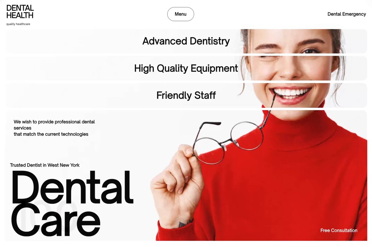
### 区块 1 - HERO

**容器:**`<section>`、`h-screen w-full overflow-hidden flex flex-col`、`pt-24 md:pt-24 px-3 md:px-5 pb-1.5 md:pb-2 gap-1.5 md:gap-2`

同时将 `section1Ref` 和 `s1Reveal.containerRef` 绑定到该元素。

通过 MaskedCard 技术使用 `HERO_IMAGE` 作为共享背景。

**3 个功能条**(从 `featureBars` 数组映射):
- 每个都是 MaskedCard,使用:`w-full h-14 md:h-20 shrink-0 rounded-xl md:rounded-2xl overflow-hidden relative`
- 使用 `s1Reveal.getAnimStyle(i)` 动画,i=0、1、2
- 内容:span 在垂直和水平方向居中(`flex items-center justify-center h-full`),使用 `text-black text-lg md:text-3xl font-bold text-center`,并置于 `relative z-10`

**主 Hero 卡片**(第 4 张卡,index 3):
- MaskedCard:`w-full flex-1 min-h-0 rounded-xl md:rounded-2xl overflow-hidden relative`
- 使用 `s1Reveal.getAnimStyle(3)` 动画
- **左上文字:**`absolute top-4 left-4 md:top-7 md:left-7`、`text-black text-xs md:text-sm font-semibold leading-4 md:leading-5 max-w-[200px] md:max-w-[300px] z-10`
- 内容:“We wish to provide professional dental services” `<br/>` “that match the current technologies”
- **左下区块:**`absolute bottom-5 left-3 md:bottom-8 md:left-4 z-10`
- 标签:`block text-black text-xs md:text-sm font-semibold mb-1 md:mb-2`,文字为“Trusted Dentist in West New York”
- 标题:`<h1>`,使用 `text-black text-[clamp(3rem,11vw,11rem)] font-bold leading-[0.79] tracking-tight`,内容为:“Dental” `<br/>` “Care”
- **右下文字:**`absolute bottom-6 right-4 md:bottom-10 md:right-8`、`text-white text-xs md:text-sm font-semibold z-10`,内容为“Free Consultation”

---

### 区块 2 - SMILE GALLERY

**容器:**`<section>`、`min-h-screen md:h-screen w-full overflow-hidden flex flex-col`、`pt-1.5 md:pt-2 px-3 md:px-5 pb-1.5 md:pb-2 gap-1.5 md:gap-2`

同时将 `section2Ref` 和 `s2Reveal.containerRef` 绑定到该元素。

通过 MaskedCard 技术使用 `SECTION2_IMAGE` 作为共享背景。

**网格容器:**`flex-1 min-h-0 grid grid-cols-1 md:grid-cols-2 grid-rows-[auto_auto_auto_auto] md:grid-rows-[1fr_1fr_0.8fr] gap-1.5 md:gap-2`

**卡片 0 - 左上(“Smile Gallery”):**
- MaskedCard:`rounded-xl md:rounded-2xl overflow-hidden relative min-h-[160px] md:min-h-0`
- 动画:`s2Reveal.getAnimStyle(0)`
- 标题:`absolute top-4 left-5 md:top-6 md:left-7`、`text-white md:text-black text-2xl md:text-3xl font-bold z-10`,文字为“Smile Gallery”
- 副标题:`absolute bottom-4 left-5 md:bottom-6 md:left-7`、`text-white md:text-black text-xs md:text-sm font-semibold z-10`,文字为“Our cosmetic dental work”

**卡片 1 - 右上(桌面端跨 2 行):**
- MaskedCard:`md:row-span-2 rounded-xl md:rounded-2xl overflow-hidden relative min-h-[200px] md:min-h-0`
- 动画:`s2Reveal.getAnimStyle(1)`
- 文字:`absolute bottom-16 left-5 md:bottom-20 md:left-7`、`text-white text-xs md:text-sm font-semibold leading-4 md:leading-5 z-10`,内容:“If you want a gorgeous smile,” `<br/>` “call us to ask about a smile makeover.”
- 按钮:`absolute bottom-4 right-4 md:bottom-6 md:right-6`、`px-5 py-3 md:px-8 md:py-5 bg-white rounded-full text-black text-base md:text-xl font-bold z-10 hover:scale-105 transition-transform`,文字为“Call Us”

**卡片 2 - 左下(“Smile makeover”):**
- MaskedCard:`rounded-xl md:rounded-2xl overflow-hidden relative min-h-[160px] md:min-h-0`
- 动画:`s2Reveal.getAnimStyle(2)`
- 标题:`absolute top-4 left-5 md:top-6 md:left-7`、`text-white md:text-black text-[clamp(3rem,7vw,6rem)] font-bold leading-[0.9] z-10`,内容为“Smile” `<br/>` “makeover”

**卡片 3 - 底部全宽(服务):**
- MaskedCard:`col-span-1 md:col-span-2 rounded-xl md:rounded-2xl overflow-hidden relative min-h-[200px] md:min-h-0`
- 动画:`s2Reveal.getAnimStyle(3)`
- 内部容器:`absolute inset-0 z-10 flex flex-wrap md:flex-nowrap gap-1.5 md:gap-2 p-2 md:p-3`
- 从 `services` 数组映射 4 张服务子卡片:
- 容器:`flex-1 min-w-[calc(50%-4px)] md:min-w-0 rounded-xl md:rounded-2xl p-3 md:p-5 flex flex-col justify-between`
- 激活态:`bg-white/90 backdrop-blur-md`
- 未激活态:`bg-white/20 backdrop-blur-xl`
- 服务名称:`<h3>` 使用 `text-xl md:text-4xl font-bold leading-[1.05] whitespace-pre-line`,颜色为 active=`text-black`、inactive=`text-white`
- 如果 `svc.num` 存在,数字徽章:`self-end w-8 h-8 md:w-12 md:h-12 rounded-full border flex items-center justify-center text-xs md:text-sm font-semibold`
- 激活态:`border-black text-black`
- 未激活态:`border-white text-white`

---

### 区块 3 - IMPLANT DENTISTRY

**容器:**`<section>`、`min-h-screen md:h-screen w-full overflow-hidden flex flex-col`、`pt-1.5 md:pt-2 px-3 md:px-5 pb-1.5 md:pb-2 gap-1.5 md:gap-2`

将 `s3Reveal.containerRef` 绑定到该元素。

不使用 MaskedCard 技术。使用普通 `<img>` 标签和纯色背景。

**网格:**`flex-1 min-h-0 grid grid-cols-1 md:grid-cols-2 gap-1.5 md:gap-2`

#### 左列:`flex flex-col gap-1.5 md:gap-2`

**1. 标题卡片:**
- `<div>`:`rounded-xl md:rounded-2xl bg-stone-50 p-5 md:p-7 flex flex-col justify-between flex-[1.2] min-h-[180px] md:min-h-0`
- 动画:`s3Reveal.getAnimStyle(0)`
- 标题:`<h2>` 使用 `text-[clamp(3rem,7vw,6.5rem)] font-bold leading-[0.95] text-black`,内容为“Implant” `<br/>` “Dentistry”
- 副标题:`<p>` 使用 `text-xs md:text-sm font-semibold text-black`,文字为“Restore Missing Teeth”

**2. 两张并排图片卡片:**
- Wrapper:`<div>` 使用 `flex gap-1.5 md:gap-2 flex-1 min-h-[140px] md:min-h-0`
- 动画:`s3Reveal.getAnimStyle(1)`
- 左图:`<div className="flex-1 rounded-xl md:rounded-2xl overflow-hidden"><img src={SECTION3_IMG1} alt="Dental implant procedure" className="w-full h-full object-cover" /></div>`
- 右图:`<div className="flex-1 rounded-xl md:rounded-2xl overflow-hidden"><img src={SECTION3_IMG2} alt="Dental restoration" className="w-full h-full object-cover" /></div>`

**3. 咨询卡片:**
- `<div>`:`rounded-xl md:rounded-2xl bg-zinc-200 p-5 md:p-7 flex items-end justify-between flex-[0.8] min-h-[160px] md:min-h-0`
- 动画:`s3Reveal.getAnimStyle(2)`
- 左侧内容区块:
- 标签:`<p>` 使用 `text-xs md:text-sm font-semibold text-black mb-2 md:mb-3`,文字为“Consultation”
- 标题:`<h3>` 使用 `text-xl md:text-3xl font-bold text-black leading-6 md:leading-8`,内容为“Dental” `<br/>` “Restoration” `<br/>` “Services”
- 按钮:`px-5 py-3 md:px-8 md:py-5 bg-white rounded-full text-black text-base md:text-xl font-bold hover:scale-105 transition-transform`,文字为“Book Online”

#### 右列:单张高大的图片卡片

- `<div>`:`rounded-xl md:rounded-2xl overflow-hidden relative min-h-[350px] md:min-h-0`
- 动画:`s3Reveal.getAnimStyle(3)`
- 背景图片:`<img src={SECTION3_BG} alt="Smiling patient" className="w-full h-full object-cover" />`
- **叠加层容器:**`absolute bottom-3 left-3 right-3 md:bottom-5 md:left-5 md:right-5 flex gap-1.5 md:gap-2`

**叠加卡片 1(左侧白色):**
- `flex-1 bg-white rounded-xl md:rounded-2xl p-3 md:p-5 flex flex-col justify-between h-36 md:h-52`
- 标题:`<h4>` 使用 `text-lg md:text-2xl font-bold text-black leading-5 md:leading-7`,内容为“The Process” `<br/>` “of Installing” `<br/>` “Implants”
- 箭头图标:`self-end w-9 h-9 md:w-12 md:h-12 rounded-full border border-black flex items-center justify-center`
- SVG:`width="14" height="14" viewBox="0 0 14 14" fill="none"`,class 为 `rotate-[-45deg]`
- Path:`d="M1 7h12m0 0L8 2m5 5L8 12"`,使用 `stroke="currentColor" strokeWidth="1.5" strokeLinecap="round" strokeLinejoin="round"`

**叠加卡片 2(右侧玻璃拟态):**
- `flex-1 bg-white/20 backdrop-blur-xl rounded-xl md:rounded-2xl p-3 md:p-5 flex flex-col justify-between h-36 md:h-52`
- 标题:`<h4>` 使用 `text-lg md:text-2xl font-bold text-white leading-5 md:leading-7`,内容为“Caring” `<br/>` “for Dental” `<br/>` “Implants”
- 箭头图标:`self-end w-9 h-9 md:w-12 md:h-12 rounded-full border border-white flex items-center justify-center`
- 使用同一个 SVG,但额外添加 class `text-white`

---

### 外层 Wrapper

整个应用包裹在 `<div className="bg-white">` 中,内容包含:
1. `{showSplash && <SplashScreen />}`(条件渲染)
2. `<Navbar />`
3. 区块 1
4. 区块 2
5. 区块 3

---

### 关键设计规则

- **区块间距:**每个区块只使用 `pb-1.5 md:pb-2`,第 2、3 区块使用 `pt-1.5 md:pt-2`,整体几乎无缝衔接。
- **边框圆角:**所有卡片使用 `rounded-xl md:rounded-2xl` 和 `overflow-hidden`。
- **配色:**严格使用黑色、白色和半透明白色(`bg-white/20`、`bg-white/90`),配合 `backdrop-blur-md` 或 `backdrop-blur-xl`。
- **背景填充:**区块 3 使用 `bg-stone-50` 和 `bg-zinc-200` 纯色卡片。
- **字体:**粗重的 bold/extrabold,标题使用 `clamp()` 响应式尺寸,leading 极其紧凑(0.79、0.9、0.95、1.05)。
- **交互:**CTA 按钮使用 `hover:scale-105 transition-transform`。
- **响应式:**只使用一个 `md:`(768px)断点。移动端堆叠,桌面端使用网格。
- **除 React 和 Tailwind 外不要使用其他外部包。**
原文提示词(English)
This design was submited by Nixtio Agency.

Access ALL prompts for stunning animated websites in one click:

---

## PROMPT: Recreate Dental Health Landing Page

Create a single-page dental clinic landing page using **React + Vite + TypeScript + Tailwind CSS**. No external UI libraries, no icon libraries. Everything lives in one `App.tsx` file. The page has 3 full-screen sections, a splash screen, and a fixed navbar.

---

### SETUP

**Font:** "Open Sauce One" loaded via these exact links in `index.html` `<head>`:
```html
<link href="" rel="stylesheet">
<link href="" rel="stylesheet">
```

**Title:** "Dental Health - Quality Healthcare"

**Global CSS (index.css):**
```css
@tailwind base;
@tailwind components;
@tailwind utilities;

@layer base {
html, body, #root {
height: 100%;
margin: 0;
padding: 0;
}
body {
font-family: 'Open Sauce One', -apple-system, BlinkMacSystemFont, sans-serif;
-webkit-font-smoothing: antialiased;
-moz-osx-font-smoothing: grayscale;
}
}
```

**Tailwind config:** Default, no extensions. Content: `['./index.html', './src/**/*.{js,ts,jsx,tsx}']`.

---

### IMAGE URLS (use these EXACT URLs)

```ts
const HERO_IMAGE = '';

const SECTION2_IMAGE = '';

const SECTION3_IMG1 = '';

const SECTION3_IMG2 = '';

const SECTION3_BG = '';
```

---

### DATA CONSTANTS

```ts
const featureBars = ['Advanced Dentistry', 'High Quality Equipment', 'Friendly Staff'];

const services = [
{ name: 'Dental
Veneers', num: '01', active: true },
{ name: 'Dental
Crowns', num: '02', active: false },
{ name: 'Teeth
Whitening', num: '03', active: false },
{ name: 'Dental
Implants', num: null, active: false },
];
```

---

### CORE TECHNICAL CONCEPT: "MASKED CARDS"

Sections 1 and 2 use a single large background image shared across multiple cards. Each card shows a different "window" into the same image, creating a cohesive mosaic effect. Implementation:

**`useMaskPositions` hook:**
- Takes a ref to the section container and a ref to an array of card elements.
- Uses `ResizeObserver` on the section container.
- For each card, computes `{ x, y, sw, sh }` where x/y is the card's top-left offset relative to the section, sw/sh is the section's width/height.

**`useImageWidth` hook:**
- Loads the image in a `new Image()` object.
- Calculates: `renderWidth = img.naturalWidth * (sectionHeight / img.naturalHeight)`.
- Returns how wide the image would be if scaled to fill the section height.

**`MaskedCard` component:**
- Props: `bgImage`, `position` (from useMaskPositions), `imageWidth` (from useImageWidth), `focalX` (0-1 float), `className`, `children`, `cardRef`, `style`.
- Calculates `overflow = imageWidth > position.sw ? imageWidth - position.sw : 0`, then `focalOffset = overflow * focalX`.
- Applies inline style:
```
backgroundImage: url(bgImage)
backgroundSize: auto []px
backgroundPosition: -[position.x + focalOffset]px -[position.y]px
backgroundRepeat: no-repeat
```
- `focalX` values: Section 1 mobile=0.7, desktop=0.8. Section 2 mobile=0.65, desktop=0.8.

**`useIsMobile` hook:**
- Listens to `window.matchMedia('(max-width: 767px)')` change events.
- Returns boolean.

---

### ANIMATION: `useStaggeredReveal` hook

- Takes `count` (number of elements) and `threshold` (IntersectionObserver threshold, default 0.15).
- Returns `{ containerRef, getAnimStyle }`.
- `containerRef` is attached to the section; when it crosses the threshold, `visible` becomes true (fires once).
- `getAnimStyle(index)` returns:
```css
opacity: visible ? 1 : 0
transform: visible ? 'translateY(0)' : 'translateY(24px)'
transition: opacity 0.6s cubic-bezier(0.16,1,0.3,1) [index*120]ms,
transform 0.6s cubic-bezier(0.16,1,0.3,1) [index*120]ms
```

---

### SPLASH SCREEN

- Fixed overlay covering viewport, `z-[100]`, white background.
- Number counter displayed at **bottom-left** (`items-end justify-start`).
- Counter style: `text-7xl md:text-9xl font-bold tabular-nums p-6 md:p-10 leading-none`, black text.
- Counts from 0 to 100 over exactly 2000ms (20ms per step, 100 steps).
- After reaching 100: wait 200ms, then set `exiting=true` which triggers `opacity-0` with `transition-opacity duration-700`.
- After 900ms total from reaching 100, call `onComplete()` which removes splash from DOM.

---

### NAVBAR

**Container:** `fixed top-0 left-0 right-0 z-50`, `flex items-center justify-between`, `px-4 md:px-6 py-2 md:py-3`, `bg-white/80 backdrop-blur-md`.

**Logo (left side):**
- Two lines stacked: "Dental" and "Health"
- Wrapper: `flex flex-col`
- Text: `text-xl md:text-2xl font-extrabold uppercase tracking-tight leading-none`
- Second line has `-mt-1.5 md:-mt-2` for tight spacing
- Below logo text: "quality healthcare" in `text-[8px] md:text-[9px] font-medium leading-none mt-1.5 md:mt-2`

**Desktop nav (hidden on mobile with `hidden md:block`):**
- "Menu" button: `px-6 py-3 bg-white rounded-full border border-black text-sm font-semibold`, hover: `hover:bg-black hover:text-white transition-colors duration-200`
- "Dental Emergency" text: `text-sm font-semibold text-black`

**Mobile hamburger (visible only on mobile with `md:hidden`):**
- Container: `w-10 h-10 flex items-center justify-center`, `relative`
- 3 spans, each: `absolute h-0.5 w-6 bg-black rounded-full`
- Transition: `transition-all duration-300 ease-[cubic-bezier(0.76,0,0.24,1)]`
- Closed state: top span `-translate-y-2`, middle `opacity-100 scale-x-100`, bottom `translate-y-2`
- Open state: top `rotate-45 translate-y-0`, middle `opacity-0 scale-x-0`, bottom `-rotate-45 translate-y-0`

**Mobile menu overlay (`md:hidden`):**
- Outer: `fixed inset-0 z-40`, pointer-events toggled based on open state
- Backdrop: `absolute inset-0 bg-black/20 backdrop-blur-sm`, fades opacity. Clicking closes menu.
- Panel: `absolute top-0 right-0 h-full w-[85%] max-w-sm bg-white shadow-2xl`, slides with `translate-x-0` (open) / `translate-x-full` (closed), `duration-500 ease-[cubic-bezier(0.76,0,0.24,1)]`
- Content: `flex flex-col justify-center h-full px-8 gap-1`
- Nav links: ['Home', 'Services', 'About', 'Gallery', 'Contact']
- Each: `text-4xl font-bold text-black hover:text-neutral-500`
- Staggered entrance: `opacity-0 translate-x-8` -> `opacity-100 translate-x-0`, `transitionDelay: ${100 + i * 60}ms` when open
- `transition-all duration-500 ease-[cubic-bezier(0.76,0,0.24,1)]`
- Bottom section: `mt-8 pt-8 border-t border-neutral-200`, delayed 450ms
- "Dental Emergency" text: `text-sm font-semibold text-black mb-4`
- Button: `w-full px-6 py-4 bg-black rounded-full text-white text-sm font-semibold hover:bg-neutral-800 transition-colors duration-200`, text "Book Appointment"
- When open: `.overflow = 'hidden'`. Cleanup on unmount.

---

### SECTION 1 - HERO

**Container:** `<section>`, `h-screen w-full overflow-hidden flex flex-col`, `pt-24 md:pt-24 px-3 md:px-5 pb-1.5 md:pb-2 gap-1.5 md:gap-2`

Attach both `section1Ref` and `s1Reveal.containerRef` to this element.

Uses `HERO_IMAGE` as shared background via MaskedCard technique.

**3 Feature Bars** (mapped from `featureBars` array):
- Each is a `MaskedCard` with: `w-full h-14 md:h-20 shrink-0 rounded-xl md:rounded-2xl overflow-hidden relative`
- Animated with `s1Reveal.getAnimStyle(i)` for i=0,1,2
- Content: `<span>` centered vertically and horizontally (`flex items-center justify-center h-full`), `text-black text-lg md:text-3xl font-bold text-center`, `relative z-10`

**Main Hero Card** (4th card, index 3):
- `MaskedCard`: `w-full flex-1 min-h-0 rounded-xl md:rounded-2xl overflow-hidden relative`
- Animated with `s1Reveal.getAnimStyle(3)`
- **Top-left text:** `absolute top-4 left-4 md:top-7 md:left-7`, `text-black text-xs md:text-sm font-semibold leading-4 md:leading-5 max-w-[200px] md:max-w-[300px] z-10`
- Content: "We wish to provide professional dental services" `<br/>` "that match the current technologies"
- **Bottom-left block:** `absolute bottom-5 left-3 md:bottom-8 md:left-4 z-10`
- Label: `block text-black text-xs md:text-sm font-semibold mb-1 md:mb-2`, text "Trusted Dentist in West New York"
- Heading: `<h1>` with `text-black text-[clamp(3rem,11vw,11rem)] font-bold leading-[0.79] tracking-tight`, content: "Dental" `<br/>` "Care"
- **Bottom-right text:** `absolute bottom-6 right-4 md:bottom-10 md:right-8`, `text-white text-xs md:text-sm font-semibold z-10`, content: "Free Consultation"

---

### SECTION 2 - SMILE GALLERY

**Container:** `<section>`, `min-h-screen md:h-screen w-full overflow-hidden flex flex-col`, `pt-1.5 md:pt-2 px-3 md:px-5 pb-1.5 md:pb-2 gap-1.5 md:gap-2`

Attach both `section2Ref` and `s2Reveal.containerRef` to this element.

Uses `SECTION2_IMAGE` as shared background via MaskedCard technique.

**Grid container:** `flex-1 min-h-0 grid grid-cols-1 md:grid-cols-2 grid-rows-[auto_auto_auto_auto] md:grid-rows-[1fr_1fr_0.8fr] gap-1.5 md:gap-2`

**Card 0 - Top Left ("Smile Gallery"):**
- `MaskedCard`: `rounded-xl md:rounded-2xl overflow-hidden relative min-h-[160px] md:min-h-0`
- Animated: `s2Reveal.getAnimStyle(0)`
- Heading: `absolute top-4 left-5 md:top-6 md:left-7`, `text-white md:text-black text-2xl md:text-3xl font-bold z-10`, text "Smile Gallery"
- Subtitle: `absolute bottom-4 left-5 md:bottom-6 md:left-7`, `text-white md:text-black text-xs md:text-sm font-semibold z-10`, text "Our cosmetic dental work"

**Card 1 - Top Right (spans 2 rows on desktop):**
- `MaskedCard`: `md:row-span-2 rounded-xl md:rounded-2xl overflow-hidden relative min-h-[200px] md:min-h-0`
- Animated: `s2Reveal.getAnimStyle(1)`
- Text: `absolute bottom-16 left-5 md:bottom-20 md:left-7`, `text-white text-xs md:text-sm font-semibold leading-4 md:leading-5 z-10`, content: "If you want a gorgeous smile," `<br/>` "call us to ask about a smile makeover."
- Button: `absolute bottom-4 right-4 md:bottom-6 md:right-6`, `px-5 py-3 md:px-8 md:py-5 bg-white rounded-full text-black text-base md:text-xl font-bold z-10 hover:scale-105 transition-transform`, text "Call Us"

**Card 2 - Bottom Left ("Smile makeover"):**
- `MaskedCard`: `rounded-xl md:rounded-2xl overflow-hidden relative min-h-[160px] md:min-h-0`
- Animated: `s2Reveal.getAnimStyle(2)`
- Heading: `absolute top-4 left-5 md:top-6 md:left-7`, `text-white md:text-black text-[clamp(3rem,7vw,6rem)] font-bold leading-[0.9] z-10`, content: "Smile" `<br/>` "makeover"

**Card 3 - Bottom Full Width (Services):**
- `MaskedCard`: `col-span-1 md:col-span-2 rounded-xl md:rounded-2xl overflow-hidden relative min-h-[200px] md:min-h-0`
- Animated: `s2Reveal.getAnimStyle(3)`
- Inner container: `absolute inset-0 z-10 flex flex-wrap md:flex-nowrap gap-1.5 md:gap-2 p-2 md:p-3`
- 4 service sub-cards mapped from `services` array:
- Container: `flex-1 min-w-[calc(50%-4px)] md:min-w-0 rounded-xl md:rounded-2xl p-3 md:p-5 flex flex-col justify-between`
- Active: `bg-white/90 backdrop-blur-md`
- Inactive: `bg-white/20 backdrop-blur-xl`
- Service name: `<h3>` with `text-xl md:text-4xl font-bold leading-[1.05] whitespace-pre-line`, color: active=`text-black`, inactive=`text-white`
- Number badge (if `svc.num` exists): `self-end w-8 h-8 md:w-12 md:h-12 rounded-full border flex items-center justify-center text-xs md:text-sm font-semibold`
- Active: `border-black text-black`
- Inactive: `border-white text-white`

---

### SECTION 3 - IMPLANT DENTISTRY

**Container:** `<section>`, `min-h-screen md:h-screen w-full overflow-hidden flex flex-col`, `pt-1.5 md:pt-2 px-3 md:px-5 pb-1.5 md:pb-2 gap-1.5 md:gap-2`

Attach `s3Reveal.containerRef` to this element.

Does NOT use MaskedCard technique. Uses regular `<img>` tags and solid backgrounds.

**Grid:** `flex-1 min-h-0 grid grid-cols-1 md:grid-cols-2 gap-1.5 md:gap-2`

#### LEFT COLUMN: `flex flex-col gap-1.5 md:gap-2`

**1. Heading Card:**
- `<div>`: `rounded-xl md:rounded-2xl bg-stone-50 p-5 md:p-7 flex flex-col justify-between flex-[1.2] min-h-[180px] md:min-h-0`
- Animated: `s3Reveal.getAnimStyle(0)`
- Heading: `<h2>` with `text-[clamp(3rem,7vw,6.5rem)] font-bold leading-[0.95] text-black`, content: "Implant" `<br/>` "Dentistry"
- Subtitle: `<p>` with `text-xs md:text-sm font-semibold text-black`, text "Restore Missing Teeth"

**2. Two Image Cards (side by side):**
- Wrapper: `<div>` with `flex gap-1.5 md:gap-2 flex-1 min-h-[140px] md:min-h-0`
- Animated: `s3Reveal.getAnimStyle(1)`
- Left image: `<div className="flex-1 rounded-xl md:rounded-2xl overflow-hidden"><img src={SECTION3_IMG1} alt="Dental implant procedure" className="w-full h-full object-cover" /></div>`
- Right image: `<div className="flex-1 rounded-xl md:rounded-2xl overflow-hidden"><img src={SECTION3_IMG2} alt="Dental restoration" className="w-full h-full object-cover" /></div>`

**3. Consultation Card:**
- `<div>`: `rounded-xl md:rounded-2xl bg-zinc-200 p-5 md:p-7 flex items-end justify-between flex-[0.8] min-h-[160px] md:min-h-0`
- Animated: `s3Reveal.getAnimStyle(2)`
- Left content block:
- Label: `<p>` with `text-xs md:text-sm font-semibold text-black mb-2 md:mb-3`, text "Consultation"
- Heading: `<h3>` with `text-xl md:text-3xl font-bold text-black leading-6 md:leading-8`, content: "Dental" `<br/>` "Restoration" `<br/>` "Services"
- Button: `px-5 py-3 md:px-8 md:py-5 bg-white rounded-full text-black text-base md:text-xl font-bold hover:scale-105 transition-transform`, text "Book Online"

#### RIGHT COLUMN: Single tall image card

- `<div>`: `rounded-xl md:rounded-2xl overflow-hidden relative min-h-[350px] md:min-h-0`
- Animated: `s3Reveal.getAnimStyle(3)`
- Background image: `<img src={SECTION3_BG} alt="Smiling patient" className="w-full h-full object-cover" />`
- **Overlay container:** `absolute bottom-3 left-3 right-3 md:bottom-5 md:left-5 md:right-5 flex gap-1.5 md:gap-2`

**Overlay Card 1 (white, left):**
- `flex-1 bg-white rounded-xl md:rounded-2xl p-3 md:p-5 flex flex-col justify-between h-36 md:h-52`
- Heading: `<h4>` with `text-lg md:text-2xl font-bold text-black leading-5 md:leading-7`, content: "The Process" `<br/>` "of Installing" `<br/>` "Implants"
- Arrow icon: `self-end w-9 h-9 md:w-12 md:h-12 rounded-full border border-black flex items-center justify-center`
- SVG: `width="14" height="14" viewBox="0 0 14 14" fill="none"`, class `rotate-[-45deg]`
- Path: `d="M1 7h12m0 0L8 2m5 5L8 12"` with `stroke="currentColor" strokeWidth="1.5" strokeLinecap="round" strokeLinejoin="round"`

**Overlay Card 2 (glass, right):**
- `flex-1 bg-white/20 backdrop-blur-xl rounded-xl md:rounded-2xl p-3 md:p-5 flex flex-col justify-between h-36 md:h-52`
- Heading: `<h4>` with `text-lg md:text-2xl font-bold text-white leading-5 md:leading-7`, content: "Caring" `<br/>` "for Dental" `<br/>` "Implants"
- Arrow icon: `self-end w-9 h-9 md:w-12 md:h-12 rounded-full border border-white flex items-center justify-center`
- Same SVG as above but with added class `text-white`

---

### OUTER WRAPPER

The entire app is wrapped in `<div className="bg-white">` containing:
1. `{showSplash && <SplashScreen />}` (conditionally rendered)
2. `<Navbar />`
3. Section 1
4. Section 2
5. Section 3

---

### KEY DESIGN RULES

- **Spacing between sections:** Only `pb-1.5 md:pb-2` on each section and `pt-1.5 md:pt-2` on sections 2 and 3 -- virtually seamless.
- **Border radius:** All cards use `rounded-xl md:rounded-2xl` with `overflow-hidden`.
- **Color palette:** Strictly black, white, and translucent white (`bg-white/20`, `bg-white/90`) with `backdrop-blur-md` or `backdrop-blur-xl`.
- **Background fills:** `bg-stone-50` and `bg-zinc-200` for Section 3 solid cards.
- **Typography:** Heavy bold/extrabold, `clamp()` for responsive headings, extremely tight leading (0.79, 0.9, 0.95, 1.05).
- **Interactions:** `hover:scale-105 transition-transform` on CTA buttons.
- **Responsive:** Single `md:` (768px) breakpoint. Stacked on mobile, grid on desktop.
- **No external packages** beyond React and Tailwind.
建议模型
Gemini · AntiGravity · React
视频地址
https://media.goodcase.ai/media/video/gemini-antigravity-87b7fea47629.mp4