


































提示词
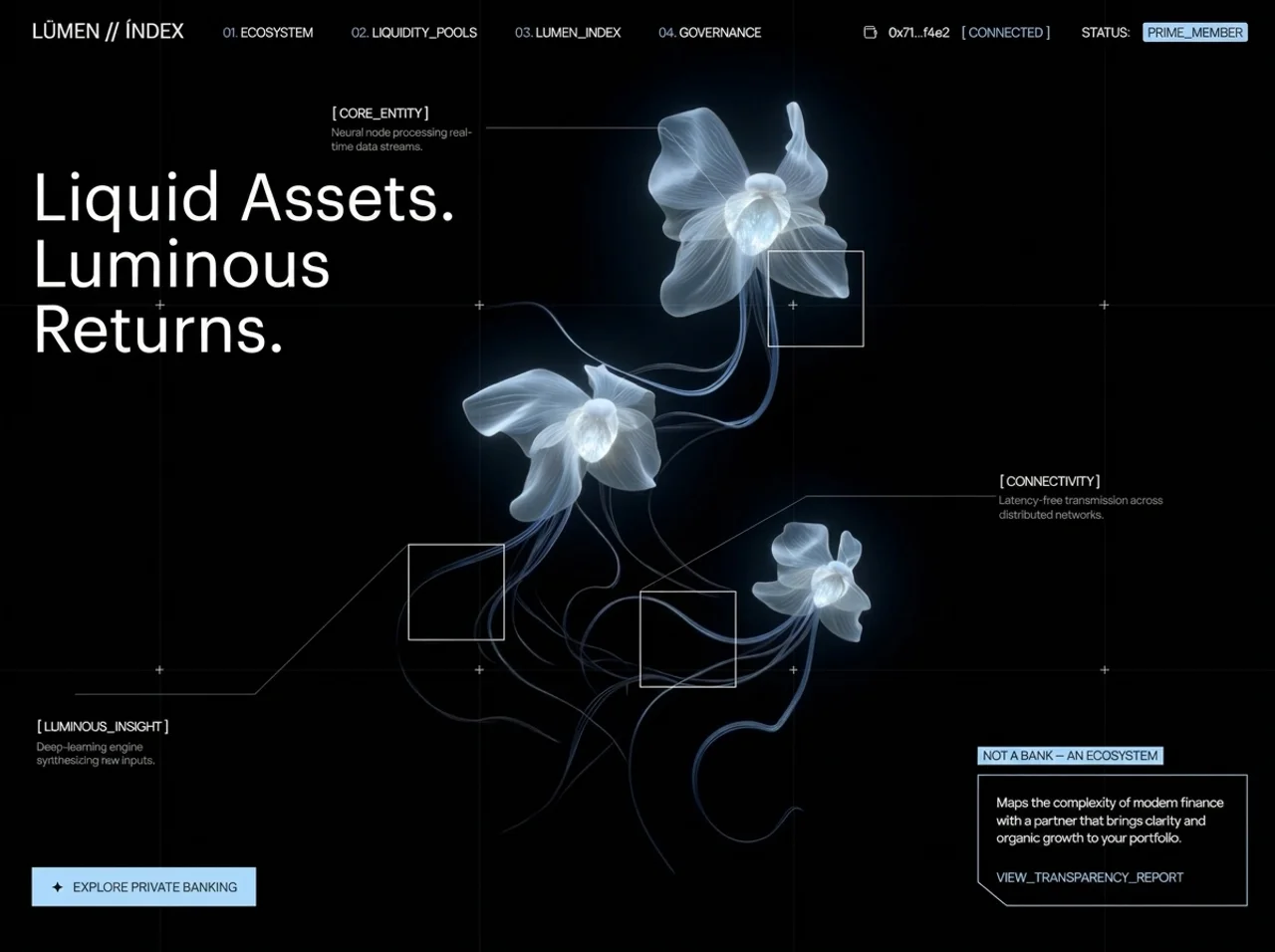
为名为 **LŪMEN // ÍNDEX** 的 DeFi / 私人银行落地页构建一个**全屏单一 hero section**。使用 **React 18 + TypeScript + Vite + Tailwind CSS**,图标使用 `lucide-react`。整个页面由一个组件渲染一个填满视口的 `<section>`——不可滚动,不得包含其他 section。

## 0. 项目设置

依赖:`react@^18.3.1`、`react-dom@^18.3.1`、`lucide-react@^0.446.0`。开发依赖:`vite@^5.4.2`、`@vitejs/plugin-react`、`tailwindcss@^3.4.1`、`postcss`、`autoprefixer`、`typescript@^5.5.3`。

`tailwind.config.js`——主题保持完全不扩展。此设计几乎所有值都使用任意值类(`text-[13px]`、`bg-[#AFDDFF]`、`px-[35px]`),因此不需要自定义主题 token:

```js
/** @type {import('tailwindcss').Config} */
export default {
  content: ['./index.html', './src/**/*.{js,ts,jsx,tsx}'],
  theme: { extend: {} },
  plugins: [],
};
```

`src/main.tsx` 在 `<StrictMode>` 中将 `<App />` 挂载到 `#root`,并导入 `./index.css`。

## 1. `index.html`——字体和元数据

页面标题必须是 `LŪMEN // ÍNDEX`(U 带长音符,I 带尖音符)。在 `<head>` 中按以下顺序加载**两种**字体:

```html
<!doctype html>
<html lang="en">
  <head>
    <meta charset="UTF-8" />
    <link rel="icon" type="image/svg+xml" href="/vite.svg" />
    <meta name="viewport" content="width=device-width, initial-scale=1.0" />
    <title>LŪMEN // ÍNDEX</title>
    <link href="https://db.onlinewebfonts.com/c/ca3d10781128664daddf89bf2e2d1305?family=Graphik+LCG+Regular+Regular" rel="stylesheet">
    <link href="https://fonts.googleapis.com/css2?family=Manrope:wght@400;500&display=swap" rel="stylesheet">
  </head>
  <body>
    <div id="root"></div>
    <script type="module" src="/src/main.tsx"></script>
  </body>
</html>
```

- **展示字体**——`Graphik LCG Regular Regular`(回退字体栈为 `'Graphik LCG', sans-serif`)。仅用于 logo 字标和 H1。
- **UI 字体**——`Manrope`,字重 400 和 500。用于其他所有内容——导航项、钱包条、节点标签、正文和 CTA。

## 2. 设计 token

| Token | 值 | 用途 |
|---|---|---|
| 强调色(冰蓝色) | `#AFDDFF` | 导航数字、`[ CONNECTED ]`、徽章填充、CTA 背景、polygon 描边、链接文本 |
| 强调色 hover | `#c8e8ff` | 仅用于 CTA hover 背景 |
| 页面背景 | `#000`(纯黑) | body + section |
| 主要文本 | `#FFFFFF` | |
| 弱化文本 | `rgba(255,255,255,0.5)`(`text-white/50`) | 节点描述段落 |
| 导航数字色调 | 80% 的 `#AFDDFF`(`text-[#AFDDFF]/80`) | `01.` `02.` 前缀 |
| 网格线 | `rgba(255,255,255,0.04)`(`bg-white/[0.04]`) | 全出血网格 |
| 加号标记 | `rgba(255,255,255,0.7)`(`bg-white/70`) | 网格交点 |
| 节点边框 | `rgba(255,255,255,0.8)`(`border-white/80`) | 三个方块 |
| 连接线描边 | `rgba(255,255,255,0.25)` | SVG 线条 |
| 菜单分隔线 | `rgba(255,255,255,0.1)`(`border-white/10`) | 移动端菜单钱包区块顶部边框 |
| 菜单背景遮罩 | `rgba(0,0,0,0.9)` + `backdrop-blur-md` | 移动端覆盖层 |

始终一致地使用两条缓动曲线:
- **入场动画:**`cubic-bezier(0.16, 1, 0.3, 1)`(expo-out)
- **交互过渡(菜单、hamburger):**`cubic-bezier(0.76, 0, 0.24, 1)`(expo-in-out)

---

# 3. 间距系统——编写任何标记前请先阅读

## 3.1 全局 reset 会清除所有默认值

```css
* { margin: 0; padding: 0; box-sizing: border-box; }
```

这意味着页面上**每一处可见间距都必须显式声明。**没有继承的段落 margin,没有默认列表间距,也没有来自 UA stylesheet 的按钮 padding。如果存在间隙,它一定来自下表中的某个值。`box-sizing: border-box` 还意味着所有 `w-[…]`/`h-[…]` 值都*包含* padding 和 border。

## 3.2 页面 gutter(最重要的规则)

整个构图依赖一组**双值 gutter**:`md` 以下为 **20px**,`md` 及以上为 **35px**。四个不同元素分别声明同一 gutter,必须完全一致,否则布局对齐会明显错位:

| 元素 | 移动端 | `md`+(≥768px) |
|---|---|---|
| `<nav>` 水平 padding | `px-5` → 20px | `md:px-[35px]` → 35px |
| `<h1>` 左偏移 | `left-5` → 20px | `md:left-[35px]` → 35px |
| 底部行左偏移 | `left-5` → 20px | `md:left-[35px]` → 35px |
| 底部行右偏移 | `right-5` → 20px | `md:right-[35px]` → 35px |
| 移动端菜单面板 padding | `px-5` → 20px |(菜单在 `lg`+ 隐藏)|

导航使用 **padding**,而 H1 和底部行使用绝对定位的 `left`/`right` 偏移——机制不同,结果相同。字标、H1 的首字符和 CTA 按钮左边缘必须落在同一条垂直线上。

**垂直 gutter** 不对称——导航为 20/27px,底部行为 20/35px:

| 元素 | 移动端 | `md`+ |
|---|---|---|
| `<nav>` 垂直 padding | `py-5` → 20px | `md:py-[27px]` → 27px |
| 底部行底部偏移 | `bottom-5` → 20px | `md:bottom-[35px]` → 35px |

## 3.3 完整间距参考——页面中的每一个值

使用的 Tailwind 数值类(1 单位 = 4px):

| 类 | 计算值 | 位置 |
|---|---|---|
| `px-5` / `py-5` | 20px | 导航 padding、菜单面板水平 padding |
| `left-5` / `right-5` / `bottom-5` / `top-5` | 20px | H1 偏移、底部行偏移、菜单关闭按钮 |
| `gap-5` | 20px | 底部行间隙(移动端,堆叠)|
| `gap-3` | 12px | 移动端菜单行:数字 ↔ 标签 |
| `mb-3` | 12px | 移动端菜单钱包第 1 行底部 margin |
| `gap-8` | 32px | 移动端菜单导航列表垂直间隙 |
| `pt-10` / `pb-10` | 40px | 菜单钱包区块顶部 padding、菜单面板底部 padding |
| `pt-24` | 96px | 菜单面板顶部 padding |
| `mt-auto` | — | 将菜单钱包区块推到底部 |
| `ml-auto` | — | 将导航右侧组 / hamburger 推到右侧 |

使用的任意括号值:

| 值 | 位置 |
|---|---|
| `2px` | 垂直 padding——`PRIME_MEMBER` chip、`NOT A BANK` 徽章 |
| `3px` | 导航项数字与标签之间的间隙;chip 圆角半径 |
| `4px` | 每个节点描述段落上方的 `mt-[4px]` |
| `5px` | `PRIME_MEMBER` chip 的水平 padding |
| `6px` | `NOT A BANK — AN ECOSYSTEM` 徽章的水平 padding |
| `8px` | 移动端菜单钱包第 2 行的间隙(`STATUS:` ↔ chip)|
| `10px` | CTA 按钮内部间隙(星形 ↔ 标签);移动端菜单钱包第 1 行间隙;徽章底部 margin |
| `12px` | 导航右侧组间隙;`md`+ 的 CTA 垂直 padding |
| `16px` | 移动端 CTA 水平 padding |
| `18px` | `mb-[18px]`——信息卡段落底部 margin |
| `20px` | gutter;`STATUS:` 前的 `ml-[20px]`;信息卡正文 padding `p-[20px]`;`md`+ 的 CTA 水平 padding |
| `27px` | `md`+ 的导航垂直 padding |
| `35px` | `md`+ 的 gutter |
| `40px` | 导航左侧组间隙和导航链接间隙;hamburger/关闭按钮盒尺寸 |

## 3.4 没有 padding 或 margin 的元素

不要为这些元素添加间距——它们完全通过绝对坐标或 flex 定位:

- `<section>`、`<video>`、内容层 `<div>`
- 移动端菜单 wrapper 和 backdrop(均为 `inset-0`)
- `<h1>`(仅通过 `top`/`left` 定位)
- 所有网格线和加号标记
- `CentralNodes` 容器、全部三个方块和所有 connector SVG
- 节点标签 `<span>`(只有其同级 `<p>` 具有 `mt-[4px]`)
- 信息卡外层 wrapper(padding 位于内部 body div)

---

## 4. `src/index.css`——reset、字体类和 keyframes

```css
@tailwind base;
@tailwind components;
@tailwind utilities;

* { margin: 0; padding: 0; box-sizing: border-box; }
body { background: #000; overflow-x: hidden; }

.font-graphik { font-family: 'Graphik LCG Regular Regular', 'Graphik LCG', sans-serif; }
.font-manrope { font-family: 'Manrope', sans-serif; }

@keyframes fadeUp      { from { opacity: 0; transform: translateY(18px); }  to { opacity: 1; transform: translateY(0); } }
@keyframes fadeIn      { from { opacity: 0; }                                to { opacity: 1; } }
@keyframes slideInLeft { from { opacity: 0; transform: translateX(-20px); } to { opacity: 1; transform: translateX(0); } }
@keyframes slideInRight{ from { opacity: 0; transform: translateX(20px); }  to { opacity: 1; transform: translateX(0); } }
@keyframes scaleIn     { from { opacity: 0; transform: scale(0.85); }       to { opacity: 1; transform: scale(1); } }
@keyframes drawLine    { from { opacity: 0; stroke-dashoffset: 100; }       to { opacity: 1; stroke-dashoffset: 0; } }
@keyframes gridReveal  { from { opacity: 0; transform: scaleY(0); }         to { opacity: 1; transform: scaleY(1); } }
@keyframes gridRevealH { from { opacity: 0; transform: scaleX(0); }         to { opacity: 1; transform: scaleX(1); } }

.anim-fade-up     { opacity: 0; animation: fadeUp       0.9s cubic-bezier(0.16,1,0.3,1) forwards; }
.anim-fade-in     { opacity: 0; animation: fadeIn       0.8s cubic-bezier(0.16,1,0.3,1) forwards; }
.anim-slide-left  { opacity: 0; animation: slideInLeft  0.8s cubic-bezier(0.16,1,0.3,1) forwards; }
.anim-slide-right { opacity: 0; animation: slideInRight 0.8s cubic-bezier(0.16,1,0.3,1) forwards; }
.anim-scale-in    { opacity: 0; animation: scaleIn      0.7s cubic-bezier(0.16,1,0.3,1) forwards; }
.anim-grid-v      { opacity: 0; transform-origin: top;  animation: gridReveal  1.2s cubic-bezier(0.16,1,0.3,1) forwards; }
.anim-grid-h      { opacity: 0; transform-origin: left; animation: gridRevealH 1.2s cubic-bezier(0.16,1,0.3,1) forwards; }
.anim-draw-line   { stroke-dasharray: 100; stroke-dashoffset: 100; animation: drawLine 1s cubic-bezier(0.16,1,0.3,1) forwards; }
```

注意,动画 transform 距离本身也是间距决策:`fadeUp` 垂直移动 **18px**,slide 动画水平移动 **20px**,`scaleIn` 从 **0.85** 开始。每个动画元素都从 `opacity: 0` 开始,并使用 `forwards` 保持最终状态。错峰完全由内联 `style={{ animationDelay: 'Xms' }}` 驱动。

## 5. 根结构

```
<section class="relative w-full h-screen overflow-hidden bg-black">   ← 无 padding
  ├── <video>                          ← 第 0 层,absolute inset-0
  └── <div class="relative z-10 w-full h-full">   ← 内容层,无 padding
        ├── <nav>                      ← 顶部绝对定位条,px-5/35 py-5/27
        ├── 移动端菜单覆盖层           ← fixed inset-0 z-50
        ├── <h1>                       ← 绝对定位,无 padding
        ├── <GridLines />              ← 4 条垂直线 + 2 条水平线 + 8 个加号标记
        ├── <CentralNodes />           ← 3 个方块 + 3 个标签 + 6 条连接线
        └── 底部行                      ← 绝对定位,inset 20/35px
```

## 6. 背景视频(第 0 层)

全出血、自动播放、循环、静音的视频,采用 cover 适配,加载时淡入:

```jsx
<video
  className="absolute inset-0 w-full h-full object-cover anim-fade-in"
  src="https://d8j0ntlcm91z4.cloudfront.net/user_38xzZboKViGWJOttwIXH07lWA1P/hf_20260813_115057_94c3699b-0fd1-4124-bcf3-3626bb8c1f77.mp4"
  autoPlay
  muted
  loop
  playsInline
/>
```

使用该**精确的 CloudFront URL**。`muted` + `playsInline` 是必需项,否则 iOS/Chrome 会阻止自动播放。视频上方**没有深色覆盖层或渐变 scrim**——文本直接位于视频之上。

## 7. 顶部导航

```jsx
<nav className="absolute top-0 left-0 w-full flex items-center px-5 md:px-[35px] py-5 md:py-[27px]">
```

**导航间距图:**

| 属性 | 移动端 | `md`+ |
|---|---|---|
| 水平 padding | 20px | 35px |
| 垂直 padding | 20px | 27px |
| 导航总高度 | 20 + 21 + 20 = **61px** | 27 + 21 + 27 = **75px** |

(内容高度为 21px——字标的 `leading-[21px]`,即最高的子元素。)

**左侧组**——`flex items-center gap-[40px]`。40px 间隙将字标与导航链接容器分开。

1. **字标**——字面字符串 `LŪMEN // ÍNDEX`,class 为 `font-graphik text-white text-[18px] md:text-[21px] leading-[21px] whitespace-nowrap anim-fade-up`,延迟 **200ms**。无 margin 或 padding。
2. **导航链接**——`hidden lg:flex items-center gap-[40px]`。另一个 40px,这次位于四个项目中的每两个项目之间。四个 `NavItem` 组件:

| number | label | delay |
|---|---|---|
| 01 | ECOSYSTEM | 350ms |
| 02 | LIQUIDITY_POOLS | 450ms |
| 03 | LUMEN_INDEX | 550ms |
| 04 | GOVERNANCE | 650ms |

`NavItem({ number, label, delay })`——wrapper 为 `flex items-center gap-[3px] anim-fade-up`。**3px 间隙**刻意设得很紧,使 `01.` 看起来附着于标签,而不是独立项目。内部:数字 span 为 `font-manrope text-[#AFDDFF]/80 text-[13px] leading-[15.6px]`,渲染 `{number}.`(末尾句点);标签 span 为 `font-manrope text-white text-[13px] leading-[15.6px] cursor-pointer hover:text-[#AFDDFF] transition-colors`。

**右侧组**——`hidden lg:flex items-center gap-[12px] ml-auto anim-slide-right`,延迟 **600ms**。`ml-auto` 将其推到最右侧。统一的 **12px** 间隙分隔全部五个子元素,但有一个例外:

| # | 子元素 | 间距说明 |
|---|---|---|
| 1 | `<Wallet>` 图标,`w-[15px] h-[15px]`,`strokeWidth={1.5}` | — |
| 2 | `0x71...f4e2`——`font-manrope text-white text-[13px] leading-[15.6px]` | 距图标 12px |
| 3 | `[ CONNECTED ]`——相同,`text-[#AFDDFF]` | 12px |
| 4 | `STATUS:`——白色,**另加 `ml-[20px]`** | 12 + 20 = **32px** 有效间距——将该条带分成两个视觉群组 |
| 5 | `PRIME_MEMBER` chip | 12px |

**`PRIME_MEMBER` chip 盒模型:**`bg-[#AFDDFF] rounded-[3px] px-[5px] py-[2px]`,文本为 `text-black text-[13px] leading-[15.6px]`。渲染高度 = 2 + 15.6 + 2 = **19.6px**。这是整个页面中*唯一*的圆角元素。

**Hamburger 按钮**——`lg:hidden ml-auto relative w-[40px] h-[40px] flex items-center justify-center anim-fade-in`,延迟 **400ms**,`aria-label="Toggle menu"`,切换 `menuOpen`。**无 padding**——它是固定的 40×40 盒子,居中放置一个 22px 图标,因此每侧具有 9px 的视觉内缩和舒适的点击目标。它包含**两个绝对定位并叠放的 span**,通过旋转交叉淡化:

- Menu 图标 span:关闭时为 `opacity-100 rotate-0 scale-100` → 打开时为 `opacity-0 rotate-90 scale-50`
- X 图标 span:关闭时为 `opacity-0 -rotate-90 scale-50` → 打开时为 `opacity-100 rotate-0 scale-100`
- 两者均为:`absolute transition-all duration-300 ease-[cubic-bezier(0.76,0,0.24,1)]`,图标为 `w-[22px] h-[22px] text-white`、`strokeWidth={1.5}`

## 8. 移动端菜单覆盖层

Wrapper:`fixed inset-0 z-50 lg:hidden transition-all duration-500 ease-[cubic-bezier(0.76,0,0.24,1)]`,在 `visible` / `invisible` 之间切换——使用 visibility 而非 `hidden`,使退出过渡可以播放。无 padding。

**Backdrop:**`absolute inset-0 bg-black/90 backdrop-blur-md transition-opacity duration-500 ease-[cubic-bezier(0.76,0,0.24,1)]`,在 `opacity-100` ↔ `opacity-0` 之间切换,点击时关闭菜单。无 padding。

**Panel:**`relative h-full flex flex-col px-5 pt-24 pb-10 transition-all duration-500 ease-[...]`,在 `opacity-100 translate-y-0` ↔ `opacity-0 -translate-y-4`(16px)之间动画。

**面板间距图:**

| 边 | 值 | 原因 |
|---|---|---|
| 左 / 右 | `px-5` → 20px | 与页面 gutter 匹配 |
| 顶部 | `pt-24` → **96px** | 避开 61px 导航和关闭按钮,使第一个导航项从 header 下方足够远的位置开始 |
| 底部 | `pb-10` → 40px | 为钱包区块下方留出呼吸空间 |

- **关闭按钮:**`absolute top-5 right-5 w-[40px] h-[40px] flex items-center justify-center`,`aria-label="Close menu"`,包含一个 `w-[22px] h-[22px] text-white`、`strokeWidth={1.5}` 的 `<X>`。20px 的 top/right 偏移使其与所替代的 hamburger 对齐。
- **导航列表:**`flex flex-col gap-8` → **项目间 32px**。每一行均为 `transition-all duration-500 ease-[cubic-bezier(0.76,0,0.24,1)]`,在 `opacity-100 translate-x-0` ↔ `opacity-0 -translate-x-6`(24px)之间动画;打开时采用**错峰 `transitionDelay`:`${150 + i * 75}ms`,关闭时为 `0ms`**(依次进入,同时快速退出)。内部行:`flex items-center gap-3` → 数字与标签之间 **12px**。数字:`font-manrope text-[#AFDDFF]/80 text-[14px] leading-[1]`。标签:`font-manrope text-white text-[28px] leading-[1.2] tracking-tight`。
- **固定在底部的钱包区块:**`mt-auto pt-10 border-t border-white/10`。`mt-auto` 吸收所有空余空间并将其推到底部;**40px `pt-10`** 位于分隔线和第一行钱包信息之间。相同的 500ms 过渡,在 `opacity-100 translate-y-0` ↔ `opacity-0 translate-y-4`(16px)之间动画,`transitionDelay` 打开时为 **450ms** / 关闭时为 0ms。
  - 第 1 行——`flex items-center gap-[10px] mb-3`:子元素间 **10px**,该行下方 **12px**。包含 Wallet 图标(15px)+ `0x71...f4e2` + `[ CONNECTED ]`。
  - 第 2 行——`flex items-center gap-[8px]`:`STATUS:` 和 `PRIME_MEMBER` chip 之间 **8px**(chip 样式与桌面端相同)。

## 9. 主标题

精确文案:**`Liquid Assets. Luminous Returns.`**

```
font-graphik text-white font-normal leading-[1em] absolute anim-fade-up
text-[32px]      sm:text-[48px]      md:text-[68px]
top-[140px]      sm:top-[160px]      md:top-[178px]
left-5                               md:left-[35px]
max-w-[300px]    sm:max-w-[420px]    md:max-w-[554px]
```

延迟 **400ms**。**无 padding 或 margin**——位置完全来自 `top`/`left`。

**H1 间距原理:**

| Breakpoint | `top` | 导航高度 | 导航下方净空 |
|---|---|---|---|
| < 640px | 140px | 61px | 79px |
| 640–767px | 160px | 61px | 99px |
| ≥ 768px | 178px | 75px | 103px |

`left` 与页面 gutter 完全匹配(20px → 35px)。紧凑的 `leading-[1em]` 结合 `max-w` 会强制标题换成三行——在 `md` 下,554px 上限使其在 "Liquid Assets." 后以及 "Luminous" 后换行。不要添加 letter-spacing。

## 10. 网格线 + 加号交点

一个 `GridLines` 组件。**任何位置都无 padding**——所有内容都相对于完整视口按百分比定位。两个硬编码位置数组:

```js
const verticalPositions   = ['12.6%', '37.5%', '61.9%', '86.2%'];
const horizontalPositions = ['32.7%', '71.4%'];
```

- **垂直线:**每条为 `absolute top-0 h-full w-px bg-white/[0.04] anim-grid-v`,`style={{ left, animationDelay: `${600 + i * 100}ms` }}` → 600、700、800、900ms。**宽 1px,高度覆盖完整视口,margin 为零。**向下擦入(`transform-origin: top`)。
- **水平线:**每条为 `absolute left-0 w-full h-px bg-white/[0.04] anim-grid-h`,`style={{ top, animationDelay: `${800 + i * 150}ms` }}` → 800、950ms。**高 1px,宽度铺满。**向右擦入(`transform-origin: left`)。
- **加号标记:**嵌套循环,在全部 **8** 个交点放置标记。Wrapper 为 `absolute anim-scale-in`,位置为 `{ top, left }`,延迟 `${1000 + (hi * 4 + vi) * 80}ms` → 1000、1080、1160、1240、1320、1400、1480、1560ms。两根线条在精确点位交叉——两根线条上的 **`-translate-x-1/2 -translate-y-1/2` 会将加号中心置于交点**;如果没有它,标记会偏到交点右下方:
  - 水平线:`absolute w-[10px] h-px bg-white/70 -translate-x-1/2 -translate-y-1/2`
  - 垂直线:`absolute w-px h-[10px] bg-white/70 -translate-x-1/2 -translate-y-1/2`

每个加号都是 **10×10px** 的十字。网格在所有 breakpoint 下均保持可见。

## 11. 中央节点——方块、标签、连接线

`CentralNodes` 组件:`absolute inset-0 pointer-events-none hidden md:block`——**整个节点系统在 `md`(768px)以下隐藏**,且无 padding。

每个方块:`absolute w-[80px] h-[80px] lg:w-[100px] lg:h-[100px] border border-white/80 anim-scale-in`。**内部为空——无 padding、无内容。**由于使用 `box-sizing: border-box`,1px 边框位于 80/100px 盒子内部。

每个标签组都是一个无 **padding** 的绝对定位 block,包含:
- 标题 span——`font-manrope text-white text-[13px] leading-[15.6px] whitespace-nowrap`
- 描述 `<p>`——`font-manrope text-white/50 text-[11px] leading-[14px] mt-[4px]`——标签组内部**唯一**的间距是该 4px 顶部 margin。

| 节点 | 方块位置 | 方块延迟 | 标签位置 | 标签动画 / 延迟 | 标题 | 描述 | 描述 max-w |
|---|---|---|---|---|---|---|---|
| 1 | `top-[27%] left-[60%]` | 1500ms | `top-[11%] left-[26%]` | `anim-slide-left` / 1100ms | `[ CORE_ENTITY ]` | Neural node processing real-time data streams. | `max-w-[160px]` |
| 2 | `top-[58%] left-[32%]` | 1800ms | `top-[76%] left-[3%]` | `anim-slide-left` / 1400ms | `[ LUMINOUS_INSIGHT ]` | Deep-learning engine synthesizing raw inputs. | `max-w-[160px]` |
| 3 | `top-[63%] left-[50%]` | 2100ms | `top-[50%] left-[78%]` | `anim-slide-right` / 1700ms | `[ CONNECTIVITY ]` | Latency-free transmission across distributed networks. | `max-w-[180px]` |

**连接线。**一个 `ConnectorLine({ x1, y1, x2, y2, delay })` 组件——每个组件都渲染自己的全出血 SVG,使百分比坐标相对于视口解析:

```jsx
<svg className="absolute inset-0 w-full h-full pointer-events-none anim-fade-in"
     style={{ animationDelay: `${delay}ms` }}>
  <line x1={x1} y1={y1} x2={x2} y2={y2}
        stroke="rgba(255,255,255,0.25)" strokeWidth="1" vectorEffect="non-scaling-stroke" />
</svg>
```

六条线组成三组折线(先一段水平线,再一段斜线连接到方块左上角):

| # | x1 | y1 | x2 | y2 | delay |
|---|---|---|---|---|---|
| 1 (CORE_ENTITY, horizontal) | 38% | 14% | 52% | 14% | 1200ms |
| 2 (CORE_ENTITY, diagonal) | 52% | 14% | 60% | 27% | 1400ms |
| 3 (LUMINOUS_INSIGHT, diagonal) | 32% | 58% | 20% | 74% | 1500ms |
| 4 (LUMINOUS_INSIGHT, horizontal) | 20% | 74% | 6% | 74% | 1700ms |
| 5 (CONNECTIVITY, horizontal) | 78% | 53% | 63% | 53% | 1800ms |
| 6 (CONNECTIVITY, diagonal) | 63% | 53% | 50% | 63% | 2000ms |

每组斜线的终点都与对应方块的 `top`/`left` 完全匹配(60%/27%、32%/58%、50%/63%),因此折线会精确落在方块左上角。水平线段的起点与标签文本相隔几个百分点,留下小幅视觉间隙,不会接触文字。

## 12. 底部行

```jsx
<div className="absolute bottom-5 md:bottom-[35px] left-5 md:left-[35px] right-5 md:right-[35px]
                flex flex-col md:flex-row items-start md:items-end justify-between gap-5 md:gap-0">
```

**底部行间距图:**

| 属性 | 移动端 | `md`+ |
|---|---|---|
| 底部偏移 | 20px | 35px |
| 左 / 右偏移 | 20px | 35px |
| 方向 | `flex-col` 堆叠 | `flex-row` 横向分布 |
| 对齐 | `items-start` | `items-end`(使 CTA 与卡片底边对齐)|
| 间隙 | `gap-5` → 20px | `md:gap-0` → **0**,因为由 `justify-between` 处理间隔 |

**左侧 CTA 按钮:**

```jsx
<button className="bg-[#AFDDFF] px-[16px] md:px-[20px] py-[10px] md:py-[12px] flex items-center gap-[10px]
                   hover:bg-[#c8e8ff] transition-colors anim-fade-up"
        style={{ animationDelay: '900ms' }}>
  <span className="text-black text-[16px] leading-none">✦</span>
  <span className="font-manrope text-black text-[12px] md:text-[13px] leading-[15.6px] uppercase tracking-wide">
    Explore Private Banking
  </span>
</button>
```

**CTA 盒模型:**

| 属性 | 移动端 | `md`+ |
|---|---|---|
| 水平 padding | 16px | 20px |
| 垂直 padding | 10px | 12px |
| 内部间隙(星形 ↔ 标签)| 10px | 10px |
| 标签字号 | 12px | 13px |
| 渲染高度 | 10 + 16 + 10 = **36px** | 12 + 16 + 12 = **40px** |

图标是 HTML entity `✦`(✦,四角星),字号 16px,使用 `leading-none`——**不是** lucide 图标。**直角——无 border radius。**大写标签使用 `tracking-wide`(0.025em)。

**右侧信息卡:**`relative max-w-[280px] hidden sm:block anim-slide-right`,延迟 **1100ms**。640px 以下隐藏。**Wrapper 本身没有 padding**——仅将宽度上限设为 280px。

1. **卡片上方的徽章:**`font-manrope text-black text-[13px] leading-[15.6px] bg-[#AFDDFF] px-[6px] py-[2px] inline-block mb-[10px]`,内容为 `NOT A BANK — AN ECOSYSTEM`(em dash,不是 hyphen)。盒子:**水平 padding 6px / 垂直 padding 2px**,渲染高度 19.6px,下方留有 **10px** 与卡片分隔。`inline-block` 使其紧贴文本,而不是填满 280px。**直角**——不同于圆角的 `PRIME_MEMBER` chip。

2. **卡片 body:**`relative p-[20px]`——**四边统一 20px**。其第一个子元素是一个绝对定位的 SVG,用于绘制**倒角边框**(底部左角被切掉的矩形):

```jsx
<svg className="absolute inset-0 w-full h-full pointer-events-none"
     viewBox="0 0 280 168" preserveAspectRatio="none">
  <polygon points="0.5,0.5 279.5,0.5 279.5,167.5 30,167.5 0.5,137.5"
           fill="none" stroke="#AFDDFF" strokeWidth="1" vectorEffect="non-scaling-stroke" />
</svg>
```

`0.5` 偏移可使 1px 描边清晰地落在像素网格上;`vectorEffect="non-scaling-stroke"` 配合 `preserveAspectRatio="none"`,即使发生非均匀拉伸,也能将描边严格保持为 1px。**倒角宽 30px × 高 30px**(从 `30,167.5` 到 `0.5,137.5`)——即底部左角的 45° 切角。

**为什么 viewBox 是 `0 0 280 168`:**它与卡片的自然渲染尺寸匹配,因此 polygon 不会变形。该高度是盒模型各部分之和:

```
20px  padding-top
90px  段落(内容宽度 240px 时,5 行 × 18px leading)
18px  mb-[18px]
15.6px 链接行
20px  padding-bottom
─────
≈168px
```

内容宽度为 280 − 20 − 20 = **240px**。

3. **段落:**`relative font-manrope text-white text-[13px] leading-[18px] mb-[18px]`——"Maps the complexity of modern finance with a partner that brings clarity and organic growth to your portfolio."。`relative` 是**必需的**,用于将其叠放在绝对定位的 SVG 上方。
4. **链接:**`relative font-manrope text-[#AFDDFF] text-[13px] leading-[15.6px] cursor-pointer hover:underline`,内容为 `VIEW_TRANSPARENCY_REPORT`。无 margin——由段落的 18px 底部 margin 提供间隔。

## 13. 响应式行为摘要

Tailwind 默认 breakpoint:`sm` 640px、`md` 768px、`lg` 1024px。

| 元素 | < 640px | 640–767px | 768–1023px | ≥ 1024px |
|---|---|---|---|---|
| 导航 padding | `px-5 py-5`(20/20)| 20/20 | `px-[35px] py-[27px]` | 35/27 |
| 字标 | 18px | 18px | 21px | 21px |
| 导航链接 / 钱包条 | 隐藏 | 隐藏 | 隐藏 | 可见 |
| Hamburger | 可见 | 可见 | 可见 | 隐藏 |
| H1 字号 / top / max-w | 32px / 140px / 300px | 48px / 160px / 420px | 68px / 178px / 554px | 与 md 相同 |
| H1 left | 20px | 20px | 35px | 35px |
| 网格 + 加号标记 | 可见 | 可见 | 可见 | 可见 |
| 中央节点(全部 3 个)| **隐藏** | **隐藏** | 可见,80px 方块 | 可见,100px 方块 |
| 底部行 inset | 20px | 20px | 35px | 35px |
| 底部行布局 | 堆叠,`gap-5` | 堆叠,`gap-5` | 横向,`items-end`、`gap-0` | 横向 |
| CTA padding / 文本 | 16/10px,12px | 16/10px,12px | 20/12px,13px | 相同 |
| 信息卡 | **隐藏** | 可见 | 可见 | 可见 |

注意这个刻意设计的不对称性:导航在 `lg`(1024px)折叠,节点图在 `md`(768px)消失,信息卡在 `sm`(640px)消失。采用三个不同的 cutoff,而不是统一的移动端 breakpoint。

## 14. 完整入场时间线

| 延迟 | 元素 |
|---|---|
| 0ms | 背景视频淡入 |
| 200ms | `LŪMEN // ÍNDEX` 字标 |
| 350 / 450 / 550 / 650ms | 导航项 01–04 |
| 400ms | H1 · hamburger(移动端)|
| 600ms | 钱包条从右侧滑入 |
| 600 / 700 / 800 / 900ms | 垂直网格线向下擦入 |
| 800 / 950ms | 水平网格线向右擦入 |
| 900ms | CTA 按钮 |
| 1000→1560ms(每步 80ms)| 8 个加号标记弹入 |
| 1100ms | `[ CORE_ENTITY ]` 标签 · 信息卡从右侧滑入 |
| 1200 / 1400ms | CORE_ENTITY 连接折线 |
| 1400ms | `[ LUMINOUS_INSIGHT ]` 标签 |
| 1500ms | CORE_ENTITY 方块 · LUMINOUS_INSIGHT 连接线 1 |
| 1700ms | `[ CONNECTIVITY ]` 标签 · LUMINOUS_INSIGHT 连接线 2 |
| 1800ms | LUMINOUS_INSIGHT 方块 · CONNECTIVITY 连接线 1 |
| 2000ms | CONNECTIVITY 连接线 2 |
| 2100ms | CONNECTIVITY 方块 |

整个编排约 2.8s。其模式是刻意设计的:标签和连接线会在它们所指向的方块*之前*出现。

## 15. 不可妥协项

- 只能有一个 React state:`const [menuOpen, setMenuOpen] = useState(false)`。
- Section 必须是 `h-screen overflow-hidden`——页面永不滚动。
- 保留全局 `* { margin: 0; padding: 0; box-sizing: border-box; }` reset。此规范中的每个间距值都以它为前提。
- 导航 padding、H1 `left` 和底部行 `left`/`right` 的 **20px / 35px gutter** 必须完全相同。这种对齐是布局的骨架。
- 除 §3.3 列出的少量数值类外,所有间距/尺寸都使用 Tailwind 括号内的**任意值**,不使用 scale steps。`leading-[15.6px]`(13px × 1.2)在各处反复使用——必须保持精确。
- 所有方括号标签均保留内部空格:`[ CONNECTED ]`、`[ CORE_ENTITY ]`、`[ LUMINOUS_INSIGHT ]`、`[ CONNECTIVITY ]`。
- 标签中的下划线是字面字符:`LIQUIDITY_POOLS`、`LUMEN_INDEX`、`PRIME_MEMBER`、`VIEW_TRANSPARENCY_REPORT`。
- 导航数字末尾必须带句点:`01.`,而不是 `01`。
- `rounded-[3px]` 只能出现一次(在 `PRIME_MEMBER` chip 上)。其他所有盒子都使用直角。
- 节点通过 `top`/`left` 百分比定位,**不使用居中 transform**——坐标标记的是每个方块的左上角,正因如此连接线才能对齐。加号标记正好相反:它们*必须*使用 `-translate-x-1/2 -translate-y-1/2`。
- 所有装饰性 SVG 和节点容器都使用 `pointer-events-none`,确保不会阻挡 CTA。
原文提示词(English)
Build a **single full-screen hero section** for a DeFi / private-banking landing page called **LŪMEN // ÍNDEX**. Use **React 18 + TypeScript + Vite + Tailwind CSS**, with `lucide-react` for icons. The entire page is ONE component rendering ONE `<section>` that fills the viewport — no scrolling, no other sections.

## 0. Project setup

Dependencies: `react@^18.3.1`, `react-dom@^18.3.1`, `lucide-react@^0.446.0`. Dev: `vite@^5.4.2`, `@vitejs/plugin-react`, `tailwindcss@^3.4.1`, `postcss`, `autoprefixer`, `typescript@^5.5.3`.

`tailwind.config.js` — leave the theme completely unextended. Nearly every value in this design is an arbitrary-value class (`text-[13px]`, `bg-[#AFDDFF]`, `px-[35px]`), so no custom theme tokens are needed:

```js
/** @type {import('tailwindcss').Config} */
export default {
  content: ['./index.html', './src/**/*.{js,ts,jsx,tsx}'],
  theme: { extend: {} },
  plugins: [],
};
```

`src/main.tsx` mounts `<App />` in `<StrictMode>` into `#root` and imports `./index.css`.

## 1. `index.html` — fonts and metadata

The page title is exactly `LŪMEN // ÍNDEX` (macron U, acute I). Load **two** font families in `<head>`, in this order:

```html
<!doctype html>
<html lang="en">
  <head>
    <meta charset="UTF-8" />
    <link rel="icon" type="image/svg+xml" href="/vite.svg" />
    <meta name="viewport" content="width=device-width, initial-scale=1.0" />
    <title>LŪMEN // ÍNDEX</title>
    <link href="https://db.onlinewebfonts.com/c/ca3d10781128664daddf89bf2e2d1305?family=Graphik+LCG+Regular+Regular" rel="stylesheet">
    <link href="https://fonts.googleapis.com/css2?family=Manrope:wght@400;500&display=swap" rel="stylesheet">
  </head>
  <body>
    <div id="root"></div>
    <script type="module" src="/src/main.tsx"></script>
  </body>
</html>
```

- **Display font** — `Graphik LCG Regular Regular` (fallback stack `'Graphik LCG', sans-serif`). Used ONLY for the logo wordmark and the H1.
- **UI font** — `Manrope` weights 400 and 500. Used for everything else — nav items, wallet strip, node labels, body copy, CTA.

## 2. Design tokens

| Token | Value | Usage |
|---|---|---|
| Accent (ice blue) | `#AFDDFF` | nav numbers, `[ CONNECTED ]`, badge fills, CTA background, polygon stroke, link text |
| Accent hover | `#c8e8ff` | CTA hover background only |
| Page background | `#000` (pure black) | body + section |
| Primary text | `#FFFFFF` | |
| Muted text | `rgba(255,255,255,0.5)` (`text-white/50`) | node description paragraphs |
| Nav number tint | `#AFDDFF` at 80% (`text-[#AFDDFF]/80`) | the `01.` `02.` prefixes |
| Grid line | `rgba(255,255,255,0.04)` (`bg-white/[0.04]`) | full-bleed grid |
| Plus mark | `rgba(255,255,255,0.7)` (`bg-white/70`) | grid intersections |
| Node border | `rgba(255,255,255,0.8)` (`border-white/80`) | the three squares |
| Connector stroke | `rgba(255,255,255,0.25)` | SVG lines |
| Menu divider | `rgba(255,255,255,0.1)` (`border-white/10`) | mobile menu wallet block top border |
| Menu backdrop | `rgba(0,0,0,0.9)` + `backdrop-blur-md` | mobile overlay |

Two easing curves, used consistently:
- **Entrance animations:** `cubic-bezier(0.16, 1, 0.3, 1)` (expo-out)
- **Interactive transitions (menu, hamburger):** `cubic-bezier(0.76, 0, 0.24, 1)` (expo-in-out)

---

# 3. SPACING SYSTEM — read this before writing any markup

## 3.1 The global reset kills all defaults

```css
* { margin: 0; padding: 0; box-sizing: border-box; }
```

This means **every space visible on the page is explicitly declared.** There are no inherited paragraph margins, no default list spacing, no button padding from the UA stylesheet. If a gap exists, it comes from one of the values in the tables below. `box-sizing: border-box` also means all `w-[…]`/`h-[…]` values *include* padding and border.

## 3.2 The page gutter (most important rule)

The whole composition hangs off a **two-value gutter**: **20px below `md`, 35px at `md` and above.** Four separate elements independently declare this same gutter, and they must match exactly or the layout visibly breaks alignment:

| Element | Mobile | `md`+ (≥768px) |
|---|---|---|
| `<nav>` horizontal padding | `px-5` → 20px | `md:px-[35px]` → 35px |
| `<h1>` left offset | `left-5` → 20px | `md:left-[35px]` → 35px |
| Bottom row left offset | `left-5` → 20px | `md:left-[35px]` → 35px |
| Bottom row right offset | `right-5` → 20px | `md:right-[35px]` → 35px |
| Mobile menu panel padding | `px-5` → 20px | (menu is hidden at `lg`+) |

The nav uses **padding**, while the H1 and bottom row use **absolute `left`/`right` offsets** — different mechanisms, identical result. The wordmark, the H1's first character, and the CTA button's left edge all land on the same vertical line.

**Vertical gutter** is asymmetric — the nav's is 20/27px, the bottom row's is 20/35px:

| Element | Mobile | `md`+ |
|---|---|---|
| `<nav>` vertical padding | `py-5` → 20px | `md:py-[27px]` → 27px |
| Bottom row bottom offset | `bottom-5` → 20px | `md:bottom-[35px]` → 35px |

## 3.3 Complete spacing reference — every value on the page

Tailwind numeric classes used (1 unit = 4px):

| Class | Computed | Where |
|---|---|---|
| `px-5` / `py-5` | 20px | nav padding, menu panel horizontal padding |
| `left-5` / `right-5` / `bottom-5` / `top-5` | 20px | H1 offset, bottom row offsets, menu close button |
| `gap-5` | 20px | bottom row gap (mobile, stacked) |
| `gap-3` | 12px | mobile menu row: number ↔ label |
| `mb-3` | 12px | mobile menu wallet row 1 bottom margin |
| `gap-8` | 32px | mobile menu nav list vertical gap |
| `pt-10` / `pb-10` | 40px | menu wallet block top padding, menu panel bottom padding |
| `pt-24` | 96px | menu panel top padding |
| `mt-auto` | — | pushes menu wallet block to the bottom |
| `ml-auto` | — | pushes nav right group / hamburger to the right |

Arbitrary bracket values used:

| Value | Where |
|---|---|
| `2px` | vertical padding — `PRIME_MEMBER` chip, `NOT A BANK` badge |
| `3px` | gap between nav item number and label; chip border radius |
| `4px` | `mt-[4px]` above every node description paragraph |
| `5px` | horizontal padding — `PRIME_MEMBER` chip |
| `6px` | horizontal padding — `NOT A BANK — AN ECOSYSTEM` badge |
| `8px` | gap in mobile menu wallet row 2 (`STATUS:` ↔ chip) |
| `10px` | CTA button internal gap (star ↔ label); mobile menu wallet row 1 gap; badge bottom margin |
| `12px` | nav right-group gap; CTA vertical padding at `md`+ |
| `16px` | CTA horizontal padding on mobile |
| `18px` | `mb-[18px]` — info card paragraph bottom margin |
| `20px` | gutter; `ml-[20px]` before `STATUS:`; info card body padding `p-[20px]`; CTA horizontal padding at `md`+ |
| `27px` | nav vertical padding at `md`+ |
| `35px` | gutter at `md`+ |
| `40px` | nav left-group gap AND nav links gap; hamburger/close button box size |

## 3.4 Elements with NO padding or margin

Do not add spacing to these — they are positioned purely by absolute coordinates or flex:

- `<section>`, the `<video>`, the content layer `<div>`
- The mobile menu wrapper and backdrop (both `inset-0`)
- `<h1>` (positioned by `top`/`left` only)
- All grid lines and plus marks
- The `CentralNodes` container, all three squares, all connector SVGs
- Node label `<span>`s (only their sibling `<p>` has `mt-[4px]`)
- The info card outer wrapper (padding lives on the inner body div)

---

## 4. `src/index.css` — reset, font classes, keyframes

```css
@tailwind base;
@tailwind components;
@tailwind utilities;

* { margin: 0; padding: 0; box-sizing: border-box; }
body { background: #000; overflow-x: hidden; }

.font-graphik { font-family: 'Graphik LCG Regular Regular', 'Graphik LCG', sans-serif; }
.font-manrope { font-family: 'Manrope', sans-serif; }

@keyframes fadeUp      { from { opacity: 0; transform: translateY(18px); }  to { opacity: 1; transform: translateY(0); } }
@keyframes fadeIn      { from { opacity: 0; }                                to { opacity: 1; } }
@keyframes slideInLeft { from { opacity: 0; transform: translateX(-20px); } to { opacity: 1; transform: translateX(0); } }
@keyframes slideInRight{ from { opacity: 0; transform: translateX(20px); }  to { opacity: 1; transform: translateX(0); } }
@keyframes scaleIn     { from { opacity: 0; transform: scale(0.85); }       to { opacity: 1; transform: scale(1); } }
@keyframes drawLine    { from { opacity: 0; stroke-dashoffset: 100; }       to { opacity: 1; stroke-dashoffset: 0; } }
@keyframes gridReveal  { from { opacity: 0; transform: scaleY(0); }         to { opacity: 1; transform: scaleY(1); } }
@keyframes gridRevealH { from { opacity: 0; transform: scaleX(0); }         to { opacity: 1; transform: scaleX(1); } }

.anim-fade-up     { opacity: 0; animation: fadeUp       0.9s cubic-bezier(0.16,1,0.3,1) forwards; }
.anim-fade-in     { opacity: 0; animation: fadeIn       0.8s cubic-bezier(0.16,1,0.3,1) forwards; }
.anim-slide-left  { opacity: 0; animation: slideInLeft  0.8s cubic-bezier(0.16,1,0.3,1) forwards; }
.anim-slide-right { opacity: 0; animation: slideInRight 0.8s cubic-bezier(0.16,1,0.3,1) forwards; }
.anim-scale-in    { opacity: 0; animation: scaleIn      0.7s cubic-bezier(0.16,1,0.3,1) forwards; }
.anim-grid-v      { opacity: 0; transform-origin: top;  animation: gridReveal  1.2s cubic-bezier(0.16,1,0.3,1) forwards; }
.anim-grid-h      { opacity: 0; transform-origin: left; animation: gridRevealH 1.2s cubic-bezier(0.16,1,0.3,1) forwards; }
.anim-draw-line   { stroke-dasharray: 100; stroke-dashoffset: 100; animation: drawLine 1s cubic-bezier(0.16,1,0.3,1) forwards; }
```

Note the animation transform distances are themselves a spacing decision: `fadeUp` travels **18px** vertically, the slide animations travel **20px** horizontally, and `scaleIn` starts at **0.85**. Every animated element starts at `opacity: 0` and uses `forwards` so it holds its end state. Stagger is driven purely by inline `style={{ animationDelay: 'Xms' }}`.

## 5. Root structure

```
<section class="relative w-full h-screen overflow-hidden bg-black">   ← no padding
  ├── <video>                          ← layer 0, absolute inset-0
  └── <div class="relative z-10 w-full h-full">   ← content layer, no padding
        ├── <nav>                      ← absolute top strip, px-5/35 py-5/27
        ├── mobile menu overlay        ← fixed inset-0 z-50
        ├── <h1>                       ← absolute, no padding
        ├── <GridLines />              ← 4 vertical + 2 horizontal + 8 plus marks
        ├── <CentralNodes />           ← 3 squares + 3 labels + 6 connector lines
        └── bottom row                 ← absolute, inset 20/35px
```

## 6. Background video (layer 0)

Full-bleed autoplaying looped muted video, cover-fitted, fading in on load:

```jsx
<video
  className="absolute inset-0 w-full h-full object-cover anim-fade-in"
  src="https://d8j0ntlcm91z4.cloudfront.net/user_38xzZboKViGWJOttwIXH07lWA1P/hf_20260813_115057_94c3699b-0fd1-4124-bcf3-3626bb8c1f77.mp4"
  autoPlay
  muted
  loop
  playsInline
/>
```

Use that **exact CloudFront URL**. `muted` + `playsInline` are mandatory or iOS/Chrome will block autoplay. There is **no dark overlay or gradient scrim** over the video — text sits directly on it.

## 7. Top navigation

```jsx
<nav className="absolute top-0 left-0 w-full flex items-center px-5 md:px-[35px] py-5 md:py-[27px]">
```

**Nav spacing map:**

| Property | Mobile | `md`+ |
|---|---|---|
| Horizontal padding | 20px | 35px |
| Vertical padding | 20px | 27px |
| Total nav height | 20 + 21 + 20 = **61px** | 27 + 21 + 27 = **75px** |

(Content height is 21px — the wordmark's `leading-[21px]`, the tallest child.)

**Left group** — `flex items-center gap-[40px]`. The 40px gap separates the wordmark from the nav-links container.

1. **Wordmark** — literal string `LŪMEN // ÍNDEX`, class `font-graphik text-white text-[18px] md:text-[21px] leading-[21px] whitespace-nowrap anim-fade-up`, delay **200ms**. No margin or padding.
2. **Nav links** — `hidden lg:flex items-center gap-[40px]`. Another 40px, this time *between each of the four items*. Four `NavItem` components:

| number | label | delay |
|---|---|---|
| 01 | ECOSYSTEM | 350ms |
| 02 | LIQUIDITY_POOLS | 450ms |
| 03 | LUMEN_INDEX | 550ms |
| 04 | GOVERNANCE | 650ms |

`NavItem({ number, label, delay })` — wrapper `flex items-center gap-[3px] anim-fade-up`. The **3px gap** is deliberately tight so `01.` reads as attached to its label rather than as a separate item. Inside: a number span `font-manrope text-[#AFDDFF]/80 text-[13px] leading-[15.6px]` rendering `{number}.` (trailing period), then a label span `font-manrope text-white text-[13px] leading-[15.6px] cursor-pointer hover:text-[#AFDDFF] transition-colors`.

**Right group** — `hidden lg:flex items-center gap-[12px] ml-auto anim-slide-right`, delay **600ms**. `ml-auto` pushes it to the far right. A uniform **12px** gap separates all five children, with one exception:

| # | Child | Spacing notes |
|---|---|---|
| 1 | `<Wallet>` icon, `w-[15px] h-[15px]`, `strokeWidth={1.5}` | — |
| 2 | `0x71...f4e2` — `font-manrope text-white text-[13px] leading-[15.6px]` | 12px from icon |
| 3 | `[ CONNECTED ]` — same, `text-[#AFDDFF]` | 12px |
| 4 | `STATUS:` — white, **plus `ml-[20px]`** | 12 + 20 = **32px** effective — this breaks the strip into two visual clusters |
| 5 | `PRIME_MEMBER` chip | 12px |

**`PRIME_MEMBER` chip box model:** `bg-[#AFDDFF] rounded-[3px] px-[5px] py-[2px]` with `text-black text-[13px] leading-[15.6px]`. Rendered height = 2 + 15.6 + 2 = **19.6px**. This is the *only* rounded element on the entire page.

**Hamburger button** — `lg:hidden ml-auto relative w-[40px] h-[40px] flex items-center justify-center anim-fade-in`, delay **400ms**, `aria-label="Toggle menu"`, toggles `menuOpen`. **No padding** — it is a fixed 40×40 box centering a 22px icon, giving a 9px optical inset on each side and a comfortable tap target. It contains **two absolutely stacked spans** that cross-fade with rotation:

- Menu icon span: `opacity-100 rotate-0 scale-100` when closed → `opacity-0 rotate-90 scale-50` when open
- X icon span: `opacity-0 -rotate-90 scale-50` when closed → `opacity-100 rotate-0 scale-100` when open
- Both: `absolute transition-all duration-300 ease-[cubic-bezier(0.76,0,0.24,1)]`, icons `w-[22px] h-[22px] text-white` `strokeWidth={1.5}`

## 8. Mobile menu overlay

Wrapper: `fixed inset-0 z-50 lg:hidden transition-all duration-500 ease-[cubic-bezier(0.76,0,0.24,1)]`, toggling `visible` / `invisible` — visibility (not `hidden`) so the exit transition can play. No padding.

**Backdrop:** `absolute inset-0 bg-black/90 backdrop-blur-md transition-opacity duration-500 ease-[cubic-bezier(0.76,0,0.24,1)]`, `opacity-100` ↔ `opacity-0`, click closes the menu. No padding.

**Panel:** `relative h-full flex flex-col px-5 pt-24 pb-10 transition-all duration-500 ease-[...]`, animating `opacity-100 translate-y-0` ↔ `opacity-0 -translate-y-4` (16px).

**Panel spacing map:**

| Side | Value | Reason |
|---|---|---|
| Left / right | `px-5` → 20px | matches the page gutter |
| Top | `pt-24` → **96px** | clears the 61px nav plus the close button, so the first nav item starts well below the header |
| Bottom | `pb-10` → 40px | breathing room under the wallet block |

- **Close button:** `absolute top-5 right-5 w-[40px] h-[40px] flex items-center justify-center`, `aria-label="Close menu"`, containing an `<X>` at `w-[22px] h-[22px] text-white` `strokeWidth={1.5}`. The 20px top/right offsets align it with the hamburger it replaces.
- **Nav list:** `flex flex-col gap-8` → **32px between items**. Each row is `transition-all duration-500 ease-[cubic-bezier(0.76,0,0.24,1)]` animating `opacity-100 translate-x-0` ↔ `opacity-0 -translate-x-6` (24px), with **staggered `transitionDelay` of `${150 + i * 75}ms` when open, `0ms` when closing** (they cascade in, snap out together). Inner row: `flex items-center gap-3` → **12px** between number and label. Number: `font-manrope text-[#AFDDFF]/80 text-[14px] leading-[1]`. Label: `font-manrope text-white text-[28px] leading-[1.2] tracking-tight`.
- **Wallet block, pinned bottom:** `mt-auto pt-10 border-t border-white/10`. `mt-auto` absorbs all free space to push it down; **40px `pt-10`** sits between the divider rule and the first wallet row. Same 500ms transition, animating `opacity-100 translate-y-0` ↔ `opacity-0 translate-y-4` (16px), `transitionDelay` **450ms** open / 0ms closed.
  - Row 1 — `flex items-center gap-[10px] mb-3`: **10px** between children, **12px** below the row. Contains Wallet icon (15px) + `0x71...f4e2` + `[ CONNECTED ]`.
  - Row 2 — `flex items-center gap-[8px]`: **8px** between `STATUS:` and the `PRIME_MEMBER` chip (chip styling identical to desktop).

## 9. Main heading

Exact copy: **`Liquid Assets. Luminous Returns.`**

```
font-graphik text-white font-normal leading-[1em] absolute anim-fade-up
text-[32px]      sm:text-[48px]      md:text-[68px]
top-[140px]      sm:top-[160px]      md:top-[178px]
left-5                               md:left-[35px]
max-w-[300px]    sm:max-w-[420px]    md:max-w-[554px]
```

Delay **400ms**. **No padding or margin** — position comes entirely from `top`/`left`.

**H1 spacing rationale:**

| Breakpoint | `top` | Nav height | Clear space below nav |
|---|---|---|---|
| < 640px | 140px | 61px | 79px |
| 640–767px | 160px | 61px | 99px |
| ≥ 768px | 178px | 75px | 103px |

`left` matches the page gutter exactly (20px → 35px). The tight `leading-[1em]` combined with `max-w` is what forces the wrap into three stacked lines — at `md` the 554px cap breaks it after "Liquid Assets." and again after "Luminous". Do not add letter-spacing.

## 10. Grid lines + plus intersections

A `GridLines` component. **No padding anywhere** — everything is percentage-positioned against the full viewport. Two hard-coded position arrays:

```js
const verticalPositions   = ['12.6%', '37.5%', '61.9%', '86.2%'];
const horizontalPositions = ['32.7%', '71.4%'];
```

- **Vertical lines:** each `absolute top-0 h-full w-px bg-white/[0.04] anim-grid-v`, `style={{ left, animationDelay: `${600 + i * 100}ms` }}` → 600, 700, 800, 900ms. **1px wide, full viewport height, zero margin.** Wipe downward (`transform-origin: top`).
- **Horizontal lines:** each `absolute left-0 w-full h-px bg-white/[0.04] anim-grid-h`, `style={{ top, animationDelay: `${800 + i * 150}ms` }}` → 800, 950ms. **1px tall, full width.** Wipe rightward (`transform-origin: left`).
- **Plus marks:** nest the loops to place a mark at all **8** intersections. Wrapper `absolute anim-scale-in` at `{ top, left }`, delay `${1000 + (hi * 4 + vi) * 80}ms` → 1000, 1080, 1160, 1240, 1320, 1400, 1480, 1560ms. Two bars crossing at the exact point — the **`-translate-x-1/2 -translate-y-1/2` on both bars is what centers the plus on the intersection**; without it the mark hangs down-right of the crossing:
  - horizontal bar: `absolute w-[10px] h-px bg-white/70 -translate-x-1/2 -translate-y-1/2`
  - vertical bar: `absolute w-px h-[10px] bg-white/70 -translate-x-1/2 -translate-y-1/2`

Each plus is a **10×10px** cross. The grid stays visible at all breakpoints.

## 11. Central nodes — squares, labels, connectors

`CentralNodes` component: `absolute inset-0 pointer-events-none hidden md:block` — **the entire node system is hidden below `md` (768px)**, and has no padding.

Every square: `absolute w-[80px] h-[80px] lg:w-[100px] lg:h-[100px] border border-white/80 anim-scale-in`. **Empty — no padding, no content.** Because of `box-sizing: border-box` the 1px border is inside the 80/100px box.

Every label group is an absolutely positioned block with **no padding**, containing:
- title span — `font-manrope text-white text-[13px] leading-[15.6px] whitespace-nowrap`
- description `<p>` — `font-manrope text-white/50 text-[11px] leading-[14px] mt-[4px]` — the **only** spacing inside a label group is that 4px top margin.

| Node | Square pos | Square delay | Label pos | Label anim / delay | Title | Description | Description max-w |
|---|---|---|---|---|---|---|---|
| 1 | `top-[27%] left-[60%]` | 1500ms | `top-[11%] left-[26%]` | `anim-slide-left` / 1100ms | `[ CORE_ENTITY ]` | Neural node processing real-time data streams. | `max-w-[160px]` |
| 2 | `top-[58%] left-[32%]` | 1800ms | `top-[76%] left-[3%]` | `anim-slide-left` / 1400ms | `[ LUMINOUS_INSIGHT ]` | Deep-learning engine synthesizing raw inputs. | `max-w-[160px]` |
| 3 | `top-[63%] left-[50%]` | 2100ms | `top-[50%] left-[78%]` | `anim-slide-right` / 1700ms | `[ CONNECTIVITY ]` | Latency-free transmission across distributed networks. | `max-w-[180px]` |

**Connector lines.** A `ConnectorLine({ x1, y1, x2, y2, delay })` component — each renders its own full-bleed SVG so percentage coordinates resolve against the viewport:

```jsx
<svg className="absolute inset-0 w-full h-full pointer-events-none anim-fade-in"
     style={{ animationDelay: `${delay}ms` }}>
  <line x1={x1} y1={y1} x2={x2} y2={y2}
        stroke="rgba(255,255,255,0.25)" strokeWidth="1" vectorEffect="non-scaling-stroke" />
</svg>
```

Six lines in elbow pairs (one horizontal run, then one diagonal into the square's top-left corner):

| # | x1 | y1 | x2 | y2 | delay |
|---|---|---|---|---|---|
| 1 (CORE_ENTITY, horizontal) | 38% | 14% | 52% | 14% | 1200ms |
| 2 (CORE_ENTITY, diagonal) | 52% | 14% | 60% | 27% | 1400ms |
| 3 (LUMINOUS_INSIGHT, diagonal) | 32% | 58% | 20% | 74% | 1500ms |
| 4 (LUMINOUS_INSIGHT, horizontal) | 20% | 74% | 6% | 74% | 1700ms |
| 5 (CONNECTIVITY, horizontal) | 78% | 53% | 63% | 53% | 1800ms |
| 6 (CONNECTIVITY, diagonal) | 63% | 53% | 50% | 63% | 2000ms |

Each pair's diagonal endpoint matches its square's `top`/`left` exactly (60%/27%, 32%/58%, 50%/63%), so the elbow lands precisely on the square's top-left corner. The horizontal runs start a few percent away from the label text, leaving a small visual gap rather than touching the type.

## 12. Bottom row

```jsx
<div className="absolute bottom-5 md:bottom-[35px] left-5 md:left-[35px] right-5 md:right-[35px]
                flex flex-col md:flex-row items-start md:items-end justify-between gap-5 md:gap-0">
```

**Bottom row spacing map:**

| Property | Mobile | `md`+ |
|---|---|---|
| Bottom offset | 20px | 35px |
| Left / right offset | 20px | 35px |
| Direction | `flex-col` stacked | `flex-row` spread |
| Alignment | `items-start` | `items-end` (baselines the CTA with the card's bottom edge) |
| Gap | `gap-5` → 20px | `md:gap-0` → **0**, because `justify-between` handles separation |

**Left CTA button:**

```jsx
<button className="bg-[#AFDDFF] px-[16px] md:px-[20px] py-[10px] md:py-[12px] flex items-center gap-[10px]
                   hover:bg-[#c8e8ff] transition-colors anim-fade-up"
        style={{ animationDelay: '900ms' }}>
  <span className="text-black text-[16px] leading-none">✦</span>
  <span className="font-manrope text-black text-[12px] md:text-[13px] leading-[15.6px] uppercase tracking-wide">
    Explore Private Banking
  </span>
</button>
```

**CTA box model:**

| Property | Mobile | `md`+ |
|---|---|---|
| Horizontal padding | 16px | 20px |
| Vertical padding | 10px | 12px |
| Internal gap (star ↔ label) | 10px | 10px |
| Label size | 12px | 13px |
| Rendered height | 10 + 16 + 10 = **36px** | 12 + 16 + 12 = **40px** |

The icon is the HTML entity `✦` (✦, four-pointed star) at 16px with `leading-none` — **not** a lucide icon. **Square corners — no border radius.** `tracking-wide` (0.025em) on the uppercase label.

**Right info card:** `relative max-w-[280px] hidden sm:block anim-slide-right`, delay **1100ms**. Hidden below 640px. **The wrapper itself has no padding** — it only caps width at 280px.

1. **Badge above the card:** `font-manrope text-black text-[13px] leading-[15.6px] bg-[#AFDDFF] px-[6px] py-[2px] inline-block mb-[10px]` reading `NOT A BANK — AN ECOSYSTEM` (em dash, not hyphen). Box: **6px horizontal / 2px vertical padding**, rendered height 19.6px, with **10px below** separating it from the card. `inline-block` keeps it hugging its text rather than filling 280px. **Square corners** — unlike the rounded `PRIME_MEMBER` chip.

2. **Card body:** `relative p-[20px]` — a **uniform 20px on all four sides**. It contains, first, an absolutely positioned SVG drawing the **chamfered border** (a rectangle with the bottom-left corner cut off):

```jsx
<svg className="absolute inset-0 w-full h-full pointer-events-none"
     viewBox="0 0 280 168" preserveAspectRatio="none">
  <polygon points="0.5,0.5 279.5,0.5 279.5,167.5 30,167.5 0.5,137.5"
           fill="none" stroke="#AFDDFF" strokeWidth="1" vectorEffect="non-scaling-stroke" />
</svg>
```

The `0.5` offsets keep the 1px stroke crisp on the pixel grid; `vectorEffect="non-scaling-stroke"` with `preserveAspectRatio="none"` holds the stroke at exactly 1px despite non-uniform stretching. The **chamfer is 30px wide × 30px tall** (from `30,167.5` to `0.5,137.5`) — a 45° cut on the bottom-left.

**Why the viewBox is `0 0 280 168`:** it matches the card's natural rendered size, so the polygon isn't distorted. That height is the sum of the box model:

```
20px  padding-top
90px  paragraph (5 lines × 18px leading at 240px content width)
18px  mb-[18px]
15.6px link line
20px  padding-bottom
─────
≈168px
```

Content width is 280 − 20 − 20 = **240px**.

3. **Paragraph:** `relative font-manrope text-white text-[13px] leading-[18px] mb-[18px]` — "Maps the complexity of modern finance with a partner that brings clarity and organic growth to your portfolio." The `relative` is **required** to stack above the absolute SVG.
4. **Link:** `relative font-manrope text-[#AFDDFF] text-[13px] leading-[15.6px] cursor-pointer hover:underline` reading `VIEW_TRANSPARENCY_REPORT`. No margin — the paragraph's 18px bottom margin provides the separation.

## 13. Responsive behavior summary

Tailwind default breakpoints: `sm` 640px, `md` 768px, `lg` 1024px.

| Element | < 640px | 640–767px | 768–1023px | ≥ 1024px |
|---|---|---|---|---|
| Nav padding | `px-5 py-5` (20/20) | 20/20 | `px-[35px] py-[27px]` | 35/27 |
| Wordmark | 18px | 18px | 21px | 21px |
| Nav links / wallet strip | hidden | hidden | hidden | visible |
| Hamburger | visible | visible | visible | hidden |
| H1 size / top / max-w | 32px / 140px / 300px | 48px / 160px / 420px | 68px / 178px / 554px | same as md |
| H1 left | 20px | 20px | 35px | 35px |
| Grid + plus marks | visible | visible | visible | visible |
| Central nodes (all 3) | **hidden** | **hidden** | visible, 80px squares | visible, 100px squares |
| Bottom row inset | 20px | 20px | 35px | 35px |
| Bottom row layout | stacked, `gap-5` | stacked, `gap-5` | row, `items-end`, `gap-0` | row |
| CTA padding / text | 16/10px, 12px | 16/10px, 12px | 20/12px, 13px | same |
| Info card | **hidden** | visible | visible | visible |

Note the deliberate asymmetry: the nav collapses at `lg` (1024px), the node diagram disappears at `md` (768px), and the info card at `sm` (640px). Three different cutoffs, not one uniform mobile breakpoint.

## 14. Full entrance timeline

| Delay | Element |
|---|---|
| 0ms | background video fades in |
| 200ms | `LŪMEN // ÍNDEX` wordmark |
| 350 / 450 / 550 / 650ms | nav items 01–04 |
| 400ms | H1 · hamburger (mobile) |
| 600ms | wallet strip slides in from right |
| 600 / 700 / 800 / 900ms | vertical grid lines wipe down |
| 800 / 950ms | horizontal grid lines wipe right |
| 900ms | CTA button |
| 1000→1560ms (80ms steps) | 8 plus marks pop in |
| 1100ms | `[ CORE_ENTITY ]` label · info card slides in from right |
| 1200 / 1400ms | CORE_ENTITY connector elbow |
| 1400ms | `[ LUMINOUS_INSIGHT ]` label |
| 1500ms | CORE_ENTITY square · LUMINOUS_INSIGHT connector 1 |
| 1700ms | `[ CONNECTIVITY ]` label · LUMINOUS_INSIGHT connector 2 |
| 1800ms | LUMINOUS_INSIGHT square · CONNECTIVITY connector 1 |
| 2000ms | CONNECTIVITY connector 2 |
| 2100ms | CONNECTIVITY square |

Total choreography ≈ 2.8s. The pattern is intentional: labels and connectors arrive *before* the squares they point to.

## 15. Non-negotiables

- Only ONE piece of React state: `const [menuOpen, setMenuOpen] = useState(false)`.
- Section is `h-screen overflow-hidden` — the page never scrolls.
- Keep the global `* { margin: 0; padding: 0; box-sizing: border-box; }` reset. Every spacing value in this spec assumes it.
- The **20px / 35px gutter** must be identical across the nav padding, H1 `left`, and bottom row `left`/`right`. This alignment is the backbone of the layout.
- All spacing/sizing uses Tailwind **arbitrary values** in brackets, not scale steps, except the handful of numeric classes listed in §3.3. `leading-[15.6px]` (13px × 1.2) recurs throughout — keep it exact.
- All bracketed labels keep inner spaces: `[ CONNECTED ]`, `[ CORE_ENTITY ]`, `[ LUMINOUS_INSIGHT ]`, `[ CONNECTIVITY ]`.
- Underscores in labels are literal: `LIQUIDITY_POOLS`, `LUMEN_INDEX`, `PRIME_MEMBER`, `VIEW_TRANSPARENCY_REPORT`.
- Nav numbers render with a trailing period: `01.` not `01`.
- `rounded-[3px]` appears exactly once (the `PRIME_MEMBER` chip). Every other box is square-cornered.
- Node positioning is `top`/`left` percentages with **no centering transform** — the coordinate marks each square's top-left corner, which is what makes the connectors line up. The plus marks are the opposite case: they *require* `-translate-x-1/2 -translate-y-1/2`.
- `pointer-events-none` on all decorative SVG and the node container so nothing blocks the CTA.
视频地址