
















提示词
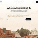
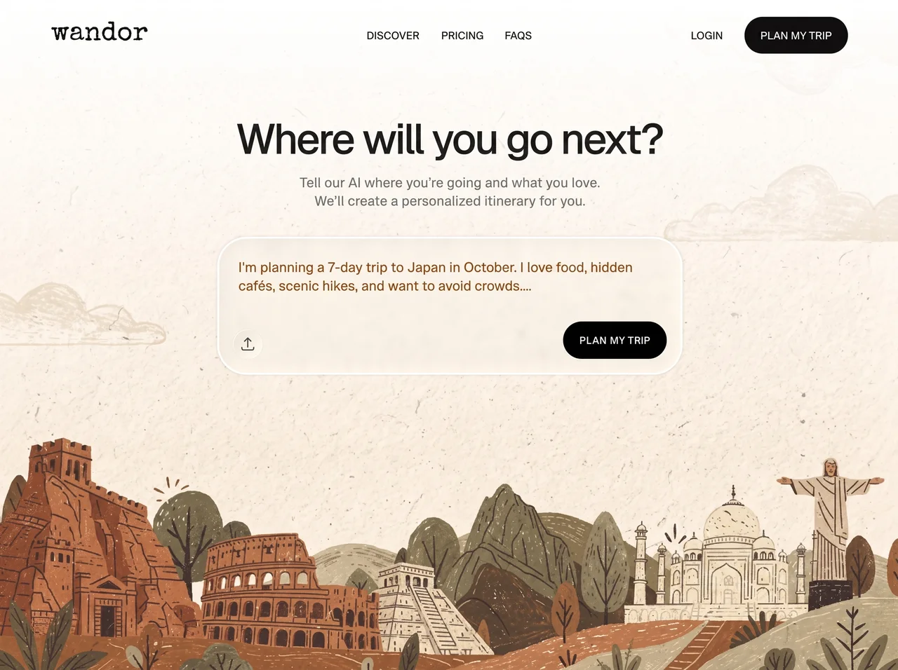
**使用 Vite、Tailwind CSS 和 lucide-react,为名为 "Wandor" 的旅行应用构建一个单页 React + TypeScript 落地页。页面是一个全视口 hero 区域,包含循环背景视频、磨砂玻璃提示卡片和导航栏。**

**字体(在 index.html `<head>` 中加载):**
- Google Fonts 链接:`https://fonts.googleapis.com/css2?family=Special+Elite&family=Geist:wght@400;500;600;700&display=swap`
- 包含到 fonts.googleapis.com 和 fonts.gstatic.com 的 preconnect(crossorigin)。
- Body / UI 字体:"Geist"(sans-serif),字重 400/500/600/700。
- Logo 字体:"Special Elite"(打字机衬线体),仅用于文字标识。
- 页面标题:`Wandor — 下一站去哪里?`

**Tailwind 配置(tailwind.config.js)——扩展主题:**
- `fontFamily.sans`:`['Geist', 'sans-serif']`
- `fontFamily.display`:`['Special Elite', 'serif']`
- 在 `wandor` 键下添加自定义颜色:
  - `dark: '#0a0a0a'`
  - `text: '#1a1a1a'`
  - `muted: '#767676'`
  - `prompt: '#905831'`(棕色/陶土色)

**全局 CSS(index.css):**
- 标准 Tailwind 指令(base/components/utilities)。
- `body`:`font-family: 'Geist', sans-serif; overflow-x: hidden; background: #fff;`

**布局——填满视口的单个 `<section>`:**
- Section:`relative min-h-svh w-full overflow-hidden`。

**背景视频(z-0):**
- `<video>` 使用 absolute 定位:`inset-0 w-full h-full object-cover z-0`。
- 精确 `src`:`https://pollen-batch-41236914.figma.site/_components/v2/f0ee2dae7671c170c34f12e31c4cb41418976c98/769c564298c132f7919405cd9f17c1b1231f341d.769c5642.mp4`
- 属性:`autoPlay muted loop playsInline`。

**顶部渐变遮罩(z-1):**
- 使用 absolute 定位:`inset-x-0 top-0 h-[687px] pointer-events-none z-[1]`。
- 行内样式 background:`linear-gradient(180deg, rgba(255,255,255,1) 0%, rgba(255,255,255,0) 100%)`——从白色到透明的垂直渐隐,覆盖顶部 687px,确保导航和标题在视频上清晰可读。

**内容容器(z-2):**
- `relative z-[2] max-w-[1360px] mx-auto`。

**导航栏:**
- `<nav>`:`flex items-center justify-between px-20 pt-6 pb-4`(移动端:`px-6 pt-5`)。
- 左侧:文字标识 `<span className="font-display text-[40px] text-black leading-none select-none">wandor</span>`(移动端:`text-[32px]`)。
- 中间:绝对居中的组 `absolute left-1/2 -translate-x-1/2 flex gap-8`(通过 `max-md:hidden` 在移动端隐藏)。三个按钮:“发现”、“价格”、“常见问题”。每个按钮:`bg-transparent border-none cursor-pointer font-sans text-[15px] font-medium uppercase text-wandor-text tracking-[0.04em] transition-opacity hover:opacity-55`。
- 右侧:flex 组 `flex items-center gap-8`:
  - “登录”按钮(移动端隐藏):`bg-transparent border-none cursor-pointer font-sans text-[15px] font-semibold uppercase text-[#292929] tracking-[0.04em] transition-opacity hover:opacity-55`。
  - “规划我的旅行”按钮:`bg-wandor-dark text-[#fafafa] border-none cursor-pointer font-sans text-[15px] font-medium uppercase tracking-[0.04em] px-5 py-3.5 rounded-full transition-all hover:bg-[#333] active:scale-95`。

**Hero 主体:**
- 容器:`flex flex-col items-center px-6 pt-16 pb-24 text-center`。
- 标题 `<h1>`:`font-sans text-[clamp(40px,6vw,68px)] font-medium text-wandor-text leading-[1.05] tracking-[-0.04em] max-w-[820px] mb-5`。文字:“下一站去哪里?”
- 副标题 `<p>`:`font-sans text-xl font-medium text-wandor-muted leading-relaxed max-w-[500px] mb-10`。文字:“告诉我们的 AI 你要去哪里以及你喜欢什么。我们会为你创建个性化行程。”

**液态玻璃提示卡片:**
- Wrapper `<div>`:`relative w-[701px] max-md:w-[calc(100vw-48px)] min-h-[208px] bg-white/[0.06] border-[3px] border-white rounded-[44px] shadow-[0_0_4px_0_rgba(0,0,0,0.15)] overflow-hidden backdrop-blur-[20px]`。这就是液态玻璃效果:极低透明度的白色填充、粗白色边框、强背景模糊、柔和阴影和大胶囊圆角。
- 提示文字 `<p>`:绝对定位 `left-[29px] top-[57px] -translate-y-1/2 w-[609px] max-md:w-[calc(100%-58px)] font-sans text-xl max-md:text-[17px] font-medium text-wandor-prompt leading-relaxed break-words`。文字:“我计划十月去日本旅行 7 天。我喜欢美食、隐秘咖啡馆和风景优美的徒步路线,而且想避开人群....”(注意末尾的 “....”)。
- 卡片内的“规划我的旅行”CTA 按钮:`absolute bottom-[21px] right-[21px] w-[156px] h-14 bg-black border-none rounded-[44px] shadow-[0_0_2px_0_rgba(0,0,0,0.05)] cursor-pointer flex items-center justify-center font-sans text-base font-medium text-[#fafafa] uppercase tracking-[0.02em] transition-all hover:bg-[#333] active:scale-95`。文字:“规划我的旅行”。
- 隐藏的文件输入框:`<input ref={fileInputRef} type="file" accept="image/*,.pdf" className="hidden" />`。
- 上传按钮:`absolute left-[21px] top-[137px] w-11 h-11 bg-transparent border border-white/70 rounded-full cursor-pointer flex items-center justify-center backdrop-blur-[14px] transition-transform hover:scale-105 focus-visible:outline-2 focus-visible:outline-white focus-visible:outline-offset-2`。`aria-label="上传灵感素材"`。点击时,通过 ref 触发隐藏的文件输入框。内部渲染 lucide-react 的 `Upload` 图标:`<Upload className="w-[18px] h-[18px] text-wandor-text flex-shrink-0" />`。

**交互 / 动画:**
- 所有按钮使用 `transition-opacity` / `transition-all` / `transition-transform`,并配合 `hover:opacity-55`、`hover:bg-[#333]`、`hover:scale-105` 和 `active:scale-95`,营造有触感的微交互。
- 玻璃卡片和上传按钮使用 `backdrop-blur-[20px]` / `backdrop-blur-[14px]`,在视频上形成液态玻璃磨砂效果。
- 视频自动静音播放并持续循环,形成环境动态效果。
- 顶部从白色到透明的渐变遮罩确保导航和标题在视频上保持清晰可读。

**响应式行为:**
- 在 `max-width: 760px`(Tailwind `max-md`)时:导航 padding 缩小为 `px-6 pt-5`,logo 降为 32px,中央导航链接和登录按钮隐藏,玻璃卡片宽度变为 `calc(100vw - 48px)`,提示文字变为 17px,宽度为 `calc(100%-58px)`。

**应用结构:**
- `src/App.tsx` 从 `@/components/Hero` 导入 `Hero`,并在外层 `<div>` 中渲染它。
- `Hero.tsx` 包含上述所有标记,以及用于中央链接的 `NavButton` 辅助组件。
- 使用 `@/` 路径别名(映射到 `src/`),通过 `resolve.alias` 在 `vite.config.ts` 中配置。
原文提示词(English)
**Build a single-page React + TypeScript landing page for a travel app called "Wandor" using Vite, Tailwind CSS, and lucide-react. The page is a full-viewport hero section with a looping background video, a frosted-glass prompt card, and a navigation bar.**

**Fonts (load in index.html `<head>`):**
- Google Fonts link: `https://fonts.googleapis.com/css2?family=Special+Elite&family=Geist:wght@400;500;600;700&display=swap`
- Include preconnect to fonts.googleapis.com and fonts.gstatic.com (crossorigin).
- Body / UI font: "Geist" (sans-serif), weights 400/500/600/700.
- Logo font: "Special Elite" (typewriter serif), used only for the wordmark.
- Page title: `Wandor — Where will you go next?`

**Tailwind config (tailwind.config.js) — extend theme:**
- `fontFamily.sans`: `['Geist', 'sans-serif']`
- `fontFamily.display`: `['Special Elite', 'serif']`
- Custom colors under key `wandor`:
  - `dark: '#0a0a0a'`
  - `text: '#1a1a1a'`
  - `muted: '#767676'`
  - `prompt: '#905831'` (a brown/terracotta)

**Global CSS (index.css):**
- Standard Tailwind directives (base/components/utilities).
- `body`: `font-family: 'Geist', sans-serif; overflow-x: hidden; background: #fff;`

**Layout — single `<section>` that fills the viewport:**
- Section: `relative min-h-svh w-full overflow-hidden`.

**Background video (z-0):**
- `<video>` absolutely positioned `inset-0 w-full h-full object-cover z-0`.
- Exact `src`: `https://pollen-batch-41236914.figma.site/_components/v2/f0ee2dae7671c170c34f12e31c4cb41418976c98/769c564298c132f7919405cd9f17c1b1231f341d.769c5642.mp4`
- Attributes: `autoPlay muted loop playsInline`.

**Top gradient overlay (z-1):**
- Absolutely positioned `inset-x-0 top-0 h-[687px] pointer-events-none z-[1]`.
- Inline style background: `linear-gradient(180deg, rgba(255,255,255,1) 0%, rgba(255,255,255,0) 100%)` — a white-to-transparent vertical fade covering the top 687px so the nav and headline read clearly over the video.

**Content wrapper (z-2):**
- `relative z-[2] max-w-[1360px] mx-auto`.

**Navigation bar:**
- `<nav>`: `flex items-center justify-between px-20 pt-6 pb-4` (mobile: `px-6 pt-5`).
- Left: wordmark `<span className="font-display text-[40px] text-black leading-none select-none">wandor</span>` (mobile: `text-[32px]`).
- Center: absolutely centered group `absolute left-1/2 -translate-x-1/2 flex gap-8` (hidden on mobile via `max-md:hidden`). Three buttons: "Discover", "Pricing", "FAQs". Each button: `bg-transparent border-none cursor-pointer font-sans text-[15px] font-medium uppercase text-wandor-text tracking-[0.04em] transition-opacity hover:opacity-55`.
- Right: flex group `flex items-center gap-8`:
  - "Login" button (hidden on mobile): `bg-transparent border-none cursor-pointer font-sans text-[15px] font-semibold uppercase text-[#292929] tracking-[0.04em] transition-opacity hover:opacity-55`.
  - "Plan My Trip" button: `bg-wandor-dark text-[#fafafa] border-none cursor-pointer font-sans text-[15px] font-medium uppercase tracking-[0.04em] px-5 py-3.5 rounded-full transition-all hover:bg-[#333] active:scale-95`.

**Hero body:**
- Container: `flex flex-col items-center px-6 pt-16 pb-24 text-center`.
- Headline `<h1>`: `font-sans text-[clamp(40px,6vw,68px)] font-medium text-wandor-text leading-[1.05] tracking-[-0.04em] max-w-[820px] mb-5`. Text: "Where will you go next?"
- Subtitle `<p>`: `font-sans text-xl font-medium text-wandor-muted leading-relaxed max-w-[500px] mb-10`. Text: "Tell our AI where you're going and what you love. We'll create a personalized itinerary for you."

**Liquid glass prompt card:**
- Wrapper `<div>`: `relative w-[701px] max-md:w-[calc(100vw-48px)] min-h-[208px] bg-white/[0.06] border-[3px] border-white rounded-[44px] shadow-[0_0_4px_0_rgba(0,0,0,0.15)] overflow-hidden backdrop-blur-[20px]`. This is the liquid-glass effect: very low-opacity white fill, thick white border, heavy backdrop blur, soft shadow, large pill radius.
- Prompt text `<p>`: absolutely positioned `left-[29px] top-[57px] -translate-y-1/2 w-[609px] max-md:w-[calc(100%-58px)] font-sans text-xl max-md:text-[17px] font-medium text-wandor-prompt leading-relaxed break-words`. Text: "I'm planning a 7-day trip to Japan in October. I love food, hidden cafes, scenic hikes, and want to avoid crowds...." (note the trailing "....").
- "Plan My Trip" CTA button inside card: `absolute bottom-[21px] right-[21px] w-[156px] h-14 bg-black border-none rounded-[44px] shadow-[0_0_2px_0_rgba(0,0,0,0.05)] cursor-pointer flex items-center justify-center font-sans text-base font-medium text-[#fafafa] uppercase tracking-[0.02em] transition-all hover:bg-[#333] active:scale-95`. Text: "Plan My Trip".
- Hidden file input: `<input ref={fileInputRef} type="file" accept="image/*,.pdf" className="hidden" />`.
- Upload button: `absolute left-[21px] top-[137px] w-11 h-11 bg-transparent border border-white/70 rounded-full cursor-pointer flex items-center justify-center backdrop-blur-[14px] transition-transform hover:scale-105 focus-visible:outline-2 focus-visible:outline-white focus-visible:outline-offset-2`. `aria-label="Upload inspiration"`. On click, trigger the hidden file input via a ref. Inside, render the lucide-react `Upload` icon: `<Upload className="w-[18px] h-[18px] text-wandor-text flex-shrink-0" />`.

**Interactions / animations:**
- All buttons use `transition-opacity` / `transition-all` / `transition-transform` with `hover:opacity-55`, `hover:bg-[#333]`, `hover:scale-105`, and `active:scale-95` for tactile micro-interactions.
- The glass card and upload button use `backdrop-blur-[20px]` / `backdrop-blur-[14px]` for the liquid-glass frosted effect over the video.
- The video autoplays muted and loops continuously for ambient motion.
- The top white-to-transparent gradient overlay ensures the nav and headline remain legible over the video.

**Responsive behavior:**
- At `max-width: 760px` (Tailwind `max-md`): nav padding shrinks to `px-6 pt-5`, logo drops to 32px, center nav links and Login button hide, glass card becomes `calc(100vw - 48px)` wide with prompt text at 17px and width `calc(100%-58px)`.

**App structure:**
- `src/App.tsx` imports `Hero` from `@/components/Hero` and renders it inside a wrapping `<div>`.
- `Hero.tsx` contains all the markup above plus a `NavButton` helper component for the centered links.
- Use the `@/` path alias (maps to `src/`) configured in `vite.config.ts` via `resolve.alias`.
视频地址