





















提示词
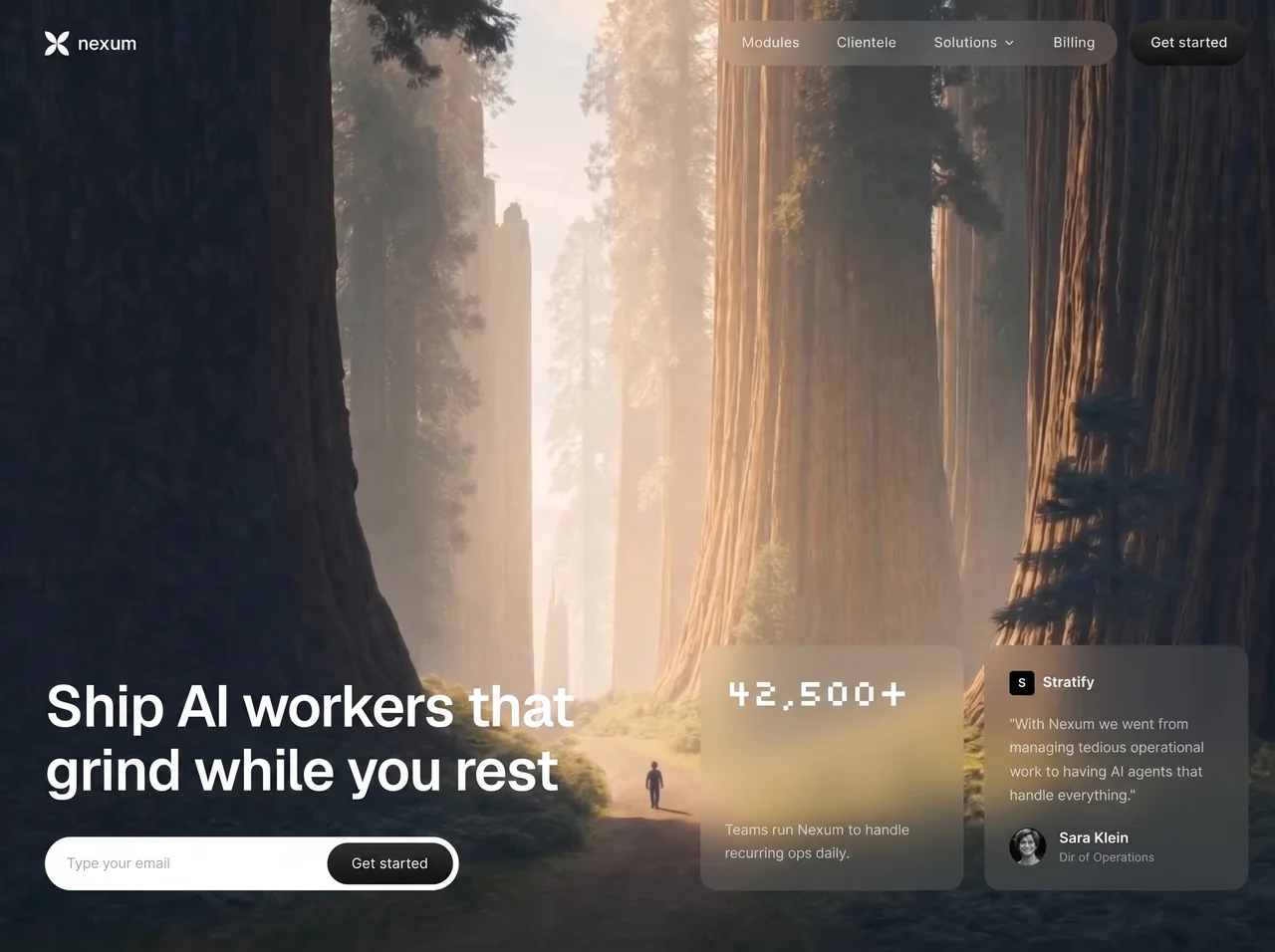
为 **nexum** 构建一个单屏全屏(`h-screen w-full overflow-hidden`)Hero 页面——这是一个深色、电影感的 AI 运维落地页 Hero,包含 full-bleed 背景视频、glassmorphism nav/cards,以及锚定底部的内容。技术栈:React + Tailwind + `lucide-react`(`ChevronDown`、`Menu`、`X`)。不使用 routing。只有一个区块。
### 字体(精确)
从 Google Fonts 加载:
```
https://fonts.googleapis.com/css2?family=Geist:wght@300;400;500;600;700&family=Silkscreen:wght@400;700&display=swap
```
- 全局 body:`'Geist', -apple-system, BlinkMacSystemFont, sans-serif`,启用 antialiased smoothing
- 仅 Stats 数字 `"42,500+"`:`fontFamily: "'Silkscreen', cursive"`,weight normal,tracking-tight
- 其余所有内容均使用 Geist
### 背景视频(精确 URL + 行为)
```
```
- 绝对定位 `inset-0`、`h-full w-full object-cover`
- Attributes:`autoPlay`、`loop`、`muted`、`playsInline`
- 不添加 overlay gradient;内容以 `z-10` 直接置于视频上方
### 页面标题
`Nexum Hero`
### 布局架构
```
<section> 全 viewport
<video> absolute full-bleed
<div z-10 flex-col h-full>
<nav> 顶栏
[mobile overlay + slide-in panel]
<main content> mt-auto 锚定底部
左侧:headline + email CTA
右侧:两张 glass cards
```
内容通过 `mt-auto` 固定在底部。在大屏上:`lg:flex-row lg:items-end lg:justify-between`。在 mobile/tablet 上:纵向堆叠。
### 颜色 / 响应式文本系统(关键)
许多元素会从小屏上的近黑色切换为 `lg+` 上的白色(因为视频在不同尺寸下呈现出不同的明暗效果):
- Logo icon + “nexum” wordmark:`text/fill-[#010101]` → `lg:text/fill-white`
- H1:`text-[#010101]` → `lg:text-white`
- Stats 数字:`text-[#010101]` → `lg:text-white`
- Stats 正文:`text-[#010101]/70` → `lg:text-white/70`
- Testimonial 文本:`text-[#010101]/80` → `lg:text-white/80`
- Stratify 名称 / Sara 姓名:`#010101` → `lg:text-white`
- 职位“运营总监”:`#010101]/60` → `lg:text-white/60`
- Desktop nav links 始终为 white/80(仅在 `md+` 显示 desktop 版本)
主 CTA gradient(用于每个“开始使用”按钮):
```css
background: linear-gradient(to bottom, #2B2B2B, #101010)
```
Hover:`opacity-90`
### Logo(精确 SVG)
24×24,viewBox `0 0 256 256`,path:
```
M 128 128 C 128 198.692 70.692 256 0 256 C 0 185.308 57.308 128 128 128 Z M 128 128 C 198.692 128 256 185.308 256 256 C 185.308 256 128 198.692 128 128 Z M 0 0 C 70.692 0 128 57.308 128 128 C 57.308 128 0 70.692 0 0 Z M 256 0 C 256 70.692 198.692 128 128 128 C 128 57.308 185.308 0 256 0 Z
```
旁边:小写 **nexum**,`text-lg font-semibold`,gap-2。
### Desktop navigation(`hidden md:flex`)
Padding:`px-5 py-5` → `sm:px-8 sm:py-6` → `lg:px-12`
**Glass pill nav cluster:**
- `rounded-full bg-white/10 px-1.5 py-1.5 backdrop-blur-lg`
- 内部链接:模块、客户、解决方案(带 `ChevronDown` 3.5×3.5)、计费
- 每个链接:`rounded-full px-4 py-1.5 text-sm font-medium text-white/80`
- Hover:`bg-white/10 text-white`、`transition-colors`
- 链接之间的间距:`gap-1`
**独立的“开始使用”pill** 位于 glass cluster 右侧(`gap-3`):
- `rounded-full px-5 text-sm font-medium text-white`
- `self-stretch`,使高度与 glass pill 一致
- 使用与上面相同的深色垂直 gradient
### Mobile hamburger(`md:hidden`)
- 圆形按钮 `h-10 w-10 rounded-full bg-white/10 backdrop-blur-lg`、`z-50`
- Icons 通过动画切换:
- Menu icon:打开时 → `rotate-90 scale-0 opacity-0`;关闭时 → 可见。`transition-all duration-300`
- X icon:打开时 → 可见;关闭时 → `-rotate-90 scale-0 opacity-0`
- Icon 颜色:`#010101` → `lg:text-white`
- 打开菜单时,将 `document.body.style.overflow = 'hidden'` 以锁定页面滚动
### Mobile menu glass overlay + drawer
1. **Backdrop:**`fixed inset-0 z-40 bg-black/80 backdrop-blur-md`,opacity 在 300ms 内从 0→100;关闭时还要使用 `pointer-events-none`
2. **Panel:**`fixed right-0 top-0 z-40 h-full w-72 bg-black/90 backdrop-blur-xl`
- 关闭:`translate-x-full`;打开:`translate-x-0`
- Transition:`duration-500 ease-[cubic-bezier(0.16,1,0.3,1)]`
3. **Links**(模块、客户、解决方案、计费)放在 `px-6 pt-24` 中,`gap-2`
- 每个:`rounded-xl px-4 py-3.5 text-base font-medium text-white/80`
- Hover:`bg-white/10 text-white`
- 打开时 staggered entrance:opacity 0→1,`translateX(24px)`→0,delay `(index+1)*60ms`
- 解决方案右侧添加 ChevronDown
4. **底部 CTA**(`mt-auto px-6 pb-10`):全宽 gradient“开始使用”pill;打开时以 300ms delay 淡入并向上滑动(`opacity` + `translateY(16px)`→0,400ms)
### Hero headline(精确文案)
> 部署在你休息时仍埋头工作的 AI 员工
Typography:
- `text-3xl` → `sm:text-4xl` → `lg:text-[3.5rem]`
- `font-semibold leading-[1.1] tracking-tight`
- Container:`max-w-xl`
### Email CTA(精确)
放在 headline 下方,使用 `mt-6 sm:mt-8`:
- Wrapper:在 `sm+` 上变为 `inline-flex flex-row items-center rounded-full bg-white p-1.5`;在 mobile 上以 column 形式堆叠,`gap-3`
- Email input:
- placeholder:**输入你的邮箱**
- Mobile:白色 pill `rounded-full bg-white px-5 py-3 text-sm text-gray-900 placeholder-gray-400`
- `sm+`:`sm:w-64 sm:rounded-none sm:bg-transparent sm:px-4 sm:py-2`(位于白色 capsule 内部)
- `outline-none`
- 按钮“开始使用”:gradient pill,`rounded-full px-6 py-3 sm:py-2.5 text-sm font-medium text-white`
### Glass cards(右侧)
Container:`flex flex-col gap-4 sm:flex-row lg:w-auto lg:gap-5`,小屏为全宽,大屏为 auto。
**共享 glass 样式:**
`rounded-2xl bg-white/10 backdrop-blur-lg p-5 sm:p-6`
#### Stats card(`sm:w-64`、flex-col justify-between)
- 大数字:**42,500+**,使用 Silkscreen,`text-3xl sm:text-4xl font-normal tracking-tight`
- 正文:**各团队每天都使用 Nexum 处理重复性运营工作。**——`text-sm leading-relaxed`、`mt-3 sm:mt-4`、opacity 70%
#### Testimonial card(`sm:w-64`)
- Header row:6×6 黑色 rounded 方形,内含粗体白色 **S**,旁边是 **Stratify**(`text-sm font-semibold`),gap-2,`mb-3 sm:mb-4`
- 引言(精确):
> “有了 Nexum,我们不再需要管理繁琐的运营工作,而是由 AI 智能体处理一切。”
— `text-sm leading-relaxed`,opacity 80%
- Footer:avatar + name
- Avatar:`https://i.pravatar.cc/72?img=12`,9×9 rounded-full,`object-cover`,fallback bg 为 `bg-white/20`,alt“萨拉·克莱因”
- **Sara Klein**——`text-sm font-semibold`
- **运营总监**——`text-xs`,opacity 60%
- `mt-4 sm:mt-5`,gap-3
### 主内容块的底部 padding
`px-5 pb-8` → `sm:px-8 sm:pb-12` → `lg:px-12 lg:pb-16`
内部垂直间距:`gap-6 sm:gap-8`
### 必须保留的 Glass / blur tokens
| 元素 | Fill | Blur |
|--------|------|------|
| Desktop nav pill | `bg-white/10` | `backdrop-blur-lg` |
| Mobile hamburger | `bg-white/10` | `backdrop-blur-lg` |
| Mobile overlay | `bg-black/80` | `backdrop-blur-md` |
| Mobile drawer | `bg-black/90` | `backdrop-blur-xl` |
| 两张 cards | `bg-white/10` | `backdrop-blur-lg` |
### 动画 / 交互检查清单
1. Nav link hover color/bg transitions
2. CTA opacity hover
3. Menu ↔ X morph(rotate + scale + opacity,300ms)
4. Overlay fade 300ms
5. Drawer slide,使用 cubic-bezier(0.16, 1, 0.3, 1),持续 500ms
6. Staggered mobile link slide-in(每步 60ms)
7. Mobile 底部 CTA 延迟 fade/slide(delay 300ms)
8. 菜单打开时锁定 body 滚动
9. 视频持续静音循环
### 禁止添加的内容
不添加深紫色 gradients,不添加额外区块,不在 nav 中添加 stats strips,不在 Hero 中添加两张 glass cards 之外的其他 cards,不在视频上添加 overlay labels,不添加第二个滚动区块。首屏 = 品牌 + 一个 headline + 一个 CTA + 两张 glass cards,叠加在 full-bleed CloudFront 视频上。
以像素级精度复刻:使用相同文案、相同 URLs、相同 SVG path、相同 breakpoints、相同 glass opacities/blurs、相同 gradient、Stats 数字使用相同的 Silkscreen,其他所有内容使用相同的 Geist。原文提示词(English)
Build a single full-screen (`h-screen w-full overflow-hidden`) hero page for **nexum** — a dark cinematic AI-ops landing hero with a full-bleed background video, glassmorphism nav/cards, and bottom-anchored content. Stack: React + Tailwind + `lucide-react` (`ChevronDown`, `Menu`, `X`). No routing. One section only.
### Fonts (exact)
Load from Google Fonts:
```
https://fonts.googleapis.com/css2?family=Geist:wght@300;400;500;600;700&family=Silkscreen:wght@400;700&display=swap
```
- Global body: `'Geist', -apple-system, BlinkMacSystemFont, sans-serif` with antialiased smoothing
- Stats number `"42,500+"` only: `fontFamily: "'Silkscreen', cursive"`, weight normal, tracking-tight
- Everything else is Geist
### Background video (exact URL + behavior)
```
```
- Absolutely positioned `inset-0`, `h-full w-full object-cover`
- Attributes: `autoPlay`, `loop`, `muted`, `playsInline`
- No overlay gradient; content sits directly over the video at `z-10`
### Page title
`Nexum Hero`
### Layout architecture
```
<section> full viewport
<video> absolute full-bleed
<div z-10 flex-col h-full>
<nav> top bar
[mobile overlay + slide-in panel]
<main content> mt-auto bottom-anchored
left: headline + email CTA
right: two glass cards
```
Content is pinned to the bottom with `mt-auto`. On large screens: `lg:flex-row lg:items-end lg:justify-between`. On mobile/tablet: stacked column.
### Color / responsive text system (critical)
Many elements flip from near-black on small screens to white on `lg+` (because the video reads lighter/darker differently):
- Logo icon + “nexum” wordmark: `text/fill-[#010101]` → `lg:text/fill-white`
- H1: `text-[#010101]` → `lg:text-white`
- Stats number: `text-[#010101]` → `lg:text-white`
- Stats body: `text-[#010101]/70` → `lg:text-white/70`
- Testimonial text: `text-[#010101]/80` → `lg:text-white/80`
- Stratify name / Sara name: `#010101` → `lg:text-white`
- Role “Dir of Operations”: `#010101]/60` → `lg:text-white/60`
- Desktop nav links are always white/80 (desktop only shows at `md+`)
Primary CTA gradient (used on every “Get started” button):
```css
background: linear-gradient(to bottom, #2B2B2B, #101010)
```
Hover: `opacity-90`
### Logo (exact SVG)
24×24, viewBox `0 0 256 256`, path:
```
M 128 128 C 128 198.692 70.692 256 0 256 C 0 185.308 57.308 128 128 128 Z M 128 128 C 198.692 128 256 185.308 256 256 C 185.308 256 128 198.692 128 128 Z M 0 0 C 70.692 0 128 57.308 128 128 C 57.308 128 0 70.692 0 0 Z M 256 0 C 256 70.692 198.692 128 128 128 C 128 57.308 185.308 0 256 0 Z
```
Beside it: lowercase **nexum**, `text-lg font-semibold`, gap-2.
### Desktop navigation (`hidden md:flex`)
Padding: `px-5 py-5` → `sm:px-8 sm:py-6` → `lg:px-12`
**Glass pill nav cluster:**
- `rounded-full bg-white/10 px-1.5 py-1.5 backdrop-blur-lg`
- Links inside: Modules, Clientele, Solutions (with `ChevronDown` 3.5×3.5), Billing
- Each link: `rounded-full px-4 py-1.5 text-sm font-medium text-white/80`
- Hover: `bg-white/10 text-white`, `transition-colors`
- Gap between links: `gap-1`
**Separate “Get started” pill** to the right of the glass cluster (`gap-3`):
- `rounded-full px-5 text-sm font-medium text-white`
- `self-stretch` so height matches the glass pill
- Same dark vertical gradient as above
### Mobile hamburger (`md:hidden`)
- Circular button `h-10 w-10 rounded-full bg-white/10 backdrop-blur-lg`, `z-50`
- Icons swap with animation:
- Menu icon: when open → `rotate-90 scale-0 opacity-0`; when closed → visible. `transition-all duration-300`
- X icon: when open → visible; when closed → `-rotate-90 scale-0 opacity-0`
- Icon color: `#010101` → `lg:text-white`
- Opening menu locks `document.body.style.overflow = 'hidden'`
### Mobile menu glass overlay + drawer
1. **Backdrop:** `fixed inset-0 z-40 bg-black/80 backdrop-blur-md`, opacity 0→100 over 300ms; when closed also `pointer-events-none`
2. **Panel:** `fixed right-0 top-0 z-40 h-full w-72 bg-black/90 backdrop-blur-xl`
- Closed: `translate-x-full`; open: `translate-x-0`
- Transition: `duration-500 ease-[cubic-bezier(0.16,1,0.3,1)]`
3. **Links** (Modules, Clientele, Solutions, Billing) in `px-6 pt-24`, `gap-2`
- Each: `rounded-xl px-4 py-3.5 text-base font-medium text-white/80`
- Hover: `bg-white/10 text-white`
- Staggered entrance when open: opacity 0→1, `translateX(24px)`→0, delay `(index+1)*60ms`
- Solutions gets a ChevronDown on the right
4. **Bottom CTA** (`mt-auto px-6 pb-10`): full-width gradient “Get started” pill; fades/slides up with delay 300ms when open (`opacity` + `translateY(16px)`→0, 400ms)
### Hero headline (exact copy)
> Ship AI workers that grind while you rest
Typography:
- `text-3xl` → `sm:text-4xl` → `lg:text-[3.5rem]`
- `font-semibold leading-[1.1] tracking-tight`
- Container: `max-w-xl`
### Email CTA (exact)
Below headline with `mt-6 sm:mt-8`:
- Wrapper: on `sm+` becomes `inline-flex flex-row items-center rounded-full bg-white p-1.5`; on mobile stacks as column `gap-3`
- Email input:
- placeholder: **Type your email**
- Mobile: white pill `rounded-full bg-white px-5 py-3 text-sm text-gray-900 placeholder-gray-400`
- `sm+`: `sm:w-64 sm:rounded-none sm:bg-transparent sm:px-4 sm:py-2` (sits inside the white capsule)
- `outline-none`
- Button “Get started”: gradient pill, `rounded-full px-6 py-3 sm:py-2.5 text-sm font-medium text-white`
### Glass cards (right side)
Container: `flex flex-col gap-4 sm:flex-row lg:w-auto lg:gap-5`, full width on small, auto on large.
**Shared glass style:**
`rounded-2xl bg-white/10 backdrop-blur-lg p-5 sm:p-6`
#### Stats card (`sm:w-64`, flex-col justify-between)
- Big number: **42,500+** in Silkscreen, `text-3xl sm:text-4xl font-normal tracking-tight`
- Body: **Teams run Nexum to handle recurring ops daily.** — `text-sm leading-relaxed`, `mt-3 sm:mt-4`, opacity 70%
#### Testimonial card (`sm:w-64`)
- Header row: 6×6 black rounded square with bold white **S** + **Stratify** (`text-sm font-semibold`), gap-2, `mb-3 sm:mb-4`
- Quote (exact):
> "With Nexum we went from managing tedious operational work to having AI agents that handle everything."
— `text-sm leading-relaxed`, opacity 80%
- Footer: avatar + name
- Avatar: `https://i.pravatar.cc/72?img=12`, 9×9 rounded-full, `object-cover`, fallback bg `bg-white/20`, alt “Sara Klein”
- **Sara Klein** — `text-sm font-semibold`
- **Dir of Operations** — `text-xs`, opacity 60%
- `mt-4 sm:mt-5`, gap-3
### Bottom padding of main content block
`px-5 pb-8` → `sm:px-8 sm:pb-12` → `lg:px-12 lg:pb-16`
Inner vertical gap: `gap-6 sm:gap-8`
### Glass / blur tokens to preserve
| Element | Fill | Blur |
|--------|------|------|
| Desktop nav pill | `bg-white/10` | `backdrop-blur-lg` |
| Mobile hamburger | `bg-white/10` | `backdrop-blur-lg` |
| Mobile overlay | `bg-black/80` | `backdrop-blur-md` |
| Mobile drawer | `bg-black/90` | `backdrop-blur-xl` |
| Both cards | `bg-white/10` | `backdrop-blur-lg` |
### Animations / interactions checklist
1. Nav link hover color/bg transitions
2. CTA opacity hover
3. Menu ↔ X morph (rotate + scale + opacity, 300ms)
4. Overlay fade 300ms
5. Drawer slide with cubic-bezier(0.16, 1, 0.3, 1) over 500ms
6. Staggered mobile link slide-in (60ms steps)
7. Mobile bottom CTA delayed fade/slide (300ms delay)
8. Body scroll lock while menu open
9. Video continuous muted loop
### What NOT to add
No dark purple gradients, no extra sections, no stats strips in the nav, no cards in the hero beyond the two glass cards, no overlay labels on the video, no second scroll section. First viewport = brand + one headline + one CTA + two glass cards over the full-bleed CloudFront video.
Recreate pixel-faithfully: same copy, same URLs, same SVG path, same breakpoints, same glass opacities/blurs, same gradient, same Silkscreen on the stat number, same Geist everywhere else.视频地址