












提示词
为 "Drift" 构建一个单页落地网站——这是一款平静、对 ADHD 友好的规划应用。使用 React + Vite + TypeScript + Tailwind CSS + lucide-react 提供图标。不要使用其他 UI 库。
### 字体
通过 Google Fonts 在 `index.css` 中导入:
- **Inter**(字重 400、500、600)——用作基础正文字体
- **Instrument Serif**(仅斜体)——用于首屏标题中的斜体词组 "压力"
```css
@import url('https://fonts.googleapis.com/css2?family=Instrument+Serif:ital@1&family=Inter:wght@400;500;600&display=swap');
```
正文:`font-family: 'Inter', sans-serif;`,启用抗锯齿渲染。body 设置 `overflow-x: clip`。
### 配色
- 首屏遮罩:`bg-black/20`
- 关于区域背景:`#F6E4CF`
- 关于区域的深色文字/图标:`#321C04`
- 浅奶油色(关于区域的按钮背景):`#FFF9F2`
- 柔和强调色(分隔线、次要按钮背景):`#D9C4AA`
- 次要按钮悬停:`#CEBA9E`
- 深色按钮悬停:`#1F1003`
### Tailwind 配置
添加自定义关键帧 `fade-in-down`(0%:opacity 0、translateY -8px;100%:opacity 1、translateY 0),使用 0.2s ease-out 动画。
---
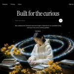
### 区域 1:首屏(占满视口高度)
- 全屏区域(`h-screen`、`overflow-hidden`、`mb-[-25px]` 负下边距,使下一区域与其轻微重叠)
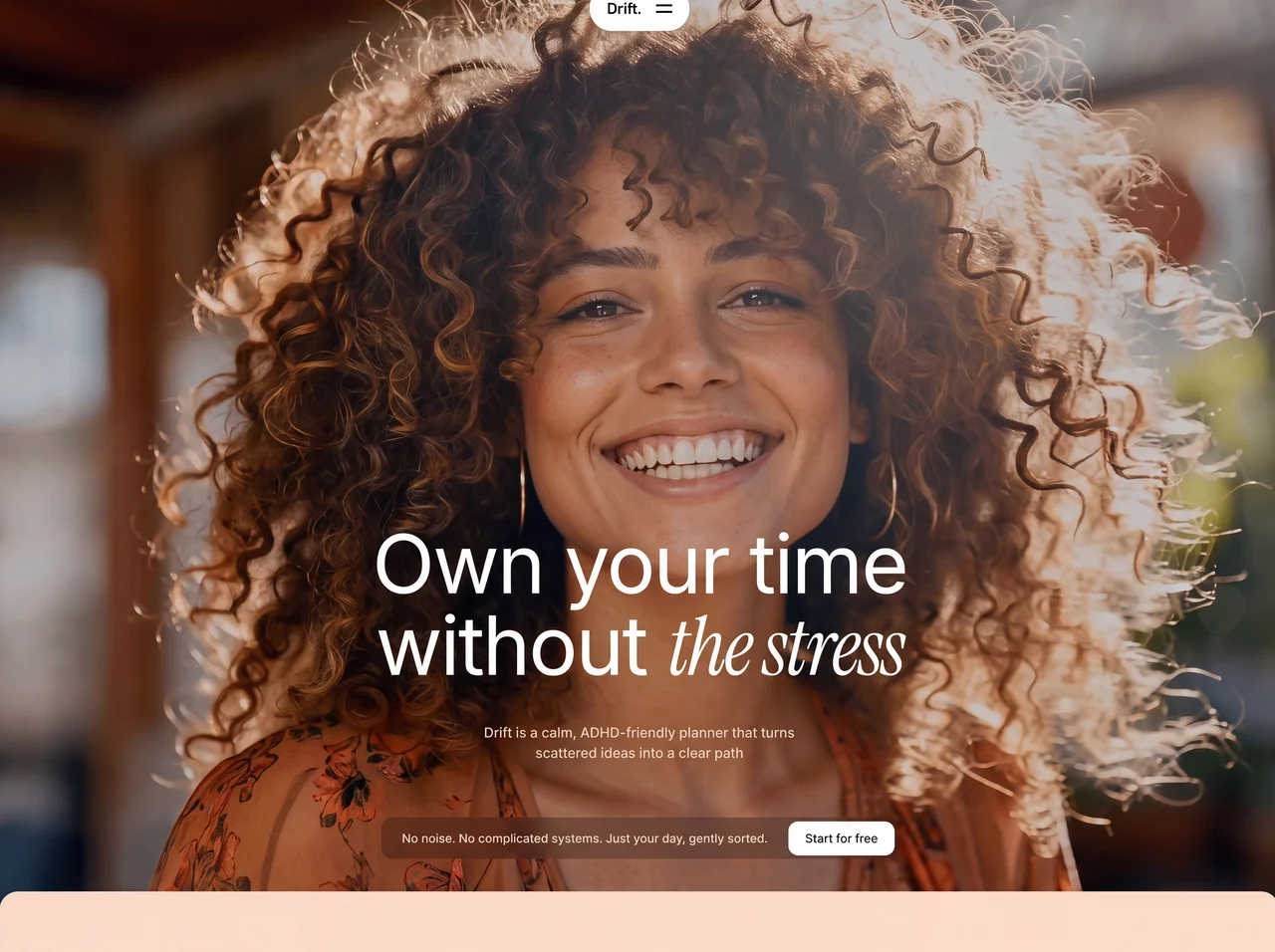
- **背景视频**(autoPlay、muted、loop、playsInline、object-cover、absolute inset-0):
```
```
- **半透明遮罩**:`absolute inset-0 bg-black/20`
#### 导航栏(居中的悬浮胶囊)
- 定位为 `absolute top-6 left-1/2 -translate-x-1/2 z-50`
- 带 shadow-lg 的白色圆角胶囊,包含:
- 品牌文字 "Drift."(text-lg、font-bold、tracking-tight、text-black)
- 动画汉堡菜单图标(两条线,点击时使用 rotate-45/-rotate-45 和 cubic-bezier(0.77,0,0.175,1) 缓动在 300ms 内变成 X)
- 下拉菜单(位于胶囊下方):白色 rounded-2xl 容器,包含链接 "功能"、"Drift AI"、"常见问题"。使用 opacity/scale/translate 过渡动画。默认隐藏,关闭时设为 pointer-events-none。
#### 首屏内容(底部对齐)
- Flex 列,`justify-end`,底部内边距 12(md:16)
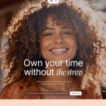
- **标题**(居中):
- 第 1 行:"掌控你的时间"——text-5xl / sm:text-7xl / md:text-8xl / lg:text-[96px]、font-normal、text-white、leading-[1.1]、tracking-tight
- 第 2 行:"没有*压力*"——字号相同。词语 "压力" 放在带有 className `not-italic` 的 `<em>` 标签中,通过内联样式 `fontFamily: "'Instrument Serif', serif", fontStyle: 'italic'` 使用 Instrument Serif 斜体
- **副标题**:"Drift 是一款平静、对 ADHD 友好的规划器,能将零散想法变成清晰路径"——text-white/80、text-sm md:text-base、font-medium、max-w-[420px]、居中
- **CTA 栏**(位于标题下方并居中,带间距):
- 容器:`bg-black/25 backdrop-blur-md rounded-xl`、flex row、items-center、pl-6 pr-1 py-1
- 桌面端文字:"没有噪声。没有复杂系统。只有被轻柔整理好的一天。"(text-white、text-sm、font-medium,在移动端隐藏)
- 移动端文字(sm:hidden):"没有噪声。只有被轻柔整理好的一天。"
- 按钮:"免费开始"——bg-white、text-black、text-sm、font-medium、px-5、py-2.5、rounded-xl、hover:bg-white/90
---
### 区域 2:关于区域
- 背景:`bg-[#F6E4CF]`
- **顶部圆角**:`rounded-t-[25px]`,搭配 `relative z-10`(与首屏重叠 25px)
- 内边距:py-20 md:py-32、px-6
#### 顶部区域(居中,max-w-3xl)
- 段落:"我们打造顺应你节奏、而非凌驾其上的工具。为轻松、专注当下与心流而设计。"——text-[#321C04]、text-base md:text-lg、text-center、leading-relaxed、max-w-lg
- 两个按钮(flex-wrap、居中、gap-4):
1. **"来打个招呼"**——深色胶囊按钮(`bg-[#321C04]`、`text-[#FFF9F2]`、rounded-full)。左侧有一个白色圆形,内含 Mail 图标(lucide-react,size 16)。文字为大写、tracking-wide、font-medium。
2. **"获取最新消息"**——柔和色胶囊按钮(`bg-[#D9C4AA]`、`text-[#321C04]`、rounded-full)。左侧有一个白色圆形,内含 Plus 图标。文字样式相同。
#### 装饰性分隔线
- 全宽 flex row,包含:小圆点(w-2 h-2 rounded-full bg-[#D9C4AA])+ 2px 间距 + 水平线(flex-1 h-[2px] bg-[#D9C4AA])+ 2px 间距 + 小圆点
#### 底部区域(max-w-6xl、flex-col md:flex-row)
- 左侧:自定义 SVG 标志(40x40、viewBox 0 0 256 256、带圆润象限的抽象几何图形、fill #321C04)+ 标签 "平静 / 放大"(text-xs、大写、tracking-widest、font-semibold,两词之间换行)
- 右侧:大段文字:"我们打造 AI 工具和助手。但更重要的是,当软件顺应你而非凌驾于你之上时,我们会帮助你重新感受温和的生产力。我们创建能承担认知负担的系统,让你可以专注于真正重要的事。"——text-2xl / sm:text-3xl / md:text-4xl / lg:text-[42px]、leading-[1.3]、font-normal、text-[#321C04]
---
### 区域 3:功能区域(滚动驱动的卡片)
- **固定背景图**(位于内容后方,-z-10):
```
https://images.higgs.ai/?default=1&output=webp&url=https%3A%2F%2Fd8j0ntlcm91z4.cloudfront.net%2Fuser_38xzZboKViGWJOttwIXH07lWA1P%2Fhf_20260709_082449_46df5cc4-ad98-4541-9236-a2659c1478a4.png&w=1920&q=85
```
- 内边距:px-5 md:px-10 lg:px-16、py-20 md:py-40 lg:py-48
#### 布局:lg+ 使用 CSS Grid(左列 400px / xl:460px,右列 1fr,gap-24 / xl:gap-48)
#### 左列(桌面端粘性定位)
- `lg:sticky lg:top-0 lg:h-screen lg:flex lg:flex-col lg:justify-between lg:py-32`
- 标题:"顺应你的思维流动,而非凌驾其上的软件"——text-white、text-2xl / sm:text-3xl / lg:text-[46px]、leading-[1.2]、font-normal
- 功能导航按钮(低于 lg 时隐藏):以功能标题组成的按钮列表。激活状态:`bg-black/20 text-white`。未激活状态:`bg-black/20 text-white/40`。点击后滚动到对应卡片(smooth、block: center)。
- 底部 CTA(低于 lg 时隐藏):"没有噪声。没有复杂系统。只有被轻柔整理好的一天。" + "免费开始"按钮(样式与首屏相同)
#### 右列(滚动卡片)
- 3 张使用 IntersectionObserver 的功能卡片:
- **激活检测**(threshold 0.6):高亮对应的导航按钮
- **显示动画**(threshold 0.15):卡片从右侧滑入(translate-x-16 到 translate-x-0、opacity 0 到 1、duration-700、ease-out)。显示后保持可见。
每张卡片(`bg-black/20 backdrop-blur-sm rounded-3xl p-6 md:p-10`):
- 相同的 SVG 标志(40x40、fill rgba(255,255,255,0.8))
- 标题(text-white、text-xl md:text-2xl、font-medium)
- 视频(aspect-video、rounded-2xl、overflow-hidden、bg-black/30、autoPlay/muted/loop/playsInline)
- 描述(text-white/60、font-medium、text-sm md:text-base、leading-relaxed)
**功能数据:**
1. 标题:"为轻松而生,而非催促"
描述:"Drift 去除让整理变得疲惫的噪声。每个界面都柔和、安静且直观,让你能继续前进,而不会困在理解操作上。"
视频:`https://d8j0ntlcm91z4.cloudfront.net/user_38xzZboKViGWJOttwIXH07lWA1P/hf_20260702_102608_5fa1187d-9ac6-44fb-82ab-54376200abc0.mp4`
2. 标题:"最温和的开始方式"
描述:"开始一天应当自然,而非令人畏惧。Drift 通过细微提示和安静的视图,让你轻松行动起来,看清此刻什么最值得投入精力。"
视频:`https://d8j0ntlcm91z4.cloudfront.net/user_38xzZboKViGWJOttwIXH07lWA1P/hf_20260625_174131_395bc785-bb21-4e65-abf6-27c56f0764b6.mp4`
3. 标题:"深度、全然的专注"
描述:"没有打扰,没有杂乱。Drift 以精简布局让你停留在当前任务中,淡化其他一切,直到你真正准备好切换。"
视频:`https://d8j0ntlcm91z4.cloudfront.net/user_38xzZboKViGWJOttwIXH07lWA1P/hf_20260525_052706_d2e390fd-1846-4fe7-a4d8-8d2f1c875358.mp4`
---
### SVG 标志(用于关于区域 + 功能卡片)
```svg
<svg xmlns="http://www.w3.org/2000/svg" width="40" height="40" viewBox="0 0 256 256" fill="none">
<path d="M 256 256 L 178 256 C 150.386 256 128 233.614 128 206 L 128 256 L 0 256 L 0 192 C 0 156.654 28.654 128 64 128 C 99.346 128 128 156.654 128 192 L 128 128 L 256 128 Z M 78 0 C 105.614 0 128 22.386 128 50 L 128 0 L 256 0 L 256 64 C 256 99.346 227.346 128 192 128 C 156.654 128 128 99.346 128 64 L 128 128 L 0 128 L 0 0 Z" fill="#321C04" />
</svg>
```
---
### 文件结构
```
src/
App.tsx -- 首屏区域 + 渲染 AboutSection + FeaturesSection
main.tsx -- ReactDOM 渲染
index.css -- 字体导入 + Tailwind 指令 + body 样式
components/
Navbar.tsx -- 带动画汉堡菜单的悬浮胶囊导航栏
AboutSection.tsx -- 奶油色的关于区域
FeaturesSection.tsx -- 带粘性左列 + 滚动卡片的深色功能区域
```原文提示词(English)
Build a single-page landing site for "Drift" -- a calm, ADHD-friendly planner app. Use React + Vite + TypeScript + Tailwind CSS + lucide-react for icons. No other UI libraries.
### Fonts
Import via Google Fonts in `index.css`:
- **Inter** (weights 400, 500, 600) -- used as base body font
- **Instrument Serif** (italic only) -- used for the italic word "the stress" in the hero heading
```css
@import url('https://fonts.googleapis.com/css2?family=Instrument+Serif:ital@1&family=Inter:wght@400;500;600&display=swap');
```
Body: `font-family: 'Inter', sans-serif;` with antialiased rendering. `overflow-x: clip` on body.
### Color Palette
- Hero overlay: `bg-black/20`
- About section background: `#F6E4CF`
- Dark text / icons in About: `#321C04`
- Light cream (button backgrounds in About): `#FFF9F2`
- Muted accent (divider, secondary button bg): `#D9C4AA`
- Secondary button hover: `#CEBA9E`
- Dark button hover: `#1F1003`
### Tailwind Config
Add a custom keyframe `fade-in-down` (0%: opacity 0, translateY -8px; 100%: opacity 1, translateY 0) with 0.2s ease-out animation.
---
### SECTION 1: HERO (full viewport height)
- Full-screen section (`h-screen`, `overflow-hidden`, `mb-[-25px]` negative bottom margin so the next section overlaps it slightly)
- **Background video** (autoPlay, muted, loop, playsInline, object-cover, absolute inset-0):
```
```
- **Semi-transparent overlay**: `absolute inset-0 bg-black/20`
#### Navbar (centered floating pill)
- Positioned `absolute top-6 left-1/2 -translate-x-1/2 z-50`
- White rounded-full pill with shadow-lg containing:
- Brand text "Drift." (text-lg, font-bold, tracking-tight, text-black)
- Animated hamburger icon (two lines that animate to an X on click using rotate-45/-rotate-45 with cubic-bezier(0.77,0,0.175,1) easing, 300ms)
- Dropdown (below the pill): white rounded-2xl container with links "Features", "Drift AI", "FAQ". Animated with opacity/scale/translate transitions. Hidden by default, pointer-events-none when closed.
#### Hero Content (bottom-aligned)
- Flex column, `justify-end`, padding bottom 12 (md:16)
- **Heading** (centered):
- Line 1: "Own your time" -- text-5xl / sm:text-7xl / md:text-8xl / lg:text-[96px], font-normal, text-white, leading-[1.1], tracking-tight
- Line 2: "without *the stress*" -- same sizing. The words "the stress" are rendered in Instrument Serif italic via inline style `fontFamily: "'Instrument Serif', serif", fontStyle: 'italic'` inside an `<em>` tag with className `not-italic`
- **Subtitle**: "Drift is a calm, ADHD-friendly planner that turns scattered ideas into a clear path" -- text-white/80, text-sm md:text-base, font-medium, max-w-[420px], centered
- **CTA Bar** (centered below heading with gap):
- Container: `bg-black/25 backdrop-blur-md rounded-xl`, flex row, items-center, pl-6 pr-1 py-1
- Desktop text: "No noise. No complicated systems. Just your day, gently sorted." (text-white, text-sm, font-medium, hidden on mobile)
- Mobile text (sm:hidden): "No noise. Just your day, gently sorted."
- Button: "Start for free" -- bg-white, text-black, text-sm, font-medium, px-5, py-2.5, rounded-xl, hover:bg-white/90
---
### SECTION 2: ABOUT SECTION
- Background: `bg-[#F6E4CF]`
- **Rounded top corners**: `rounded-t-[25px]` with `relative z-10` (overlaps hero by 25px)
- Padding: py-20 md:py-32, px-6
#### Top Area (centered, max-w-3xl)
- Paragraph: "We craft tools that move with your rhythm, not over it. Designed for ease, presence, and flow." -- text-[#321C04], text-base md:text-lg, text-center, leading-relaxed, max-w-lg
- Two buttons (flex-wrap, centered, gap-4):
1. **"Say hello"** -- dark pill button (`bg-[#321C04]`, `text-[#FFF9F2]`, rounded-full). Has a white circle on the left containing a Mail icon (lucide-react, size 16). Text is uppercase, tracking-wide, font-medium.
2. **"Stay informed"** -- muted pill button (`bg-[#D9C4AA]`, `text-[#321C04]`, rounded-full). Has a white circle on the left containing a Plus icon. Same text styling.
#### Decorative Divider
- Full-width flex row with: small circle (w-2 h-2 rounded-full bg-[#D9C4AA]) + 2px gap + horizontal line (flex-1 h-[2px] bg-[#D9C4AA]) + 2px gap + small circle
#### Bottom Area (max-w-6xl, flex-col md:flex-row)
- Left: Custom SVG logo (40x40, viewBox 0 0 256 256, abstract geometric shape with rounded quadrants, fill #321C04) + label "Calm / Amplified" (text-xs, uppercase, tracking-widest, font-semibold, line break between words)
- Right: Large paragraph: "We make AI tools and assistants. But, most importantly, we help you remember what gentle productivity looks like when software moves with you, not over you. We create systems that carry the cognitive weight, so you can attend to what truly counts." -- text-2xl / sm:text-3xl / md:text-4xl / lg:text-[42px], leading-[1.3], font-normal, text-[#321C04]
---
### SECTION 3: FEATURES SECTION (scroll-driven cards)
- **Fixed background image** (behind content, -z-10):
```
https://images.higgs.ai/?default=1&output=webp&url=https%3A%2F%2Fd8j0ntlcm91z4.cloudfront.net%2Fuser_38xzZboKViGWJOttwIXH07lWA1P%2Fhf_20260709_082449_46df5cc4-ad98-4541-9236-a2659c1478a4.png&w=1920&q=85
```
- Padding: px-5 md:px-10 lg:px-16, py-20 md:py-40 lg:py-48
#### Layout: CSS Grid on lg+ (400px / xl:460px left column, 1fr right column, gap-24 / xl:gap-48)
#### Left Column (sticky on desktop)
- `lg:sticky lg:top-0 lg:h-screen lg:flex lg:flex-col lg:justify-between lg:py-32`
- Heading: "Software that flows with your mind, not over it" -- text-white, text-2xl / sm:text-3xl / lg:text-[46px], leading-[1.2], font-normal
- Feature nav buttons (hidden below lg): list of feature titles as buttons. Active state: `bg-black/20 text-white`. Inactive: `bg-black/20 text-white/40`. Clicking scrolls to card (smooth, block: center).
- Bottom CTA (hidden below lg): "No noise. No complicated systems. Just your day, gently sorted." + "Start for free" button (same style as hero)
#### Right Column (scrolling cards)
- 3 feature cards with IntersectionObserver:
- **Active detection** (threshold 0.6): highlights corresponding nav button
- **Reveal animation** (threshold 0.15): cards slide in from right (translate-x-16 to translate-x-0, opacity 0 to 1, duration-700, ease-out). Once revealed, stays visible.
Each card (`bg-black/20 backdrop-blur-sm rounded-3xl p-6 md:p-10`):
- Same SVG logo (40x40, fill rgba(255,255,255,0.8))
- Title (text-white, text-xl md:text-2xl, font-medium)
- Video (aspect-video, rounded-2xl, overflow-hidden, bg-black/30, autoPlay/muted/loop/playsInline)
- Description (text-white/60, font-medium, text-sm md:text-base, leading-relaxed)
**Feature data:**
1. Title: "Built for ease, not urgency"
Description: "Drift strips away the noise that makes organizing feel draining. Every surface is made to be soft, quiet, and intuitive so you can move forward, not get stuck decoding."
Video: `https://d8j0ntlcm91z4.cloudfront.net/user_38xzZboKViGWJOttwIXH07lWA1P/hf_20260702_102608_5fa1187d-9ac6-44fb-82ab-54376200abc0.mp4`
2. Title: "The gentlest way to start"
Description: "Beginning your day should feel natural, not daunting. Drift eases you into motion with subtle cues and a quiet view of what deserves your energy right now."
Video: `https://d8j0ntlcm91z4.cloudfront.net/user_38xzZboKViGWJOttwIXH07lWA1P/hf_20260625_174131_395bc785-bb21-4e65-abf6-27c56f0764b6.mp4`
3. Title: "Deep, undivided focus"
Description: "No interruptions, no clutter. Drift holds you in the present task with a stripped-back layout that softens all else until you are truly ready to shift."
Video: `https://d8j0ntlcm91z4.cloudfront.net/user_38xzZboKViGWJOttwIXH07lWA1P/hf_20260525_052706_d2e390fd-1846-4fe7-a4d8-8d2f1c875358.mp4`
---
### SVG Logo (used in About + Feature cards)
```svg
<svg xmlns="http://www.w3.org/2000/svg" width="40" height="40" viewBox="0 0 256 256" fill="none">
<path d="M 256 256 L 178 256 C 150.386 256 128 233.614 128 206 L 128 256 L 0 256 L 0 192 C 0 156.654 28.654 128 64 128 C 99.346 128 128 156.654 128 192 L 128 128 L 256 128 Z M 78 0 C 105.614 0 128 22.386 128 50 L 128 0 L 256 0 L 256 64 C 256 99.346 227.346 128 192 128 C 156.654 128 128 99.346 128 64 L 128 128 L 0 128 L 0 0 Z" fill="#321C04" />
</svg>
```
---
### File Structure
```
src/
App.tsx -- Hero section + renders AboutSection + FeaturesSection
main.tsx -- ReactDOM render
index.css -- Font imports + Tailwind directives + body styles
components/
Navbar.tsx -- Floating pill navbar with animated hamburger
AboutSection.tsx -- Cream-colored about section
FeaturesSection.tsx -- Dark features with sticky left + scrolling cards
```视频地址