














































提示词
[DESTINATION] = {argument name="city name" default="[CITY NAME]"}
[LANDMARK] = {argument name="primary landmark" default="[PRIMARY LANDMARK]"}

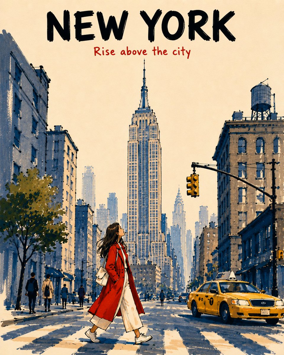
创作一张 4:5 竖版 Alcohol Marker 旅行海报,描绘从 low pedestrian viewpoint 看到的 [DESTINATION] 的 [LANDMARK]。让它像一段充满感情但并不完美的旅行回忆,而不是写实渲染、明信片、地图、地标拼贴或 cinematic panorama。

字体排版

顶部保留 14–16% 的开放暖象牙色纸张区域。

在顶部中央准确写出:

“[CITY NAME]”——使用大号、粗体的黑色马克笔大写字母。

下方写:

“[SHORT TRAVEL PHRASE]”——使用较小的朱红色手写马克笔字样。

确保两行文字都清晰易读,并与地标分开。不要添加其他文字。

场景

将 [LANDMARK] 醒目地置于画面上方中央,在简化不必要细节的同时,保留其最具辨识度的轮廓和标志性特征。

将周围建筑简化为 2–3 个宽阔的建筑体块。添加一辆简单的当地车辆、几名很小的行人,以及一位年轻女性旅行者;她正穿过画面下方中央的 foreground,同时抬头仰望。

让她穿一件鲜艳的朱红色外套,内搭奶油色服装,肤色呈自然的暖桃色。让她的暖色调与冷调石板蓝及浅蓝灰色建筑形成对比。

景深与马克笔风格

Foreground:饱和色彩、2–3 层重叠的马克笔笔触、清晰可见的 chisel-tip strokes、较深的阴影叠层,以及粗重且断续的黑色轮廓线。

Midground:中等密度的石板蓝/蓝灰色马克笔笔触、1–2 层笔触,以及中等粗细的断续轮廓线。

Background:逐步降低饱和度、密度、对比度、细节和轮廓线粗细。使用浅蓝灰色单层笔触和纤细、不完整的轮廓线,使其轻柔地融入象牙色天空。

建筑使用宽阔的竖向笔触,街道使用短促的方向性笔触。保留约 40% 的暖象牙色纸张裸露区域。

风格限制

保持插画简洁、富有触感、图形化、轻盈、怀旧且略带不完美,只呈现主要建筑形体和少量窗户暗示。

避免:写实主义、重复的窗格、密集的天际线细节、逼真的倒影、统一的轮廓线、数字渐变、水彩效果、黑色实心阴影、过度细节、杂乱或额外字体排版。

整体:以富有表现力的 Alcohol Marker 重现精致的中世纪现代风格旅行书插画,具有鲜明的 foreground-to-background atmospheric perspective 和明确无误的地域感。
原文提示词(English)
[DESTINATION] = {argument name="city name" default="[CITY NAME]"}
[LANDMARK] = {argument name="primary landmark" default="[PRIMARY LANDMARK]"}

Create a vertical 4:5 alcohol-marker travel poster of [LANDMARK] in [DESTINATION], viewed from a low pedestrian viewpoint. Make it feel like an affectionate, imperfect travel memory, not a photorealistic rendering, postcard, map, landmark collage, or cinematic panorama.

TYPOGRAPHY

Keep the top 14–16% open warm ivory paper.

At the top center, write exactly:

“[CITY NAME]” — large, bold black marker capitals.

Below it:

“[SHORT TRAVEL PHRASE]” — smaller vermilion-red handwritten marker lettering.

Keep both lines highly legible and separate from the landmark. No additional text.

SCENE

Place [LANDMARK] prominently in the upper-center, preserving its most recognizable silhouette and defining features while simplifying unnecessary detail.

Reduce surrounding architecture to 2–3 broad building masses. Add one simple local vehicle, a few tiny pedestrians, and a young female traveler walking across the lower-center foreground while looking upward.

Dress her in a vivid vermilion-red coat over cream clothing, with natural warm-peach skin tones. Make her warm colors contrast against the cool slate-blue and pale blue-gray architecture.

DEPTH & MARKER STYLE

Foreground: saturated colors, 2–3 overlapping marker passes, visible chisel-tip strokes, darker shadow overlaps, and thick broken black contours.

Midground: medium-density slate-blue / blue-gray marker strokes, 1–2 passes, moderately thick broken outlines.

Background: progressively reduce saturation, density, contrast, detail, and contour weight. Use pale blue-gray single-pass strokes with thin, incomplete outlines that gently merge into the ivory sky.

Use broad vertical strokes for buildings and short directional strokes for streets. Leave approximately 40% of the warm ivory paper exposed.

STYLE CONSTRAINTS

Keep the illustration simplified, tactile, graphic, airy, nostalgic, and slightly imperfect, with only major architectural forms and a few window suggestions.

Avoid: photorealism, repetitive window grids, dense skyline detail, realistic reflections, uniform outlines, digital gradients, watercolor effects, black-filled shadows, excessive detail, clutter, or extra typography.

Overall: sophisticated mid-century-inspired travel-book illustration recreated with expressive alcohol markers, with strong foreground-to-background atmospheric perspective and an unmistakable sense of place.
建议模型
GPT Image 2