













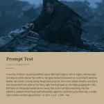


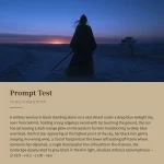





























提示词
使用 React、TypeScript、Tailwind CSS 3 和 Framer Motion,将“我们的综合品牌塑造方法”版块构建为 React 组件。该版块采用深色背景(`#0f0f0f`)和白色文本。字体为 `'DM Sans', sans-serif`(通过 Google Fonts 加载:`https://fonts.googleapis.com/css?family=DM+Sans:500,400`)。以下是确切规范:

---

**整体版块容器:**

- `<section>` 使用 `overflow-x-hidden`、`bg-[#0f0f0f]`、`text-white`,内联样式为 `fontFamily: "'DM Sans', sans-serif"`

- 内层包装容器:`mx-auto max-w-7xl px-6 py-24 sm:px-10 lg:px-16 lg:py-32`

- 所有动画均使用缓动曲线 `[0.22, 1, 0.36, 1]`,并通过 Framer Motion 的 `useInView` 配合 `{ once: true, margin: "-60px" }`,在滚动进入视口时仅触发一次

---

**页眉(版块顶部):**

- Flex row(`flex items-start gap-4`),使用 `mb-20`

- 两行垂直堆叠的文本:

  - 第 1 行:“我们的综合”,使用 `text-[#6e6e6e]`(灰色)、`font-light`,字号 `clamp(2rem, 3.4vw, 2.6rem)`、`leading-[1.18]`、`tracking-[-0.01em]`。从 `opacity:0, y:20` 动画至可见,持续 `0.7s`。

  - 第 2 行:“品牌塑造方法”,使用 `text-white`,字体样式相同。动画相同,但设置 `delay: 0.1s`。

- 右侧放置一个小型方形按钮:`h-7 w-7`、`border border-white/20`,包含加号图标(SVG:两条垂直相交的线组成 +,`stroke="currentColor"`、`strokeWidth="1.3"`、viewBox `0 0 12 12`)。文本颜色为 `text-white/70`,hover:`bg-white/10 text-white`。从 scale 0.8、opacity 0 动画至 1,delay `0.25s`。

---

**内容行(页眉下方):**

- `flex flex-col gap-12 lg:flex-row lg:items-start lg:gap-10`

- 左侧:`flex min-w-0 flex-1 flex-col gap-8 sm:flex-row sm:items-start sm:gap-10`,包含肖像和推荐语

- 右侧:圆形图

---

**左侧:故障效果肖像**

- 容器:`relative shrink-0`,固定尺寸 `width: 250px`、`height: 310px`

- 包含一个使用 `object-cover` 填满容器的 `<img>`,采用以下 Pexels 图片:`https://images.pexels.com/photos/3778212/pexels-photo-3778212.jpeg?auto=compress&cs=tinysrgb&w=600`

- 10 个白色小型故障块(`bg-white`)绝对定位在肖像边缘周围(部分溢出边界)。每个块都有固定像素 `width` 和 `height`,以及基于百分比的 `left`/`top`。它们以 `scale: 0 -> 1`、`opacity: [0, 1, 0.9]` 依次出现,从 `delay: 0.5s` 开始,每个错开 `0.05s`,持续 `0.35s`。

- 故障块的确切位置(x%、y%、宽度 px、高度 px):

  ```

  (2, -3, 22, 22), (12, -5, 14, 10), (28, -2, 10, 10),

  (82, 22, 8, 8), (-4, 75, 16, 12), (8, 82, 10, 10),

  (-2, 88, 18, 16), (56, 82, 12, 14), (70, 90, 10, 10),

  (42, 94, 8, 6)

  ```

- 整个肖像组从 `opacity:0, y:24` 动画至可见,持续 `0.8s`,delay `0.2s`。

---

**左侧:推荐语文本(肖像旁)**

- 容器:`min-w-0 max-w-[420px]`

- 左双弯引号字符 `u201C`,使用 `text-[#555]`,字体为 `Georgia, 'Times New Roman', serif`,`fontSize: "3.2rem"`、`lineHeight: 0.7`。以 `y:14` 动画进入,delay `0.3s`。

- 引语段落:“我们不断看到同一种模式—有潜力的品牌迷失在混乱的流程、零散的视觉设计和令人过目即忘的网站之间。这间工作室的存在,就是为了将这一切整合成一个清晰、一致的故事。”长破折号使用 `—`。样式为 `text-white/90`,字号 `clamp(1.05rem, 1.5vw, 1.28rem)`、`font-normal`、`leading-[1.58]`。从 `y:20` 动画进入,delay `0.4s`。

- 署名区块 `mt-10`:

  - 姓名:“Alex West”,使用 `text-[1.15rem] font-medium tracking-[0.01em] text-white`

  - 职位:“创始人 & 创意总监”(在 JSX 中使用 `&`),使用 `mt-1 text-[0.85rem] tracking-wide text-[#6e6e6e]`

  - 两者一起从 `y:14` 动画进入,delay `0.55s`。

---

**右侧:圆形图**

- 包装容器:`flex w-full max-w-[360px] shrink-0 items-center justify-center self-center sm:max-w-[400px] lg:max-w-[440px]`

- 内层容器的 `aspect-ratio: 1/1`,position relative,从 opacity 0->1 动画进入,delay `0.4s`,持续 `0.8s`。

- SVG 使用 `viewBox="0 0 100 100"`,绝对定位并填满容器:

  - 一个以 `(50, 50)` 为圆心、半径为 `30` 的圆,`stroke="white"`、`strokeWidth="0.18"`、`opacity="0.45"`

  - 3 条线从中心 `(50,50)` 向外辐射至半径 `36`(30+6),角度如下:

    - “网站”位于 215 度

    - “品牌”位于 335 度

    - “ui/ux design”位于 110 度

  - 线条默认:`strokeWidth: 0.18`、`opacity: 0.45`。hover 对应标签时:`strokeWidth: 0.6`、`opacity: 1`。过渡持续时间为 `0.3s`。

- 3 个文本标签以相同角度定位在距中心半径 `46`(30+16)的位置,并使用 `transform: translate(-50%, -50%)` 居中。样式为 `fontSize: clamp(1.25rem, 2.8vw, 2.4rem)`、`letterSpacing: -0.01em`、`text-white`、`whitespace-nowrap`。

  - 默认 `fontWeight: 300`,hover 该标签时:`fontWeight: 700`(过渡 `0.25s`)。

  - 每个标签从 `opacity:0, y:16` 动画至可见,从 delay `0.6s` 开始,每个错开 `0.15s`,持续 `0.7s`。

- hover 状态共享:hover 某个标签时,同时高亮该标签(加粗)及其对应的 SVG 线条。

---

**依赖项:** React 18、Framer Motion (v12+)、Tailwind CSS 3。使用 `useState`、`useRef`、Framer Motion 中的 `useInView`,并为所有动画使用 `motion` 组件。除 Framer Motion 外,不使用其他外部动画库。
原文提示词(English)
Build an "Our Comprehensive Branding Approach" section as a React component using TypeScript, Tailwind CSS 3, and Framer Motion. The section sits on a dark background (`#0f0f0f`) with white text. Font is `'DM Sans', sans-serif` (loaded via Google Fonts: `https://fonts.googleapis.com/css?family=DM+Sans:500,400`). Here is the exact specification:

---

**Overall Section Container:**

- `<section>` with `overflow-x-hidden`, `bg-[#0f0f0f]`, `text-white`, inline style `fontFamily: "'DM Sans', sans-serif"`

- Inner wrapper: `mx-auto max-w-7xl px-6 py-24 sm:px-10 lg:px-16 lg:py-32`

- All animations use the easing curve `[0.22, 1, 0.36, 1]` and trigger once when scrolled into view using Framer Motion's `useInView` with `{ once: true, margin: "-60px" }`

---

**Header (top of section):**

- Flex row (`flex items-start gap-4`) with `mb-20`

- Two lines of text stacked vertically:

  - Line 1: "Our Comprehensive" in `text-[#6e6e6e]` (gray), `font-light`, size `clamp(2rem, 3.4vw, 2.6rem)`, `leading-[1.18]`, `tracking-[-0.01em]`. Animates from `opacity:0, y:20` to visible, duration `0.7s`.

  - Line 2: "Branding Approach" in `text-white`, same font styling. Same animation but with `delay: 0.1s`.

- A small square button to the right: `h-7 w-7`, `border border-white/20`, contains a plus icon (SVG: two perpendicular lines forming a +, `stroke="currentColor"`, `strokeWidth="1.3"`, viewBox `0 0 12 12`). Text color `text-white/70`, hover: `bg-white/10 text-white`. Animates scale from 0.8 to 1, opacity 0 to 1, delay `0.25s`.

---

**Content Row (below header):**

- `flex flex-col gap-12 lg:flex-row lg:items-start lg:gap-10`

- Left side: `flex min-w-0 flex-1 flex-col gap-8 sm:flex-row sm:items-start sm:gap-10` containing the portrait and testimonial

- Right side: the circle diagram

---

**Left: Glitch Portrait**

- Container: `relative shrink-0`, fixed size `width: 250px`, `height: 310px`

- Contains an `<img>` filling the container with `object-cover`, using this Pexels image: `https://images.pexels.com/photos/3778212/pexels-photo-3778212.jpeg?auto=compress&cs=tinysrgb&w=600`

- 10 small white glitch blocks (`bg-white`) absolutely positioned around the edges of the portrait (some overflow outside). Each block has a fixed pixel `width` and `height` and percentage-based `left`/`top`. They animate in with `scale: 0 -> 1`, `opacity: [0, 1, 0.9]`, staggered by `0.05s` starting at `delay: 0.5s`, duration `0.35s`.

- The exact glitch block positions (x%, y%, width px, height px):

  ```

  (2, -3, 22, 22), (12, -5, 14, 10), (28, -2, 10, 10),

  (82, 22, 8, 8), (-4, 75, 16, 12), (8, 82, 10, 10),

  (-2, 88, 18, 16), (56, 82, 12, 14), (70, 90, 10, 10),

  (42, 94, 8, 6)

  ```

- The entire portrait group animates from `opacity:0, y:24` to visible, duration `0.8s`, delay `0.2s`.

---

**Left: Testimonial Text (next to portrait)**

- Container: `min-w-0 max-w-[420px]`

- Opening curly quote character `u201C` in `text-[#555]`, font `Georgia, 'Times New Roman', serif`, `fontSize: "3.2rem"`, `lineHeight: 0.7`. Animates in with `y:14`, delay `0.3s`.

- Quote paragraph: "We kept seeing the same pattern -- brands with potential lost between messy processes, scattered visuals, and forgettable websites. This studio exists to align it all into one clear, consistent story." Use `—` for the em-dash. Styled as `text-white/90`, size `clamp(1.05rem, 1.5vw, 1.28rem)`, `font-normal`, `leading-[1.58]`. Animates from `y:20`, delay `0.4s`.

- Attribution block `mt-10`:

  - Name: "Alex West" in `text-[1.15rem] font-medium tracking-[0.01em] text-white`

  - Title: "Founder & Creative Director" (`&` in JSX) in `mt-1 text-[0.85rem] tracking-wide text-[#6e6e6e]`

  - Both animate together from `y:14`, delay `0.55s`.

---

**Right: Circle Diagram**

- Wrapper: `flex w-full max-w-[360px] shrink-0 items-center justify-center self-center sm:max-w-[400px] lg:max-w-[440px]`

- Inner container has `aspect-ratio: 1/1`, position relative, animates opacity 0->1, delay `0.4s`, duration `0.8s`.

- SVG with `viewBox="0 0 100 100"`, absolutely filling the container:

  - A circle centered at `(50, 50)` with radius `30`, `stroke="white"`, `strokeWidth="0.18"`, `opacity="0.45"`

  - 3 lines radiating from center `(50,50)` outward to radius `36` (30+6) at these angles:

    - "websites" at 215 degrees

    - "brands" at 335 degrees

    - "ui/ux design" at 110 degrees

  - Lines default: `strokeWidth: 0.18`, `opacity: 0.45`. On hover of corresponding label: `strokeWidth: 0.6`, `opacity: 1`. Transition duration `0.3s`.

- 3 text labels positioned at radius `46` (30+16) from center at the same angles, using `transform: translate(-50%, -50%)` for centering. Styled with `fontSize: clamp(1.25rem, 2.8vw, 2.4rem)`, `letterSpacing: -0.01em`, `text-white`, `whitespace-nowrap`.

  - Default `fontWeight: 300`, on hover of that label: `fontWeight: 700` (transition `0.25s`).

  - Each label animates in with `opacity:0, y:16` to visible, staggered by `0.15s` starting at delay `0.6s`, duration `0.7s`.

- Hover state is shared: hovering a label highlights both the label (bold) and its corresponding SVG line.

---

**Dependencies:** React 18, Framer Motion (v12+), Tailwind CSS 3. Uses `useState`, `useRef`, `useInView` from framer-motion, and `motion` components for all animations. No external animation libraries beyond Framer Motion.