











































提示词
### 概述

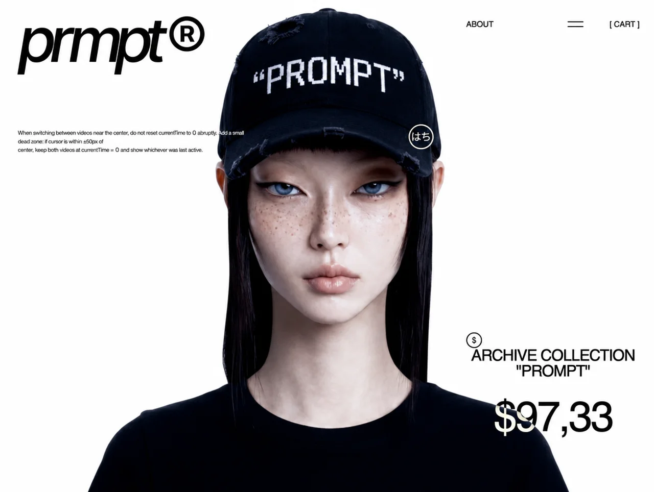
为名为 "prmpt" 的品牌构建一个全屏、由滚动驱动的时尚/档案落地页。页面分为两个主要阶段:

1. **Hero 阶段**(滚动的前 100vh):全视口视频背景,上方叠加 UI(logo、导航、产品信息、自定义光标)。一个黑色面板从下方向上滑动并覆盖视频。
2. **Gallery 阶段**(继续滚动):黑色面板中包含一个错落排列的产品图片网格,图片进入/离开视口时会放大/缩小。最后,一个白色叠层淡入,并显示 "view" CTA 按钮。

---

### 技术栈

- **React 19** + **TypeScript**
- **Vite 6**,使用 `@vitejs/plugin-react`
- **Tailwind CSS v4**,通过 `@tailwindcss/vite` 插件使用
- **GSAP 3.15** + `@gsap/react`(ScrollTrigger)
- **Motion (Framer Motion) 12**(`motion/react`)
- **字体**:"Inter Tight"(Google Fonts,字重 500)-- 通过 `<link>` 或 import 加载

---

### 资源 URL

**视频(CloudFront):**
- LEFT 视频:`https://d8j0ntlcm91z4.cloudfront.net/user_39ca84eAE1ODL9hbR5VhoEj8tBf/hf_20260625_154433_532a85d3-dabf-4265-b8bd-19ac6af31842.mp4`
- RIGHT 视频:`https://d8j0ntlcm91z4.cloudfront.net/user_39ca84eAE1ODL9hbR5VhoEj8tBf/hf_20260625_154401_a664f076-b971-4557-8728-40ef9ea4c49b.mp4`

**Gallery 图片(共 10 张,按顺序):**
1. `https://images.higgs.ai/?default=1&output=webp&url=https%3A%2F%2Fd8j0ntlcm91z4.cloudfront.net%2Fuser_38xzZboKViGWJOttwIXH07lWA1P%2Fhf_20260629_104530_521b2f85-c0f3-4d0e-9704-b578315b4cb9.png&w=1920&q=85`
2. `https://images.higgs.ai/?default=1&output=webp&url=https%3A%2F%2Fd8j0ntlcm91z4.cloudfront.net%2Fuser_38xzZboKViGWJOttwIXH07lWA1P%2Fhf_20260629_103711_76ccdb8b-5043-4f47-9c54-4379713393ea.png&w=1920&q=85`
3. `https://images.higgs.ai/?default=1&output=webp&url=https%3A%2F%2Fd8j0ntlcm91z4.cloudfront.net%2Fuser_38xzZboKViGWJOttwIXH07lWA1P%2Fhf_20260629_103728_394f6a1b-85e2-4386-a4f6-408472a0a5b7.png&w=1920&q=85`
4. `https://images.higgs.ai/?default=1&output=webp&url=https%3A%2F%2Fd8j0ntlcm91z4.cloudfront.net%2Fuser_38xzZboKViGWJOttwIXH07lWA1P%2Fhf_20260629_103739_86743e0e-16a7-4bee-bf38-dd67985344dc.png&w=1920&q=85`
5. `https://images.higgs.ai/?default=1&output=webp&url=https%3A%2F%2Fd8j0ntlcm91z4.cloudfront.net%2Fuser_38xzZboKViGWJOttwIXH07lWA1P%2Fhf_20260629_103748_b2215dc8-a3a7-470d-b19a-5b87fa7d0c37.png&w=1920&q=85`
6. `https://images.higgs.ai/?default=1&output=webp&url=https%3A%2F%2Fd8j0ntlcm91z4.cloudfront.net%2Fuser_38xzZboKViGWJOttwIXH07lWA1P%2Fhf_20260629_103758_e919ce72-5c9d-4b87-9be6-d7647b34825c.png&w=1920&q=85`
7. `https://images.higgs.ai/?default=1&output=webp&url=https%3A%2F%2Fd8j0ntlcm91z4.cloudfront.net%2Fuser_38xzZboKViGWJOttwIXH07lWA1P%2Fhf_20260629_103808_013583d0-3386-4547-9832-37c7d8edb3ac.png&w=1920&q=85`
8. `https://images.higgs.ai/?default=1&output=webp&url=https%3A%2F%2Fd8j0ntlcm91z4.cloudfront.net%2Fuser_38xzZboKViGWJOttwIXH07lWA1P%2Fhf_20260629_103937_a0c49d0a-33eb-4ead-aea6-c1baf241acbc.png&w=1920&q=85`
9. `https://images.higgs.ai/?default=1&output=webp&url=https%3A%2F%2Fd8j0ntlcm91z4.cloudfront.net%2Fuser_38xzZboKViGWJOttwIXH07lWA1P%2Fhf_20260629_103956_d18ed8fd-7b6f-4b86-91f9-20010fe38670.png&w=1920&q=85`
10. `https://images.higgs.ai/?default=1&output=webp&url=https%3A%2F%2Fd8j0ntlcm91z4.cloudfront.net%2Fuser_38xzZboKViGWJOttwIXH07lWA1P%2Fhf_20260629_104034_ba5a9963-87ff-4008-a545-6bd686c088b5.png&w=1920&q=85`

---

### SECTION 1:Hero(视频背景 + 叠加 UI)

#### 根容器
- `id="scroll-spacer"`、`position: relative`、`user-select: none`、`background: white`
- 高度动态计算(初始为 `500vh`,随后由 GSAP 覆盖为 `vh + maxScroll + 2*vh`)
- 桌面端隐藏默认光标(`cursor: none`),触摸设备使用默认光标

#### 1A. 自定义光标(仅桌面端)
- 在移动端/平板端隐藏(< 1024px)
- 一个跟随 `mousemove` 的 `fixed`、`pointer-events-none`、`z-index: 50` div
- 通过直接操作 DOM 定位(`style.left/top = clientX/clientY`)
- 使用 `transform: translate(-50%, -50%)` 将其中心对准指针
- `mix-blend-mode: exclusion`
- 包含一个 48x48 SVG:一个带描边的圆(r=22.75,strokeWidth=2.5),内部包含自定义日文/装饰性字形 path,全部填充为白色

#### 1B. Logo(左上角)
- `position: fixed`、`pointer-events-none`、`z-index: 20`
- `mix-blend-mode: exclusion`
- 响应式宽度:124px(移动端 < 640)、266px(平板端 640-1024)、355px(桌面端)
- 位置:移动端为 `top: 16px, left: 16px`,桌面端为 `top: 32px, left: 32px`
- Motion 动画:淡入 + 向上滑动(`opacity: 0->1, y: 12->0`),时长 0.6s,ease `[0.25, 0.1, 0.25, 1]`,延迟 0s
- SVG viewBox `0 0 355 110`,包含 "prmpt" wordmark + 带圆圈的 "R" 标记,所有 path 均填充为白色

#### 1C. 说明文字(Logo 下方,左侧)
- `position: fixed`、`pointer-events-none`、`z-index: 20`
- `mix-blend-mode: exclusion`
- 位置:桌面端 `left: 32px`,移动端 `left: 16px`
- Top:桌面端 244px、平板端 180px、移动端 118px
- 宽度:桌面端 692px、平板端 `calc(50vw - 48px)`、移动端 `calc(100vw - 32px)`
- 字体:Inter Tight,字重 500,字号 12px,line-height 140%,letter-spacing -0.04em,颜色 #FFFFFF
- Motion 动画:与 logo 相同,但延迟 0.3s
- 文本内容:"在中心附近切换视频时,不要突然将 currentTime 重置为 0。添加一个小型死区:如果光标位于中心 +/-50px 范围内,则让两个视频都保持 currentTime = 0,并显示上一次处于激活状态的视频。"

#### 1D. Header 导航(右上角)
- `position: fixed`、`z-index: 20`、`pointer-events-none`
- `mix-blend-mode: exclusion`
- 位置:桌面端为 `top: 32px, right: 32px`,移动端为 `top: 16px, right: 16px`
- 宽度:桌面端 330px,移动端 auto
- 高度:30px
- Flex row,justify-content: space-between,align-items: center
- Motion 动画:相同 easing,延迟 0.15s
- 包含:
  - "关于" 文本(移动端隐藏):Inter Tight,500,15px,大写,白色
  - 一个 gap 为 50px(桌面端)/ 20px(移动端)的 flex row:
    - Hamburger SVG 图标:viewBox `0 0 40 40`,两条水平线(`M0 14H40` 和 `M0 26H40`),描边为白色,strokeWidth 2.5。尺寸:桌面端 30x30,移动端 24x24
    - "[ 购物车 ]" 文本:Inter Tight,500,桌面端 15px / 移动端 13px,白色

#### 1E. 产品信息(右下角)
- `id="outro-info"`、`position: fixed`、`pointer-events-none`、`z-index: 20`
- `mix-blend-mode: exclusion`
- **桌面端**:right: 32px,bottom: 80px,width: 330px,flex-column,居中对齐
- **移动端**:left: 0,right: 0,bottom: 48px,flex-column,居中对齐
- Motion 动画:opacity 0->1,延迟 0.45s
- `data-outro-offset`:桌面端 166,移动端 132 -- 用于滚动动画
- 包含:
  - 顶部区块(flex-column、align flex-start,桌面端宽度 100% / 移动端 252px,桌面端 margin-bottom 32px / 移动端 12px):
    - 圆形图标:relative div(桌面端 30x30,移动端 20x20),包含:
      - SVG 圆形(cx=20,cy=20,r=18.75,描边为白色,桌面端 strokeWidth 2.5 / 移动端 2)
      - `<span id="circle-symbol">` 在内部居中,初始显示 "8",滚动时变为 `['8', '$', '^^', '%', '/']` 中的随机符号(节流 80ms)
      - 字体:Inter Tight,500,桌面端 15px / 移动端 10px,letter-spacing -0.04em,大写,白色
    - 系列标签:Inter Tight,500,桌面端 30px / 移动端 20px,line-height 100%,文本居中,letter-spacing -0.04em,大写,白色。内容:`档案系列` + 换行 + `"PROMPT"`
  - 价格:Inter Tight,500,桌面端 80px / 移动端 60px,line-height 100%,文本居中,letter-spacing -0.04em,白色。内容:`$97,33`

#### 1F. "view" 按钮(右下角,初始隐藏)
- `id="outro-buy"`、`position: fixed`、`pointer-events-none`、`z-index: 20`
- `mix-blend-mode: exclusion`
- **桌面端**:right: 32px,bottom: 32px,width: 330px,height: 174px
- **移动端**:left: 16px,right: 16px,bottom: 60px,height: 100px
- `transform-origin: right bottom`、`transform: scale(0)`(初始隐藏,通过滚动缩放至 1)
- 背景:#fff,border-radius: 1335px(胶囊形)
- Flex 居中
- 文本 "view":Inter Tight,500,桌面端 110px / 移动端 72px,letter-spacing -0.04em,颜色 #fff,`mix-blend-mode: exclusion`

#### 1G. 视频容器
- `id="main-canvas"`、`pointer-events-none`
- **桌面端**:`position: fixed, inset: 0, width: 100%, height: 100%, z-index: 0`
- **移动端**:`position: fixed, left: 0, top: 220px, width: 100vw, height: calc(100vh - 220px), z-index: 0`
- 两个视频都加载完成后,透明度从 0 过渡至 1(`opacity 0.3s ease`)
- `overflow: hidden`
- 包含两个 `<video>` 元素(muted、playsInline、preload="auto"),使用绝对定位填满容器,`object-fit: cover`
- Left 视频初始为 `display: none`,right 视频初始为 `display: block`


**桌面端(非触摸):**
- 视频不会自动播放。通过 `requestAnimationFrame` 根据光标的 X 位置进行拖动播放。
- 死区:距中心 `Math.max(30, width * 0.05)` 像素
- 如果光标位于死区内,让当前视频保持 `currentTime = 0`
- 如果光标移动到死区左侧:显示 RIGHT 视频,根据从中心左侧死区边缘到左边缘的距离拖动播放
- 如果光标移动到死区右侧:显示 LEFT 视频,根据从中心右侧死区边缘到右边缘的距离拖动播放
- `activeSideRef` 跟踪上一次激活的是哪一侧,仅当光标越过死区时才改变
- 进度计算:`(distance from dead zone edge) / (available range)` 映射至 `0...video.duration`
关键要求:仅在 !video.seeking 时更新 currentTime -- 这样会等待浏览器完成上一次跳转的渲染,再请求新的跳转,从而避免播放抖动。
#### 1H. 视频交互逻辑

**移动端/平板端(触摸):**
- 视频交替自动播放:先播放 left,触发 `ended` 事件时切换至 right,right 触发 `ended` 时再切换回 left
- 遵循 `prefers-reduced-motion`

#### 1I. 白色叠层
- `id="outro-overlay"`、`position: fixed, inset: 0`、`pointer-events-none`、`z-index: 12`
- 背景:#fff,opacity: 0(由滚动控制)

#### 1J. Footer
- `id="outro-footer"`、`position: fixed`、`pointer-events-none`
- Left: 16px,桌面端 bottom: 32px / 移动端 24px
- `mix-blend-mode: exclusion`,opacity: 0(由滚动控制)
- Flex row,桌面端 gap: 80px / 移动端 space-between
- 两个 span:"PRMPT (R) 2026" 和 "隐私政策"
- 字体:Inter Tight,500,桌面端 13px / 移动端 11px,letter-spacing -0.02em,大写,白色

---

### SECTION 2:黑色面板(Gallery)

#### 容器
- `position: fixed, inset: 0`,背景为黑色,`z-index: 10`
- 初始向下平移 `translateY(100vh)`(位于屏幕下方)
- 通过 GSAP ScrollTrigger 在滚动的前 100vh 内向上滑动至 `translateY(0)`(scrub: true,ease: none)

#### 内层 Wrapper
- `width: 100%`、`padding-top: min(400px, 40vh)`

#### 网格布局算法
- 响应式列数:2(< 640px)、3(640-1024px)、4(>= 1024px)
- 每个单元格使用 `aspect-ratio: 2/3`
- 布局函数 `buildLayout(count, cols)` 创建各行:
  - 对每一行 `r`,计算主列:`a = (r * 2 + (r % 2)) % cols`
  - 在 `a` 列放置一张图片
  - 每第 3 行(`r % 3 === 0`),在 `b = (a + 2) % cols` 放置第二张图片(如果与 a 相同,则使用 `(a+1)%cols`)
  - 空单元格填入 `-1`(渲染为空白 spacer div)

#### 卡片行为
- 每张卡片都使用 class `bp-card`、`will-change: transform`
- 初始为 `transform: scale(0)`
- `transform-origin`:网格左半部分的卡片使用 `right bottom`,右半部分使用 `left bottom`
- 每一帧都根据卡片的垂直位置在 RAF 中计算缩放:
  - **进入**:`Math.min(1, (vh - top) / (vh * 0.6))` -- 进入视口时从 0 缩放至 1
  - **退出**:`Math.min(1, bottom / (vh * 0.4))` -- 从顶部退出时从 1 缩放至 0
  - 最终缩放值:`Math.min(enter, exit)`
  - 如果卡片完全位于屏幕外(bottom <= 0 或 top >= vh):`scale(0)`

#### 滚动阶段(基于 RAF,而非 scroll 事件)
- **Phase 1**(scrollY 0 至 vh):面板向上滑动。使用 panelOffset = `vh - scrollY` 计算卡片
- **Phase 2**(scrollY > vh):面板固定在顶部。内层 wrapper 向上平移:`translateY(-(scrollY - vh))`。使用 phase2 offset 重新计算卡片
- **Outro**(scrollY > vh + maxScroll):白色叠层淡入,产品信息向上滑动 `outroOffset` px,"view" 按钮从 0 缩放至 1,footer 淡入。进度:`(scrollY - vh - maxScroll) / (vh - 100)`

#### Spacer 高度计算
- 动态设置为:`vh + maxScroll + 2 * vh`,其中 `maxScroll = wrapScrollHeight - vh`

---

### CSS(index.css)

```css
@import "tailwindcss";

.bp-card {
  will-change: transform;
}

@media (prefers-reduced-motion: reduce) {
  .bp-card {
    will-change: auto;
  }
}
```

---

### 响应式断点
- **移动端**:< 640px
- **平板端**:640px - 1024px
- **桌面端**:>= 1024px

---

### 核心设计原则
- 所有文本叠层均使用 `mix-blend-mode: exclusion`,以便在浅色和深色背景上都保持可见
- 没有可见的滚动条交互 -- 位置跟踪完全由 RAF 驱动
- 所有叠加 UI 元素均使用 `pointer-events-none`
- 根容器使用 `user-select: none`
- 滚动超过第一个视口高度后隐藏视频(`visibility: hidden`)
- 滚动时随机改变圆形符号(节流至 80ms)
- 入场动画依次错开:logo(0s)、nav(0.15s)、说明文字(0.3s)、产品信息(0.45s)
原文提示词(English)
### Overview

Build a full-screen, scroll-driven fashion/archive landing page for a brand called "prmpt". The page has two main phases:

1. **Hero phase** (first 100vh of scroll): Full-viewport video background with overlaid UI (logo, nav, product info, custom cursor). A black panel slides up from below covering the video.
2. **Gallery phase** (continues scrolling): The black panel contains a scattered grid of product images that scale in/out as they enter/exit the viewport. At the end, a white overlay fades in with a "view" CTA button.

---

### Tech Stack

- **React 19** + **TypeScript**
- **Vite 6** with `@vitejs/plugin-react`
- **Tailwind CSS v4** via `@tailwindcss/vite` plugin
- **GSAP 3.15** + `@gsap/react` (ScrollTrigger)
- **Motion (Framer Motion) 12** (`motion/react`)
- **Font**: "Inter Tight" (Google Fonts, weight 500) -- loaded via `<link>` or import

---

### Asset URLs

**Videos (CloudFront):**
- LEFT video: `https://d8j0ntlcm91z4.cloudfront.net/user_39ca84eAE1ODL9hbR5VhoEj8tBf/hf_20260625_154433_532a85d3-dabf-4265-b8bd-19ac6af31842.mp4`
- RIGHT video: `https://d8j0ntlcm91z4.cloudfront.net/user_39ca84eAE1ODL9hbR5VhoEj8tBf/hf_20260625_154401_a664f076-b971-4557-8728-40ef9ea4c49b.mp4`

**Gallery Images (10 total, in order):**
1. `https://images.higgs.ai/?default=1&output=webp&url=https%3A%2F%2Fd8j0ntlcm91z4.cloudfront.net%2Fuser_38xzZboKViGWJOttwIXH07lWA1P%2Fhf_20260629_104530_521b2f85-c0f3-4d0e-9704-b578315b4cb9.png&w=1920&q=85`
2. `https://images.higgs.ai/?default=1&output=webp&url=https%3A%2F%2Fd8j0ntlcm91z4.cloudfront.net%2Fuser_38xzZboKViGWJOttwIXH07lWA1P%2Fhf_20260629_103711_76ccdb8b-5043-4f47-9c54-4379713393ea.png&w=1920&q=85`
3. `https://images.higgs.ai/?default=1&output=webp&url=https%3A%2F%2Fd8j0ntlcm91z4.cloudfront.net%2Fuser_38xzZboKViGWJOttwIXH07lWA1P%2Fhf_20260629_103728_394f6a1b-85e2-4386-a4f6-408472a0a5b7.png&w=1920&q=85`
4. `https://images.higgs.ai/?default=1&output=webp&url=https%3A%2F%2Fd8j0ntlcm91z4.cloudfront.net%2Fuser_38xzZboKViGWJOttwIXH07lWA1P%2Fhf_20260629_103739_86743e0e-16a7-4bee-bf38-dd67985344dc.png&w=1920&q=85`
5. `https://images.higgs.ai/?default=1&output=webp&url=https%3A%2F%2Fd8j0ntlcm91z4.cloudfront.net%2Fuser_38xzZboKViGWJOttwIXH07lWA1P%2Fhf_20260629_103748_b2215dc8-a3a7-470d-b19a-5b87fa7d0c37.png&w=1920&q=85`
6. `https://images.higgs.ai/?default=1&output=webp&url=https%3A%2F%2Fd8j0ntlcm91z4.cloudfront.net%2Fuser_38xzZboKViGWJOttwIXH07lWA1P%2Fhf_20260629_103758_e919ce72-5c9d-4b87-9be6-d7647b34825c.png&w=1920&q=85`
7. `https://images.higgs.ai/?default=1&output=webp&url=https%3A%2F%2Fd8j0ntlcm91z4.cloudfront.net%2Fuser_38xzZboKViGWJOttwIXH07lWA1P%2Fhf_20260629_103808_013583d0-3386-4547-9832-37c7d8edb3ac.png&w=1920&q=85`
8. `https://images.higgs.ai/?default=1&output=webp&url=https%3A%2F%2Fd8j0ntlcm91z4.cloudfront.net%2Fuser_38xzZboKViGWJOttwIXH07lWA1P%2Fhf_20260629_103937_a0c49d0a-33eb-4ead-aea6-c1baf241acbc.png&w=1920&q=85`
9. `https://images.higgs.ai/?default=1&output=webp&url=https%3A%2F%2Fd8j0ntlcm91z4.cloudfront.net%2Fuser_38xzZboKViGWJOttwIXH07lWA1P%2Fhf_20260629_103956_d18ed8fd-7b6f-4b86-91f9-20010fe38670.png&w=1920&q=85`
10. `https://images.higgs.ai/?default=1&output=webp&url=https%3A%2F%2Fd8j0ntlcm91z4.cloudfront.net%2Fuser_38xzZboKViGWJOttwIXH07lWA1P%2Fhf_20260629_104034_ba5a9963-87ff-4008-a545-6bd686c088b5.png&w=1920&q=85`

---

### SECTION 1: Hero (Video Background + Overlaid UI)

#### Root Container
- `id="scroll-spacer"`, `position: relative`, `user-select: none`, `background: white`
- Height is dynamically calculated (initially `500vh`, then overridden by GSAP to `vh + maxScroll + 2*vh`)
- Custom cursor hidden on desktop (`cursor: none`), default on touch devices

#### 1A. Custom Cursor (Desktop Only)
- Hidden on mobile/tablet (< 1024px)
- A `fixed`, `pointer-events-none`, `z-index: 50` div that follows `mousemove`
- Positioned via direct DOM manipulation (`style.left/top = clientX/clientY`)
- `transform: translate(-50%, -50%)` to center on pointer
- `mix-blend-mode: exclusion`
- Contains a 48x48 SVG: a circle with stroke (r=22.75, strokeWidth=2.5) containing a custom Japanese/decorative glyph path, all filled white

#### 1B. Logo (Top Left)
- `position: fixed`, `pointer-events-none`, `z-index: 20`
- `mix-blend-mode: exclusion`
- Responsive width: 124px (mobile < 640), 266px (tablet 640-1024), 355px (desktop)
- Position: `top: 16px, left: 16px` (mobile), `top: 32px, left: 32px` (desktop)
- Motion animation: fade in + slide up (`opacity: 0->1, y: 12->0`), duration 0.6s, ease `[0.25, 0.1, 0.25, 1]`, delay 0s
- SVG viewBox `0 0 355 110`, contains the "prmpt" wordmark + circled "R" mark, all paths filled white

#### 1C. Caption (Below Logo, Left Side)
- `position: fixed`, `pointer-events-none`, `z-index: 20`
- `mix-blend-mode: exclusion`
- Position: `left: 32px` (desktop), `left: 16px` (mobile)
- Top: 244px (desktop), 180px (tablet), 118px (mobile)
- Width: 692px (desktop), `calc(50vw - 48px)` (tablet), `calc(100vw - 32px)` (mobile)
- Font: Inter Tight, weight 500, size 12px, line-height 140%, letter-spacing -0.04em, color #FFFFFF
- Motion animation: same as logo but delay 0.3s
- Text content: "When switching between videos near the center, do not reset currentTime to 0 abruptly. Add a small dead zone: if cursor is within +/-50px of center, keep both videos at currentTime = 0 and show whichever was last active."

#### 1D. Header Navigation (Top Right)
- `position: fixed`, `z-index: 20`, `pointer-events-none`
- `mix-blend-mode: exclusion`
- Position: `top: 32px, right: 32px` (desktop), `top: 16px, right: 16px` (mobile)
- Width: 330px (desktop), auto (mobile)
- Height: 30px
- Flex row, justify-content: space-between, align-items: center
- Motion animation: same easing, delay 0.15s
- Contains:
  - "ABOUT" text (hidden on mobile): Inter Tight, 500, 15px, uppercase, white
  - A flex row with gap 50px (desktop) / 20px (mobile):
    - Hamburger SVG icon: viewBox `0 0 40 40`, two horizontal lines (`M0 14H40` and `M0 26H40`), stroke white, strokeWidth 2.5. Size: 30x30 (desktop), 24x24 (mobile)
    - "[ CART ]" text: Inter Tight, 500, 15px (desktop) / 13px (mobile), white

#### 1E. Product Info (Bottom Right)
- `id="outro-info"`, `position: fixed`, `pointer-events-none`, `z-index: 20`
- `mix-blend-mode: exclusion`
- **Desktop**: right: 32px, bottom: 80px, width: 330px, flex-column, align center
- **Mobile**: left: 0, right: 0, bottom: 48px, flex-column, align center
- Motion animation: opacity 0->1, delay 0.45s
- `data-outro-offset`: 166 (desktop), 132 (mobile) -- used by scroll animation
- Contains:
  - Top block (flex-column, align flex-start, width 100% desktop / 252px mobile, margin-bottom 32px desktop / 12px mobile):
    - Circle icon: relative div (30x30 desktop, 20x20 mobile) containing:
      - SVG circle (cx=20, cy=20, r=18.75, stroke white, strokeWidth 2.5 desktop / 2 mobile)
      - `<span id="circle-symbol">` centered inside, shows "8" initially, changes to random symbol from `['8', '$', '^^', '%', '/']` on scroll (throttled 80ms)
      - Font: Inter Tight, 500, 15px (desktop) / 10px (mobile), letter-spacing -0.04em, uppercase, white
    - Collection label: Inter Tight, 500, 30px (desktop) / 20px (mobile), line-height 100%, text-align center, letter-spacing -0.04em, uppercase, white. Content: `ARCHIVE COLLECTION` + line break + `"PROMPT"`
  - Price: Inter Tight, 500, 80px (desktop) / 60px (mobile), line-height 100%, text-align center, letter-spacing -0.04em, white. Content: `$97,33`

#### 1F. "View" Button (Bottom Right, Initially Hidden)
- `id="outro-buy"`, `position: fixed`, `pointer-events-none`, `z-index: 20`
- `mix-blend-mode: exclusion`
- **Desktop**: right: 32px, bottom: 32px, width: 330px, height: 174px
- **Mobile**: left: 16px, right: 16px, bottom: 60px, height: 100px
- `transform-origin: right bottom`, `transform: scale(0)` (starts hidden, scales to 1 via scroll)
- Background: #fff, border-radius: 1335px (pill shape)
- Flex center
- Text "view": Inter Tight, 500, 110px (desktop) / 72px (mobile), letter-spacing -0.04em, color #fff, `mix-blend-mode: exclusion`

#### 1G. Video Container
- `id="main-canvas"`, `pointer-events-none`
- **Desktop**: `position: fixed, inset: 0, width: 100%, height: 100%, z-index: 0`
- **Mobile**: `position: fixed, left: 0, top: 220px, width: 100vw, height: calc(100vh - 220px), z-index: 0`
- Opacity transition: 0 -> 1 when both videos loaded (`opacity 0.3s ease`)
- `overflow: hidden`
- Contains two `<video>` elements (muted, playsInline, preload="auto"), absolutely positioned to fill container, `object-fit: cover`
- Left video starts `display: none`, right starts `display: block`


**Desktop (non-touch):**
- Videos are NOT auto-played. They are scrubbed based on cursor X position via `requestAnimationFrame`.
- Dead zone: `Math.max(30, width * 0.05)` pixels from center
- If cursor is in dead zone, keep current video at `currentTime = 0`
- If cursor moves left of dead zone: show RIGHT video, scrub it based on distance from center-left-edge to left edge
- If cursor moves right of dead zone: show LEFT video, scrub it based on distance from center+deadzone to right edge
- `activeSideRef` tracks which side was last active, only changes when cursor exceeds dead zone
- Progress calculation: `(distance from dead zone edge) / (available range)` mapped to `0...video.duration`
CRITICAL: Only update currentTime when !video.seeking -- this prevents jittery playback by waiting for the browser to finish rendering the previous seek before requesting a new one.
#### 1H. Video Interaction Logic

**Mobile/Tablet (touch):**
- Videos auto-play alternately: left plays first, on `ended` event switches to right, on right `ended` switches back to left
- Respects `prefers-reduced-motion`

#### 1I. White Overlay
- `id="outro-overlay"`, `position: fixed, inset: 0`, `pointer-events-none`, `z-index: 12`
- Background: #fff, opacity: 0 (controlled by scroll)

#### 1J. Footer
- `id="outro-footer"`, `position: fixed`, `pointer-events-none`
- Left: 16px, bottom: 32px (desktop) / 24px (mobile)
- `mix-blend-mode: exclusion`, opacity: 0 (controlled by scroll)
- Flex row, gap: 80px (desktop) / space-between (mobile)
- Two spans: "PRMPT (R) 2026" and "PRIVACY POLICY"
- Font: Inter Tight, 500, 13px (desktop) / 11px (mobile), letter-spacing -0.02em, uppercase, white

---

### SECTION 2: Black Panel (Gallery)

#### Container
- `position: fixed, inset: 0`, background: black, `z-index: 10`
- Initially translated `translateY(100vh)` (off-screen below)
- Slides up to `translateY(0)` during first 100vh of scroll via GSAP ScrollTrigger (scrub: true, ease: none)

#### Inner Wrapper
- `width: 100%`, `padding-top: min(400px, 40vh)`

#### Grid Layout Algorithm
- Responsive columns: 2 (< 640px), 3 (640-1024px), 4 (>= 1024px)
- Each cell has `aspect-ratio: 2/3`
- Layout function `buildLayout(count, cols)` creates rows:
  - For each row `r`, compute primary column: `a = (r * 2 + (r % 2)) % cols`
  - Place one image at column `a`
  - Every 3rd row (`r % 3 === 0`), place a second image at `b = (a + 2) % cols` (or `(a+1)%cols` if same as a)
  - Empty cells get `-1` (rendered as empty spacer divs)

#### Card Behavior
- Each card has class `bp-card`, `will-change: transform`
- `transform: scale(0)` initially
- `transform-origin`: cards in left half of grid get `right bottom`, right half get `left bottom`
- Scale is computed per-frame in RAF based on card's vertical position:
  - **Enter**: `Math.min(1, (vh - top) / (vh * 0.6))` -- scales from 0 to 1 as it enters viewport
  - **Exit**: `Math.min(1, bottom / (vh * 0.4))` -- scales from 1 to 0 as it exits top
  - Final scale: `Math.min(enter, exit)`
  - If card is fully off-screen (bottom <= 0 or top >= vh): `scale(0)`

#### Scroll Phases (RAF-based, NOT scroll events)
- **Phase 1** (scrollY 0 to vh): Panel slides up. Cards are computed with panelOffset = `vh - scrollY`
- **Phase 2** (scrollY > vh): Panel is fixed at top. Inner wrapper translates up: `translateY(-(scrollY - vh))`. Cards recomputed with phase2 offset.
- **Outro** (scrollY > vh + maxScroll): White overlay fades in, product info slides up by `outroOffset` px, "view" button scales from 0 to 1, footer fades in. Progress: `(scrollY - vh - maxScroll) / (vh - 100)`

#### Spacer Height Calculation
- Set dynamically: `vh + maxScroll + 2 * vh` where `maxScroll = wrapScrollHeight - vh`

---

### CSS (index.css)

```css
@import "tailwindcss";

.bp-card {
  will-change: transform;
}

@media (prefers-reduced-motion: reduce) {
  .bp-card {
    will-change: auto;
  }
}
```

---

### Responsive Breakpoints
- **Mobile**: < 640px
- **Tablet**: 640px - 1024px
- **Desktop**: >= 1024px

---

### Key Design Principles
- All text overlays use `mix-blend-mode: exclusion` to remain visible against both light and dark backgrounds
- No visible scroll bar interaction -- entirely RAF-driven position tracking
- `pointer-events-none` on all overlaid UI elements
- `user-select: none` on root container
- Videos hidden (`visibility: hidden`) once scroll passes first viewport height
- Circle symbol randomizes on scroll (throttled to 80ms)
- Entry animations staggered: logo (0s), nav (0.15s), caption (0.3s), product info (0.45s)
视频地址