











提示词
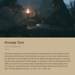
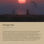
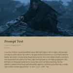
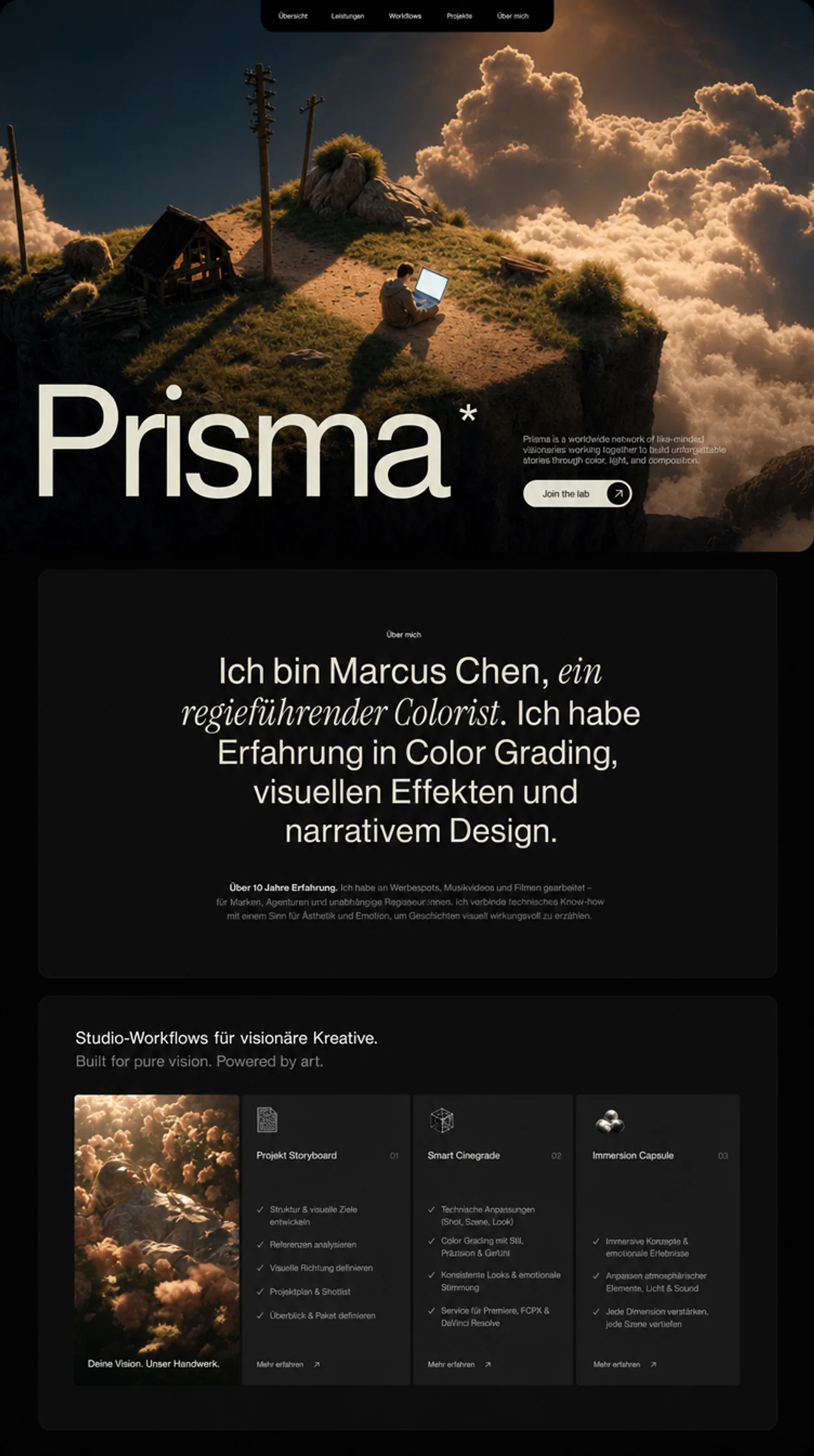
为一家名为 "Prisma" 的创意工作室创建一个使用 React + Vite + TypeScript + Tailwind CSS 的落地页。页面包含 3 个部分:Hero、About 和 Features。使用 framer-motion 实现动画,使用 lucide-react 提供图标。设计采用深色、低调且富有电影感的风格,并搭配暖奶油色调色板。

字体

在 index.html 中加载两种 Google Fonts:

Almarai(字重:300、400、700、800)——用作全局默认字体
Instrument Serif(仅 italic)——用于 About 部分的斜体强调文字
在 index.css 中设置全局字体系列:


* { font-family: 'Almarai', -apple-system, BlinkMacSystemFont, 'Segoe UI', 'Roboto', 'Oxygen', 'Ubuntu', 'Cantarell', sans-serif; }
在 tailwind.config.js 中扩展:

colors.primary: #DEDBC8(暖奶油色,用于所有主要文字和强调元素)
fontFamily.serif: ['"Instrument Serif"', 'serif']
配色系统

背景:全局使用黑色(#000000),About 卡片使用 #101010,Features 卡片使用 #212121
主要文字颜色:#E1E0CC(通过内联样式应用,与 Tailwind primary 略有不同)
Tailwind primary:#DEDBC8(用于 text-primary、text-primary/70 等工具类)
灰色文字:text-gray-400、text-gray-500
导航栏链接颜色:rgba(225, 224, 204, 0.8),hover:#E1E0CC
自定义 CSS 工具类(index.css)

两个 SVG 噪点纹理工具类:

.noise-overlay:分形噪点(baseFrequency: 0.85,numOctaves: 3),用作 hero 视频的叠加层
.bg-noise:分形噪点(baseFrequency: 0.9,numOctaves: 4),用作 Features 部分的细微背景
两者均使用带 feTurbulence 滤镜的内联 SVG data URIs。

第 1 部分:HERO

占满视口高度(h-screen)。整个部分使用 p-4 md:p-6 内边距,营造内嵌效果。内部是一个带 rounded-2xl md:rounded-[2rem] 和 overflow-hidden 的容器。

背景视频:

URL:https://d8j0ntlcm91z4.cloudfront.net/user_38xzZboKViGWJOttwIXH07lWA1P/hf_20260405_170732_8a9ccda6-5cff-4628-b164-059c500a2b41.mp4
autoPlay loop muted playsInline、object-cover,填满整个容器
顶部噪点叠加层:.noise-overlay,使用 opacity-[0.7] mix-blend-overlay pointer-events-none
渐变叠加层:bg-gradient-to-b from-black/30 via-transparent to-black/60
导航栏:

绝对定位于顶部中央
从顶部边缘垂下的黑色胶囊形背景:bg-black rounded-b-2xl md:rounded-b-3xl px-4 py-2 md:px-8
5 个导航项:"Our story"、"Collective"、"Workshops"、"Programs"、"Inquiries"
文字尺寸:text-[10px] sm:text-xs md:text-sm
项目间距:gap-3 sm:gap-6 md:gap-12 lg:gap-14
链接颜色:rgba(225, 224, 204, 0.8),hover:#E1E0CC(内联样式)
Hero 内容(底部对齐):

绝对定位于底部:absolute bottom-0 left-0 right-0
12 栏网格:左侧 8 栏用于标题,右侧 4 栏用于文字和按钮
使用 WordsPullUp 组件显示巨型标题 "Prisma":
响应式尺寸:text-[26vw] sm:text-[24vw] md:text-[22vw] lg:text-[20vw] xl:text-[19vw] 2xl:text-[20vw]
font-medium leading-[0.85] tracking-[-0.07em]
颜色:#E1E0CC
在 "Prisma" 最后的 "a" 上添加上标星号(*):使用 absolute top-[0.65em] -right-[0.3em] text-[0.31em] 定位
上拉动画:每个单词从 y:20 向上滑入,延迟以 0.08s 递增,由 useInView 触发
描述段落(右栏):
"Prisma 是一个遍布全球的视觉艺术家、电影制作人和故事创作者网络。将他们联结起来的并非地域、地位或标签,而是热情,以及通过独特视角释放潜能的渴望。"
text-primary/70 text-xs sm:text-sm md:text-base,line-height: 1.2
Framer motion:从 y:20 向上淡入,delay 0.5s,自定义 ease [0.16, 1, 0.3, 1]
CTA 按钮 "Join the lab":
胶囊形状:bg-primary rounded-full
黑色文字、font-medium、text-sm sm:text-base
右侧有一个黑色圆形(bg-black rounded-full w-9 h-9 sm:w-10 sm:h-10),其中包含白色/奶油色 ArrowRight 图标
Hover:间距增大(hover:gap-3),圆形放大(group-hover:scale-110)
Framer motion:从 y:20 向上淡入,delay 0.7s,使用相同的自定义 ease
第 2 部分:ABOUT

bg-black,带内边距且内容居中的部分
内部卡片:bg-[#101010],文字居中,max-w-6xl
顶部:小标签 "Visual arts",使用 text-primary、text-[10px] sm:text-xs
主标题使用 WordsPullUpMultiStyle 组件,包含 3 个片段:
"我是 Marcus Chen,"——font-normal(Almarai)
"一名自学成才的导演。"——italic font-serif(Instrument Serif italic)
"我掌握调色、视觉特效和叙事设计技能。"——font-normal
容器:text-3xl sm:text-4xl md:text-5xl lg:text-6xl xl:text-7xl max-w-3xl mx-auto leading-[0.95] sm:leading-[0.9]
每个单词都通过上拉效果进入(y:20 到 y:0),延迟以 0.08s 递增
下方正文段落使用与滚动关联的字符透明度动画:
文字:"过去七年里,我曾与 Parallax 合作。这是一家位于 Berlin 的制作公司,制作电影和剧集;我也曾与 Paris 的 Noir Studio 合作。我们共同创作的作品在多个重要电影节上赢得了国际赞誉。"
text-[#DEDBC8]、text-xs sm:text-sm md:text-base
每个字符都分别包裹在 AnimatedLetter 组件中
使用 useScroll,目标 offset 为 ['start 0.8', 'end 0.2']
每个字符的透明度根据滚动位置从 0.2 过渡到 1,形成渐进式文字显现效果
字符错开:charProgress = index / totalChars,range [charProgress - 0.1, charProgress + 0.05]
第 3 部分:FEATURES

min-h-screen bg-black,带有 opacity-[0.15] 的细微 .bg-noise 叠加层
标题文字使用 WordsPullUpMultiStyle:
第 1 行:"为富有远见的创作者打造工作室级工作流。",奶油色
第 2 行:"为纯粹愿景而生,由艺术驱动。",使用 text-gray-500
两行均使用:text-xl sm:text-2xl md:text-3xl lg:text-4xl font-normal
4 栏卡片网格(lg:h-[480px]、gap-3 sm:gap-2 md:gap-1):

每张卡片均具有错开的入场动画:从 scale 0.95 开始并淡入,由 useInView 触发(once,margin "-100px"),以 0.15s 的间隔错开,并使用 ease [0.22, 1, 0.36, 1]。

卡片 1——视频卡片:全尺寸视频背景(URL:https://d8j0ntlcm91z4.cloudfront.net/user_38xzZboKViGWJOttwIXH07lWA1P/hf_20260406_133058_0504132a-0cf3-4450-a370-8ea3b05c95d4.mp4),autoPlay loop muted playsInline、object-cover。底部文字:"你的创意画布。",颜色为 #E1E0CC。

卡片 2——"项目故事板。"(01):bg-[#212121],顶部放置小图片图标(https://images.higgs.ai/?default=1&output=webp&url=https%3A%2F%2Fd8j0ntlcm91z4.cloudfront.net%2Fuser_38xzZboKViGWJOttwIXH07lWA1P%2Fhf_20260405_171918_4a5edc79-d78f-4637-ac8b-53c43c220606.png&w=1280&q=85,10x10 sm:12x12 rounded)、带编号的标题、4 个带绿色 Check 图标的清单项,以及带旋转箭头(-45deg)的 "Learn more" 链接。

卡片 3——"智能点评。"(02):布局与卡片 2 相同。图标:https://images.higgs.ai/?default=1&output=webp&url=https%3A%2F%2Fd8j0ntlcm91z4.cloudfront.net%2Fuser_38xzZboKViGWJOttwIXH07lWA1P%2Fhf_20260405_171741_ed9845ab-f5b2-4018-8ce7-07cc01823522.png&w=1280&q=85。包含 3 个与 AI 分析、创意建议和工具集成相关的清单项。

卡片 4——"沉浸胶囊。"(03):布局相同。图标:https://images.higgs.ai/?default=1&output=webp&url=https%3A%2F%2Fd8j0ntlcm91z4.cloudfront.net%2Fuser_38xzZboKViGWJOttwIXH07lWA1P%2Fhf_20260405_171809_f56666dc-c099-4778-ad82-9ad4f209567b.png&w=1280&q=85。包含 3 个与静音通知、环境音景和日程同步相关的清单项。

所有 Features 卡片的清单项均使用 lucide-react 中的 Check 图标,颜色为 text-primary,并使用 text-gray-400 描述文字。"Learn more" 按钮使用旋转 -45deg 的 ArrowRight。

共享动画组件

WordsPullUp:按空格拆分文字,每个单词都是一个 motion.span,从 y:20 向上滑动至 0,延迟依次递增。使用 useInView(once: true)。支持 showAsterisk 属性,在最后一个单词的最后一个字符 "a" 后添加上标 *。

WordsPullUpMultiStyle:接收由 {text, className} 片段组成的数组,将所有片段拆分为独立单词,并保留各单词的 className。使用相同的上拉动画。单词包裹在 inline-flex flex-wrap justify-center 中。

响应式断点

页面在移动端、平板端和桌面端均完全响应式适配。Features 中的卡片从 1-col(移动端)切换至 2-col(md),再切换至 4-col(lg)。Hero 文字从 26vw 缩放至 19vw。导航栏项目在移动端使用更小的间距紧凑排列。所有内边距、字体尺寸和间距均使用 Tailwind 响应式前缀(sm/md/lg/xl/2xl)。

技术栈

Vite + React 18 + TypeScript
Tailwind CSS 3
framer-motion(用于所有动画:上拉文字、淡入、滚动关联透明度、卡片入场)
lucide-react(ArrowRight、Check 图标)
原文提示词(English)
Create a React + Vite + TypeScript + Tailwind CSS landing page for a creative studio called "Prisma". The page has 3 sections: Hero, About, and Features. Use framer-motion for animations and lucide-react for icons. The design is dark, moody, and cinematic with a warm cream color palette.

FONTS

Load two Google Fonts in index.html:

Almarai (weights: 300, 400, 700, 800) -- used as the global default font
Instrument Serif (italic only) -- used for italic accent text in the About section
In index.css, set the global font family:


* { font-family: 'Almarai', -apple-system, BlinkMacSystemFont, 'Segoe UI', 'Roboto', 'Oxygen', 'Ubuntu', 'Cantarell', sans-serif; }
In tailwind.config.js, extend:

colors.primary: #DEDBC8 (warm cream, used for all primary text and accents)
fontFamily.serif: ['"Instrument Serif"', 'serif']
COLOR SYSTEM

Background: black (#000000) globally, #101010 for the About card, #212121 for Features cards
Primary text color: #E1E0CC (applied via inline style, slightly different from Tailwind primary)
Tailwind primary: #DEDBC8 (used for utility classes like text-primary, text-primary/70)
Gray text: text-gray-400, text-gray-500
Navbar link color: rgba(225, 224, 204, 0.8) with hover: #E1E0CC
CUSTOM CSS UTILITIES (index.css)

Two SVG noise texture utilities:

.noise-overlay: fractal noise (baseFrequency: 0.85, numOctaves: 3) used as overlay on hero video
.bg-noise: fractal noise (baseFrequency: 0.9, numOctaves: 4) used as subtle background in Features section
Both use inline SVG data URIs with feTurbulence filter.

SECTION 1: HERO

Full viewport height (h-screen). The entire section has p-4 md:p-6 padding creating an inset effect. Inside is a container with rounded-2xl md:rounded-[2rem] and overflow-hidden.

Background video:

URL: https://d8j0ntlcm91z4.cloudfront.net/user_38xzZboKViGWJOttwIXH07lWA1P/hf_20260405_170732_8a9ccda6-5cff-4628-b164-059c500a2b41.mp4
autoPlay loop muted playsInline, object-cover, fills entire container
Noise overlay on top: .noise-overlay with opacity-[0.7] mix-blend-overlay pointer-events-none
Gradient overlay: bg-gradient-to-b from-black/30 via-transparent to-black/60
Navbar:

Absolutely positioned at top center
Black background pill that hangs from top edge: bg-black rounded-b-2xl md:rounded-b-3xl px-4 py-2 md:px-8
5 nav items: "Our story", "Collective", "Workshops", "Programs", "Inquiries"
Text size: text-[10px] sm:text-xs md:text-sm
Gap between items: gap-3 sm:gap-6 md:gap-12 lg:gap-14
Link color: rgba(225, 224, 204, 0.8), hover: #E1E0CC (inline styles)
Hero Content (bottom-aligned):

Absolutely positioned at bottom: absolute bottom-0 left-0 right-0
12-column grid: left 8 columns for heading, right 4 columns for text + button
Giant heading "Prisma" using WordsPullUp component:
Responsive sizes: text-[26vw] sm:text-[24vw] md:text-[22vw] lg:text-[20vw] xl:text-[19vw] 2xl:text-[20vw]
font-medium leading-[0.85] tracking-[-0.07em]
Color: #E1E0CC
Has a superscript asterisk (*) on the final "a" of "Prisma": positioned with absolute top-[0.65em] -right-[0.3em] text-[0.31em]
Pull-up animation: each word slides up from y:20 with staggered delay of 0.08s, triggered by useInView
Description paragraph (right column):
"Prisma is a worldwide network of visual artists, filmmakers and storytellers bound not by place, status or labels but by passion and hunger to unlock potential through our unique perspectives."
text-primary/70 text-xs sm:text-sm md:text-base, line-height: 1.2
Framer motion: fade up from y:20, delay 0.5s, custom ease [0.16, 1, 0.3, 1]
CTA Button "Join the lab":
Pill shape: bg-primary rounded-full
Black text, font-medium, text-sm sm:text-base
Right side has a black circle (bg-black rounded-full w-9 h-9 sm:w-10 sm:h-10) containing a white/cream ArrowRight icon
Hover: gap increases (hover:gap-3), circle scales up (group-hover:scale-110)
Framer motion: fade up from y:20, delay 0.7s, same custom ease
SECTION 2: ABOUT

bg-black, padded section with centered content
Inner card: bg-[#101010], centered text, max-w-6xl
Top: small label "Visual arts" in text-primary, text-[10px] sm:text-xs
Main heading uses WordsPullUpMultiStyle component with 3 segments:
"I am Marcus Chen," -- font-normal (Almarai)
"a self-taught director." -- italic font-serif (Instrument Serif italic)
"I have skills in color grading, visual effects, and narrative design." -- font-normal
Container: text-3xl sm:text-4xl md:text-5xl lg:text-6xl xl:text-7xl max-w-3xl mx-auto leading-[0.95] sm:leading-[0.9]
Each word animates in with pull-up effect (y:20 to y:0), staggered at 0.08s delay
Body paragraph below with scroll-linked character opacity animation:
Text: "Over the last seven years, I have worked with Parallax, a Berlin-based production house that crafts cinema, series, and Noir Studio in Paris. Together, we have created work that has earned international acclaim at several major festivals."
text-[#DEDBC8], text-xs sm:text-sm md:text-base
Each character is individually wrapped in an AnimatedLetter component
Uses useScroll with target offset ['start 0.8', 'end 0.2']
Each character's opacity transitions from 0.2 to 1 based on scroll position, creating a progressive text reveal effect
Character staggering: charProgress = index / totalChars, range [charProgress - 0.1, charProgress + 0.05]
SECTION 3: FEATURES

min-h-screen bg-black, with subtle .bg-noise overlay at opacity-[0.15]
Header text uses WordsPullUpMultiStyle:
Line 1: "Studio-grade workflows for visionary creators." in cream
Line 2: "Built for pure vision. Powered by art." in text-gray-500
Both: text-xl sm:text-2xl md:text-3xl lg:text-4xl font-normal
4-column card grid (lg:h-[480px], gap-3 sm:gap-2 md:gap-1):

Each card has staggered entrance animation: scale from 0.95 + fade in, triggered by useInView (once, margin "-100px"), staggered at 0.15s intervals with ease [0.22, 1, 0.36, 1].

Card 1 - Video card: Full video background (URL: https://d8j0ntlcm91z4.cloudfront.net/user_38xzZboKViGWJOttwIXH07lWA1P/hf_20260406_133058_0504132a-0cf3-4450-a370-8ea3b05c95d4.mp4), autoPlay loop muted playsInline, object-cover. Bottom text: "Your creative canvas." in #E1E0CC.

Card 2 - "Project Storyboard." (01): bg-[#212121], small image icon at top (https://images.higgs.ai/?default=1&output=webp&url=https%3A%2F%2Fd8j0ntlcm91z4.cloudfront.net%2Fuser_38xzZboKViGWJOttwIXH07lWA1P%2Fhf_20260405_171918_4a5edc79-d78f-4637-ac8b-53c43c220606.png&w=1280&q=85, 10x10 sm:12x12 rounded), title with number, 4 checklist items with green Check icons, "Learn more" link with rotated arrow (-45deg).

Card 3 - "Smart Critiques." (02): Same layout as Card 2. Icon: https://images.higgs.ai/?default=1&output=webp&url=https%3A%2F%2Fd8j0ntlcm91z4.cloudfront.net%2Fuser_38xzZboKViGWJOttwIXH07lWA1P%2Fhf_20260405_171741_ed9845ab-f5b2-4018-8ce7-07cc01823522.png&w=1280&q=85. 3 checklist items about AI analysis, creative notes, tool integrations.

Card 4 - "Immersion Capsule." (03): Same layout. Icon: https://images.higgs.ai/?default=1&output=webp&url=https%3A%2F%2Fd8j0ntlcm91z4.cloudfront.net%2Fuser_38xzZboKViGWJOttwIXH07lWA1P%2Fhf_20260405_171809_f56666dc-c099-4778-ad82-9ad4f209567b.png&w=1280&q=85. 3 checklist items about notification silencing, ambient soundscapes, schedule syncing.

All feature card checklist items use Check icon from lucide-react in text-primary color, with text-gray-400 description text. "Learn more" buttons use ArrowRight rotated -45deg.

SHARED ANIMATION COMPONENTS

WordsPullUp: Splits text by spaces, each word is a motion.span that slides up (y:20 to 0) with staggered delay. Uses useInView (once: true). Supports showAsterisk prop that adds a superscript * after the last character "a" of the final word.

WordsPullUpMultiStyle: Takes an array of {text, className} segments, splits all into individual words preserving per-word className. Same pull-up animation. Words are wrapped in inline-flex flex-wrap justify-center.

RESPONSIVE BREAKPOINTS

The page is fully responsive across mobile, tablet, and desktop. Cards in Features switch from 1-col (mobile) to 2-col (md) to 4-col (lg). Hero text scales from 26vw down to 19vw. Navbar items compress with smaller gaps on mobile. All padding, font sizes, and spacing use Tailwind responsive prefixes (sm/md/lg/xl/2xl).

TECH STACK

Vite + React 18 + TypeScript
Tailwind CSS 3
framer-motion (for all animations: pull-up text, fade-in, scroll-linked opacity, card entrances)
lucide-react (ArrowRight, Check icons)