





















提示词
提示词:

构建一个高级电动车落地页,具有深色电影感美学。整个网站使用黑色背景(hsl(0,0%,0%)),配浅色文字(主色 hsl(0,0%,95%))和橙色强调色(hsl(25,100%,50%))。不使用默认字体——保持极简和编辑感。使用 shadcn/ui 设计令牌。以下是按顺序排列的各版块:

设计系统(index.css)
--background: 0 0% 0%
--foreground: 0 0% 12%(用于 CTA 按钮内圆等深色元素)
--primary: 0 0% 95%(接近白色,用于所有文字)
--primary-foreground: 0 0% 12%
--accent-warm: 25 90% 55%(橙色强调色)
所有版块背景均为纯黑 hsl(0,0%,0%)

版块 1:导航栏
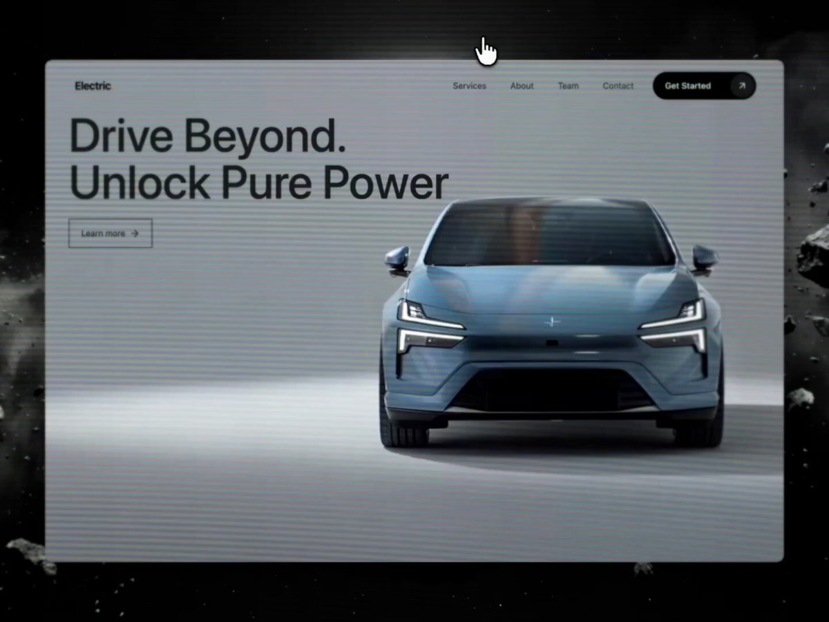
固定在顶部,全宽,圆角药丸形状
初始透明,滚动后:黑色背景加 backdrop-blur-xl,边框 primary/10
左侧 Logo:「Electric」加一个橙色圆点「.」——Logo 颜色随滚动从黑变白
导航链接:Services、About、Team、Contact —— 悬停时有放大的圆角背景药丸效果
右侧 CTA 按钮:「Get Started」,圆角药丸形状,内含一个圆形前景色背景中的 ArrowUpRight 图标
CTA 随滚动从黑色背景切换为白色背景
移动端:汉堡菜单,打开一个圆角深色遮罩层,内含链接和 CTA

版块 2:Hero
全视口高度,视频背景(/videos/hero_bg.mp4,自动播放、循环、静音)
左上方大标题:「Drive Beyond. / Unlock Pure Power」—— 白色文字,桌面端 78px
标题下方:「Learn more」链接,配箭头图标,带边框按钮(border-foreground),无填充

版块 3:Connected Systems(BigLinks)
上半部分:视频背景(/videos/biglinks_bg.mp4),带 60% 黑色叠加层
左对齐内容:药丸徽标「Connected Systems」,标题「Seamlessly Integrate / Every System」,副标题段落
12 列图标网格(移动端 4 列,平板 6 列,桌面端 12 列):每个图标 80x80px,圆角 rounded-xl,边框 white/10,背景 white/5,backdrop-blur。图标为橙色并带发光效果(drop-shadow-[0_0_8px_hsl(25,100%,50%)])。图标包括:Gauge、Zap、Shield、Cog、Fuel、Navigation、Bluetooth、Wifi、Radio、Car、Wrench、Settings(来自 lucide-react)
「Explore All」圆角药丸边框按钮
下半部分:3 个纵向堆叠的超大全宽文字链接:「Find a dealer」「Fleet & lease」「Book a test drive」—— 每个都是巨大字号(桌面端 110px),右对齐配一个 ChevronRight 图标,用 border-b border-primary/10 分隔,悬停时降低透明度

版块 4:Services
视频背景(/videos/services_card.mp4,自动播放、循环、静音)
居中内容:药丸徽标「Next-Gen Driving」,标题「Design, build and perfect / every single detail」
下方:一个玻璃拟态卡片(max-w-2xl,居中,bg-primary/5 backdrop-blur-xl border-primary/10 rounded-2xl)标题:「Effortless, All-Electric / Performance」
描述自适应技术的段落
3 个带橙色 Zap 图标(带发光)的要点:「Full-spectrum torque & drivetrain control」「Personalised driving & comfort profiles」「Track range & plan routes easily」

版块 5:About
黑色背景,左对齐
标签:一条线加「About Us」文字
标题:「Why You Absolutely Should / Experience Our Electric Range」(后半部分为 primary/50)
下方:两栏布局左侧:3 张抽象形状图片并排(shape-1.png、shape-2.png、shape-3.png),均为 object-contain,高 256px
右侧:两段正文文字,颜色 primary/70

版块 6:Audience(For Whom?)
黑色背景,左对齐
标签:一条线加「For Whom?」
标题:「Who Should Experience / Our Electric Range」(第二行为 primary/50)
4 列卡片网格:第一张卡片:圆形,带背景图片(audience-icon.png),aspect-square rounded-full border-primary/10
其余 3 张卡片:圆角 rounded-3xl 边框卡片,配 lucide 图标(Users、Gauge、Wrench),颜色 primary/50,下方配标签文字

底部:圆角信息条,配说明段落

版块 7:CTA
黑色外层背景,内层圆角 rounded-2xl 卡片,视频背景(/videos/services_card.mp4)加 50% 黑色叠加层
左对齐内容:标题「Experience the future / of driving today.」
副标题:「Book your test drive — one click, instant access. / No commitment, pure electric.」
圆角 CTA 按钮:「Book a Test Drive」,配一个圆形前景色徽标内的 ArrowUpRight 图标,药丸形状,背景 bg-primary

所需素材:
4 个视频:hero_bg.mp4、biglinks_bg.mp4、services_card.mp4(使用两次:Services 和 CTA)
3 张抽象形状 PNG:shape-1.png、shape-2.png、shape-3.png
1 张受众图标图片:audience-icon.png
所有图标使用 lucide-react

关键设计模式:
所有版块内边距:px-7 py-16 md:px-12 lg:px-20 lg:py-24,最大宽度 7xl 居中
标签模式:h-px w-6 bg-primary/40 线条加小号文字

徽标模式:圆角药丸,边框 primary/30,全大写字间距宽松
CTA 按钮模式:圆角,bg-primary text-primary-foreground,内含圆形图标徽标
橙色强调色仅用于:Logo 圆点、图标发光、特定高亮——始终为 hsl(25,100%,50%),可选叠加 drop-shadow 发光
原文提示词(English)
PROMPT:

Build a premium electric vehicle landing page with a dark, cinematic aesthetic. The entire site uses a black background (hsl(0,0%,0%)) with light text (hsl(0,0%,95%) as primary) and orange accents (hsl(25,100%,50%)). No default fonts — keep it minimal and editorial. Use shadcn/ui design tokens. Here are the sections in order:

Design System (index.css)
--background: 0 0% 0%
--foreground: 0 0% 12% (used for dark elements like CTA button inner circles)
--primary: 0 0% 95% (near-white, used for all text)
--primary-foreground: 0 0% 12%
--accent-warm: 25 90% 55% (orange accent)
All section backgrounds are pure black hsl(0,0%,0%)
Section 1: Navbar
Fixed top, full-width, rounded-full pill shape
Transparent initially, on scroll: black bg with backdrop-blur-xl, border primary/10
Logo left: "Electric" with an orange dot "." — logo color changes from black to white on scroll
Nav links: Services, About, Team, Contact — hover has a scale-up rounded bg pill effect
CTA button right: "Get Started" with a rounded-full pill, contains an ArrowUpRight icon inside a circular foreground bg
CTA switches from black bg to white bg on scroll
Mobile: hamburger menu, opens a rounded dark overlay with links + CTA
Section 2: Hero
Full viewport height, video background (/videos/hero_bg.mp4, autoplay, loop, muted)
Large heading top-left: "Drive Beyond. / Unlock Pure Power" — white text, 78px on desktop
Below heading: "Learn more" link with arrow icon, bordered button (border-foreground), no fill
Section 3: Connected Systems (BigLinks)
Top half: Video background (/videos/biglinks_bg.mp4) with 60% black overlay
Left-aligned content: pill badge "Connected Systems", heading "Seamlessly Integrate / Every System", subtitle paragraph
12-column icon grid (4 cols mobile, 6 tablet, 12 desktop): each icon is 80x80px, rounded-xl, border white/10, bg white/5, backdrop-blur. Icons are orange with glow (drop-shadow-[0_0_8px_hsl(25,100%,50%)]). Icons: Gauge, Zap, Shield, Cog, Fuel, Navigation, Bluetooth, Wifi, Radio, Car, Wrench, Settings (from lucide-react)
"Explore All" rounded pill border button
Bottom half: 3 big full-width text links stacked vertically: "Find a dealer", "Fleet & lease", "Book a test drive" — each is huge text (110px desktop), with a ChevronRight icon right-aligned, separated by border-b border-primary/10, hover reduces opacity
Section 4: Services
Video background (/videos/services_card.mp4, autoplay, loop, muted)
Centered content: pill badge "Next-Gen Driving", heading "Design, build and perfect / every single detail"
Below: a glass-morphism card (max-w-2xl, centered, bg-primary/5 backdrop-blur-xl border-primary/10 rounded-2xl)Heading: "Effortless, All-Electric / Performance"
Paragraph describing adaptive tech
3 bullet points with orange Zap icons (with glow): "Full-spectrum torque & drivetrain control", "Personalised driving & comfort profiles", "Track range & plan routes easily"

Section 5: About
Black bg, left-aligned
Label: line + "About Us" text
Heading: "Why You Absolutely Should / Experience Our Electric Range" (last part in primary/50)
Below: two-column layoutLeft: 3 abstract shape images side by side (shape-1.png, shape-2.png, shape-3.png), each object-contain, 256px tall
Right: two paragraphs of body text in primary/70

Section 6: Audience (For Whom?)
Black bg, left-aligned
Label: line + "For Whom?"
Heading: "Who Should Experience / Our Electric Range" (second line in primary/50)
4-column grid of cards:First card: circular with a background image (audience-icon.png), aspect-square rounded-full border-primary/10
Other 3 cards: rounded-3xl bordered cards with lucide icons (Users, Gauge, Wrench) in primary/50, label text below

Bottom: rounded info bar with descriptive paragraph
Section 7: CTA
Black outer bg, inner rounded-2xl card with video bg (/videos/services_card.mp4) + 50% black overlay
Left-aligned content: heading "Experience the future / of driving today."
Subtitle: "Book your test drive — one click, instant access. / No commitment, pure electric."
Rounded-full CTA button: "Book a Test Drive" with ArrowUpRight in a circular foreground-colored badge, pill shape with bg-primary
Assets needed:
4 videos: hero_bg.mp4, biglinks_bg.mp4, services_card.mp4 (used twice: services + CTA)
3 abstract shape PNGs: shape-1.png, shape-2.png, shape-3.png
1 audience icon image: audience-icon.png
Use lucide-react for all icons
Key design patterns:
All section padding: px-7 py-16 md:px-12 lg:px-20 lg:py-24, max-w-7xl centered
Label pattern: h-px w-6 bg-primary/40 line + small text

Badge pattern: rounded-full pill with border primary/30, uppercase tracking-widest
CTA button pattern: rounded-full, bg-primary text-primary-foreground, with inner circular icon badge
Orange accent color used only for: logo dot, icon glows, specific highlights — always hsl(25,100%,50%) with optional drop-shadow glow
建议模型
Gemini 3.1 / GPT-5.6 Sol
视频地址
https://media.goodcase.ai/media/video/gemini-3-1-65cd001c4cd3.mp4